Tips and Suggestions for Improving Character to Sell at DAZ
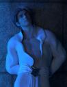
Hello there, I recently sent a new PA application for this G8M character I made, and it was rejected. I would like to know, specifically, what I should do to improve it. Any tips, suggestions, or critiques on how to improve this character, so that I am able to sell here. Help would be appreciated from current PA's to see what they did, what works and what doesn't, and how to improve the quality of this character. Whether that be improving lighting, composition, expression, mood, poses, environment, etc. It was rendered in Cycles, if that is that okay. I did try to be creative with the lighting, but that might not have been the best idea. Please be specific and honest. If it's really bad, you can just be direct, and let me know how to fix my mistakes. I really want to sell my characters here, and I don't want to give up on that idea. Thanks.
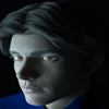
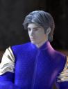
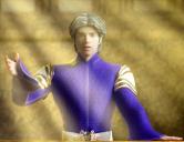
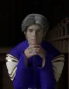
Below, I have attached a few renders so you have an idea of what I did.

Daz 3D is part of 
Connect
DAZ Productions, Inc.
224 S 200 W, Suite #250
Salt Lake City, UT 84101
Licensing Agreement | Terms of Service | Privacy Policy | EULA
© 2024 Daz Productions Inc. All Rights Reserved.
Comments
In my non-professional opinion, the lighting is near-atrocius and the skin looks bad. The brows appear to be surrounded by skin texture that doesn't match the rest of the face. I'm not familiar with "Cycles", but if those images are what you submitted and are any indication of how it would render in Iray or 3delight, then its no surprise it was rejected. First, I would either re-evaluate your choice of render engine and decide if its suitable(if so, major adjustments seem to be needed) or if you should change to a different one. If you're going to be promoting the sale of your characters to Daz customers, you should probably be rendering in Iray and/or 3delight and using a lighting setup that shows off the qualities of your character.
That's about all I can say because without decent renders, its hard to recommend improvements on the character. Bad renders and/or bad lighting can make characters appear completely different or worse than they actually are. I render in Iray for photo-realism, so I'm probably a bit more picky than others when it comes to clear realistic renders.
Cycles is not ok,If you want to sell a DS package it should be rendered in DS, the 99% of customers want to see how it work in DS not in blender
i think thats the first step :)
The head morph looks nice but the skin is unimpressive. No opinion on the body morph since we don't even get to see it properly.
Quality of the character aside, the promos have a "dated video game" vibe and need a lot of improvement. I don't know if this has to do with the render engine but the render quality just isn't great, the images look lifeless. It doesn't help that the character has the same vacant expression in each shot. Also, your JPGs are over-compressed.
In any case, you should render with IRAY if you want to sell to/on DAZ, which is very IRAY focused.
In terms of style, most of your examples are more concerned with creating a certain mood than with actually showcasing the character. You can have a few moody promo renders but most of them should be about really showing us the character. At least one full body shot where we get to see him in underwear or trunks so we can see the body morph.
Here's some vaguely comparable characters you can measure yourself against:
https://www.daz3d.com/darui-for-yuzuru-8
https://www.daz3d.com/hyun-ki-for-yuzuru-8
https://www.daz3d.com/warrin-hd-for-genesis-8-male
https://www.daz3d.com/sebastian-for-genesis-8-male
https://www.daz3d.com/jurou-for-lee-7
Opinion of a hobbyist who's in the market for handsome, vaguely video game inspired male characters.
As pointed out by the others, you need to do promo images in Iray since that is what the majority of users that purchase content in the store use. I would suggest looking at the other characters sold in the store and see how those promos look and try to emulate them. The head morph does look nice though.
I would say that your lighting is definitely letting you down. That would be a good thing to focus on. Try a few more simple, neutral lighting setups. Daz is usually fine about taking more artistic renders as promos as well, but they really want images that show off the character's textures and shape. I sent in a character once with the main image (a headshot) lit with fairly strong purplish lights and a blue rim light, and it got sent it back because the colors were tinting the skin too much. With the lights as they are, it's hard to tell much about the textures. Your morph looks nice and the poses look good. I especially like the ones in the third and fifth images.
I'd also suggest, once you have the lighting set up in Iray, that you need bigger, close-up images to show the detail (assuming there is detail), and also that you need to show more of the figure - body shots with just underwear, close-ups of arms, chest, and legs etc. Look at store promos.
Pretty good body and face, but you may want to consider other outlets until you ramp up your skills.
So much for the Pro-Lighting Studio for Blender... That was a bad idea. Sorry for subjecting you to my subpar renders, but I had to make sure that they were that terrible. Here are some new renders for now, I may post more later. Please let me know if I'm going in the right direction, and that the renders are improving. Also, feel free to give me tips on these, as well. I followed all of the suggestions that were given. I used the BOSS Portrait Light Set for these, with a simple background, so I can know for sure if they are fine, before adding the final background. I also used the new PBR Skin Shader on him, with a microdetail normal map, for extra detail. Thanks.
Definitely moving in the right direction! These are much better.
Now that we can actually see him it's also clear that his skin needs work. Bumps/normals are too harsh and there is a marked difference between face and torso. His brows look off, I see a strange white outline.
What type of character is he?
The coloring leaves a toony impression, although needs more contrast, but the shape of the torso is maybe too human for a toon
For a somewhat realistic human, the skin is too pale and "lifeless"
Agree on bumps/normals being too harsh and there's something strange on his neck.
Those are definitely better lit. The front and back full shots look very good. The shadows and rim light in Linius Promo 03 are really nice - there's a lot of good detail showing around the ribcage and arms and that shows off your body morph well. As Hylas said, it does look like your bump and/or normal maps are too strong. They're good details, but at that strength they look a bit rough and overly bumpy. You might want to dial the values down on those. It looks like there may be a seam where the face texture meets the torso, but it's hard to tell just from those shots - might want to double check that area. :)
I like the paleness of his skin, but think it's a little too dry/chalky looking. I haven't tried the new PBR Skin shader yet myself, but I expect there are settings in there that can help with that. Take a look at page 2 of this thread, where a user called melissastjames shows several images that show her shader settings for the comparison pictures she posted. That might give you ideas of what settings to play with to get a nice result with your textures. If you have Victoria or Michael 8.1, you could use their settings as a comparison as well. Human skin tends to be a bit oily, so striking a balance between dry and too much (where it starts to look greasy or like shiny plastic) is important. Sometimes it just takes a lot of tweaking the dials until you get what you like. Also, I would say that his eyes seem flat; there's no shine to them. That may be the lighting, of course, but make sure that the cornea and eye moisture materials pick up reflections to really show off the eyes. You could compare your settings to those of any Daz Original or other character you have and build from there. With a few tweaks to the textures, I think all those promos will end up looking very good. I think you're making good progress! Keep it up and don't be discouraged by critique. I think you've got a very promising character there, and would love to see you achieve your goal of becoming a PA.
I only had time to render two, but I think I got the idea of how I should do things from now on. Tomorrow, or next week, when I have more time, I will submit the final renders to Daz again. This time, hopefully, all goes well, and I will begin selling my characters here. Again, thanks everyone for all the help!
As far as I know, you can submit the same character. If you were to just keep sending in identical work and showing no improvements, I would guess that you might be told not to do that simply because they'd have already seen it and turned it down. But if the artwork is different and it shows improvement, I would imagine that's okay. Keep in mind that those are just guesses, as I have no special knowledge of what the preferences of the Daz team in that department are. If you aren't sure and want to check, I think there's a contact email on their Sell Your Daz 3D Content page (the link is at the bottom of the webpage).
The changes to your skin textures seem to be reacting differently to the lights you're using (that's normal), and I would suggest that you lower the brightness or turn down the Burn Highlights setting (under Render Settings > Tone Mapping) for the first headshot so his forehead and cheeks aren't overexposed; it hides whatever details there are in those areas. The second one looks a bit flat. If you have a light directed at him from the front, consider scooting it to the side and pointing it at him from an angle to bring some shadows in and counteract that. Here's a quick example of what I mean, since I don't think I'm too good at explaining. I used Tasha 8's vampire skin because it's the palest I have and added the PBR skin shader with melissastjames' adjusted settings. She may still be a lot pinker than your Linius textures are, so it's not the best comparison. Just for illustrative purposes.
You can see that even in spots (her collar and where the rim light hits her face near the eye in the first one) are still overly bright and I didn't manage to eliminate that entirely. I find pale skin rather tricky to light. Here are the basic light setups I tossed together while attempting to mimic what your images show, if you want to look at the settings - they're not at all fancy but may give you some ideas you can use. Maybe someone else here can even play with them and come up with better suggestions than mine. They're just spotlights and a distant light. I used a flat grey png in the Environment Map slot under Render Settings so the background would be entirely neutral and not cast extra lights, but it might be worth throwing an HDRI image in and experimenting with Dome Rotation to see if that adds anything to the scene. Tone Mapping can be a huge help with highlights and shadows if tweaking the lights themselves doesn't get the look you're after. If you look in these scenes, you can see that I adjusted the Burn Highlights and Crush Blacks values to try and balance the brights and darks.
Anyway, just some quick thoughts. I think you're definitely moving in the right direction and can see improvements in what you've posted. I hope this bit of rambling helps. Good luck!
If those two renders are examples of what you plan to submit, I feel you still have a long way to go before your product is ready to submit. Compare your images to most of the male character promos in the store to get an idea on what your need to work on.
Just had another thought. Do you have this Click N Render IBL product? There are some excellent neutral/greyish ones in there, and it's one of the simplest and best lighting products I own. It's great for promos, particularly the basic ones. If you have it (or if you don't, it's on sale right now) give it a try without any other lights in the scene. It might be a big help to you in your lighting endeavors.
Hey there again everyone, I decided that selling a character would be a bit more difficult for me, right now, and I need more time to work on rendering characters. I tried to improve, and look at other PA's works, but I just can't replicate them. It doesn't really help me. I tried again, with better renders, and I got rejected again. As a beginner, it's tough. Quixotry's suggestions are specific and helpful, as usual, and I will keep them in mind, for my next try. As for now, I created hair, and thought I should give it a shot at selling it here. Below are some renders. I hope I'm improving, and any suggestions are welcome and needed. I did try my hardest. Again, I'm a slow learner, so I may have made silly, obvious mistakes, but the input is very much necessary and helpful. Thanks.
Welcome back!
I see a few problems:
1) The hairline is way too harsh.
2) The shape of the hairline isn't right.
Look at some photos of slick back hair, typical male hairlines have a very different shape.
2) The "wind" morphs in pictures 3 and 4 look unnatural.
In real life, to achieve a look like this you'd have to use a ton of gel so I imagine your hair probably wouldn't be affected by wind at all.
3) Not enough volume. Even if you go for a soaked-in-gel, wet look you'd have a little more volume, especially on top.
I went and yoinked your two samples there. I tried them out and they both looked really good.
I can immediately tell they are different than some of the tutorials ive seen online. Without taking too much of your time,
can you give kinda a small explanation of some of the key factors you did setting that light setup up?
I didnt download your gray background, at the time, but what setting causes that strobe background to occur?