Ring Causes Problems on Purpose ᕕ( ᐛ )ᕗ
 plasma_ring
Posts: 1,020
plasma_ring
Posts: 1,020
Hello! I'm Plasma Ring and I like pretty people of all genders, Batman, making up demons, and doing weird things in ZBrush. I decided to make my own thread to ramble in because I have many thought tangents which may or may not be useful to other people, and I need somewhere to put them that is not Twitter, because Twitter is bad for me.
Originally I picked up Daz Studio to make assets for what is basically an interactive Batman fanfiction, then fell down the hole and discovered I love 3D to a truly frightening degree. If it hadn't been for Daz I probably wouldn't have tried it; I always assumed it was way over my head, and I work in an industry that makes heavy use of 3D models so I'd already gotten kind of scared off by how Serious Business it looks from a career perspective. Daz is just fun! I've played MMORPGs for almost 20 years and this has replaced it for me in a lot of ways, since the big draw for me there was creating characters and using them to roleplay and make art. I have a feeling 3D is going to blow up in fandom circles over the next few years, especially with free tools like Blender getting more accessible and powerful all the time.
This year I've decided to practice creating content and making my own morphs, since I always end up wanting to do stuff that causes massive mesh distortion when I try to make it with dials. I also do a lot of nonphotorealistic postwork, mainly using Photoshop, DxO's Nik Collection, Topaz Studio, and Clip Studio Paint, and I'd like to learn to make shaders so I can do more goofy NPR stuff.
I haven't seen CSP discussed much for Daz postwork, so here's an overview of some of the features I use a ton. I wish I'd gotten it sooner because I went through a lot of actions and techniques trying to get consistent results in Photoshop, and it turns out CSP has native functionality that just does exactly what I need in one step, whoops. I like the way Photoshop handles blending modes much better (and it has my filter plugins), so I end up toggling back and forth between them while I'm working.
Smart Smoothing
My NPR technique mostly involves building up a bunch of texture and filter layers and then selectively masking them out, similar to photobashing. The easiest way to start is with a fake underpainting--basically using some kind of filter to create a layer with all the details broken up into blocks of color. Parts of this remain in the final image to define shapes that aren't the focus of the piece. For example, if I'm doing a portrait I'll usually leave chunks of the hair filtered and only bring in strands from the original render in places where they frame the face, have strong highlights, or otherwise create visual interest.
Unfortunately art filters tend to be super unpredictable and inconsistent, especially when dealing with photorealistic scenes that aren't lit like a studio glamour shot. Many of them create wormy "brushstrokes" and jagged color separation, or make soup of any adjacent shadows regardless of value. Before picking up CSP I'd narrowed down a few rotating options that work on most images:
- Iray denoiser (if my scene doesn't drop to CPU)
- Surface blur in Photoshop
- Topaz Studio's impression filter (sometimes jaggy)
- Oil Paint Photoshop Action by LUXDesignStudios on Creative Market, which is the best one I've ever found
And then there's Smart Smoothing in Clip Studio Paint, which you can find under the Edit menu. It's more or less Iray denoiser on command, and seems to work off the GPU in the same way, although it's instant and always works! :V In most cases it will detect even slight variations in color or value and preserve them, so the effect looks very much like an artist has just started to block in detail and add texture. It has three strength levels, making it much easier to find something that suits most images.
Brightness to Opacity and Tone Removal
Having selective definition on edges helps the effect. What's funny is that I never painted at all before I started doing this and only did pencil sketches and digital inking, so I occasionally try freehanding linework until the nerves in my hands remind me why I outsource this stuff to machines now. Unfortunately I never really found a sketch action I liked, and while the shaders and tools in Daz are awesome I'm not fantastic at getting the results I need from them.
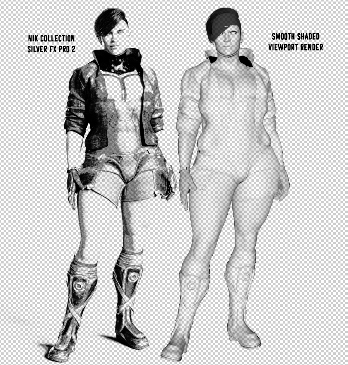
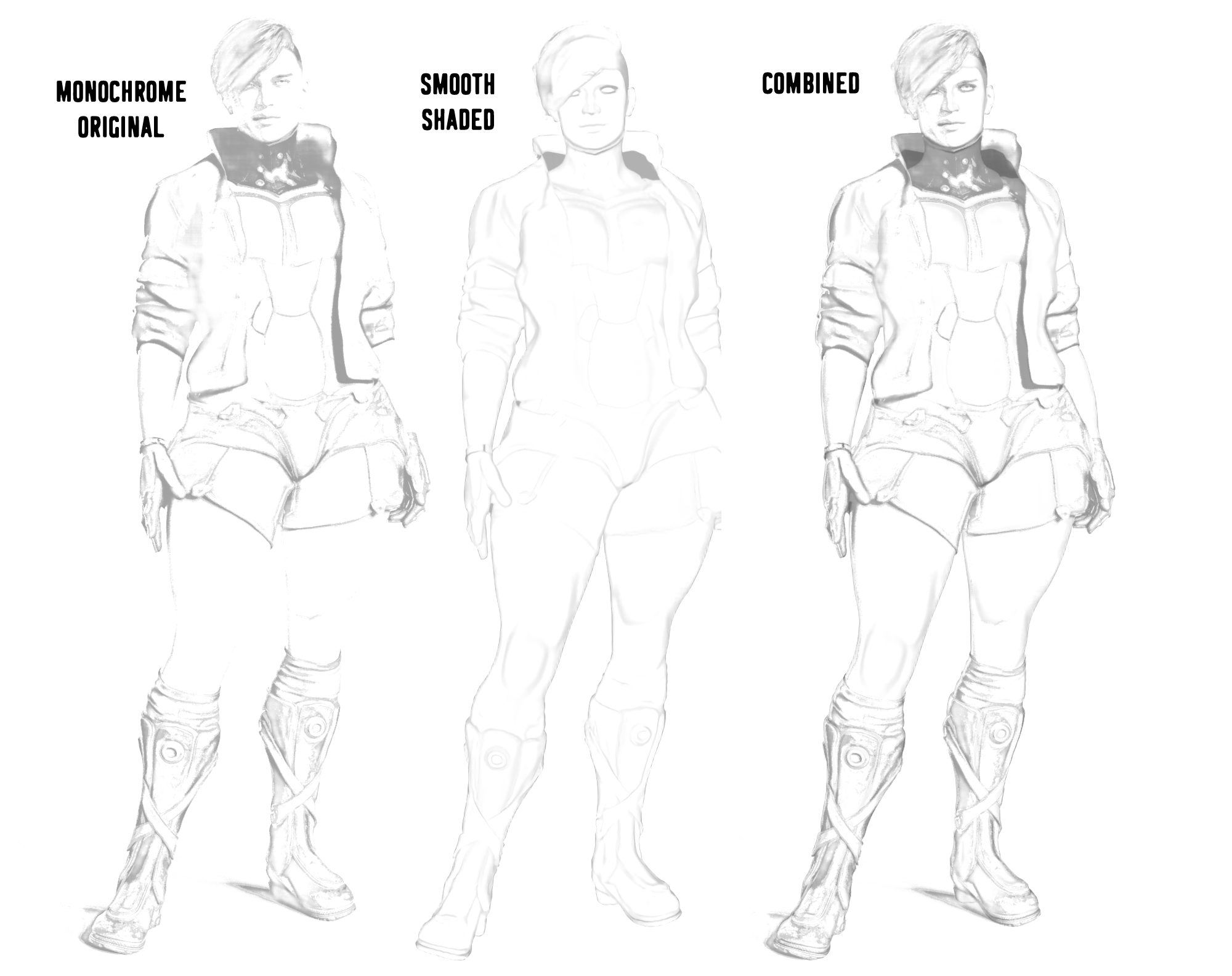
CSP is aimed at illustrators and comic artists, so it makes sense that there's a built-in function for separating lineart from a white background. It's found under Edit > Convert Brightness to Opacity. I usually run my image through Silver FX Pro in the Nik Collection plugin since it allows fine control over detail and brightness in grayscale images depending on which film filter you use, but in most cases you can just convert a copy of your render to grayscale and tweak brightness and contrast until it's as close as you can get to black and white without losing detail.
Converting brightness to opacity on this tends to come out like a low-fi xerox, which can be pretty cool and preserves a lot of detail. Smooth shaded viewport renders can also give interesting results, especially if you composite the two. But no matter how close you got to black and white when adjusting the grayscale image, chances are you'll still end up with a barely-there gray shadow bleeding into your colors when you overlay it.
There's a feature for that, too! Kinda. Edit > Remove Tones > Delete tones from selected layer is actually for stripping screentone out of comic illustrations, but on regular pics it leaves behind something like a pencil sketch. I've messed around with compositing different results, using smart smoothing on the lines, and changing the color (Edit > Convert to drawing color will use your active painting color). You can also right click on the layer and Convert Layer > Vector Layer, then use the Operation tool in the upper left corner (cube and arrow icon) to change the brush the lines are drawn with. This is intended for use with clean black and white lineart, though, and in my experience it doesn't work very well on lines derived from renders.
One of the things I like most about doing this filter/texture overlay/textured brush thing is how it can make stuff like the highlights on the jacket look like individual brush strokes, even if they aren't actually brushed in. The reflection on the collar is something I'd work on removing if it was a bigger piece, because even if it's technically supposed to be there, sometimes realistic details look like mistakes in this style.
Daz 3D is part of 
Connect
DAZ Productions, Inc.
224 S 200 W, Suite #250
Salt Lake City, UT 84101
Licensing Agreement | Terms of Service | Privacy Policy | EULA
© 2024 Daz Productions Inc. All Rights Reserved.
Comments
I'm still playing around with LT conversion, which is the extract-line-create-manga-backgrounds feature only available in the EX version of the software. You can get some effects kinda similar to the Arnold toon shader if you turn off the generated screentones, although it predictably works better on hard surfaces with clean lines and direct lighting than it does people or scenes. Alas, I only have so many uses for weird pipes.
To do the first one I rendered one version with normal textures, one with bump maps in the diffuse channel, and one texture shaded viewport render of that. I used the brightness to opacity, remove tone, and smart smoothing process on that. The second one is a composite of the first experiment, combined with two different versions I made using LT conversion.
Some pics of my design for Harvey/Two-Face, using HD Face Burns. I want to do a tattoo on the left forearm using a pattern from Escher's "Cycle," but so far I haven't found a way to accurately wrap a seamless texture sleeve.
They're co-conscious and each control half of the body, although Two-Face does most of the talking. The coin is how they reach consensus when each of them feels strongly about taking a different action, although it really lets Harvey avoid a battle of wills with someone he's emotionally dependent on. Over time Two-Face feels less like he has to be in control to protect them and Harvey has more success winning him over, which makes their relationship a little less dysfunctional.
Working on some glow eyes presets. I'm really picky about emissive eye effects since just changing the surface without using maps looks a little too flat to me and overwhelms the face easily.
I've got these set up so that in brighter light they're still glossy and the glow is most obvious in dark environments.
Tryin' them out in different environments. I'm handpainting some different styles of gradients for neato effects.
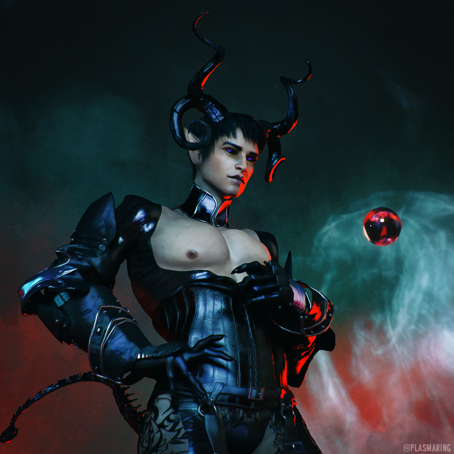
Messing around with environment tinting using my character Innalech, who I use as an icon a lot because I like his horns. He and his foil, Benedict, came from a really goofy one-off premise and then as usual it stuck and spiraled into a semi-serious concept. This is why I finish one short story roughly every two years. :V
He's a succubus (which in this setting is basically a gender identity) and he commands one of the infernal legions that have started showing up and conquering human territories. He has complicated feelings about the whole war thing, and is only allowed to hold that much power because the soulcatcher crystal he wields is more or less a superweapon. It would suck for him if some human broke it, wink wonk.
His head is mostly a custom sculpt at this point and I'd like to eventually try to sculpt his entire morph from scratch. Right now his base is CC Zophael mixed with HFS Ultimate Shapes and his skin texture is from Ceridwen.
For this pic I did a composite of three renders, each using a different light from PTF Legendary with an electric purple tint. The mesh lights are from Luminosity Black.
Batman: Europa is not really a series I would recommend to anyone on the basis of quality; the entire premise is just an extremely goofy excuse for Batman and Joker to wander around together acting immature. Since that's the main thing I read Batman comics for, I love it a lot.
I got an idea for a fake variant cover so here's WIP Europa Joker. I'm referencing mostly the third issue, which has strong Y2K Malkavian clanbook energy and some interesting character development (even if it doesn't go anywhere).
It's way easier to do variant designs for Joker than for Batman, which is actually one of the reasons I'm trying to learn modeling. I'm picky about batsuit elements and I've never been able to find some parts that fit exactly what I want.
Neat! You managed to make them look really good!
Someone else's thread I can stalk and admire while never being quite brave enough to tell them their work is amazing!
Really nice renders, I particularly like Innalech!
Absolutely love your style. I'm not much for doing postwork, but this is seriously making me consider picking up my near-forgotten copy of CSP again.
Thank you very much! I tried them on Victoria 8.1 last night and there's kind of a cool effect where if you look close you can see her eye details behind the glow.
Aaa thank you you're very kind! I admire your work and that means a lot to hear.
Thank you so much! CSP really is a great program, it took me a while to pick up but I'm so glad I gave it another shot.
It turns out the 8.1 eyes are really good for doing the glow-under-glass thing. I have to repaint my maps because most of them are too small now, but I needed to clean them up anyway.
Experimenting with smart prop loading around the pupil, kind of a cool effect.
Updating these dorks to 8.1. :V
I don't usually post outright shipping or realistic stuff here but here's my first test converting these two models to 8.1. They still need work, but I'm pretty happy with how Bruce is turning out. I have multiple model sets for Batpeople because my own take on the setting is so different from canon that it feels weird crossing the streams, and it's easier to do general fanart with less context-dependent designs.
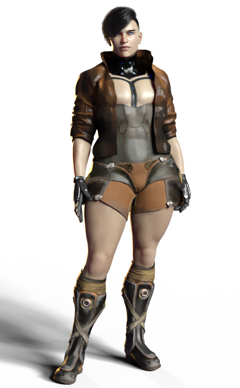
I was having a sensible chuckle with a friend this morning about putting something like this out in the wild online and seeing how many mainstream Bat-fans would think it was a cosplay shoot. (I would actually be mortified.) I think anyone who looked for more than a couple seconds at the full size image could probably tell it wasn't a photo of real people, but early on in my Daz noodling I was struck by how much of a difference in realism just using an exterior photo HDRI could make. It was one of the first things I learned to move away from in developing my postwork style, because once you start layering on art filters any kind of even, natural lighting gets inconsistent results; sometimes it'll look great, and sometimes it'll look exactly like you filtered a stock photo.
One of the most fascinating things to me is the perception gap between people who are familiar with what 3D looks like and people who don't see it very often (at least with the understanding that it's 3D--most people see way more 3D and VFX in media than they're usually aware of). When I first started looking at Daz models I was totally floored at how photorealistic the models looked and I was pretty sure I wouldn't be able to tell them from a real person. Once I started working with them all the time my eyes kind of adjusted and now they don't look any worse to me, but they definitely look like 3D models and not real people. I still can't tell super realistic archvis from a photo though, lol.
Some of my favorite artists who do a lot of character-based work have had to repeatedly explain to people that their renders aren't cosplay photos, even when the models look fairly stylized to me. I think probably if people aren't expecting to encounter 3D--especially as render art, which is still a relatively niche thing--it might be easy for the eyes to take things like realistic lighting and materials and sort of fill in the blanks.
It's a big part of why I have deeply mixed feelings about virtual influencers like Miquela; she looks very obviously like a 3D character to me, but she's just one of several projects like this that started out not disclosing that their social media presence belonged to a fictional character and...I don't know if "tricked" is the right word, but a bunch of the early comments on her Instagram were about how flawless and doll-like she looked, and how could she possibly be real?! At first glance she was perceived as an unusually beautiful person, not an (IMO) fairly generic 3D model. On the other hand I dig stuff like VTubers, who I feel are bringing back some of the 90s-00s "On the internet, nobody knows you're a dog" online identity play. They come up with backstories and personalities, but the stylized anime avatar honestly seems to make it much easier for people to distinguish between the persona and the performer.
TL;DR I would like to see 3D gain popularity to the extent that everyone who wants to can make avatars and use it for their own nefarious ends rather than being mistaken for reality. It's actually very cool to me to see how realistic 3D can be and know it's not real and was just built out of some jpegs and wire! Come for the gay comic book absurdity, stay for the rambling. ᕦ( ᐛ )ᕡ