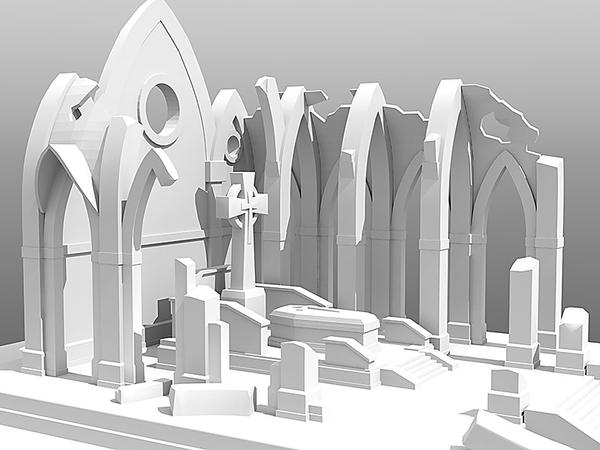
My first Prop - The Forgotten Chapel - WIP [Commercial]
Hi there,
this is going to be my first prop for DAZ and Poser. I have been working as a 2D freelance illustrator for 8 years and was digging into 3D over the last months as well. My 2D portfolio is at www.drakken.de, in case you want to take a look.
So attached is the beginning of my first set. It is not finished yet and i already did things over and over again, because i have no process to stick to at the moment. I also do not know small things like where to add bevels etc and am testing around a lot. Many promo images (models, untextured) from well known vendors do not show edge bevels at all.
What needs to be done:
Add details, debris, plants, etc.
Think about textures.
Think about an environment arount the Chapel (perhaps a cemetary?)
...
And i am a no native english speaker, just in case you wonder :)
Thanks for watching.


Comments
very nice work - :)
Looks great so far. Can't wait to see the textured version.
Thanks a lot :)
Playing around with base textures and colors etc. right now. No bump / displ maps or dirt layers so far, just basic stuff.
Still just basic texturs... really time consuming :)
any chance of a peek at the wireframes to get an idea of how many polys there are?
regards,
waningmoon
No prob :)
According to the statistics panel there are about 8260 polys right now.
nice. i see a fair amount of triangles. if i recall daz or poser can have problems with triangles. i do remember it being said that quads are preferred. other than that, i would ask around for modelling input techniques for making items for daz.
regards,
waningmoon
Quads are prefered as they can be easily subdivided and they smooth better too, So in this case he should be ok.
Triangles are not really a problem in poser and DS espicially if they are on flatish surfaces of a ridgid objects, (like this chaple).
Ive even bought some clothing items on the Daz store that were ALL in triangles, and they render just fine.
Its N-gons you really have to watch out for as they wont render correctly in either program and are considered bad topology in general.
Very good model, the only thing I can see that is any real cause for concern is where you have cut a hole for that round window, it looks like you made a boolean cut, becareful with those - as they leave quite a mess behind, but since the cutting surface is flat you might get away with it on this particular occasion :)
Normally I would cut an approx hole manually, it doesnt have to be as circular as the actual window either, it could be little more than an octogan, since that curved window frame/border (where you used a tube primative) will cover up the 'approximate' hole nicley. Doing it this way you aren't left with a bunch of irregular topology, which may or may not render well on the exported mesh.
One other thing to bear in mind, Poser and DS will discard any smoothing group information in an .OBJ (exported format), for this reason, you might find you will need to break the verts that make up all your sharp edges and corners or preferabley, bevel/chamfer them, otherwise DS/poser might try to smooth over them (not a good look) you will want to retain those nice clean well defined edges.
i would do a quick test export/import to poser now to check out how it renders in its current state.
Those areas where you have chamfered edges should be just fine though :)
Thats the golden rule for a mesh intended for DS/Poser, if you want a good clean edge, you must either; chamfer, bevel or break verts.
breaking verts should really be avoided if you intend to use a displacment map though, or else you end up with broken seams, (gaps)
You texture work is looking really nice :) If you dont end up needing to break verts on edges I would definately suggest you add a displacment map for the masonry and it will look amazing.
If you have only been doing 3d for a few months, you are doing very well indeed. Nice work.
@waningmoon
Thanks. I researched quite a bit up front and triangles should be ok. N-Gons are a no-go.
@DogZ
Thanks a lot for your input :)
Interesting. I found a few tutorials where people stated, that one should apply smoothing angles to every part of the model to prevent poser from smoothing too much. A rule of thumb was, that an angle of 34 degrees is a good value for a lot of cases. Some said, that there might be edges that one has to detach from one another to get a good result, but principally, one should avoud breaking everything apart. Well, i think i will have to try that out. I imported a small part already into Daz Studion without any problems.
Jack Tomalin wrote a good tutorial about preparing models for poser a few years ago. The pdf should be downloadable somewhere at his website.
Displacements: I might have to redo a few of the pillars etc, because i forgot that displacements need enough underlying geometry to work properly, and some areas need more. Well, it is my first prop anyway. When i get that done i should know most of the hurdles concerning creating props.
Thanks again.
will be watching out for a release when you are either happy with it or sick of seeing it. :p
regards,
waningmoon
@waningmoon
Lucky me that i am kind of a pitbull concerning problems - i just need to solve them :)
For all of you who are interested or start out as i do right now:
I attached a quick testrender done in poser. Please forgive me the low quality, but i am not familiar with the render engine in poser right now.
The model on the left side has a bit more geometry to it, its edges bevelled and the bases detached from it, the model on the right has no bevelled edges, less geometry and its bases still attached to it.
My conclusion: unfortunately i have to re-do a few parts of the chapel but for the future i will definetly go with edge bevels whereever possible.
Beveling the edges there made a world of difference. It's coming along nicely :)
Thanks Gedd! :)
I will finish the center part (see attached image) of the set first and give it away as a freebie.
Would be cool if i could get some feedback. As this is my first set i want to make sure, that the final thing works :)
I ordered an older Poser Version (7) today for backwarts compatability. So it might take me one or to days two set things up.
Here is the center part nearly finished. It needs some more tweaking etc. but it's coming along quite okay, i think.
Very nice work.
Are you unwrapping in Modo, or are you utilizing ZBrush at all in your workflow? I ask because I'm modeling my assets for my comic in LightWave 11, and using GoZ quite a bit to handle both UV work and polypainting / map creation.
Regardless, love the look of the crypt. Well done.
Thanks!
I do my unwrapping in headus uv layout. Modo has strong UV-Tools too, but with uv-layout i am just a bit faster.
Had to test my textures today and realized, that most of them were to weak for close-ups. So here is another try for the celtic cross.
The map has a size of 4096 x 4096. Is that too big for this cross compared to the rest of the chapel?
I am not sure about that ...
Don't know if it is too heavy for the scene but it looks great. That type of thing is really relative to how many objects one has in the scene and how powerful the machine is, and it changes over time. People can always reduce the texturemap easier then scaling it up though :)
looks great
Thanks Guys!
Here is a render of a close-up. The top of the sarcophag is a 4096 map, the body a 2048 map (floor too). The difference is obvious, i think.
So everything needs a 4096 map? The skulls have a 1024 map though, but they are very small.
...nicely done. Love the moss/mould textures. I can see this working well for my Balkan war scenes.
Something I've played around with, a little...
It may seem counter intuitive, but not only do 4096 maps look better,they seem to be a 'sweet spot' for 3Delight (not sure about Firefly...Poser's render engine), 2048 work well in 3Delight, too. But the kicker is, if they are in tif format they are even nicer...and overall, render faster.
Why?
Because tif is the 'native' format of 3Delight. TDLmake, the texture 'optimizer' for 3Delight converts everything to tif and then creates mipmaps...if it doesn't have to convert anything, that's one step saved...both the time it takes to convert and any possible conversion losses (quality of the image). In my tests, I was saving between 5 and 10 seconds...in a smaller render that usually finished in a minute or so...with a noticeable difference in the final 'look'. And when the memory 'costs' were added up...the loading of the texture, conversion and so on, the 'huge' tif file actually, when all was said and done, ended up 'even' or smaller than the others. BMP were the worst, for memory usage and jpg were the worst for quality. PNG was a nice, happy, middle ground.
Texture sizes, outside of 'power of two', not only didn't look as good, but didn't save all that much memory (2 MB out of 43MB for 4000 x 4000 Tif (41MB) vs a 4096 x 4096 (43MB) tif). And the 'look' of a 4x4 image was just 'off'...no it wasn't like dropping to 1k or anything like that...but there was a definite 'something' missing.
@KyotoKid
Thanks!
@mjc1016
Thanks a lot for the infos (especially those about the tiffs). Right now it seems, that only 4096 maps are usable for close-ups etc. I tried a lot with 2048s, but the renders all looked smufged / unsharp. Even sharpening in PS did not help much.
Lucky me, i did not try to do maps out of the range of the 'power of two's'. Would have been wasted time then :)
I call this part done for now (color textures), but i may re-visit some areas later. Now i have to texture the rest of the set to complement this focal area.
Now that i know how to handle my textures i am back on track.
Watching with interest — this looks good.
...yes.
Question. Are there any specular maps? I was thinking just for the mossy bits, to add that wet look.
Thanks again!
@Zev0
I am doing color textures only at the moment. All other maps like bumbs, displ, glossines, specs etc will be done later. The materials are not set up correctly, therefore you can see harsh highlights here and there.
Now i need more details, details, details ...
Want details? Add coloured chapel glass, but broken...:) Thats if its a church lol. Also I'd remove one or two slabs from the ground, having soil showing, maybe even one or two broken ones.
It's looking very good. One of the most noticeable things it appears at this point is the lack of ambient occlusion in your renders :)
Yes I do like this very much, it is coming a long nicely.