Christmas Tree weirdness
 Taoz
Posts: 9,978
I've been playing a bit with this Christmas Tree:
http://www.daz3d.com/shop/yuletide-treasure-tree-2011
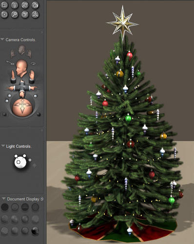
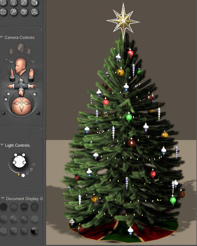
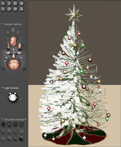
Excellent product as such, but there's something I don't understand. In the Poser preview it looks like the tree has dropped all its needles on the right side. Doesn't matter if you rotate it, it's the same from all angles.
Likewise, if I set up a symmetric light set, the right side of the tree is equally dark, compared to the left. I have to use a rather asymmetric light setup to make the light look somewhat evenly distributed. It only seems to affect the tree, not the props.
Anyone who knows why that is?
I've attached some pictures to demonstrate what I mean.

christree03.jpg
642 x 806 - 102K

christree02.jpg
642 x 803 - 105K

christree01.jpg
672 x 811 - 171K
Post edited by Taoz on


Comments
Are the needles on the tree billboards rather than geometry? I would imagine they are (I don't have the product) and that can cause issue on how they face the camera and how light and shadow is cast.
EDIT> Not that I don't fault the maker of the tree. All geometry would be a real system crusher. Not to mention, migraine inducing modeling.
No idea, don't know what billboards are. But i agree, using geometry would probably be a gigantic task. In any case it's very detailed and looks very good so I don't complain... :)
I've attached a close up in case that may reveal something:
Does it change anything if you switch preview mode (OpenGL - SreeD or visa-versa)? I have seen that before with transparencies. I assume it is not showing up in the render (those lower images are finished renders, right)?
Two-sided items showing odd artifacts after rendering
Does this help?
Billboards are transparent images often used to simulate foliage... a simple example would be a small square UV mapped with a leaf image on a black background... in the transparency setting poser is told NOT to render the black area... the modeler then covers the branch with many similar simple square polygons which will render out as leaves... the simple squares save resources as one does not have to model 6 billion actual leaves.
***Double post from quoting myself!
Well now that you mention it - I've just installed Poser 8 and PP 2012 in Win 7 - 64. In Poser 8 and PP 2012 - 32 the preview only works with SreeD, so I set them to use that. It seems however that this setting also affects PP 2012 - 64 (which I'm using here). I've now set it back to OpenGL, and this is how the preview looks now, in PP 2012 - 64. No difference in the rendered scene though, as far as I can see.
And yes, the two lower pics of the first three I posted are renders.
Wow...gone for a few minutes and the help posts floodgates open.
:)
And looking at the picture you posted, they appear to be billboards to simulate the foliage (as lordvicore indicated). The foliage follows a similar path which would usually indicate a mapped transparency on a flat plane. Usually easier to tell if you observe it in the material room.
***GAAAH I quoted myself!
Since it is billboards, the only way I found to make the shadow and light look correct sometimes is to do what you did which was using a specialized light to enhance the offending side.
I really like this tree. IT renders quite well... Thanks for posting about it- although-sorry you are having trouble.
Looking at that again, it does appear to be made out of billboards... if you look on the left side some of the planes are tilted slightly to and fro.
My amateur guess is that the preview mode does not see the light interacting "properly" and perceives the whole part as transparent.
?
By the way, you are just asking why this occures (sorta like "is this normal?) and not trying to solve a problem... like you don't actually need this to appear "normal" in preview mode for some reason... right?
Hey, that seemed to fix it. I checked Normals Forwards for all the needle material groups I could find, and this is how it looks now, with symmetrical lights. Thanks! :)
Well here's how it looks in the material room:
Yes, it's an excellent product - have been looking at others (Rendo had one for sale last week) but this is by far the best I've seen yet. And the problem is fixed now as you can see.
Maybe I had that backwards... I forget if it is black or white that is transpartent, I've only made a few parts that were transparancies... but yeah, thats what they look like... I also noticed that if you look at the ground in the preveiw image the shadows on the floor are all there... BUT... for squarish/rectangular objects.
PS... here are some images from a thread at another site's forums that I was recently following, they sort of show how a leaf would be handled...
one side of my tree would look like the first preview after the cats got into it?
also it may have been too close to the fire ;-P
Wendy.... your new avatar is seriously feaking me out... nice though.
Well it doesn't matter that much in preview mode, but it was difficult to get some good lighting in the renders so I wanted to know if this was normal or if something could be done about it.
Maybe the Millennium Cats in my runtime have been playing with it... :)
Ah, I see... Yup, that is a big problem with Poser... I hate having to fiddle with the lights, and that damn little ball with the pins sticking out of it is virtually useless (to me- some like it)...
You could try subsituting a primative cone of equal size maybe, to get a better idea where shadows will fall and then swapping back to the tree when you are satisfied... but as far as I know, there is probably not much you could do to change that...
You could also try making a simalar thread like this one over at Renerosity in the Poser Q&A section... this would double your chances of getting a better answer if there is one.
I don't know if you do this or if this is of any help, but I mostly postition lights manually by selecting them and them placing them roughly where I think they should go, using the TOP, LEFT, RIGHT,FRONT,BACK and or Bottom cameras.
Its a pain in the butt, yet it works better than that stupid ball.
Also... I think there is a way of "looking through" the light when using spotlights (if you are)... I forget how to do it and I don't have Poser with me or my Poser books either, at the moment...
This method lets you get a better idea where they are aimed... Yeah, I really hope I'm not hallucinating this feature, or its not in some other program.
Kids... always wear a helmet, or you'll end up like me when you get older.
i think you're referring to the shadow cams :)
AH YEAH! Stoooooooopid me. I knew it was something you see all the time but I'm always too lazy to really check out. Probably works real good and makes your life easier too. HA!
Yea, I do that too sometimes but I'm usually too lazy to do it. The ball is sort of okay for me, I just wish it - and the dials as well- could be easily fine tuned. If it's a heavy scene everything is delayed and jumps forth and back and it's difficult to hit the right setting. It's probably difficult fine tuning the light ball (though I have some ideas for how to do it) but with the dials it would be easy to make it so the sensitivity was increased or decreased x10 or whatever you choose, if you press ctrl or something. You can actually change the sensitivity but you have to open an annoying dialog box every time so for all practical purposes it's more or less useless.
AFAIR Carrara has that feature also though I haven't used it yet. Will check the Poser manual to see if I can find something about it.
At this point I don't know if this info is relevant or useful anymore, but I found some info in one of my Poser books... basically go to the render settings window and click the preview tab, in the next window and in the "transparency display" section you can try fiddling with those settings to see if it helps your situation any.
I haven't tried fiddling with these settings yet myself... Sorry if you know about this already or is this is useless.
This setting doesn't seem to have any effect on the tree in the preview. But how the preview looks doesn't mattter so much - the real problem was with the render, but that has been solved. But thanks anyway! :)