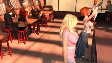
did i do good any critisim in how to improve would help
 photo
photo


group photo.jpg
2560 x 1440 - 3M
Post edited by chris_settlemoir on
You currently have no notifications.
 photo
photo


Licensing Agreement | Terms of Service | Privacy Policy | EULA
© 2025 Daz Productions Inc. All Rights Reserved.
Comments
The composition seems a little odd -you have three groups of people, none of whom are looking at each other (or out at the viewer) and the larger figures are looking out of the picture. As a rsult there's nothing to draw the eye in, rather the reverse. The first thing you need to decide is what you are trying to portray, and why it is of interest to the viewer? The individual poses, and the lighting, look good.
Hey Chris! First of all, kudos for tackling a people-filled scene. I hate doing those! (and I don't, lol.) My first observation- well, wasn't my FIRST, but... the woman in pink's upraised arm is a bit distracting- it is right by the boobs, and almost looks like a perspective/distance boob due to its curved nature. I was thinking, "What IS that?" Speaking of that- she is the attention getter, her pink outfit and large chest overrule the rest of the image. Her hair needs to be darkened as you have glare-outs (washed out areas) so just go in Diffuse and darken the color slightly.
The red-headed woman looks like she is leaning forward at an uncomfortable angle. I do like the action in the pose. Her hand is going through the counter.
I think the Slacker guy would have at least one foot on the floor (one foot doesn't touch at all, that would put an inordinate amount of weight on one side of the body, and it isn't flat on the floor to hold it.) The african american's arm dropped straight to his side looks uncomfortable.
There's not one clear speaker- and if the woman with her back to us is speaking, why is the blonde looking at the man next to her, who isn't?
Overall the scene has a nice, relaxed atmosphere and the poses don't look stiff. They just need to make sense with weight balance and who is looking at who.
Oh, and where's the food? That group of four is sitting there without anything on the table? The people in back don't have anything either. Cheap dates, lol.
lol the food they are cheap lol, do you have any recomendation for food props and i used i13 poses 99 percent of the time
The lighting looks great to me. The DOF is just right. I also have to applaud you for taking the time to give each character different styles of hair and clothing so they don't look like they marched off a clone assembly line! The only clothing choice i don't like is the black skimpwear on the longhaired redhead to the left.
Realistically, there ought to be some food props at the tables. I recommend the Diner Food line right here at DAZ. Other people have mentioned the woman in the pink blouse near the front - we can't see her face at all in this composition which seems to be an unintentional choice. I don't belong to a school of thought that says that we must have a character make eye contact with the camera in every render, so if you're going for an impressionistic slice-of-life, Edward Hopper-style image then don't worry about eye contact. But I think we should see her face, at least partially. What bothers me more is that there is some odd negative space between her and the short-haired woman to her immediate left.
What could you do differently? This is a big set and it's still a little underpopulated. A few more characters walking or standing around would be nice. Maybe someone sitting alone for variety? Depending on the hangout you want to portray, a waitress would be a good addition. I wonder why we can't see anything out the windows. You might need to do some postwork to achieve these things as the more characters/props you have the more of a memory drain DAZ is. I would also suggest to continue your customization of the characters' poses by tweaking the expressions on the faces we do see. Something as simple as using visemes will make them more alive. If you are after something photorealistic and are using 3Delight as your render engine, some motion blur would be a great idea to boost the realism.
I hope my suggestions are somewhat useful. At the end of the day, it's your vision after all!
oh i love it all my goal on my day off is to add more characters and do some more work on the render and then when i get done ill repost a new photo
Maclean also has food. Ironman13 has sandwiches. And the diner food has already been mentioned, so that should give your customers a nice variety.