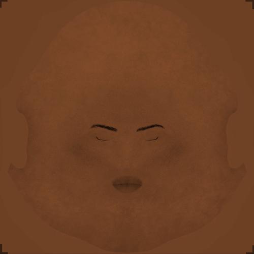
African Skin, SSS and DLight
 wancow
Posts: 2,708
http://www.ShareCG.com/v/66213/view/21/DAZ-Studio/wc-Black-Skin
These are V4 UVS... just so y'all know :)
CURRENT MATERIALS FILES:
http://www.ShareCG.com/v/66225/view/21/DAZ-Studio/Skin-Material-for-Black-and-White-Skin-(DS4.5)
I'd post this in freebies, but that's not the purpose of creating these textures.
I created them so that those of us who are interested in getting good renders with dark skinned characters can learn how to get... well, good renders with dark skinned characters...
My own materials have proven inadequate.
Now, these are not the best of textures... that's fine. The goal is to make the textures look good in spite of their poor quality. HOWEVER, if you feel the need to take these textures and make them better... be my guest! :)
I am starting from a baseline of my own materials: available here:
http://www.ShareCG.com/v/66181/view/21/DAZ-Studio/WC-SSS-Materials-for-Genesis-D|S4.5
these settings suck for African skin. If you have a better baseline, would love to hear from you.
OH, and so there is NOOOO confusion. These textures are my own made with merchant resources that are distributed free from MCDLabs on ShareCG and Biscuits on R.com... I, however, made the eyebrows by hand! So, don't anyone try and claim I stole these.


Comments
Interesting concept. Love that you're getting others involved. Silly question though, was the skin for M4/V4/Genesis? Will load it up and have a look later today if I have a chance.
I don't know how much of a difference it makes, but I remember hearing on the Oprah show that they used orange or pink tinged lights. That may be something to get started.
Sorry bout that: it's V4UVS. It's the most readily available, and those are the MRs I used, so that's what we have :)
I'm playing with this atm using the interjection, which uses UberSurface (not Human Surface)... I'll put up the results.
I just stumbled into this... it looks... well you can see how it looks... tell me if this looks okay?
I think it's the DAZ African Morphs... yah... that's gotta be it... it's just the morphs...
Link Deleted
ADDED: Basically, I screwed up. The SSS Materials were NOT enabled for the skin surfaces. HUH? When I finally realized it eight people had already downloaded the material preset... and I'm feeling like an idiot... anyway, not SSS... but it does look kinda good, right?
Okay, someone actually contacted me and said these look halfway decent. so I have uploaded the material preset designed to work with the texture.
http://www.ShareCG.com/v/66222/view/21/DAZ-Studio/WC-African-Skin-Materials
Please read the text carefully, I did not include a readme. It's all on that page.
You will also need:
http://www.ShareCG.com/v/66213/view/21/DAZ-Studio/wc-Black-Skin
and
http://www.ShareCG.com/v/65921/view/21/DAZ-Studio/fast-render-light-set-with-UE2-and-Light-Target
Drop the textures into My Library/People/Genesis/Materials/wancow/WC Skin/
Drop the Materials Preset file anywhere in a Materials folder you like so you can find it.
The lights are a scene file.
Hi Wancow, The thing with skin is the colour varies between individuals so there is very little right and wrong if the colour is "human" and the texture aligns with the figure.
Having said the above, massive differences can be achieved with lights. I started to play with this skin texture last night, with and without the SSS shaders and all without lights. I used the texture in the diffuse color and displacement map areas in DAZ 4.5.
Today I am also playing with the light preset you uploaded. I have two pictures, using your texture and SSS shaders. One with the lights, one without just to show the difference a light can make. Apologies for the dodgy spun dial face on Genesis..
With Wancow's light preset.
Without lights
Here's one with a single spotlight set to "active view". no colour change to the light.
http://www.ShareCG.com/v/66225/view/21/DAZ-Studio/Skin-Material-for-Black-and-White-Skin-(DS4.5)
Okay... so here's the deal.
I have deleted the previous set. If you want to get the exact same results as I have in the image above, use the same set I'm now linking to, and turn off SSS for everything from Lips to Toenails... so basically, I screwed up.
DRUC, welcome to the conversation! And thank you very much for participating.
Here's where we're at. The link above gives you two material presets and a Ray Trace Shadow Light Set. It's basically the same as the other light set with the intensity dialed down by 2/5ths and Ray Trace Shadows enabled.
The two material presets: they are not the same with different textures.
THe Caucasian uses a texture for colour on SSS, the African does not.
Anyway... please everyone, WHEN you tweek these, please list the tweeks!
The problem with using lights is this; When you pose a black person and a white person in the same scene: coloured lights will affect one more than the other... so an orange light will make the white person look like a Tangerine skinned alien. Unfortunate, but true.... fortunately, we live in the 3D Universe, where anything is possible.
No need for appologizing for any morphs used... we're all about skin colours here :) Don't care how ugly or fugly or stunningly beautiful any of the characters are... just want good skin on them :)
Sorry for the delay in participation. My internet has been...uncooperative. Hadn't had to put up with that for a while.
Anyways, lights can have a pretty massive affect on skin tones though it's not impossible to get them to cooperate. I'll have to mess with those later but for now I did two renders that took longer than expected to complete. The materials aren't wancow's but rather from some of RecieCup's characters since that's actually my go-to when a texture looks weird or I want to "fix" a Poser only freebie. It's also what I use on the promos for my freebie characters. The thing that stands out the most to me isn't the skin as a whole but rather the palms/soles and the nails. While the amount varies per person, generally the palms of the hands and the soles of the feet have more contrast compared to the rest of the skin. The main thing is making sure the tones are different but the transition is smooth and natural as opposed to a hard line.
I hear you on the palms and soles issue... I promise, when this project is done, I'll work on a decent texture that will have decent palms and soles... and lips...
I just may have had an epiphany. It'll have to wait for tomorrow for proper testing.
make sure you write it down or something... :)
Attempting to ask around about something...
I joined this conversation to learn, both from others and by experimentation. I am currently learning some lights can cause rather long render times, LOL
It's true... there's a certain setting on UE2 I have found, right now I forget which, that when adjusted gives faster render times... it was a big part of why I posted my light sets on sharecg
I was utterly drained yesterday so I didn't get to do much. I do bring an interesting answer of sorts.
So...one of the skins I like is PD Naomi. It is a two skin set that winds up being the one that renders quite well with both skins in the same scene with no fiddlying with settings. In asking P3Design about it, the "answer" is essentially that there isn't an easy answer and it takes experimentation. However, in addition to that she also noted that good bump and specularity settings go a long way towards helping as well. That seems to lead back to what I tend to do with some Poser skin textures where I use RecieCup's settings to get them to look right in DS. Furthermore, the light and dark skin for Naomi seem to use the exact same settings so there is a factor of figuring out the right base starting point and adjusting from there.
Image uses the Naomi shape on V4 with a personal light set that uses UE2.
"RecieCup’s settings"
Where does one find those?
That's a bit of a personal shorthand. You know how with your materials you have to load them and then reload all of the textures? It's actually something I've done for a while using one of RecieCup's characters. I'll load the desired character textures, load the skin from one of her characters, then manually re-add the textures. It's actually what I do with all of my freebie character promos, barring the ones that are her characters' skins. She has freebies on ShareCG, Renderosity, and on her personal site RenderCandy with her site probably being the fastest way to get them all.
Okay, so I grabbed Rehana... NICE Texture!!! wow
Anyway, top is my Materials under my raytrace lightset
bottom is Rehana Default, same lights...
Now you've got me really intrigued. I'd always known but it never fully sank in until now that RecieCup's character's had a certain sheen around the edge but it's a lot more noticeable when put in contrast with your materials. Interesting.
Remember that with this current set of materials, all I use are the bump and diffuse maps... the rest are all colour and the Lana spec maps for strength. I'm still debating where to go with this, but at the moment, I'm not unpleased with the results I'm getting from this current set. The only difference with the caucasian set is that I use the diffuse map for colour in the SSS channel. That's what I used for Sam in this image: http://wancow.deviantart.com/#/d5nwypf but in that image Michael has his own defualts. I was really interested in seeing the comparrison between the two...