Recommendation for time saving UI revision
 tomlongmacon
Posts: 54
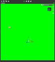
The problem: Once you get a few objects in your scene, the select tool highlights them on mouse-over, blinding you to the rest of your scene. This forces you to take the time to turn off objects, etc. to be able to see things correctly.
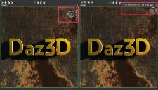
The solution: A minor UI reposition of the camera/view controls, taking them out of the main view port and thus eliminating unintentional mouse-overs.
Diagrams addressing the issue attached.


Daz3D Problem.jpg
892 x 1006 - 97K


Daz3D Solution.jpg
1786 x 1014 - 2M


Comments
you could use :- Viewport Options Menu > Docked View Controls
That's great and should make my life easier, thanks! That should be the default, not the other way. It took me forever to find, even with you telling me what I was looking for. All you old pros know where everything is, so ui changes I mentioned would benefit noobs like me, who want to learn the program, but still don't know where everything is. I still stand by my recommendation. :)
Switch to Bounding Box Only in the Draw Settings pane.
Actually, Choholes is the better suggestion.. It gives you navigation outside the viewport. It's my opininion that you shouldn't have to click things or sacrifice quality or do a workaround just to navigate a scene. Some things are understandable.. ie. until we get volumetric lighting, get used to planes.
I confess, it was not actually my suggestion. I was relaying some Info from one of the devs.