Carrara Portrait Lighting
 Boojum the brown bunny
Posts: 348
One of the powerfull parts of Carrara is that the lighting is so very versitile... and one of the difficulties with Carrara is that lighting is so very complicated. :) I thought we might start up a thread on Carrara Lighting, combining actual photography techniques with 3D Artwork with specific instructions for Carrara. After all, photographers have been using specialized lighting to get that perfect model photographed and on the cover of a magazine. To kick off the conversation, here are some single light portrait solutions.
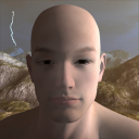
Loop Lighting -
Named for the loop of shadow under the nose this is a flattering lighting for portrait photographers. Mose of the face is lit yet it provides just enough shadow to provide depth to the face. To create this lighting style, place your light 25 to 60 degrees above the face and about 20 to 50 degrees to the right or left of the face. For this scene I'm using a spotlight set to 50% brightness and ambient light of 25%. This is stock M5 using the james texture with highlight turned off and sub surface scattering turned on.
Loop Lighting
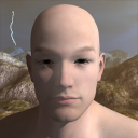
Butterfly Lighting -
Named for the butterfly shaped shadow under the nose this a classic lighting style from back in the 1930's. The lighting will enhance high cheekbones and narrow faces. To create this lighting style, place your light 30 to 70 degrees above the face, in a direct line of the face. For this scene I'm using a spotlight set to 50% brightness and ambient light of 25%. This is stock M5 using the james texture with highlight turned off and sub surface scattering turned on.
Butterfly Lighting
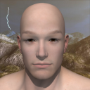
Rembrandt Lighting -
This lighting style is similar to the loop lighting, but with the light source higher and further to the side to increase the dramatic shadows. A small dab of light should appear on the cheek under the shadowed eye while the shadow of the nose passes close to the edge of the persons mouth. This creates a more moody and complex portrait. For this scene I'm using a spotlight set to 60% brightness and ambient light of 25%. This is stock M5 using the james texture with highlight turned off and sub surface scattering turned on.
RembrandtLighting
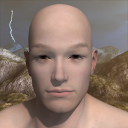
Split Lighting -
The face is half lit and half in shadow. Place your light to one side of the persons face so that one half of the face is in shadow. Best used with delicate shading, so keep your ambient light a bit higher on this style of lighting. This is a good style to smooth out facial imperfections.





Comments
Thanks for posting - I look forward to the discussion. Now if only the forums would show your images!!
I agree, it would be nice! So I just went in and posted links inside the body of the post until DAZ3D allows people to actually view my attachments! Thanks for pointing out that they weren't viewable.
Boojum
Hi Boojum,
Thanks for the links - helps a lot to understand! I personally hate ambient lighting as it has no real-world equivalent. I would always use sky lighting and usually indirect lighting as well. The choice then is what to put in the background channel to act as your source for the skylighting - of course an HDRI image works well, but even with just a flat color (eg. white!) it will give a more reallstic result than using just indirect light.
I'd be interested to see your examples with this - you may need to adjust the intensities to balance the direct and indirect light.
Hey! It looks like they finally got the image attachments working! Ok, the image attached to this post is done with ambient lighting turned down to 0, Indirect Lighting at 24%, and the scene's spot light turned up to 75%. This is using the Butterfly Lighting scene that I made. Oh, for those who hadn't guessed, the backdrop is just that.. a render I had done in bryce that I added to give a background.
Boojum
I don't seem to be able to upload an image?!
Below are three images using a default V4 standing on a buff colored plane, to illustrate the differences between various forms of Global Illumination. All are lit with a single directional light in the "Loop" style as above.
1 - This has no Global Illumination, just Ambient Light set to 25% as in Boojum's original examples. Note that there is no definition in the shadow areas (eg. the right nostril and ear) as ambient light illuminates all surfaces equally.
2 - This has Ambient Light turned down to zero and Sky Light from a pure white color. Now much better definition in the shadowed areas but some of the shadows are rather harsh. Always remember to check the "Light Through Transparency" box in the Global Illumination panel when using portraits or you will get "dark eyes".
3 - This adds Full Indirect Lighting to the above. This models the way that light bounces around the scene, resulting in softer, almost glowing shadows. The fact that she is standing on a colored plane becomes important here, whereas in the previous renders it was totally irrelevent. There is reflected light from that plane - delete it, or change its color, and the effects will be seen in the final render.
I hope you agree that the realism increases as you go from 1 to three - unfortunately, render times also increase in line with this - the usual 3D rendering trafe-off!
Great lighting samples and references here! Glad I stumbled onto this thread!
Just a suggestion....
If you want to apply real studio photography techniques and duplicate them with your renders, I suggest you start out with reference photos and try to duplicate what's in the photo. Because if you don't do that, it's far too easy to use your own biased/innaccurate perceptions of what's "good" or "real looking" and you come up with renders that look neither good nor real.
And if you really want to study studio photography techniques, then take a look at some real lighting techniques, which include light types, colors, placement, etc., and try to duplicate them.
How about a challenge...someone find a real cover photo from a magazine, post a link, then everyone tries to duplicate exactly what is in the photo, and you all post your methods.
Or just keep playing....sorry I butted in....
By the way, here's a link to the latest (Sept) cover of Vogue magazine, with a portrait of Lady Gaga. Which of the above-described portrait lighting methods was used here:
http://www.vogue.com/magazine/
thanks for starting this boojum bunny
as one who tends to do a lot of different renders with different lighting
then combine them in post
I'm looking forward to seeng what comes up
what follows isn't specifically portrait lighting but is in some ways relevant
I'm presently rendering a multitude of very large images for print
so my personal opinion is to choose the quickest lighting solution and work from that.
theory being - the quicker I can render the more mistakes I can make and the faster I can learn.
so
just some rambles from me, might help someone
for speed
I avoid soft shadows with lights - especially ray traced soft shadows,
I tend to light objects individually in a complicated scene so I can get the light exactly where I want it
I use low level bulbs with no shadows as fillers
I might use a sky dome as an anything glows
I often use the camera as an anything glows object - you make it a bright colour and very intense initially so
you can see where it lands (after changing the default distance from 33 feet)
sometimes I use a plane behind the camera as an anything glows light
to separate an object from the background a spot turned up pretty high acts as a great rim light and saves post work to 'pop' parts of the image
I get very good results from Tim Payne's and Dimension theories lighting products but the render times kill me so I tend not to use them
So the theory is, choose the fastest technique and eventually you will get good results :)
EDIT: Joe, if you give us a mesh with Lady Gagagaga's head to play with I am certain we can reproduce that lighting.
Well, here's the first entry, but it's incredibly and embarrassingly bad, so please ignore it. The purpose of the exercise is to figure out what type of lighting the studio used, and why they did that. That's my excuse, and I'm sticking to it.
In this case, by trying to reproduce it, you quickly realize that the main lighting was a single, fairly harsh light that was placed "low and inside" over the camera's left shoulder. And as you can see, it had overblown highlights to give that cool, hip kinda harsh look that everyone uses nowadays. However, that's pretty much all that was used, except for a tiny bit of fill. In the scene I did my version of it, I pretty much used a single spot, cranked way over 100% intensity, with soft shadows. Not much else. Pretty much the opposite of what Headwax normally uses.
The point is, and it's one I've made over and over and over and over here, is that you don't need fancy lighting solutions, and prepackaged light setups, and GI and all the fancy rendering solutions. Often just a few strategically placed and designed lights will do it all. And you certainly don't need no "7 point" lighting setup like some self- proclaimed lighting masters recommend. Nor do you need the prepackaged "3 point lighting system" that everyone thinks is what everyone else uses. They don't.
Not bad Joe, love the parody.
Oh, I didn't tell you my entire work flow...
which starts off by turning off all lights and dropping a single bulb /spot into the scene and see what happens.
So not so far from your approach.
If I was lighting the gagagaga lady I would look at the vogue cover, look for the darkest shadows and take that as my miniumum light exposure and get that right
that would be my baseline
, then I would look at the rfelections in hee eyes and steal the photogs's light set up for the eyes,
and that would give me clues to what his strongest lights were in general
as well as his eyelights
and I would take it from there
mind you I am just sitting at work looking at you guys working playing
so I am not taking it anywhere ;)
No, it really sucks. The lighting is horrendous, flat and no depth, colors are ridiculously wrong, eyes are all jacked up, the whole thing is totally lifeless and cold. And the hat is ridiculous. I just alpha mapped a plane with a feather, duplicated, and arranged. Totally lazy, and an ugly result.
Some day I would like to take some time and really try to duplicate that hat. It's pretty awesome. It really makes the photo. Which the photographer probably knew was needed when photographing Lady Gaga...
Well, actually, for scenes in general, it's very far from my approach. I first figure out what my goal for the image is. What do I want it to say, what do I want the viewer to feel, what is the overall sense and purpose for the image. That includes colors, shadows, intensity, and a bunch of other stuff.
Once I have an idea of where the image is going, I figure out what type of lighting will get me there. I generally know from experience what type of lighting gives what type of sense and feeling to the viewer. Do I want the image to be bright, or sad, or dangerous, or whatever. There are lighting techniques that help you get to each of those different feelings.
I NEVER decide on a pre-set, 3 point lighting or other lighting "standard" that people use but don't really know why. The lighting depends on the goal for the image, not on some drag and drop solution. I generally end up with a few spotlights using soft shadows, and nothing else. No ambient, no GI, no sky domes or whatever, no nothing. Like I said, pretty much the opposite of what you described.
Great thread and discussion and renders.
For those of us rookies that are more into buying ready-to-render items, what is there in the store in order to make a photo realistic portrait renders in Carrara?
I have only purchased Carraracters Delphinia and Elite textures Maya, that have Carrara support and include one car scene with cams and lights, but have not had the time to work with them yet.
Delphinia has an essential video tutorial that shows the trick of multipass rendering, to tweak the highlights in PhotoShop. Did not see this mentioned above, guessing it is a common trick for the pros.
Will get back with some renders...
http://www.daz3d.com/shop/carraracters-delphinia
http://www.daz3d.com/shop/v4-elite-texture-maya
The Elite set and lights by Ringo, should give you a good starting point.
DT's Delphinia and all of Dimension Theory's Videos will also help whether you're focus is on portrait lighting, general scene lighting, or Global illumination.
Post production always helps,. but that's a different subject :)
Hope it helps :)
Bumping the thread, it slowed down too soon.
I got busy with the Cyborg M4 before finishing the portrait renders.
Anyways, here is a free lighting rig by evilproducer that I think that I understand, not sure where the looping butterflies are though.
http://www.sharecg.com/v/49996/view/7/Material-and-Shader/Carrara-7-Studio-scene
Personally, I generally steer clear of a "standard" 3-point lighting scheme (which is anything but standard). In this case I used a softbox because I wanted the broad highlights on the eyeglasses and the dress, as well as good highlights on the rhinestone bracelets.
However, I caution you to take anything I say with a grain of salt, because as Roy so accurately stated, in all my years here I've never shown any indication that I know what I'm talking about. Not an attack, 'cuz that's not his style. Just a fact. Thanks, Roy.
nice work very soft, thanks for the link
JoeMamma wrote
Just so you know. There is no reason to be offended by what Roygee wrote.
As for your image of the girl. Compositionally I admire jhow the roundness of the breasts relate to the soft roundness of the bubblegum which is, in turn, ties in with the colour of the ribbon and, in a way, this gives you an organic whole, that, not only stimualtes the mind, it gives you a satisfying feeling of admiration. On the other hand the tension in both the breasts and the bubble gum indicate that, at any time, there could be a minor explosion in either, which leaves the viewer with a feeling of dynamic dynamnism....
But seriously, it's a fine image - is there a crease in that inner elbow perhaps?
Not offended, just continually astonished at the unending hypocrisy on this forum. People who demand that others are sweet and polite, but at the same time they have no qualms about being incredibly rude. If I had said anything remotely similar, there would be a posse of a dozen people weilding torches and pitchforks after me. But here, not only is everyone strangely silent, but they in fact stick up for him. Go freakin' figure. Guys who wouldn't know a good image if it walked up and tapped them on the shoulder, pronouncing judgement on stuff they don't even begin to understand.
And I know it's fun to mock me and my advice, Mr. Wax, but why not try to act like you preach to others? And yeah, in a normal forum of adult people I might see the humor in what you said, but with you guys it's real hard to separate the childish attacks from the well-meaning joking.
Hi Joemamma, well yes, I am having a friendly joke with you. It''s probably a cultural thing. Herein Australia we make jokes with people, it helps judge their metal and lets you decide what kind of person thaye are by how they react. There are people who choose to be offended, or to choose to not see the funny side of things. Then there are people who cannot see the funny side of things, and then there are people who see the funny side of things that are not funny .. well you know what I mean perhaps , and if you don't I could spend all day dividing the human race in to all those different people and I would still leave out one kind, and they of course would choose to be offended that I had not put them in.
Roygee, like a few posters I have seen, had asked you for a demonstration of your abilities. He obviously hadn't had the pleasure of seeing your best work and was curious to see an example.
On the other hand, if you want to say that Roygee said (about yourself) that "I’ve never shown any indication that I know what I’m talking about" when in fact he said something entirely different, then most people would feel you need to apologise to him.
Just so you know. There is no reason to be offended by what Roygee wrote.
Over here in America we say, "Put up or shut up."
While your theory is, for the most part, sound, your delivery of said theory makes it very hard to accept. And what few images you've posted aren't really stellar. You're supposed to be 'in the industry' and you're always going on at us for having such thin skins. Your responses to criticism show you to have the thinnest skin of all. You left a while back, supposedly washing your hands of us hobbiests. Now, you're back criticizing us, mocking us and just plain making an ass of yourself. Why are you here swimming with us bottom feeders? You obviously don't use Carrara. By your own admission, it's NOT a professional level program. Your attitude towards us lowly hobbiest is condescending at best. You often say WE are the ones making fun of you and treating you badly. For us it is the other way around. If you want us to listen to you and take what you say seriously and give you the respect you obviously feel you deserve, then give us the same.
And "Put up or shut up."
I apologize to the OP for the above rant. Joe just caught me in a bad mood. I'll go take my meds now and all will be right with the world.
Someone mentioned a using a softbox, how is that done in Carrara?
Is there anything else besides the softbox?
The Elite set and lights by Ringo, should give you a good starting point.
DT's Delphinia and all of Dimension Theory's Videos will also help whether you're focus is on portrait lighting, general scene lighting, or Global illumination.
Post production always helps,. but that's a different subject :)
Hope it helps :)
Thank you for the help. Not sure what you mean with "lights by Ringo"?
There is a freebie in the forum with a broken link, is that the one and do you have it?
Thank you for the help. Not sure what you mean with "lights by Ringo"?
There is a freebie in the forum with a broken link, is that the one and do you have it?
I think some of the light scenes included in the Carrara content were created by Ringo. They would be a good place to start in regards to improving/learning about lighting in Carrara.
Ringo used to moderate the Yahoo Carrara group years ago. He still sells some very nice shaders here and 3D Paint Brushes for Carrara.
http://www.daz3d.com/shop/catalogsearch/result/?q=RingoMonfort
Here's a link that explains a soft box:
http://en.wikipedia.org/wiki/Soft_box
There are ways to do it in Carrara. The easiest way is to set up a plane, add a color in the glow channel of the shader and turn on Indirect light. It's slow, but it looks nice.
The other way is to set up a light box. I created a cube ion the vertex modeler and set up shading domains so that one side of the cube could be set up with it's own shader and the other five sides would be another shader. The single sided domain uses a shader with translucency, and the other domain uses a flat black shader. I stuck in a single bulb light at it's default settings with the exception of soft shadows. Those I set with a light radius the same size as the box.
The first sample is the Indirect Light method. The second sample is the light box with no soft shadows. The third sample is the light box with soft shadows applied to the bulb and the fourth sample is just the bare bulb. If you want any more info. about the shader settings or light settings, just ask!
So...the light bulb is outside the box?
Pardon my stupid question!
I've been playing with planes and anything glows.
I place a strongeranything glows one on one side at say 45 degrees to the figure and then a fill anything glows on the other side,
Then another fill on the camera itself (with anything glows once more)
Have you experimented with this method?
If so, which would you recommend?
I'm lighting multi figure scenes so trying to avoid dominant shadows.
booksbydavid wrote :
feel free to share the meds, I need some as well.... I have for a while :)