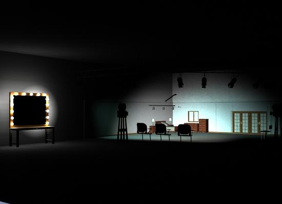
a quick lighting question.
Which or what light can I add to the scene that won't over power everything else? I mean nice subtle light that still lets me keep the feeling and ambience of the scene without knocking out the others.. I've tried a few in the Lights folder but they all ruin the scene. I suppose it would depend on where the focus in the scene is?


Inside_Stage4.jpg
550 x 397 - 78K


Comments
You can also adjust the intensity of any lights in the Parameters pane, with the light selected. You don't have to use it at 100%.
If you're using 3Delight, I recommend using a large area light over the place you want to light and change the intensity so that it's not too bright. That way you get an even lighting over the scene, without overblowing your existing setup. You can also do something similar using UberEnvironment.
Thank you, I got it. I simply put in a Spotlight at the top, at about the center, with a spread angle out wide to cover the room but low intensity so not to overpower everything else. So when the key figure is walking towards us we can still see the enviroment in the room. ANd the three main spot lights to the bedroom scene are , a light blue, light red and white.
(BTW: the movie cameras you see, were created in Blender)
I've found that point lights, the default ones, are underpowered... you would probably do well to experiment with them.
Thank you, I think I'm satisfied now. With a couple spotlights placed stragically,so when he moves toward us, it won't over power the rest of the room. I think I got a pretty good balance. NOW, comes the fun part. To make him walk and talk, I hope Daz will do it with the walk Aniblock mixed with Lip Sync in 32bit. If not...I've already got it set in mind to do it manually.
and here's an outside look at what I'm about to undertake to try...Hopefully all the years of studying and practicing animation will work.
The one thing I found realy aggravating about Hexagon. I had done the 3D text, and went I sent it to Daz, the letters closed up (!!!). SO Here I did them in Illustrator instead, with a brass texture, and a second layer of the letters in black with a drop shadow effect over a texture so it ends up still looking like the letters were mounted. In Photoshop gave it the inset frame, THEN put it all as a texture over the cube in Daz.
Ha, I found what I was looking for. I watched a Blender tutorial, and he had used a simple plane as a source of light for the scene. So it dawned on me Daz already has that in the Uber light Area. So, I created a simple box to make it look like a light fixture, then added the Area Light plane. Added that to the scene, then raised up it up to cover the area. With the intensity turned down to 40% and three spotlights also at 30%, I finally got a nice balance in lights. You figure four lights equals 130% in light intensity, but not too much so it coversthe area I wanted and still puts out a nice light for the rest. And also the track lights hanging up add another 90% (30 each), but not too much.
I never really tried the Ubder lights until I saw that tutorial, that really helps a scene. The spotlights are light red, light blue and a white for contrast and the Area Light plane is a light grey for depth.
and the full view. This is what I was looking for...
and we'll get a nice subtle light for the Actor when he walks towards us.
There's also two spotlights overhead, pointing straight down, they're in line towards the front corner. With a wide spread angle to help fill the area but low intensity again to not over power everything else.
Here's a cheaters method that might work for you as well. Use a distant light. Intensity of only 10 or 15% (maybe higher) but make certain that you do NOT have shadows enabled. Lights without shadows pass through everything. They're not stopped by roofs or walls so it's an easy way to add a "global luminescence" to a scene without a lot of render overhead.