Novica & Forum Members Tips & Product Reviews Pt 9
This discussion has been closed.
Adding to Cart…

Licensing Agreement | Terms of Service | Privacy Policy | EULA
© 2025 Daz Productions Inc. All Rights Reserved.You currently have no notifications.

Licensing Agreement | Terms of Service | Privacy Policy | EULA
© 2025 Daz Productions Inc. All Rights Reserved.
Comments
Okay, using the default Iray lighting (what you have when the studio initially loads) so I am not using specialty lights. It's Film ISO 179.01 and Exposure Value 13.92
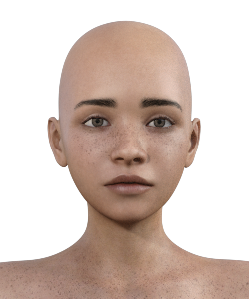
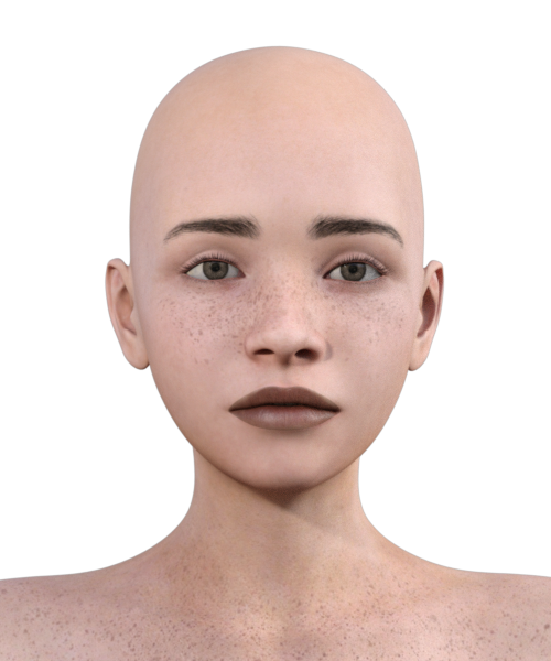
Testing on Molly HD for Genesis 3 Female(s) with Human Essentials for Iray and let's start with the default lights, Molly out of the box. I'm not going to adjust lighting or do anything in postwork.
Keep checking back, I have it all done but adding one by one as I need to double check each one.
This is default lights (on all of them) but Default Molly. On the right, the Skin applied. (No lips or eyes changed.) I don't like the oils taken out of the skin, nor the color change to a pink. When I get done, I'm going to darken the skin and we'll see what changes exist. DId you notice the downward slope of the top lip changed? The eyebrows thinned where they start? Lips went darker.


Okay, now the Lips default shader, from previous one, and PLUS bump 50. Then bump 100. I really like the bump 100 and Lip Shader.(this second one)
I'm going to retest some of these, because the lips changed color and I am only doing the eyes. The first one is the cornea. Second one builds on that, and is cornea and tears.
This was the entire eye addressed with the pupils, cornea, sclera, eye moisture, skin, and lips 100. On the right, the original Molly.
Hope all goes well. Keeping you and your son in my thoughts.
Thanks Rich.
Okay, so here's original Molly, the Human Essentials one, and then Essentials + mine with tweaks.
Trying to get the skin closer to the original, but adding more sheen and darkening the lips from the Essentials one. I do like what the Essentials does with the eyes, and it's an easy click to increase lip bump. Not sold on the skin. A bit dry and pink IMO. So this is the Essentials plus my tweaks.
Oh my gosh, praying for the London folks in that 27 story highrise that burned. Check CNN if you haven't heard.
Here's Chastity default, out of the box, same default Iray lights. Then I had saved my tweaked Human Essentials Molly skin as a material preset, and it's rather fun to see it on Chastity. I still want to darken the lips and doing more tweaking. This default light is horrible. I'm switching.
So kept tweaking and tweaking, the default light, of course, isn't the best for portraits. So changed to the Pro-Studio ones that I normally use and played around. This is still using the Human Essentials as a base, but the skin is really changed. It's mostly the eyes and lips from Essentials, although I darkend the surface moisture and sclera to a blue, the eyes were stark white and looked bad. These two both had different settings, played with metallicity and reflections, also the SSS settings. And definitely changed from that pink color.
This is different skin, but different lighting too.
And that's all the tweaking, this will do. Molly is a cutie. Again, the eye whites are gray and the lips are a custom color. I don't know if I would use the Human Essentials for the skin, but for the lips and eyes, it may be worth a look when discounted. Otherwise, I found the skin too pink and it was a bit flat, although that could have been the default Iray lights.
Lovely renders, Novica! I especially like what you did with those leaves. Molly looks great. Interersting to see her skin on Chastity.
Praying that your son's surgery goes well and that he makes a speedy recovery. Can't imagine how uncomfortable that must be for him (and scary for you.)
I, too, will be keeping him in my thoughts during this. Your family as well.
Thoughts and prayers sent your way. Hoping this is a 100% fix forever!
Praying for a speedy recovery!
Here's the final skin.
Simple Elegance Hair for Genesis 3 Female(s)
That hair still has a lot of poof, even with the sliders turned off. If you go too far, you mess up the crown. It could have gone a bit smaller but I did this in the early morning hours and headed to bed (around 7am, didnt even bother to try sleeping. Son's surgery is now tomorrow, they had a time opening to do it, but it would have been a mixture of shifts/teams, so the "crackerjack A Team" will do it first thing in the morning. I'm pleased with that. Doctor is Harvard/Yale.)
Oh, good news- Mom is going to be able to go back to her assisted living apartment on Friday! She walked down to the therapy room (walker, and assisted- someone standing behind her) and did therapy, then walked back (with several sitting down breaks.)
Hmmm...anyone rendered that SciFi Surgery yet?
Sorry about the troubles you and your family are going through.
I hope and pray your sons surgery goes well and that he has a speedy recovery.
@ferretmania Thanks, we're muddling along. Recovery is expected to be 3-4 days.
I hope he does well, Novica. Since he's been through it before, I guess you know what to expect.
My son does not appreciate my humor (actually, he does.) I said, "Okay, good news is that the first lung stayed attached to the chest wall, it's the other lung. And you only have two lungs, so now you're done."
Waiting another day to get their best is worth it, I think. You and your family will continue to be in my thoughts and prayers.
Here is a revised version of Magic Moment. I made all of the unicorn's coat/head emissive to match the leg fur, and added a small amount of bloom in Render Settings. Then I let it render all night, so there are almost twice as many samples. The sprites don't look grainy now. (I made it a bit darker, too, with Levels in Photoshop.)
Here's the original for comparison, (links back to the original comment):
Sending your son well wishes for a quick recovery and good health.
Thanks @xmasrose
@LAdair- that is stunning. Those changes really make it pop.
Be aware that the Sci-Fi Surgery Room renders a lot darker than the promos. I added a 900 lumen Ghost Light and that helped. Also, some of the screens are black, I'll have to check the promos to see if all of them are supposed to have images on them. Edit: Yes, there's a lot of black screens.
Will put quickie render here in a few minutes, the one with the Ghost Light. You'll have to turn walls off to get your renders, the room is a decent size but you'll need to back up to get some of the shots. Walls are individual settings. The good news is the Ghost Light (Vertical) loads right in front of the woman, all you have to do is raise it and tilt it. I scaled to 135%.
This is with the default Iray lights, first one is Film ISO 163 and Exposure Value 13.65. Note the armature that comes down (that huge thing, with a notebook on the end) It isn't washed out. There's a reason I am pointing this out.
I'm re-rendering (stopped at 82%) as she isn't scooted back far enough, but this will show you what I mean about the lighting.
82% at 15 minutes 2573 iterations.
Second Film ISO 170 and Exposure Value 13.50 I went lighter (higher ISO, Lower Exposure Value) But the armature kept it's detail. That's because I darkened it to a medium gray! If you're getting washed out details but the scene needs to be brighter for the people, then darken the items using the Surfaces setting for Diffuse. I am leaving the wall in back with the original white, so you can see the washout. (also the floor in front.)
Thank you, Novica. I'm much happier with the unicorn image now.
I thought the Sci-Fi Surgery Room looked way too bright in the promos, and the surfaces too shiny and reflective. And less blue than your render.
Yep, definitely more blue with the default Iray lights. They tend to be a blue-gray. The Ghost Light was just plain white, so no help there. I added the second image that has the Ghost Light. While it helps light the scene, you'll definitey have to add gray to the floor, armature, white things on the walls to avoid washouts. However they did the promos, the lights are not included so be aware you'll have to piddle with this one if you buy it. I got it for $8 plus change, so it's okay. The walls are separate so you can even use an outdoors light set and it will work. (I'm thinking Dumor's Apocalyptic sets.)
Novika, continued prayers for your son, glad you have an excellent team to do thejob. Great news on your mom as well!
L'Adair that looks fabulous!
Oh, gotta love this. I was just getting ready to test FW Jun when I saw the thread in Commons, so I went ahead with him. He has NO MATERIALS.
You can NOT load him up without what, twenty or more error messages???? I just kept clicking skip, skip, skip, skip, skip and had only made it through the eyelashes and one arm.
EDIT: An update was in DIM last night (14th) so he's probably fixed.
Thank you, Sonia. :)
Oh, no! I hope you didn't have your heart set on using him today.
Oh no, just working my way through new purchases and testing them. Lesson learned. How could it have been QA tested? Perhaps someone can explain it, I'm puzzled. You can NOT load him up AT ALL. I'm thinking the PA wouldn't have any trouble doing so, because the files are on their computer. But anyone else who tried to use this dude would not have been able to. So?
So...
Jun is from Fred Winkler Art, and his work is usually top-notch. Maybe the poor soul QAing it was behind on deadlines, and figured, "FW makes quality stuff. I can just pass this one through, no problem." And then, of course, Murphy's Law... the one he didn't check is the one with the problem!
Thanks for showing the surgery. I am somewhat disappointed in that product. The dark screens don't really look good to me.
Yeah, when looking at the main promos, they are definitely there. Not something I noticed, I just saw the price LOL.
Probably. And Richard did report it. Fred's probably going, "Are you kidding me? How'd that happen?" Sometimes what the PAs put in gets changed, I remember that happening several times too.