trans map question ...
 WillowRaven
Posts: 3,787
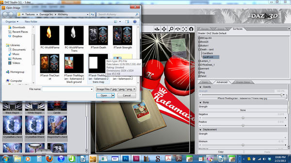
In my scene, I am attempting to turn a tarot card into a baseball trading card. Needless to say, they are not shaped the same. So, I did up the pose that was to become the card and photoshoped a passable trading card. Realizing there would be extra space from the original card, I figures I would just transmap out the negative space of the original card. I assumed it would be simple because I have somehow accomplished a similar feat with a pig stye and hid the fence this way. But it doesn't seem to be working this time. Here is a screenshot of my scene as well as showing what the transmap image looks like in the pop-up window.
What am I doing wrong? I had a similar visual failure in daz on a dress before, but in render, it was fine. In this case, not even the render is working the way I want.


Comments
I would just create a plane primitive, attach the image and scale it as needed...no need to mess with transparency or anything. Just use the individual xyz sliders (probably just x and z) to scale it. Start with maybe a 6" square...
I thought of that, too, but was worried about distortion/proportion. I even scanned a real baseball card and used it as my canvas/template in PS to make sure it was accurate. I really did think pasting the accurately scaled image on a ready-made card, and just hiding the negative space would be simple ... lol. It worked on the pig pen ... lol
I am still trying to figure out what I'm doing wrong ... I know giving up and doing a plane would likely be easier, but now it's a matter of wanting to know why it's not working. I created a transmap, but it's not working. Here is how it renders:
I can't think of anything, unless the card you are using has some 'thickness' to it and has a separate material zone for the 'face' and 'back' sides...if that's the case, then you need to apply a transmap to both zones.
I see it different, The Card should be ADDed to the Texture of the Book page. Or Deformers used to bend it to match the bend of the books page.
OPPs Never mind.
That's it! It has a front and back. I will try to remedy from here. See why I decided to persist?
:D
Duh! See why I come here when I am having a blond moment? I will just design the page :D. But it's still good to know on the double sided card I need two transmaps.
Thanks guys :D
Use a Displacement map to get that Glued down look.
I was planning on masking tape ... :D I can't believe I was over-thinking it so much ... lol. It's going much faster since I am not design the book's page rather tan placing the elements. I can be such a dingbat, at times.