Lighting - Too dark or not enough
I'm working on my medieval scenario affectionately called "The Witch's Sister". The scene I'm working on has a woman sitting at a table in a tavern. It's supposed to be dark.
The problem is it looked fine on my PC but too dark on another. Even my laptop looks fine but when hooked up to my TV monitor it is darker soooooo I lightened it. Now I'm wondering if it is still too dark or too light.
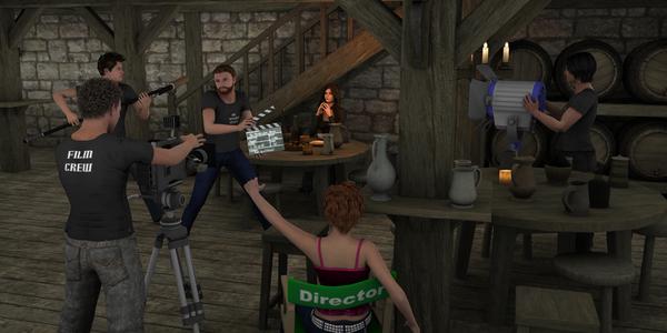
I did another render. It's with the camera crew. I didn't do anything except throw them into the scene and stepped up the Uber light intensity from 24% to 75%. I haven't worked on textures, etc like I have with the women at the table. Ugh...just looking at it...it's going to take me a long time to get the look down on the entire Tavern lol.
So is the woman at the table too light or too dark? I know I need to work on some stuff still like the spoon, bread, and the candlelight looks too much on my laptop but looks fine on my TV monitor.
A friend gave me about 50 scenarios and I'm working on them but didn't want to do a bunch of renders for this scenario and her not be able to see them.
Also, I was thinking about giving the woman a magical look (oh no, don't say pixie dust...breathe..ok I'm better) like she is casting a spell or something. I don't know. What do you think? Overkill?
Maybe I should give up and go play Skyrim the rest of the day lol.


Comments
Concerning how light/dark the image is; I don't think there is any good answer to this question. Different monitors will display the image differently, and different people will have different opinions as well.
If you were doing the image for yourself you could purchase a device to do color correction on your monitor then get it the way you want it, and it will be closer than it otherwise would have been when you change monitors, although still not identical. If you are doing the image for a customer you could try to target it to their current display. If you are doing it for everyone, you are mostly out of luck, although you could try a survey (which it appears you are doing here) to see if the vast majority of viewers think it is too dark or too light rather than opinions being split 50/50, and go with that.
On the monitor I'm using at the moment, which is actually a little brighter than my normal color corrected one, your scene is very dark and things are lost in shadow, so it would probably be even darker on the color corrected one. However, your scene is lit by a single candle plus some dim background light so that makes perfect sense, and if that's what you intended, then it's fine.
On my calibrated display the first image is dark but not lost, except perhaps in the top-left corner. The second image is a bit flat, without strong bright or dark areas.
Hey thanks for the replies! I think for safety sake I'm going to lighten it up then it won't matter. The 2nd pic is I think 75% so I will try that on the close up and see what it looks like and go from there. Thanks again!