Flying Fabric - Artistic Flowing Cloth Pieces (commercial)
 PA_ThePhilosopher
Posts: 1,039
Hey guys,
Here is another product coming down the pipeline soon. Let me know what you think.
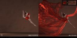
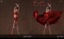
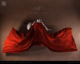
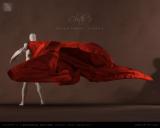
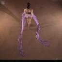
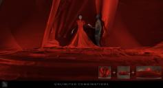
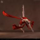
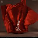
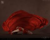
Also, if you wouldn't mind helping me decide which promo to use for my main promo. I can't make up my mind between the first or second image.
As always, your tips and advise on presentation are appreciated.
Thanks, 
-P
DESCRIPTION:
Who would have ever thought that a simple piece of fabric could add so much dynamism and movement to a scene?
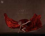
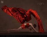
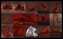
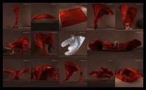
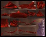
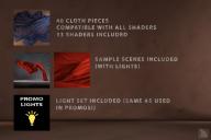
Lush and sultry, yet epic and grand. The Flying Fabric Collection includes 40 organic free-flowing cloth pieces for use as set pieces in your scenes. These props can be used for a wide array of applications, including; capes, sheets, dress and gown extensions, scarves, shawls, and much more. Simply load a prop into your scene and position/rotate it as desired. Load as many cloth pieces as you like, and combine them to form unique shapes.
But this is more than just a collection of props. Also included is the same light set used in making the promo images (included as sample scenes), so you won’t have to fiddle for hours to get the right lighting. Use these lights as you please, either with these props or in any other project you wish.





















Comments
For just a general "I'd save that as a wallpaper pic" I like the first one better. However, I think the second one works better as a Promo, the contrast and movement in the cloth is better.
Wow, this looks amazing! And I agree with dragotx, I really love the first one but for the main promo I would go with the second one.
Hmmmm, thanks for the input guys. I was originally leaning toward the first render, since it is prettier. But I see your point about the second one too, being more defined and clear as to what the product is. Hmmmm...
-P
Heretics corner: I prefer the first although they all look really spectacular.
Cheers,
Alex.
Ahh tough choice. I love them both, but yeah for Promo I think the second would be better.
Looks like an amazing product :)
01Main5E for the main promo, definitely. It's a "Wow, that's spectacular" image. I would put 02-Cloth37 right after it becuase it ties to the main and really shows the difference the cloth makes.
2 votes for first.
3 votes for second.
Now I'm on the fence again, lol.
I think what I might do is submit both to Daz with a note to let them decide which to use. I'm so indecisive.
-P
For what it's worth, I prefer the first one as well :)
I suppose the question is, if you see it as a tiny thumbnail (not full size), which one grabs your eye and makes you want to click on it to find out more?
-P
Definitely #2 (the dancing lady) - I think #1 is really nice when enlarged but less clear when a thumbnail.
I like both. What attracts the eye to #2 is the deeper red color, but the cloth doesn't give the dynamic sense of "flying" that #1 does. So I prefer #1.
Fantastic product, #2 for the thumbnail and #1 as the promo (:
I'll be buying this at some point! Ha!
Any morphs with these or are these static props that load "as is"?
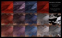
And the color is based on my shader?
Probably too late, but the first one would work better as a promo if the cloth was a different color. Blue or green, less gauzy, something that contrasted more sharply with both the figure and the background. (Actually, that UV Map image would be perfect, if it were an actual shader with texture.)
I like the sense of motion better in the first one -- it's the sort of thing that would make me wonder what it was and to click through to see it. The benefit of the second one really comes down to the sharper contrast that lets you see what everything is.
As a test, I simply adjusted the light balance on the first image to give it a deeper red color and more contrast (hope you don't mind -P). Now it stands out more to me.
I am SO buying this! I like the composition of option 1 better than option 2, but my color-blind eyes have trouble distinguishing what the first one really is when it is thumb-nail size.
Wow thanks guys. I appreciate your help in this. Since the votes were split, I ended up submitting both to Daz to let them decide.
@RGcincy I like the contrast in your image; that would definitely make a better thumbnail. Thanks.
@avxp There are no morphs with these props. They are just static props. All the shaders I made. The red velvet is based off of a similar shader I had in my library, but is slightly different.
We'll see what the team comes back with,
-P
Beautiful! Looking forward to this
I, for one, can't wait.
I don't do the traditional superhero thing to the ninth, but I'm jealous of anyone that uses that as a cape for a character.
I'll be using for fashion, special effects, backdrops, space effects, dream sequences, album covers.....my goodness, the number of uses are too high to recount here.
The last time I saw something like this, it was a shiny sheet and was for men. Looked a little...different....
I wanted that one too.....
This is awesome.
@avxp "The last time I saw something like this, it was a shiny sheet and was for men. Looked a little...different...."
There are equivalent Shiny Sheetz packages for females.
This concept seemed really familiar but I was unsure. I did look in the store and nothing came up.
I thought maybe I saw one of those early threads or coming soon- feeler threads about this product and got confused.
That new see-thru elevator got me too. I swore it was an old item.
BUT! It was just talked about a long time ago.
@avxp
Here you go. These are just the latest for G3F
https://www.daz3d.com/shiny-sheetz-ii-genesis-3-female-s
https://www.daz3d.com/shiny-sheetz-genesis-3-female-s
Looks great, and agree on others who have said the second.
BWAHAHAHHAHA
I own that- THAT'S WHY IT DIDN'T SHOW UP in my search of the Vendor Jepe.
That's utterly terrible. My library is out if control. I'm a clown.
ANd yes, I will still be getting this one too. lol
Sold! I own most of the Shiny Sheetz and bedding, but you can never have enough gorgeous, flowy fabric! Ever! And these are "knock-it-out-of-the-park" gorgeous.
I also vote for #1 as the main promo. Fantastic!
That's good to hear. I was a little worried of stepping on Jepe's toes---since fabric is his thing---but I am hoping my product is different enough from his (we also have very different styles), that we will be hitting a slightly different customer base.
-P
I've got a ton of ideas on what to do with this already. Can't wait!
I think a lot of us will purchase this even if we own Jepe's stuff. I own most of Jepe's stuff, and I own most of yours lol. I am going to be buying from both of you I'm sure for a long time to come. You both have a very distinctive style that doesn't clash, making both of your products very useful, just in different ways.
Has a real "Singin' In The Rain"/Cyd Charisse segment feel to it in the first one ;).
Laurie