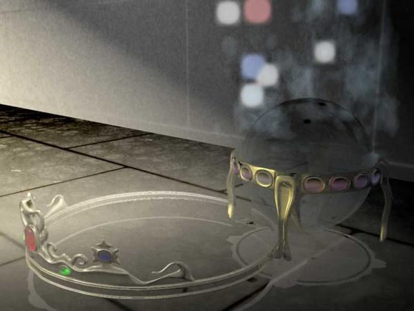
Feel like I'm throwing my life away. 10 hours+ trying to get it looking just ok.
 Sweetleaf
Posts: 32
So I've been trying to get a scene to work, and it just doesn't.
There's nothing complex about it, it's not animated, it's not got a billion objects interacting.
As you can see from the render the wall at the back really stands out and looks like it's printed on card, instead of being like the floor, but the only thing is, it IS the floor. I copied the plane and rotated it by 90 degrees, and bleh, it's a mess even though they have the same shader. The 'shadows' of both the magic globe, and the tiara/crown are light grey and somewhere quite below the objects, even though they both rest on the floor plane, and the shadows are supposed to be normal 'black' shadows.
The scene has a distant negative light, because the scene wasn't dark enough beyond the two spots highlighting the objects, and there are two negative spots to try and remedy the light problems. One top left of the scene (makes the floor look 'tarry' but has no effect on the wall) as we see it, and one bottom right, just outside the scene, so 'dark' light leaks into the left/top and right side of the image.
Can anyone help me resolve this please, so I don't go and shoot my computer with a nail gun or something crazy?
I'm only here as a last resort. This is the scene in question:-


Comments
Why are you using negative lights? Why are you using out door lighting on an indoor scene?
It sounds like you are trying to use Poser lighting philosophy in an app that actually has good lighting so doesn't need poser work arounds.
In the sequencer, scroll down to "scene" select it, click the triangle on ambient. That is where you set shadow darkness.
Delete the negative lights and try again. Just doing this should solve your issues.
You can use distant lights for indoor scenes But bulbs work much better. Also I think you are over thinking carrara.
Thank you very much Stan. In answer to your questions, I wasn't aware of the settings way down the scene until you made me aware.
Additionally, I don't use poser. I just wasn't adequately informed.
As you can see, thanks to your help, it's looking a bit better, though I've still got work ahead of me.
You're right...it looks bad :)
Now, the first thing I'd suggest is STOP, RELAX, and take a deep breath.
And then go into your scene and do one thing for me: SIMPLIFY !!!!
It's far more difficult to fix a complex problem than it is to fix a simple problem. And if you have 25 different things going on, you'll never figure it out. Start simple. Delete all the negative lights in your scene, and leave only ONE simple spotlight. Get rid of all scene ambient lighting (select Scene/Effects/Ambient and set the slider at 0%.
Now, in your single spotlight make sure cast shadows is ON and at 100%. And then get rid of any other fancy stuff and shaders and whatever else you have in the scene.
You should do that with EVERY scene you ever build. Start with a single, simple light, and from that basis you can start making simple, understandable changes.
Now, do a render and post the result. Then tell us what you want to do with the image, because the way it is now I have no idea what effect you're trying to get.
Okay, not knowing what you're shooting for, I did a very simple scene with a couple of crystal objects, and only a single spotlight. I also rendered with caustics, and added a glow plane for reflections. It rendered in about 5 seconds. It's a reasonable starting point for whatever look you want to achieve.
The spot has soft shadows and a fairly narrow beam. And the crystal shader was the stock blue crystal shader in Carrara.