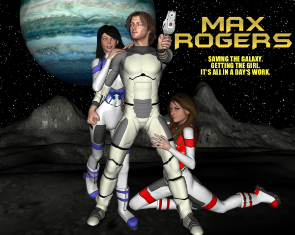
My digital comic book composed of DAZ products!
 galactica1981
Posts: 1,251
Hello,
I would like to tell everyone about my new digital comic book which I’ve been working on since last August. It is a science fiction epic called Max Rogers, and it is composed mostly of products from the DAZ website. I hope you will check it out at: http://maxrogerscomic.com
I’d also like to thank everyone on these boards that helped me out with technical problems as I would have been lost otherwise. I should also extend thanks to the following PAs whose sci-fi products were invaluable: Kibarreto, Jack Tomalin, Stonemason, and Dreamlight.
I think I’ve managed to create a comic unlike any you’ve seen before. It’s composed entirely of single-page panels. And because of the digital format, I can make it as long as I want, and so I’m able to draw scenes out in a way that a traditional comic book simply can’t. One person told me that when reading the comic it almost felt like they were watching a movie.
Anyway, I hope everyone will check it out. And if you like it, please let me know!
Here is a video about the comic: http://www.youtube.com/watch?v=ADBfTTsIqZs
Here is a video about the making of the comic: http://www.youtube.com/watch?v=dcbbfh4Vtb8&feature=endscreen&NR=1
The Cast
Michael 4 is Max Rogers
Violet for V4 is Cleo Chronos
Mindy for V4 is Destiny Jones
Reby Sky is Aurelia Aaron
Droid is Rokur


Comments
Here's a few more photos!
Here is the cover for issue #3!
Cleo, Max and Aurelia!
Hi. It looks like it was a lot of work. Although pictures of a woman clinging to a man in a pose like some of the above are not exactly my cup of tea. I only wonder why your characters look just like DAZ figures straight out of the store (Mike 4, Reby Sky)? If I ever did a comics, I would want my characters to have unique looks, and spinning a few face dials is not so hard.
Well, it's actually not a risque comic. It's actually very family friendly. There are no scantily clad women, no vulgar language. There's romance, but no explicit sexual situations. As far as why I didn't change the figures, I simply like them the way they are, and most people are not familiar with DAZ so they're not going to recognize Michael 4 or Mindy or Reby Sky. I hope you'll check out the comic. I think you'll like it!
Agreed! Seeing as it is supposed to be a comic, i would have went with a toon shader instead of generic lighting, would have made it (and the characters) stand out more.
As for "unlike any you’ve seen before", seems the storyline isn't exactly that original and the names, Max Rogers - Buck Rogers, LOL
Can tell some work went into it though, best of luck with it.
I looked into toon shaders, but in the end I figured that if I was going to do this, then I might as well try to do something different. And I definitely think I've created a different kind of comic book!
I think it's great what you're doing. It's an incredible amount of work, and I think it's good to push the envelope on different kinds of artistic mediums for comic books. And you're absolutely right - 99% of your target audience won't know the DAZ characters.
I think it is great also! I am doing something along these lines as well, so i know its a lot of work! Good Luck with it.
I would like to know however, if you're going to offer an alternative way to view the comic other than requiring the reader? That may deter some folks from it, as it detered myself.
-MJ
I'm curious. Is it that you don't want to download the PDF file? Or is it the software? Almost any PDF reader should work, and the software is free. It would be nice to post the comics on my website, but they each consist of 400 to 500 single-page panels, and you wouldn't enjoy waiting for each panel to load, especially if you don't have a fast online connection. With the PDF file, you can quickly jump from one panel to the next, and it just makes it a better reading experience.
Maybe its my system, but i have Adobe Reader and that wouldn't read the downloaded file. It had a funny extension i never seen before. .c4l or something. I cant access the site from the workstation im currently on, but the file definitely wasnt a .pdf or any file I was familiar with.
And if each comic is 400- 500 pages, thats one helluva read at a time.
-MJ
Well, actually it's a CBZ file. There is a free software program called PDF Lite that will read it. And despite the huge number of panels, each comic can be read in about 15-20 minutes because I don't use an excessive amount of dialogue or narration. What's great about the digital format is that I can draw scenes out and mostly let the art tell the story, keeping the narration to a bare minimum. I think it makes the reading experience a lot more fun. I remember reading Marvel comics as a kid and feeling exhausted after reading a bunch of them due to them having so much dialogue and narration. I definitely avoid that here. The goal is to make the experience less like reading a comic book and more like watching a movie.
http://www.pdflite.com/
As much as I love supporting artistic freedom, I can't help feeling that this work might have been improved with proper lighting rather than the default 'headlamp' renders. As there have been quite a large number of comics made using Daz figures and props I confess I do look at them from a technical level as well as from a readers perspective. I guess it's in my nature as I'm a Daz artist myself.
If you're going for a movie like quality then good lighting can do amazing things. It sets the mood, it highlights parts of the scene you want emphasis on and draws the viewer into the world. Of course, the trade-off for quality is time. It will take longer to render each scene if it's more detailed. But, as they say, first impressions count and if you can show off a glowing well-rendered cover at least, you can draw in a far wider audience.
I know this might seem overwhelmingly negative feedback, but don't let yourself be discouraged. A lot of us here are thinking more as artists than as authors, so we tend to judge works on those merits more than the content, at least at first glance. That said, if you have a good story and good artwork combined, you turn a good work into a great work. It's something to think about for future volumes at least.
Best of luck.
It looks like fun. I hope it goes well for you. :)
There's always room for improvement, but I think what is most important is that you enjoy your work.
I certainly don't mind constructive criticism. I guess I just don't see any problem with the lighting. I think the pictures look good as they are. Could they be better? I'm sure they could. The problem with fancy lighting is that it makes the renders take longer to complete. When I'm making a comic with 400 to 500 panels I simply can't have each render taking a half hour or more to complete or I'd never finish the comic! It also makes necessary revisions difficult. Again, I personally think the art looks good as is. I realize that people who are skilled artists make take issue with them, but it just isn't realistic to spend that much time on each panel. My main goal is to tell an entertaining story, which I think I have. But I'm happy to hear all feedback.
I'm a pretty big fan of 'pulp' sci-fi. I'll check them out.
There are ways you can cheat to get quick renders while still having the illusion of 'fancy' lighting, by baking lighting effects, especially AO, into the textures. Then you might be able to squeak by with single lights and deep shadow maps for everything, still get quick renders, but have more atmosphere.
EDIT AND SORT OF SPOILERS
Though I'm just through the introduction, I have to comment before I finish reading. Your pacing could use a little work, and the single-panel square page really limits the composition, but "I think I went out of bounds" was just...deadpan perfect. You have a feel for the genre.
I'm curious as to how to set up baking lighting effects. I haven't heard of that before. Personally, I hate tinkering with the lighting. It's really a nightmare, and I just don't have time to do it with every panel.
I'm not sure about baking lighting effects, but have you looked at lighting sets that are designed for speed, such as SpeedLights Outdoor Light Set 1? Also, if you take off ambient occlusion on the hair and anything with transparencies, you'll speed your render time up considerably. Other people may have good suggestions for speed lighting.
Here is the cover to issue #7 - an homage to Pulp Fiction!
Portrait of Cleo.
I had an instructor in college comment once that "If you want your art to tell the story, then you owe it to your audience to make sure you give them the best possible art you can"
Your comment just reminded me of that.
So, particularly if you intend to sell your comic, you really should not worry so much about render times, but instead worry about giving your audience/customers their monies worth with the art of your story. You really need lighting and shadows to help set mood, that is a big part of the visual story telling.
You might want to look into some literature on the art of comic making.
The full page renders are really not helping you. A big part of the comic experience is in the pacing, and you can do so much visual pacing with how you set up the frames on your pages. It is a powerful visual tool where you can bring drama to its climax, or set out quiet peaceful interludes.
That said...making a story this way is an ambitious project......kudos on getting it done as you did.
I appreciate the feedback, though I'm not sure I agree with it. Hand-drawn comics don't have lighting and shadows, and yet they still tell stories effectively. But did you read issue #2? The first issue is mostly a setup, and the second is the big payoff. You get a complete story that I think is really worth reading.
SAY WHAT?!?!? Hand drawn comics most CERTAINLY have lighting and shadows - they're incorporated into the art itself.
Of course hand drawn comics have lighting and shadows.
It is one of the main tools to develop the atmosphere.
http://3.bp.blogspot.com/_efLX1je2_Yc/THBd0b6vjCI/AAAAAAAAA6o/UbtswlObJb0/s1600/Hulk+#24+020.jpg
would the scene look as threatening if the hulk were brightly lit?
http://25.media.tumblr.com/tumblr_maw3ijUbQ81reig32o1_1280.jpg
would Doc Doom look so sinister if he wasn't in half shadows?
http://www.blogcdn.com/www.comicsalliance.com/media/2011/09/starfire-red-hood.jpg
The whole innocence of this scene would be lost if it was set in a dark shadowy light.
Imagine if the boy (I think its Robin) was no longer sitting under the tree, but was instead hiding behind a shadowy doorway staring at starfire?.....would instantly tell a completely different story.
There is an art to visual story-telling, all the elements have to play together for it to be effective.
I would strongly suggest looking at this book, it is full of information on this:
http://www.amazon.ca/Understanding-Comics-Scott-McCloud/dp/006097625X/ref=sr_1_1?s=books&ie=UTF8&qid=1365522812&sr=1-1&keywords=understanding+comics+the+invisible+art
or even the old classic:
http://www.amazon.ca/How-Draw-Comics-Marvel-Way/dp/0671530771/ref=sr_1_1?s=books&ie=UTF8&qid=1365522699&sr=1-1&keywords=how+to+draw+comics
Rawn
Edited to add:
I am not intending to bust your butt on this, just trying for some constructive feedback.
Taking on the work of doing an illustrated story is an epic project.
I started making characters because I had several storylines i wanted to illustrate.......but then i got hooked on character making and never got back to illustrating LOL
The best lighting and shadow examples I have ever seen have come from hand drawn comics.....
I concur, Understanding Comics is an absolute must read for anyone venturing into the sequential art realm. It's a great book!
McCloud's other book, Making Comics, is also definitely worth a read: http://www.amazon.com/Making-Comics-Storytelling-Secrets-Graphic/dp/0060780940
There's also a lot of great content on his website.
Edited to add: and how could I forget to mention Reinventing Comics? http://www.amazon.com/Reinventing-Comics-Imagination-Technology-Revolutionizing/dp/0060953500
Regarding other comments in this thread... while it's perfectly ok for an artist to decline any suggested change, I think there have been some very good suggestions here that would be worth considering.
The reason I often buy comics, er, I mean graphic novels is precisely because of the artistic style. That certainly doesn't always have to be realism either. Style can vary quite a lot. Consider Hayao Miyazaki's Nausicaa or Wendy Pini's original Elfquest. These stories became classics precisely because of the mastery of art and storytelling on the part of their creators. That said, best of luck to you!
@galactica1981: Here are my rambling thoughts and observations...
(1) Your forum username confirms what is already obvious in your books: you're passionate about those campy, late-'70s/early-'80s sci-fi shows that informed so many of our childhoods. And by giving it a satirical, Matrix-y twist, you've modernized the concept enough to make it interesting to fans of the genre.
(2) In appraising the book artistically, one thing leaps out at me, particularly with #2: it reads less like a comic book than the storyboards for a pre-production film. I may be projecting here, but I get the sense that you'd be happiest taking these pages to a movie set and recreating them with actors and a cinematographer.
Let me see if I can explain myself by briefly paraphrasing McCloud: comics don't use multi-panel page layouts just to save paper. They use them because the gutters and borders between the panels convey lots of information; among many other things, they create a visual rhythm that can establish a sense of passing time or heightened/lessened intensity.
By forsaking that visual grammar, you're putting a ton of pressure on each individual render to wholly conjure a sense of time, place, and emotion. There's no storytelling metadata there to help sell the illusion of movement or emphasize certain moments over others... every shot seems to consume an identical unit of time, and no shot is more important than any other. As the creator reading your own work, you already know which panels are meant to deliver a shock, which ones should be accompanied by a pause for effect, and so on. But without multi-panel layouts, we're not clued into your timeline.
Which leads me to...
(3) This thing screams "motion comic" to me. Even without voice acting, it would benefit from filmic transitions between panels, zooms into and pans across panels, and possibly even the occasional sound effect. (A score would be an obvious, but non-necessary bonus.) Have you considered loading your render folder into Premiere or iMovie, or maybe tinkering with iBooks Author, MotionArtist, or similar tools? Maybe I'm crazy, but I feel like you and the story would take to it like ducks to water.
(4) My sincerest compliments on sticking your neck out. I can sit here and nitpick, inventing new work for you to do, but the reality is that you have already done A LOT. That takes guts and focus in an enviable abundance.
Alex Ross and Joe Jusko produced fully painted comics, going for realism rather than a toon appearance. So I don't consider the toon look as a requirement for comics.
I'm also not too good with lighting so I can understand where you're coming from. And if you're just creating this for yourself rather than for some publisher, then you have the final say. BUT if you want to reach the most people and keep them coming back for more, then it may be worth considering lighting. As these people, who are making suggestions on how you can make your comic better, are part of your audience.