Back tattoo
 Tramp Graphics
Posts: 2,412
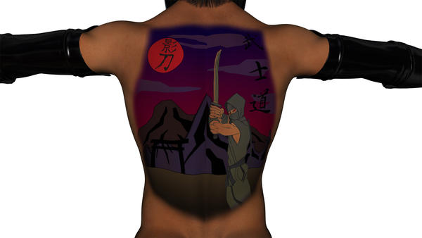
I've been working on finally giving Kageto his back tattoo, and think I may have something, but could use some critique and suggestions for improvement in technique or design.


Tattoo-test.jpg
2000 x 1125 - 211K


Comments
I think the design is great but I think the image could do without the sky. It seems like too much to be coloured in that way, smoothly - in terms of realism. I've seen full-body tattoos but they seem to be patterned like scales or other random symbols. Perhaps the clouds could be coloured like the sky. Not to mention it makes those other letters difficult to read on some screens. As for the warrior depicted, he just needs his legs drawn unless you're planning to obscure them with an item in front. It doesn't look right with his legs faded out like that. Overall, you're progressing nicely and are on the right track.
That's definitely gonna make one badass tattoo. I like it.
You could try blending it in more with the skin, now it looks more like a bodypaint than a tattoo. Maybe RawArt's tutorial can be of some help : http://www.daz3d.com/forums/discussion/8638/
I redid the mountains. I really didn't like how they originally turned out. I also added some shading to the Shinobi and clouds to give them more dimension. I think this works better.
I think version 2 is definitely an improvement. I know IRL people don't want their tattoos to fade, but it sure adds realism in a digital render (and I prefer this color scheme, too).