An Experiment - can you spare a few moments?
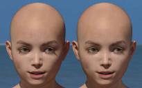
Here is a render of 2 faces.
The faces are identical, copy & paste from one face to the other for shader of Nikolas for G3M and copy & paste for shape also. I have done some work on the translucency, gloss and top coat in an attempt to maximise detail. But everything is identical for both faces.
The figures are at the centre of an HDMI dome, split by -10 +10 on the (red) x translate, so any lighting diference will be minimal.
The camera, positioned on 0 x translate, is set to focal length 500mm, so the camera angle difference between the two faces will be minimal.
Everything about the 2 faces and the setup is identical - barring that there could be some reflections between the faces, however, that too will be minimal.
There is just one setting that is different for either face, and we are led to believe that it is a significant setting. I will not say YET what it is.
So here is the experiment;-
1. What can you see that is different? Something or nothing?
2. If you can see a difference, what is it, (I don't mean guess the setting) please put into words what difference you see.
3. If you can see a difference, do you believe that one face has rendered better, or is more realistic than the other, and is it marginal or significant?
If you see no difference please say so, as that in itself is interesting.
Later I will post here what setting is different.


Comments
The face on the viewer's left is lighter colored but otherwise I see no difference.
I ought to say that to my eyes, I can see the most marginal of differences in detail level, for instance, looking closely at the bridge of the nose, right of centre?
they look the same to me
But there again, my screen is 32 inches, it may be the render looks different depending on where I sit.
I see 2 faces so close together, that the light reflection from one influences the appearance of the other (and vice versa), esp in the shadow area on the left face..... so no telling what influence is from the reflections and what from the difference in setting(s)
(Edit to add, the shadows on the face left are darker, clearly visible in the neck area and the eye lash shadow)
Eye lash shadows are a little bit different, shadows on neck also. Can't be sure on anything else;)
The one on the left is at more of an angle to the camera. The one on the right is more dead on. There are more shadows on the left side of the left one's face.
for me it's the elongated eye lash shadow below the left eye(s) that makes the difference. It's darker on the right face. And in my opinion, it's quite weird to look at on both faces.
1. they are different in angle to the camera resulting in slight different size and shape of the 2D visual
2. there are the already described differences in the shadows and the reflections from one face on the other already mentioned, the shadows I woudl as well thing are caused from the different angles
3. the left faces seems to have a slightly higher gloss especially on the nose ridge, I can't say if that is caused by the small difference they have in position or if that is what is caused by your indicated difference
4. the left face seems to be a tiny bit lighter in colour regarding the central facial area
I would guess SSS
The one on the right appears to have 347 more eyebrow hairs... Aside from that they seen fairly identical.
I was going to point out the same thing about the faces reflecting light off each other and the right head casting a shadow on the left one, so it's really not a good test at all. That said, the head on the left seems to have a slightly brighter and more contrasty image, with the highlight on the nose being slightly whiter and the pink discolorations in the skin standing out a little more. However, that's at least partially because the head on the right is diffusing the light more evenly, so it's slightly less glossy.
I believe that the differences introduced by the camera angle are quite small, this is born out by the very similar angles of the eyelash shadows on both faces, though some difference is certainly present.
As to differences introduced by reflections between the faces I maintain that this too will be small.
The setting difference is the "Render Subd Level (Minimum)". The face on the right has a setting of 5 and the right a setting of 3.
I have spent a long time looking at this image and comparing the faces and I believe that the only SIGNIFICANT difference is in the depiction of eyelashes and eyelash shadows.
I believe that marginal differences in gloss are likely accounted for by the slight difference in camera angle mention by myself and several others here.
I am surprised that this change of setting has introduced such small visible differences between the two faces, especially when the large disparity in demands on the computer during rendering along with the difference in render time.
Happy rendering!
The only reason I ever put render subd above 3 is when I am doing a high resolution close up, with HD morphs of some kind. Otherwise it's just at 2 or 3.
You chose a literal baby face for this experiment. Smooth baby faces dont require any magic from a smoothing algorithm. A haggard face, much older, then you'd see much more of a difference. Also look at other parts of the body since the face is by far the most polygon dense of all the material zones. Lastly, keep in mind that bump settings can at times corrupt smoothing. You'll find surfaces with bump and normals might produce hard lined shadows in situations where you would not expect them to. Hard terminators. Higher resolution from the mesh wont help because no matter how far apart they are there are still facets and the hard terminator will follow one of the available facets. Octane has fixed this issue, but its still a problem in Iray that I can tell. All the best!
Try to keep your bump and normals below the halfway mark.
To me on my monitor.... the one on the right looks a tiny tad bit more reddish and translucent with softer eyelashes and their shadows.
Putting Render SubD high is only necessary for SubD morphs. Otherwise, what you're effectively doing is first smoothing (huge difference), smoothing the smooth thing (much less difference), smoothing the twice smoothed thing (almost zero difference), and so on.
Right, this only has a noticable effect with an HD morph dialed in. If the morph is at subd 4 and the render subd 2 you will lose some detail. Even then it can still not be noticable if you're focusing on the wrong thing. Say the actual detail that needed subd 4 is only on the fingers and you're looking at the face.
The harder shadows on the leftthand image break it from the blue background giving an illusion of more redness.
The softer shadows in the other appear to be the result of more reflectivity within the shadowed areas
The skin tones within the well lit areas are identical.
That's all my worn out old eyes can see through these smudged, out of date, scratched prescription glasses.
Thank you everyone for interesting comments.
Same thing. I only detect the left one being lighter in color. You can really tell when you look at the shadow areas and compare (like the neck).
The figure on the left is definitely to the left of the figure on the right. The right figure appears to be much more right shifted.
I've noticed some liberal leanings in the left figure, and hints of rightuousness on the right figure.
There appear to be small differences in camera angle and light angle that make the shadows around the nose and mouth slightly different in terms of depth and angle. The left image appears slightly lighter.