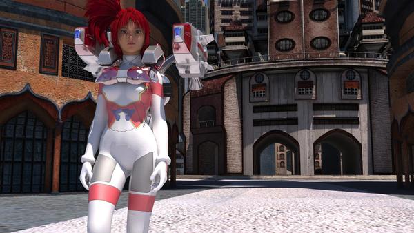
Shantara City and Gumdrop using LuxRender
I like how it renders.


Osaka_in_Shantara_City_-_Lux.jpg
1920 x 1080 - 563K
You currently have no notifications.
I like how it renders.


Licensing Agreement | Terms of Service | Privacy Policy | EULA
© 2025 Daz Productions Inc. All Rights Reserved.
Comments
Greetings,
The ground textures are really blurry even at that distance; are all the textures like that?
I did a render today of Andoria City, to remind myself and compare to the Shantara City stuff, and I ran into the problem that all the textures are designed for long-distance viewing, and up close they look like a blurry mess. (Plus with 23 lights, it renders horribly slowly.) Given that the promos for Shantara City are all distance shots, I was worried that the same problem exists there.
I love the nooks and crannies of the city (like that 2nd floor tunnel near the middle just under her jet pack/rocket launcher/thingie), but I need to trust that the textures will handle putting a character in one of those nooks, say right next to a wall.
Contrast this with the promos for Urban Sprawl 2 which show curbside closeups, and they're crisp. Any other renders you can share, to give a feel for the space?
-- Morgan
To my surprise, I don't know why the author doesn't set up UV for it to be distant/close render friendly. The city is too good to set up any angle like the one I really enjoy, The Sandy Bay Seaside Village. Unfortunately, I have to do major texture refining or replacing them with another shaders (I hope they export properly to LuxRender). Such hassle. Sigh.
To my understand, the textures might be already maxed out (2048x2048) but the scale of the objects are already too HUGE which stretches textures pretty bad.. But I think that can be be resolved by using seamless with tiling value. I did increase tiling value and they didn't appear to be seamless at all..
I hope the author will release a new update to resolve that.
Here's a draft (far from perfect but doing good progress).
Greetings,
Nice retexturing of the ground!
The other thing to do would probably be to split the ground plane into multiple smaller blocks, and texture them so that at the edges it's seamless. This lets you have higher density textures at each point.
I love what you did with the car! How did you do that?
Cute and funny picture, all around.
-- Morgan
Thanks Cypherfox! :D I can try your suggestion for multiple planes putting together.
Haha, the car came from Live Architectures Bundle. Buildings and cars which can be destructive. ;)
http://www.daz3d.com/live-architectures-bundle
I remedied the ground problem by applying Urban Environment Shaders (with very surprising results!):
http://www.daz3d.com/urban-environment-shaders-for-daz-studio