A lost Car ( in details )
 Apoc
Posts: 407
Hello again :) The forums here are always helpful and I've seen alot of skillful people here in terms of 3d modeling.
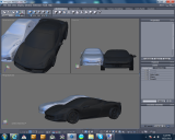
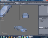
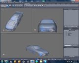
I was working on this project for about a month now ( on and off ) and I finally got the jest of modeling in hexagon. Sadly im no where near pro level and was wondering if I can ask for opinions and help on this car model I been working on.
I have the wheels designed as well as the underbody layed out. But as far as the structure of the car goes, It looks exactly as how I wanted! . . . except . . well . . its not as detailed , If that makes any sense. It looks very plain , compared to other figures on this site that look very realistic, mines is just looks like a low poly version.
Are there any tips on how to make it ---
* More realistic
* higher polygon
* smoothed while keeping the shape in certain sections
* detailed
Now this is just feedback im looking for ^^ not a detailed tutorial of how to do every lil thing. But feel free to post them as you like :) im certain someone will find this information useful. But go easy on me lol its my frist attempt at modeling in hexagon
I was kinda hoping to get my model to look something like the last picture of the lamburgini




Comments
not a modeller but one thing I notice is detailed texture maps and use of materials goes a long way in making otherwise simple models pop!
most things look plain and low poly in wire frame or untextured, think video games, normal maps and displacement adds a lot of detail too.
That is pretty good for a first try :-) Detailed cars are not easy to model.
Difficult to really have a good look at yours with this small resolution they now allow us on the forum. Off-hand, it seems that your topology is a bit messy - take a look at this Bugatti Veyron I started some time back and haven't yet completed because I'm having a real problem getting the windows right. Notice how the edges flow following the contours of the body and defining it. All the polys are quad and pretty much square and every edges flows right across the body.
That is what will give you good smoothing and gives enough mesh to do details. For the parts that must remain sharp and hard, you add edges close together - the closer they are, the more they resist smoothing.
Your topology seems to be a mix of quads, tris and N-gons, with some random edges which don't seem to serve any purpose. My rule of thumb is that if an edge does not define a change in shape, it has no business being there.
Hope I'm not seeming too harsh here - it is meant constructively, not as criticism.
What method did you use? The normal method tuts show of making a box , cutting edges and moving verts to match the shape? That works OK for low poly models, but for something more detailed, using surfaces tools, especially the Gordon surfaces gives more satisfactory results.
Then, as Wendy says, using textures for final details does the trick - always a toss-up on how to much to model and how much to fake with textures.
Thanks for the Tip Wendy and Roy :), your right cars are not easy to model.
But if I understand what your saying, you said its best for my edges to flow all the way across the body instead of being cut off half way? is that what makes mine so sloopy when smoothed? cause its not all quads?
And I also noticed that you have your side mirrors done, any tips of tutorials on how you extruded them and made it look so smooth :)? I would to have as much tips and tricks as I can :) and dont worry your criticism is not harsh at all, im finding this information very usefull cuase im still learning much about modeling
Also as a side note, if I wanted to change my model back into mostly quads, would it be easier to just erase, connect, and redraw the edges, or is there another way to do so and keep the symetry?
apoc im not a hex modeler but i do model cars almost exclusively
1st tip is to place all edges on a crease on the body a.k.a. edge modeling
locate the basic form points and work from there
a unimesh is good if you need it for a background piece but if its featured you want something more accurate
also you dont extrude the mirros they are sperated meshes simply for topology
and roygee i did spot 1 flaw in you veyron
top center of the windshield
seems the verts are merged incorrectly
Hi Apoc - yes, that is what I meant - you'll discover along your modelling journey to, in general, avoid any poly shape other than quad and to have them evenly spaced. Topology is a science - if you want to learn more about good shaping, take a look at these http://vimeo.com/user904568 and http://www.blendernewbies.com/tools/subdivisionmodeling/subd_PRIMER/index.html (darn this new forum, can't find a way to make a dynamic link to URL's)
There is a pretty good car box modelling tutorial at Geekatplay - he never finished the project, but it's good enough to get you started.
I normally model only one half of symmetrical objects - Hex does have symmetrical modelling, but it's not all that trustworthy.
The mirror is a separate mesh - I model things in as many separate pieces as I can get away with - makes UV mapping, texturing and animation easier.
If I remember correctly, the mirror started as a chamfered oblong, which was shaped, extruded and closed, then the stem extruded from the mirror body.
Well spotted, simpleplanning - I assure you there are many more mistakes in that model. Glad you came along - maybe you can give me some tips on doing the door windows - they curve from top to bottom and front to back, curved all around the perimeter and the front tapers to a rounded point.
Ah I see now. I used geekatplay's video along with a few others to get me started, but cause all of them were unfinished. I was on my own to finish it. I learned alot doing it myself, though I still wish they was a full car modeling tutorial. The next step im looking for is to cut the model in half so I can take away the symetry. I started using hex's symmetrical modelling but somewhere along the line, my symmetry got lost.
do you happen to know the best way to resymmetrize it agian or slice it evenly into half?
Come to think of it, I've never seen a completed car tut - probably because it would take too long to do. The guy at Geekatplay had a sysytem failure, lost all his files and wasn't up to starting from scratch - don't blame him.
No way I've seen to recover lost symmetry, other than cutting the model in half and mirroring it.
First make sure the model is centred in the X-axis - go into top view, select it and check that the X-position is zero - if not type in 0.00. Now you need to cut a line down the centre - select "tessellate by slice", hold down shift and click on an edge running along the X-axis which transverses the model. Sometimes this operation can give strange results - if this happens, abort, select the edge again and do a ring-select - make sure it has selected a ring of edges right around the model, then hit "connect".
That should give you an edge cutting all the way through the model on the centre-line. Select this and check that the edge is positioned at X = 0.00 and the X size is 0.00. Select the points on the side of the model you don't like and delete. With the remainder of the model selected, hit "symmetry" and choose either X+ or X-. That should give you a mirrored mesh right up against the original. Select both and weld, average weld.
http://cgcookie.com/blender/2009/12/05/modeling-a-porsche-911-gt3-rs-part-01-2/
its for blender but the basic mechanics are the same in all modeling wares
grand total its about 8-9 hours for all 8 parts
now after about 12 hours of research into hexagons modeling system i can officialy say it it almost useless
at least for modeling complex meshes
modeling cars needs to be done vertex by vertex on a mirror and the mirror in hex has no clipping point
also since the basics are basic id suggest even sketchup would be better
Hex is certainly quirky and unstable on some machines, not very good at catching user errors and lacks a lot of modern tools because of lack of development, but to say it is useless for making complex meshes is a very sweeping statement. Such a pity that the old forum has been archived, or I could point you to very good, highly complex models, including motor cars, shown in the old WIP thread. For an example of an excellently made motor car, look at page 39 of the manual, which should be in "Docs" in your Hex program folder. Many professional vendors use Hex as their primary modeller.
Poly-by-poly is not the only method of modelling motor cars, - surface tools give far better, faster results - but if that is how you prefer to do it, Hex is certainly up to the task.
In fact, any modelling app that can string together two polys is capable of producing any shape you want, the only limitation being the knowledge and skill of the user and the size of model the app can handle.
Not sure what you mean by a clipping mirror clipping point, but Hex certainly does have a mirror plane. The symmetry modelling tools are not the greatest, but you can model one half then mirror and join the two sides perfectly symmetrical.
All that does is prevent you from pushing a point past the center line, which isn't a problem in the first place if you pay attention to what you're doing. Personally I don't like modeling in symmetry and just do one side so maybe that's why I see it as a useless feature?
roy to state that i said it was useless is assanine i never said that
the temrinology i used was almost useless
and perhaps that is a bit harsh if all you intend to make is modern era cookie cutter cars that are very low detail and low poly
and for the record i have the archived site available and its still rhudementory at best
and there is a reason that modelers do not complete a car tut in hex they fix the issues in another software
mirror modeling is ok for the basic form but the details should be vert by vert
i have a 34 ford coupe i am working on that the geometry would kill hex and did
also just for a test render it crashed poser and studio
Assinine - spelt incorrectly, but means - "Something so stupid it makes a person look like a complete ass, despite whatever misguided good intentions they believe they have."
OK - let's agree to disagree and try to keep it polite.
On the one hand we have seen and admired many works done in Hex by folks such as CGDreams, Duke of Vampires, BigT, m_m_italy, to mention but a few, whose work is anything but rudimentary. Maybe you could post something done by yourself, so that we can judge.
Doesn't seem much point in producing work which is so heavy it can't be rendered in everyday software?
Ciao "Roygee".
Capito poco......
Capito quasi niente......
Bat: Grazie.
Ciao
P.S.
Sorry for the O.T.
Cia0 m_m_italy
:)
Felice di vedere che sono tornati sul forum - aspettiamo fom lavoro più si
O.K.
If I remember correctly you write from South Africa .......
Hello from Italy
P. S.
Sorry for O.T.
And congratulations for models.
I need to watch my post more, I missed a converstion but the big words were hard to follow anyway.... so moving on :ohh: . . . I remade my car model but working with all quads are hard, I still have a few triangles laying around, is that ok?
My next question to anyone who can possible provide a answer, Is how to add fine details and indents such as the ones in the picture below. Should I just extrude and intrude the faces after I cut the shape out? or should I keep modelig the edges and keep the lines flowing all across the symmetry of the model?
Wow, that's some task you've taken on.
OK, tri's, as such, aren't a huge problem - they'll become quads when smoothed. It all depends on where they are situated - if on a corner or curve, they can cause artefacts when smoothed. Best to stick with quads all the way. one way to deal with them is by terminating an edge flow in a diamond shape.
The air intakes are holes - I would be inclined to extrude inwards, delete the "back wall", then bridge to make the grids. Extruding, in or out, should not interfere with the edge flow if done correctly.
This is one of those design choices Wendy was referring to - you could fake the holes by using an alpha map.
As awlays roy :D you save the day with a quick and very helpful response
This is the result I was going for, does anyone want to critique it with feedback :) im happy to hear
Difficult to say without seeing the mesh - there are some pinching issues - could you post two wire pics, with and without smoothing?
of course , unsmoothed and level 4 smoothing
Thanks - that makes it much easier.
Firstly, the most obvious - you have a six-sided N-gon at the top front corner of the wheel arch, causing a dent. This is caused by the edge running up the the wheel arch - this edge doesn't appear to have a purpose. Perhaps it's there to flare the arch? If so, I would join it to the vert immediately above and behind, making it into two quads and continuing the loop around the wheel arch. If that's not the purpose, rather get rid of it.
Secondly, the inward extrusions for the air intake are causing pinching at their tips. I haven't found a method of making such small extrusions nice and smooth without adding a lot of edges - maybe someone can help us out here. I personally would rather make a hole, or a large inward extrusion and make the fins separately.
There are some dings around the front corner and it's difficult to find a reason - the geometry looks OK, although there are too many edge loops for the purpose. Possibly some of it is non-planar. This is a problem with box-modelling something as curvy as a car, which is why I prefer using the surfaces tools.
Try cutting in some more edge loops through the middle of the faces in that area..
It shouldn't be necessary to smooth to level 4 - level 2 and occasionally 3 should be enough. If you need more than that, it shows that the geometry is pretty uneven - again because of box-modelling? Rather add more loops and keep the smoothing down.
Hope this helps somewhat.
Cheers
You should head over to http://www.digitaltutors.com/11/index.php. Well worth the money and you'll learn alot. Most tuts that have polymodeling can easily be transferred to hexagon. I made a Mustang once from a tut for 3dmax and had no problem to adapt it to hexagon.
Wow those tutorials look very promising!, but before I dive into the hardcore stuff I wanna learn as much as I can for free frist, like I said this is just for constructive crictisim and feedback but I appreciate the link , really, I saved it in my favorites bar ^^ probally in a month I will save up to take a few learning coursed that arent free there :) but im sure you should put that link in the tutorial section of this forum, im sure alot of other people can find that very useful
So if I understand you correctly roy, you say a more simplier solution to making the air intakes is to extrude a hole, model the small spines of the air intake seperatly then wield them together to the object after there done? wouldnt that create the same result or would that just make the pinching invisble since there is not backface for the edges to fall on?
I tried something like that simlar but didnt seem to give me much of a effect, but as far as realism goes,
Other then using a alpha map to create the holes, would it be possible to just add texture on top of the areas where there is pinching to help make it look more smooth?
I mean , I didnt look to bad to me , but I always like going for the best, here is a result with a differnt lighting shader,
He means something like bellow. It's just tossed together quick so it's not very pretty but should give you the idea, the three lines that meet the fins can be eliminated also.
I haven't checked out DT much since they changed format but their tutorials are well done and planned out so there isn't a lot of the "hmmm, let me try it this way" type garbage most have. I don't think they have any specific to Hex but as Ghostman said, they are easy to transfer between any app.
actually admkrk, thats exaclty what I was looking for! it looks great :) . im inclined to ask how you did it if your willing to teach a newbie
For the fins? Nothing fancy, just squashed a cube and beveled the edges plus added some splits to give them a bit of curve. You should be able to see it better in this picture. All the unseen polys can be deleted before duplicating the first one to lighten up the mesh and you could lose over half the lines you have in the nose if you did something like this.
But like I said It was just tossed together and as you can see when smoothed, has a lot of ridges. It does take a bit of time to get it right so that doesn't happen or I'd have fixed that too.
Just to add that that Blender tutorial simpleplanning linked isn't too bad even if it is long winded. I've been puttering around with it and came up with this so far. I only loosely followed it and it didn't spend much time tweaking since I'm not planning to finish it so there are plenty of problems with the mesh as it is but for the most part it's not a bad tutorial and shows a good basic workflow, except for all the times he redoes stuff.
What admkrk shows is exactly what I meant - nice flow on the test model. I'm learning Blender, so will take a look at those tuts next month when my broadband allowance is reset - running almost on empty right now. My ISP is currently upgrading the speed of our connections, which will triple the speed and make those endless pauses for buffering less painful.
To answer Apoc23 - I was wondering whether the dings would be less obvious in a different lighting and they are. I don't know how to texture something to disguise the pinching - bear in mind that when you texture your car, you'll want a nice shiny, glossy finish, which will accentuate any flaws.
PS - You could try a light brushing over the dings with the smoothing tool - but do this on a copy, because it can go horribly wrong if overdone.
yea my workflow got all messed up cause I didnt know how to use all the tools they showed in some of the videos til now :P and also I followed the image to the latter instead of considering the actually geometry of the final object. So any other modeling tutorials for differnt programs im confident I can translate into hex now. But I have to admit im learing alot more then I ever could, fixing my mistakes, then I would from watching or reading toturials online :ohh: so I thank you guys alot for the help , you've been very resourceful , I hope I can be as great moddlers as you in the future :P