Obsolete Interface in Carrara 8.5
 corinthianscori
Posts: 55
Carrara 8.5 released. I'm using it, and the interface is just as dated as it was in 2009, ten years ago, when I used it first.
Why hasn't the interface been streamlined, and updated for modern hardware and simple U.I. conventions?
Daz Studio, for instance, has multiple user-ready, click-and-go interface changes such as Hollywood as well as Default. DS also has U.I. icon changes with a click.
I'm looking at Carrara 8.5 and it looks as non-streamlined as the initial beta did ten years ago.
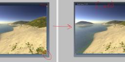
The UI has these tiny click-buttons in the top left to close render-windows, and the ability to scale that window is in the bottom right. Windows/Macs have both these options in the top right of every new window, along with the ability to go ful screen or minimize that window. Honestly, what year was this interface design last updated? I'm seriously asking, not being snarky.
The entire experience with this software with its small fonts and small click boxes shows this software is a relic from 800x600 screen resolutions. The fonts, buttons, and windows in this software would be perfectly usable if the user interface was designed for a maximum of 1040xsomething-or-another which puts everything in the UI much larger than what displays on modern monitors and screen resolutions. My point is that WHY HASNT THIS BEEN ADDRESSED?!
Go ahead and open Adobe Photoshop Cloud(im using CS4) and just compare the look of the interface between the two. It's night and day, and my Photoshop CS4 debuted in 2008, over a decade ago and Photoshop CS4(2008) looks better than this new Carrara software from 2019!
My guess is that this Carrara could be updated but the resources are being spent on Daz Studio and the development toward the future of Daz through it. That's fine, and a good idea, actually.
The soft body phyics, and additional Carrara-only features will soon be integrated into Daz Studio, of course; all good for progress, and I applaud and encourage this, however, please...update this Carrara UI before shuttering the software.[could be true: the reason you have to pay for a point-upgrade is due to development of Carrara and lack of development somewhere else like Daz Studio. Updates to Carrara can mean no spline-based hair or soft body physics in Daz Studio. Less features for future Daz Studio means less folk willing to use Daz Studio 5+ and that means less traffic shopping the store storefront.]
This UI needs some serious updating. Burn this Carrara UI to the ground and start over with version-9, backward compatibility be banished to obsolete status.


Comments
Carrara is no longer in development by DAZ3D sadly
many of use here use it and love it anyway but DAZ is only interested in developing DAZ studio and to an extent Hexagon
and you are correct it all comes down to them selling content and DAZ studio is their means of using that content
I use it on a daily basis, it has many features that I use for short animations. Seamless support for Poser format content (loads directly from the Carrara browser), NLA animation clips, many lighting options, etc. Here is a short animation done in Carrara with Poser content and NLA clips:
https://www.youtube.com/watch?v=5IBX3znFk_0&t=2s
And yes, there is a lot of Poser content being developed, not necessarily here at DAZ ....
Im in Windows 10 and Carrara is still using Windows XP's dated back-door UI?! *cry*
sounds like dalek troubles
When it comes to tweeking Carrara your cry for help joins the rest of Carrara users because generally they love the software but are as frustrated as you because Daz has done nothing to it for around 7 years - and dont intend to. However SEVEN YEARS I say and IMHO its still ahead of Daz Studio in many ways. I think Carrara's interface is just about the nicest around and easy to navigate I would hate to see it changed. I hate all those dark interfaces other softwares have adopted. If you dont like Carraras default there are limited chages of colour and fornt you can make through Preferences. Hopefully you will stick with Carrara [ are you a new user ] ? It takes time to discover the delights and power of this software.
.
and while it may be dated in the fashion sense, i'm really not being a luddite when I complain about every contemporary web and program interface treating my screens as a huge iphone... My desktop is not (yet?) a 3x5 touchscreen phone, and I prefer developers that understand that difference.
both Carrara and DS are missing some 'traditional' desktop (mouse/kbd) UI updates that have proven themselves in the last 10 years, but most of the current W10 interface trends are not on my wishlists for any of the programs I use :^)
--ms