[Released] Medieval Fantasy Bedroom [Commercial]
 StrangeFate
Posts: 806
DAZ STUDIO 4.20 UPDATE: All our Products' lighting has been updated to work with Daz 4.20+ Iray. Make sure to update the Products.
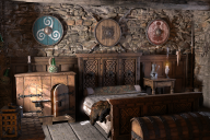
As the title says, I've been working with the PA Roguey that I've been training on a medieval bedroom that should hopefully be out soon.
Some tidbits:
-Bed Blankets are DForce ready.
-All props are rigged and/or have morphs to open etc.
-All textures and UV maps are optimized to not waste any resources.
-Please Note how I'm lining up all features by the length of their sentences.
-Candle flames and smoke have morphs to help you with more dynamic situations.
-Candles emit realistic light and invisible planes outside each window cast light from the outside.
-Day & NIght scene presets are already included to get you started and can be tweaked to get more dramatic results.
-Includes several render settings that take advantage of the new denoiser feature for Iray in Daz 4.11 allowing you to get Iray renders done faster.
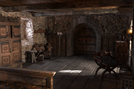
-Walls and ceiling are extra long and floor tiles are modular, allowing you to resize the room to fit your needs or to build new spaces, like castle hallways.
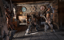
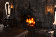
The promos below use either the default lighting without any changes, or sometimes in the night renders I moved or duplicated the window emissives and placed them behind the characters in the scene to give them a more dramatic lighting contrast (and increased or decreased emissive strength too). With some contrast/saturation adjustment in PS, that's usually all it takes. Since the candles and windows emit proper light, it should be easy to predict results. I never had the need to add any new lights or anything for any of the renders.
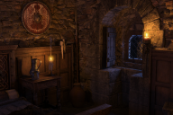
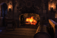
The candles you see, fireplace + 2 window emissives relocated to behind the vampires on each side do all the lighting here:











Comments
wow look great !
In the words of Zappa: "Good googily moogily!"
Looks amazing!!! I am hoping the lighting preset used in the promos we see are included
Now get to work on some new armor, I need a new belt and scabbard for GF8, LOL
wau... looks very good.
Hope that we will see some addons for that in the future. So that we could build an seemless castle where all rooms look like one piece.
And some matching exterios (matching stones, doors and windows) would be also nice ;)
Being lucky enough to test this set, I've spent some time playing and can tell you that the day/night light presets are really easy to use. They're flexible and simple to tweak to get just the look you're after - especially in conjunction with all of the candles. It's like a photo studio in an awesome stone structure (and a ton of very useful props like the candles, smoke, cobwebs, chests, etc.).
- Greg
ETA: Here's 2 renders of the room:
Amazing.
Wow, this looks really nice!
Thanks for the info Greg!
very rarely do i have specific render ideas with a product, but I do with this one.
I'm certain you'll love it when it's released. You can't tell by the B&W images, but I wanted to add that the blue light coming in through the windows (which casts some nice defined shadows from the window lattices) makes it very easy to achieve that nice cinematic teal & orange look (with the help of the fireplace & candles). As you can see in @Strangefate's 2nd image, it really makes your figures pop.
- Greg
Oh . . . and one more thing about this set that's worth highlighting is the ease of which you can remove out of camera props. I've only got a 6GB 1060, so I was concerned about VRAM. The way the scene is structured, it only took a minute to switch to top view, hide the ceiling, and start clicking on props behind the camera to delete. The groups that were setup were helpful (like the dresser group that included the piece of furniture, plus the glass bottle, candles, etc.).
In the end, the LAMH wolf rendered easily without dropping to CPU. The original render was big, too (3120x2400).
- Greg
Saw this on deviantart. It's just so amazingly detailed. What a beautiful set.
I'm waiting patiently to throw fork over my money.
*sigh*
Iray only? I did have to ask.
It does look nice
I have so many fantasy sets though ....
Wow! This is perfect. I would love to see much more in this style. Instabuy!
I was lucky enough to be able to beta test this. It's incredibly detailed and realistic. Amazing realism in every prop and piece of furniture in the scene. Real world wear and tear, rust and corrosion on older metal bits, dust, scratches and gouges in the wood, cob-webs, soot and smoke stains, debris on the floor - an INCREDIBLE amount of realism and detail work went into this.
I really like that there is a separate folder for the props and for the architectural elements so that you can also easily use any of the room's elements or build your own scene. It also comes with a really nice array of dForce elements like the mattress, blankets, and fur throw.
This is a gorgeous room with a lot of realism. I'm most impressed with it!
This is one of hte best medieval rooms I've come across. The lighting is incredible and I don't even have words for the amount of detail and realism this has. The fireplace lighitng for both day and night are just amazing.
I should also add that for those who know me well, there is very minimal postwork, this is pretty much just the set and the lighting provided.
One more from me, I will be using this set a lot, so many great spots to put characters in, and the day and night presets are so easy to use., the lights from the windows are pretty darn realistic. Again, minimal postwork ( the smoke from the dragon and the graininess in this image are postworked but that's about it.
Geez, how many beta testers did you have SF, LOL
WOW! If this doesn't scream Skyrim, I don't know what does!
As one or two people have noted already, the detail on this set is amazing. The textures and sense of depth on the walls, in particular, are spectacular.
Can the walls be removed selectively for camera angles?
Cheers,
Alex.
Thanks for all the interest!
FSMCDesigns - The daylight promos use the included lighting as is. I just tweaked the brightness in PS a little sometimes. The night time promos use the default lighting too, with the difference that by default, most candles are turned on, and usually you'll want to turn some off to have a more interesting lighting situation. Also, for some renders I increased the strength and color of the emissive planes outside the windows to levels that don't look realistic, but look good for specific shots.
So, basically, the lighting is there but for a more dramatic effect, you'll want to play with the intensity of the window emissive surfaces (or move them to behind your character even) until it fits your need.
I have a 1070 video card, and with the new Daz Studio 4.11 Iray denoiser I get a clean (but rough, sample below) Iray render in the viewport in about 5-7 seconds, which is great when playing with lighting and camera angles.
Armors... yes, after a short break when this is released, I'll go back to working part time on a handful of armors (for males tho) that are already modeled.
3 Beta testers :p
Gerster - To some extent. I do love making modular sets that eventually all plug/fit together and some of the stuff Roguey and I are planning goes in that direction. The only issue with that is that I feel like people just prefer small, flexible sets for pin ups or a specific scene, and and careless about a place with a real layout and hallways in between. Be it because they just render still images and don't need rooms or locations to make sense in relation to others, or because they don't want to deal with the logistics and resource issues a large place would cause in Daz.
Right now I'm not enterilery sure what approach is best, but we will be doing several environments within the same style that will work well together, plus furniture/prop sets that let you change the purpose of those rooms completely (rather than selling you another pair of walls with them). At the end of the day, with this product and the next, you should have enough modular architecture that you can build hallways to link t he rooms I think.
Exteriors... they're planned around the same style after the next 1 1/2 sets... I'm already looking into the best way to do what I want to do, trying to maintain quality without blowing up people's video cards.
JOdel - Afraid yes :/ ...but you should try the Iray denoiser in Daz Studio 4.11. Most of the promo renders for the bedroom where rendered at 2250x1500 in 20-30 minutes on my 1070. You can get away with 10 minute renders if you don't mind a more painterly look on them, which sometimes looks nicer than a regular, cleared render.
Sigurd - Everything I'll be doing with Roguey will be in that style. She has already 2 more products modeled out as far as she can take things. I'm the bottleneck :/ I'll be splitting my time between her stuff and finishing my new armors, but if the bedroom does alright, between the both of us, we have tons of ideas for enviros in the same style.
Alexhcowley - If you look at the image attached to this post with the layout of the room, you can see that the walls are extra long. They're all separate so you can hide them, make the room bigger, use them for hallways, swap out one side if you don't want windows on both sides, or cover the windows with the empty wall piece leaving the stone arches around the windows visible (looks nice)... you should have some flexibility.
And another promo... again using the included night time lighting.
All candles but the ones on the floor were turned off... don't remember if i also hid the fireplace (probably did).
A duplicate of one of the walls was moved outside the door to simulate a hallway and the emissive from that window cranked up significantly to get a lot more of its blue light.
There was 1 bug with the windows when I made this render. Making the emissive stronger would also light up the window, making it look like day time outside even tho the skybox itself was dark... doesn't happen anymore.

Thank you for the answer, but I disagree with you. ;)
I also do only still images, but I do comics. And therefore location which match together are very very usefull. And I'm think I'm not the only one who does comics.
So, I always vote for modular, matching systems
Awesome job! Thanks for the response. Cannot wait.
Gerster - I would prefer that too at the end of the day. For flexibilities sake I plan on keeping walls, windows etc on a modular grid anyway, so with the next product you might already have walls that are made of 3x3 meter (or whatever) tiles, rather than 1 long wall with everything on it.
Excellent news! I like sets like this precisely because of the flexibility. I will look forward to the arrival of your set.
Cheers,
Alex.
Well as someone who does render animations I must say I prefer modular sets with lots of props as I don’t render one continuous shot but edit together cut scenes so the same walls and doors, windows can be reused in several rooms swapped around and my furnishings rearranged kitbashed to suit,
this looks like an awesome set and most likely it would not be rendered complete if I did an animation just single walls and some of the bits.
Well, this is easily an insta-buy! Will be the same for all of the associated products. Yes, I can see the future, at least for work like this.
Really provokes the imagination with possibilities.