Texturing Models For Bryce Renders
 franontheedge
Posts: 342
Hi,
I'm enjoying playing around in Wings3d, PhotoShop and Bryce.
Haven't got to Bryce yet, but here are some screen captures from Wings after texturing.
1) Here is the first bit of Texturing.
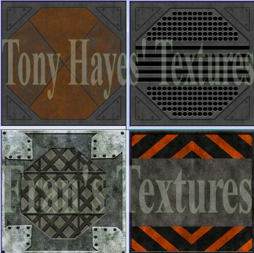
I downloaded some lovely textures from Tony Hayes at ShareCG,
Tony Hayes' 27 Sci-Fi Metal Textures
I didn't copy these textures but simply used them as inspiration.
It's great to see what's possible when an expert does it.
If you look at Tony's top right hand texture closely you'll see that he's got his light coming from the middle as the lower parts are lit from above and the upper parts are lit from below.
And if you look at my left hand texture - I have all the parts lit from above with shadows below - this is because I usually place lights in or near the ceiling when rendering in Bryce.
If I was to light a scene at floor level I'd simply go back into the PhotoShop saved image and change the direction of the light in that particular layer.
Here are Tony Hayes' textures at the top and my own textures at the bottom:


Comments
And here is a screen capture of the room in Wings3d at its current stage:
Coming along nicely.
Real nice so far.
Fran: really nice job on your textures and modeling...Trish
Thanks all.
I've been UVMapping and texturing the little bits, like pipes, control boards etc etc.
I've also done some more to the short end wall, not sure if it'll stay like that or what... (If it stays, the prop will have another wall behind it - obviously. Because the propellor is a model not a texture.)
Any different suggestions for this end wall, anybody?
Fran: I like being able to look into a hallway like that.....something could be happening right on the other side... and we would miss it if the door was solid...not trying to complicate matters.....Trish
Lol! Not to complicate matters eh?
Okay, well Wings will probably crash soon, 'cos I've made more corridor - the pink bit. The wall with the nice texture and all the cluttering pipes etc is in green.
Now I'll have to punch a new hole in that new long wall and make a new set of doors or a single sliding door...
Seeing as I'd already made the propellor and shaft/tunnel for it, it had to have somewhere to sit - it was either a room or corridor, and I love making corridors.
I started this project when I downloaded this room from sharecg:
http://www.sharecg.com/v/39124/browse/5/3D-Model/Scifi-Room-with-a-view
Which although a nice enough room shape, despite the picture and what it said on the download page it had no textures and some parts seem to be part of other parts and there are no UV co-ordinates, so it was impossible to use in the state it arrived in. So I took it into Wings3d, but even there it had some oddnesses, so I thought it'd be easiest to just recreate it - and then UV Map and texture it...
Only then I didn't.
I created something different. It's about the same size and has roof skylights and a long window on one wall... but that's about it for similarities.
He made a sunken floor - dunno why - but I'm thinking a simple plain floor - with a shaft leading downwards instead...
I might have to start saving parts of this scene as separate scenes - I got a new SSHD drive for my birthday - and 2 days of trauma while we shifted my desk from the little room to our bedroom (- less hot and we want to redecorate and fix the lathe & plaster ceiling - but that's another story) even so I don't think having a new faster drive is gonna stop a huge scene from crashing Wings!
There you are Trish,
A new openable door for the Prop Shaft corridor:
Pic1 = door closed.
Pic2 = door half open.
And here are some of the floors textured with the shaft, and a new wall done too:
Fran: I am really liking this... very cool!!...now you can get in there to work on it if something goes wrong... congrats on the new HD by the way...Trish
Thanks, I'm enjoying playing in it.
Yeah I'm very happy with the SSHD, it's bigger than my old drive and faster being a hybrid.
I've retextured the boiler, with a less manic look, more old and kinda dusty.
And here's a shot of the whole model - so far.... it's getting quite big!
Looks like you are ready to put in some people and render away...
Not quite. There's at least 11 surfaces, window walls, walls, and ceilings to UVMap and texture, plus some little bits like a power handle, a few levers etc etc.
Only Wings is getting very slow now... whimper.
and I need some surfaces under all that grid flooring... um.
On a different question, you don't know if one can get any free shapes for PhotoShop anywhere do you?
Fran : what do you mean by shapes...they have free brushes.... http://www.brusheezy.com/ try here.....Trish
That's starting to look real nice, franontheedge.
Maybe the best, in order to keep Wings happy, is to break up everything into components, which you can reassemble in Bryce. You could use markers so you'd know how to line up everything when you import them into Bryce. Doing this will eliminate the need for Wings to continue drawing the parts you're not working on.
Not quite. There's at least 11 surfaces, window walls, walls, and ceilings to UVMap and texture, plus some little bits like a power handle, a few levers etc etc.
Only Wings is getting very slow now... whimper.
and I need some surfaces under all that grid flooring... um.
On a different question, you don't know if one can get any free shapes for PhotoShop anywhere do you?
I did a google search and came up with quite a few results
https://www.google.co.uk/#q=free+custom+shapes+for+PS
I have , in the past, downloaded some of the sets hilighted in ''The Ultimate Collection''
Fran-Wow I can't believe it that you are doing this in Wings. it's awesome.
No, not brushes, I mean shapes that you can use to add to the 'custom shapes' here:
(see pic)
I tried a google search and just came up with a download of an .exe shapes downloader program that installed a load of rubbish on my machine - including an apps thing for phones, and to add insult to injury didn't even seem able to download any shapes either...
What I was hoping for was a similar resource to the brushes for PhotoShop, which you can find all over the place - especially Deviant Art... um... I'll just go check out Deviant Art, now I think of it...
Oooh, su-weet!
Hey take a look, they even got Cogs! I love cogs! Pity it's not suitable for this current project...
Oh wow, there's loads!
Well thank you but it's really not so hard. Wings3D is one of the easiest programs to use that I've ever come across, even its manual is easier to understand than any other manual I've ever seen, and there's no need to be too impressed by this model, it's mostly just cubes with pictures on them.
~~~~~~~~~~~~~~~~~~~~~~~~~~~~~~~~~~~~~~~~
@Trish,
Arrrrgggghhhhhh!!!!!! You beast, you've trapped me downloading lots of lovely grunge brushes – arrrrgggghhhhh! Help, someone save me!
Lol.
I have this addiction to grunge – brushes, textures, whatever. I love making grunge brushes, and downloading other peoples is a lot of fun too – trouble is my PhotoShop is so full to bursting with brushes – I can't see them all.
Sorry, nothing to show at present, since I'm making a new texture for PealandPalace. I was just playing really, but got carried away, and I've created a new character too - 'Burpea', here's a link to all the Pealand characters that I hope to model one day:
Pealand Characters
I'll post the image of the new character in the Bryce Renders thread...
LOL at Fran. My Google-Fu is quite good
Markers? To help realign the individual components, unless you have an excellent eye, or memory.
Yes, I understand the concept of 'markers' generally and what they are for, what I don't get is just how you are suggesting they should be applied to this particular situation - or why?
I mean if you are talking about in Wings3d - saving the sections as separate files and then re-merging some of them simply brings everything into one file - already in their correct positions.
If you mean in Bryce... well, (scratches head) what do you mean? Adding an extra cube in Wings3d for a marker?
Why? You'd still have to go in really close in Bryce and move the section into place - an extra cube would surely just get in the way... I can't think how it would help.
If you don't mean this, then can you explain what you do mean?
What really would help is if Bryce would stop changing the relative sizes of imported objects - and their positions too.
Okay, I'm getting very close to being ready for Bryce now.
I'm just UVMapping the basement:
Pic 1 (BasementTexturing)
And the corridor at the other end is now finished:
Pics 2 & 3 (EndCorridor1 & End Corridor2) EndCorridor1 is looking into the last corridor and EndCorridor2 looks away from it towards the room with the big window & the shaft leading down to the Basement.
@fran: You're saving this project is pieces, so you want to put those pieces back together exactly like you took them apart. With some of the pieces it might be hard to realign them once they've been broken up. If you used a cube, for example, reshaped it so it fits a face on your Wings model close to one part's edge, put one that corresponds on the opposite part, don't wield them to either object, then when you take them into Bryce you can line up those two pieces and know your parts have been reassembled correctly. You can then delete those two reshaped cubes. This is what I meant by using a marker.
I'm sorry, but I still don't see how having extra cubes as 'markers' would help in getting the cubes I already have (the model) aligned.
It's much easier to align the cubes that make up the model - without extra cubes getting in the way.
If you use all the views in Bryce: top, left, right, front & back - it's really simple to do.
It's how I've always done it.
Anyway, here are some shots of the model - from inside Bryce.
@fran: It really doesn't matter what is used to realign bits and pieces of a model once it's taken apart. Sometimes witness marks can make the process go faster. But as I said, it really doesn't matter. What you've recently shown is really looking good.
This is coming along nicely... I especially like the wall lighting in the last one... It sets your textures off very well.
Wow Fran I'm speechless, it's amazing what you modeled, Are you going to do an animation with this scene?
Beautiful and Awesome work Fran !!! wow this is really looking great....Trish
I agree, this is looking terrific.