November 2019 - Daz 3D New User Challenge - Materials
 Linwelly
Posts: 5,963
Linwelly
Posts: 5,963
New User's Challenge - November 2019
Sponsored by Daz 3D
Are you new to the 3D World? Are you at the beginning stages of learning 3D rendering? Have you been around for a little bit but feel you could benefit from some feedback or instruction? Have you been around awhile and would like to help other members start their creative journey? Well then come and join the fun as we host our newest render challenge!
"Materials"
This month's focus will be on Materials and Surfaces. One of the most important aspects of a great render is the effective use of materials. Effective surface settings can add realism, style, and visual interest to an image. This month we will be concentrating on how to create and manipulate the surfaces on the objects in your scene.
Also, keep in mind all the various items covered over the past several months. They will affect the way your materials look in your final rendered scene.
So far this year we have covered the following topics:
Inspiration:
Check out the amazing entries and discussion in last year's Materials challenge.
Other Helpful Links:
When following tutorials, be cognizant of the different applications (Bryce, Daz Studio, Poser, Carrara Blender, etc.) and different render engines (3Delight, Iray, Reality, etc). Techniques for one may not apply directly to another. If you have some favorite Materials, Surfaces, and Shader tips, please share them in this thread.
Daz Studio Tutorials:
Daz 101: Surfaces by Daz 3D (video)
Iray Surfaces and What They Mean by Sickleyield
The Iray Uber Base Shader by Daz 3D (video)
Daz Studio 4.0 - Surfaces by Daz 3D (older video, 3Delight surfaces)
Bryce Tutorials:
Scroll down to the Materials section by Daz 3D
Other helpful places:
3Delight - Uberenvironment made easy!
Tutorial: Adding Surfaces and Striped Texture to a T-Shirt
this is more indepth and experimental for the 3delight renderer: 3Delight Laboratory Thread: tips, questions, experiments
I will be checking in as will the rest of the Community Volunteers to try and help with anything you all may need.
For a list of the current contest rules, please see this thread : Challenge Rules
Closing Date: November 30th 2019
Daz 3D is part of 
Connect
DAZ Productions, Inc.
7533 S Center View Ct #4664
West Jordan, UT 84084
Licensing Agreement | Terms of Service | Privacy Policy | EULA
© 2025 Daz Productions Inc. All Rights Reserved.
Comments
Here's my start for the month. Going to need more texture work, but I should have been focusing on trying to get some rest for work this morning when I started on this so I didn;t do as much as I might have otherwise.
I KNOW I'm going to be a late entry in this month. because I bought a new prop set and it's going to take me over a week to get it looking right in the render. But what's the actual rule set for this? apply materials and shaders to things? I am planning on doing a whole new skin for one of my characters which will apply a custom material. I have a few peices of clothing I'm planning on adding some shaders to... doing my own custom moonlight and given what I'm going to be rendering... I expect two to three days just to complete the render. I have been practicing new tricks these last two months I've taken off of the challenges.
Well that sounds like what you have in mind is perfectly down the line for this month :D
But as well how to use the LIE or geoshells, the geometry editor to create new surface sections etc
Well I've been forced to use the geometery editor quite a bit for some of these props...
a near complete do over of the throne room set. rendered in DAZ3D
Nice start you have here.
Version B here. Tried to do some more texture worki, and added some props on the bar.
Sentinel
Honestly, this is probably a poor choice for entering into this challenge, because despite having a lot of retexturing done to various parts, they're not really on display, and the things about the image that actually need to be improved don't really the materials. Gambit's coat and boots are different material shaders applied to existing clothing, his shirt simply a color swap after removing the maps. Nightcrawler's outfit is a lightly Photoshopped version of Colossus' outfit, itself a texture for the M4 bodysuit. Colossus' skin is a variation on Nvidia vMaterials banded copper, recolored to look like steel.
1
have you tried it with the buildings also looking plastic?
Very nice changes on that set! Makes me want to go and explore. I like as well the lens all wide angle and this is one of the rare cases where adding DOF would be wrong (yes I'm an addic to that). Maybe you could give the lights from the candles a tad more power as even on my rather bright monitor it is rather on the dark side. As well i would position the Lady a bit different, in the moment she's blocking the view but showing us her backside not much of a point of interest. Maybe moving her to the side so the viewer staps into that romm next to her might be an option, or placing her deeper in the room in conversation with a second person?
Ok I'm rambling, looking forward to where you will take this!
Hey Shinji, I guess you already know whats comeing, right? We need more light :D
Your first version was brighter which was better to see. I understand you want a bar setting not all too much light but this challence gives you the option to change surfaces to emissive and a bar is a perfect place to have lots of different emissive surfaces. For example that floor might have some light panels down it (try adding some simple black and white pattern to the emissive channel of the floor and give the emissive a flashy colour)
Just an example but its a perfect setting to get experimantal.
I don't think its a poor choice, I believe this can go in very different directions from here. I have the feeling that you need to make a decision on which stile you want to follow up. In the moment the firgures and their accessories are alle a bit on the toony side while the building and rubble in on the realistic side. i guess that is what Dragoneyes002 wanted to point you at as well. So turning the buildings to plastic shader might be one option (battle in legoland ... ;) ) or you give the average sized character a bit more real feel and only the giant will be the plastic monster then I would think the ray (rays and lightning) needs to be more emissive with some bloom as well. Lots of possibilities to take this :D
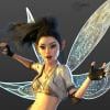
So, when this came straight on the heels of Halloween, the first thing that jumped into my head was Weeping Angels. After initially jumping way too far into the deep end, I drastically pared back my scope: I first want to make sure I have a good monster, then construct the scene around them (they do generally hunt in packs).
Weeping Angle Test 0
At this point I've been mostly focussing on the materials and pose. I'm using Ceramics for Iray as a starting point and experimenting from there.The ground plane is an untextured primitive whose sole purpose is providing a static 'ground' for dForce, and the only lighting is iRay's default Sun-Sky.
I know you have the wings down already but the section from the back to the first joint should go down some to give more of the drooping effect of despair
the character is superfluous although even the dress was changed textures. its more for scale than anything else. the light is a early morning scene increasing the candle emission may not make the difference unless you want the ceiling a bit brighter.
here is what I'll do. I'll remove that lady and put two others from another scene who are out of the way then up the light some but i'm not sure it'll do what you wanted.
Haha, mostly it should do what you want it to do, what I say is just thoughts which can point in different directions, what you make of that is with you :D
About the light, yes that is sometimes a dilemma to combine a nice light setting with effectively lighting the parts you want lighted. I like the general light so maybe its just playing a bit with intensities in tone mapping to give it a tad more edge
Version c here, finaly (things were timpermental fot a few days, including but not limited to my layout reseting on me.)
Some more texture tweeking on the set, moved the props on the bar so it was as if the guy seated there had been using them instead of them set out for someone, and added a third character who is stepping out. Material work was done on the new character's Crome
where do I downoad the scene
Ups, that should be your scene , not sure why the y went missing
I'm sorry for the inconvienience, I hope this answers your question?
Now I will go and correct that
This is probably the only image I'm going to enter this month, because my inspo-jar is empty and I need a short break from Dazzing. I didn't even have the challenge in mind when I set this scene up, but there are so many shaders going on here I figured I might as well enter it. So what have I done here? Going left to right.
Adana: Her hair's been dyed, using Sloshwerks' hair shaders. The base with the dark roots is a preset, and I applied a bubble-gum pink to the outer layer of her hair. Her dress texture originally comes with a translucent black shiffon overlay, which I applied a lace shader by JGreenlees to. It allowed the roses to show their colours (heh) a little more freshly, and casts a nifty shadow. Her stockings come with 3DUniverse's Rayn character, and I just changed the colour in the texture-tab. All the girls are wearing them, actually.
Ben: He uuuh... I think the only texture change his outfit's had is a suede shader applied to part of the boots. Oh, and I dyed his eyebrows black, since they're fibermesh. They're from the Kennady & Regan set.
Riana: Every single fabric texture is a shader. Her dress, the Isabel outfit by Arryn & Onnel, has a lot of material zones. The main dress is a dark purple velvet, also one of Jen's superb shaders. All the ruffles have been hit with lace, of a more thick-threaded (I don't know much terminology here) kind than what I used on the sleeves. The collar and panel thing (yeh) aren't actually part of the dress. I put a t-shirt underneath, and used an invisibility shader to remove the sleeves. The belt and ribbons are a satin texture from not-here. Her stockings just had the colour changed, but her boots have been retextured all over except from the soles.
Lilo: She's also wearing an Arryn & Onnel dress, called "Dorothy" I believe. The black part with Halloween patterns is the Iray Magic set by Denki Gaka; belt, ruffles and boot laces are from Jen's Sparkling set. The spiderweb lace on the stockings is also by Jen. I hoard her shaders! Putting a glass shader onto the pendant didn't work out so well. It was supposed to have colours similar to her hair, but it just looks opaque. The hair-dye is another premade mix from the Sloshwerks set.
Iris: Her hair's been shadered black, with a purple streak on the left side. The shirt is an original texture, but the dress is wearing (?!) the Iray Magic shaders with foil patterns. The sleeves are from the Emotions for Josie set for G2F, and has velvet and lace shadering going on.
The house: I re-textured the siding with a cotton base. Yes.
I'll update this post to put in more links if you want, but right now I'm tired and can't brain a little busy.
no worries, I thought that would have been a great challenge (you give the scene and we spice it up) maybe another time
The thing about a dark room is our eyes adjust until we can see everything, (unless the room is too dark.) This room has plenty of light, and your eyes would adjust to where you could actually see the characters as more than just dark shapes, (with emissive eyes!) The easiest way I've found to accomplish that is with a Ghost Light. For an image like this one, I would set up a vertical plane, (Z-Positve axis,) and position it where it would cast light on the entire area in the camera frame. With Cutout Opacity set to something like 0.00000001, there is no specularity and it won't show if any part of it is in the camera frame. It doesn't take much light to simulate the eyes' ability to see detail in a low light situation. And it's always an option to use Tone Mapping to darken the image, if necessary.
I like where you're going with this image. I just want to be able to see the characters, too.
I have retextured the Parkside High Lobby to look like a trendy nightclub
This looks really good. I love what you've done. Looking at it again, I noticed the moon shining through the window. And then I noticed the shadows are falling the wrong direction for the moon to be lighting the scene.
I've noticed the effect, and never figured out how to counter it, of shadows falling one way on one side of the image and another on the other side, like there was a magnet in the middle of the scene they were all stretching toward! You cans see it here, to some extent, where the light between the shadows in the back appears to be straight across, while both light and shadow in the foreground are going more at an angle from front to back. At least it's not too pronounced. I only see it because of past experiences with this phenomenon.
In this image, removing the moon from the background would help the "uncanny valley" feeling of the shadows "going the wrong way", but I think the overall image would suffer from it being gone. I love seeing it in the window and reflected in the floor. Where is the light actually coming from? Is it all one HDRI with the moon and other light? Have you tried the render with light coming from the same direction as the moon? (I'm curious how much that would change the mood of the scene.)
I have to agree with Linwelly on the placement of the figure in the scene. I love the dress, and that hair looks perfect with it. But seeing her backside isn't all that interesting. Maybe seeing her halfway between her backside and her facing to the right, so a "3/4 profile," might add interest without losing that great look of her hair with that dress.
Regardless, I'm looking forward to seeing where you go from here.
quick answer to the moonlight and the heavy light the moon is up during the morning the sun is at another angle the reflection on the floor is angle of view even without the moon you see whatever is reflected in your direction.
EDIT: what I forgot to mention the moon is lit up by the sun which is why you see a bit less than half of the moon also showing where the sun is in relation to the scene.
just like on a lake any source of light will make traced reflection towards the viewer while emited light can be in a given direction other than directly at the viewer.
well looks like the redo file at 10mb wont load
At the moment, it sounds like you're calling your Weeping Angel a monster!

I'm not sure what direction you plan on taking this, whether your going for a ceramic look in the end, or something else…
You're figure's feet aren't actually on the plane. I think if you use Align, you can get her feet just on top of it. Then you can tweak until her toes look to be on the plane. This will probably put the dress below the plane. It looks like you haven't run dForce yet, or the dress would be pooling around her feet a bit. If you use the Animated Timeline option, you can start her slightly above the plane and then move down until her feet look natural by the end of the animation.
To use Align, open the Align pane, (main menu, Window > Panes(Tabs) > Align.) Select the plane first and then the figure, holding down the Ctrl key. In the Align pane, make sure X Axis and Z Axis both show No Change. For the Y Axis, select Stack : Above (+Y). Then click on Apply. IF you're using the Animated Timeline, use Align where the pose is complete, hopefully with a a dozen or more frames after to let the cloth settle.
I think dragoneye002 has a point about the wings. I recognize MorningStar wings. They have a number of wing-specific bones for both left and right. You can tweak those bones to make the wings droop even more, create asymmetrical differences, and you can move the wings down her back using the Y-Translate of the highest level wing bones, lWing1 and rWing1.
This is a really nice start. I can hardly wait to see the rest of the scene!
So... the geometry editing is taking a while... I've gone through 4 partial renders and still find things that need fixing, and I haven't even done the custom character materials yet let alone the outfit, This could be a while. Also moving around the flora to get the right effect is... time consuming.:) I am not posting this thing until it perfect. then it's getting a 4K overhaul.
ok here is a smaller file size with the candles at 3X's emission and no lady in the center which unfortunately made the pic into an easy to copy backdrop hense the big name across it.
you can see more of the detail of the wood carvings under the windows plus this one has the regalia and a quick change to the carpet (didn't work because the maping is sloppy)
if its a nightclub do one of two things darken the wall colors or darken the light through the windows to simulate night time you can do both if the interior is seperately lit up.
Wanted to get my WIP to get suggestions. Two things I noticed was the grass seems to be to plastic looking and not really very dense maybe because of the angle (using Realistic Grass Evolution). Second is the walls, does the bump seem to high?
Sorry for the graininess, I decided to stop it early instead of processing through the whole thing.