Cheetiot's 2nd bunch of questions. Apologies once again...
 cheetiot
Posts: 25
cheetiot
Posts: 25
Hi all. Just looking for some advice and opinions on the following things:
1. In surface settings, do the best specular results usually come from putting a map in to the specular color or the specular strength. And does your opinion change depending on the shader used?
2. I've only played with it a little, but the specular setting on the new subsurface shader seem to be a little weird. When I turn up the strength and glossiness to create stronger, more defined highlights, when I render the highlights are actually much weaker. Has anyone else had this?
3. A while back I tried using a conforming prop on Genesis, and applied all the same surface settings to it as those that were on Genesis. However, it rendered a different colour, which I traced back to the subsurface settings (this is using UberSurface). These settings did not seem to work on the conforming prop. Am I assuming correctly that subsurface will only work if it's a full 3D model, and what essentially is a 2D plane will get no benefit from it?
4. I know I'm not allowed to use parts of the Genesis mesh in making an item to distribute, but is there any reason why this can not be done for making personal items and props that only I will use? I'm thinking of trying to make some hair, and for the skullcap I was just going to copy the top of Genesis' head and use that as the base to work from.
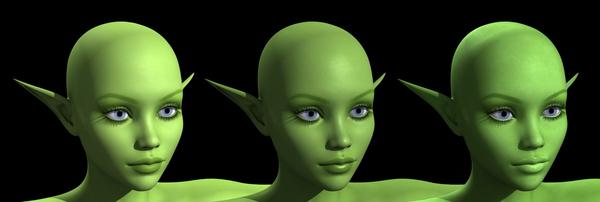
5. And finally, going back to surface settings, can I ask for advice on the picture. It's a simple UE2 and 2 spotlight setup, but I've played around with different skin surface settings for each option. Can I ask for opinions on which version is best, why, and what I could do to improve. I know there's never a single way to do things right, but like I say I'm just looking for opinions and options.
Thanks for any help
Cheet
Daz 3D is part of 
Connect
DAZ Productions, Inc.
7533 S Center View Ct #4664
West Jordan, UT 84084
Licensing Agreement | Terms of Service | Privacy Policy | EULA
© 2025 Daz Productions Inc. All Rights Reserved.
Comments
1. Specular colour isn't the same as specular strength. The strength should be a grayscale image with the darker areas being duller and the white areas being more reflective. You can put a colour map into the strength, but it won't give ideal results. It's very useful if you don't want a uniform sheen on an object or figure.
2. The higher the glossiness, the smaller the highlights become. At full glossiness, the highlights become so tiny that they disappear altogether. Bear this in mind when applying the setting and lower it down if they vanish.
3. Ensure that both of the surfaces are using the same shader. Different shaders, even if they both support subsurface settings, will work very uniquely. You can apply a base shader of the correct type and then copy-paste the settings over to ensure everything works. Note that with Genesis, you may need to correct any UV settings as these are not copied.
4. The rules are against distribution. As far as I am aware there is no problem with you using the mesh for your own personal needs. As long as the derived item is not distributed, you should be fine.
5. My personal choice would be the 3rd. The others seem to lose a bit of detail with the settings.
1 I found that having the gray-scale specular strength map in the specular color channel does work about the same but can make the colors a little duller.
3 I would have experiment to be sure but I suspect an objects mesh density would have an effect on something like subsurface scattering.
Answering the ones I can add something to while I'm on lunch break...
1. If you don't want the entire object to have the same specular highlight, then (most often) you should put the grayscale map in the Strength value. You can put a grayscale map in the color value and it will have a similar effect because the strength is multipled by the color. But depending on which shader is being used, that might not work well. Some shaders blend the color of the specular highlight with the color of the diffuse map, then multiply by strength; so you could get a different effect.
3. Many complex shaders may have slightly different looks based on the underlying geometry. For instance, UberSurface has a fresnel setting to it that will change the surface as you get closer to the edges. However, the other huge difference can be that a curved surface like a human body is going to have much more variation in the angle of the surface norman from one polygon to the next than something that is modeled to be a hard object. So the surface will look different, just because of the variance from one surface patch to the next, even if the values and such are the same.
5. Personal preference, I suppose and it varies based on monitor setups, etc. For instance on my laptop, your images showed much differntly than they did just now when I put it back into the docking station and viewed it on my monitor. Since you asked for preference ... I like the middle one as it feels a bit richer in saturation and the lips stand out better.
Thanks for the responses. I'm definitely going to have to play with the options a bit more.
Yep they both were, and all the same settings. If I turned off subsurface and rendered everything looked fine, you couldn't even see the seam. Oh well. One of those things.