Endlessly ongoing... playing cards/casino chips/coins/banknotes scatter... hiatus time (still)
 3dcheapskate
Posts: 2,719
This thread will result in a freebie - I'll add the link here when I reach that point.  Also links to pre-release/test stuff.
- 22 Feb 2020: DS Chip-Stack Pre-Release 0.1
- 24 Feb 2020: Poser 54 Chip-Scatter Adjustable Prop Pre-Release 0.1
- 22 Feb 2021: Monte Dubbioso Casino Chip Textures Release 1
- 20 Mar 2021: First public test release of the DAZ Studio native playing cards scatter figure
- 21 Mar 2021: First public test release of the Poser playing cards scatter figure
There are plenty of freebie playing cards* (individual cards, hands, and decks) around, but none of them really allow me to do what I want.What do Iwant to do ? I don'treally know,but I do know that I can't easily do it with any of the freebies I've found.
Firstly I want the faces of all 52 cards (or 54 if you include jokers) on a single image. So I found a public domain image of the faces of a full standard English deck on Wikipedia and used it to create texture maps for decks with/without jokers. 1024x1024 75% JPG versions of both attached - use them as you want.
I want to easily change the backs, so I found a couple of nice images with CC Attribution 2.0 Generic (CC BY 2.0) licences ( 1941 Blondie Comic card back from Mark Anderson's Flickr photostream, and Streamline No. 1 card back from Dave Marriot Jr's blog) and fiddled with them in GIMP to get whatIwanted. I also created a couple of diamond pattern backs from scratch. Once again - use them as you want (but note the (CC BY 2.0) licences on the two artsy backs.
I created a single card mesh with rounded corners, all quads - 48 vertices, 46 faces per card. Three mat zones-face, edges, and back. Mapped the front to the top left card (2 of hearts) on my 54 card map, the back to the full UV map area, and the edges to pick out astripfrom the back. Then duplicated the mesh, moving it up slightly, and adjusted the UV mapping of its front to the next card (3 of hearts).
Etc.
Until I had a deck of 54 cards.
Then the fun started - morph targets. Just two at present:
- A randomish rotation of randomish cards
- X-translate each card a fixed distance further to the right than the previous card
At this point I remembered that what I want is a whole pack of cards thrown into the air with each card in a randomish position and orientation...
...to be continued (and released as a freebie at some point).
Feedback, suggestions, ideas, etc might help.I can see myself getting bored with this quite easily... 
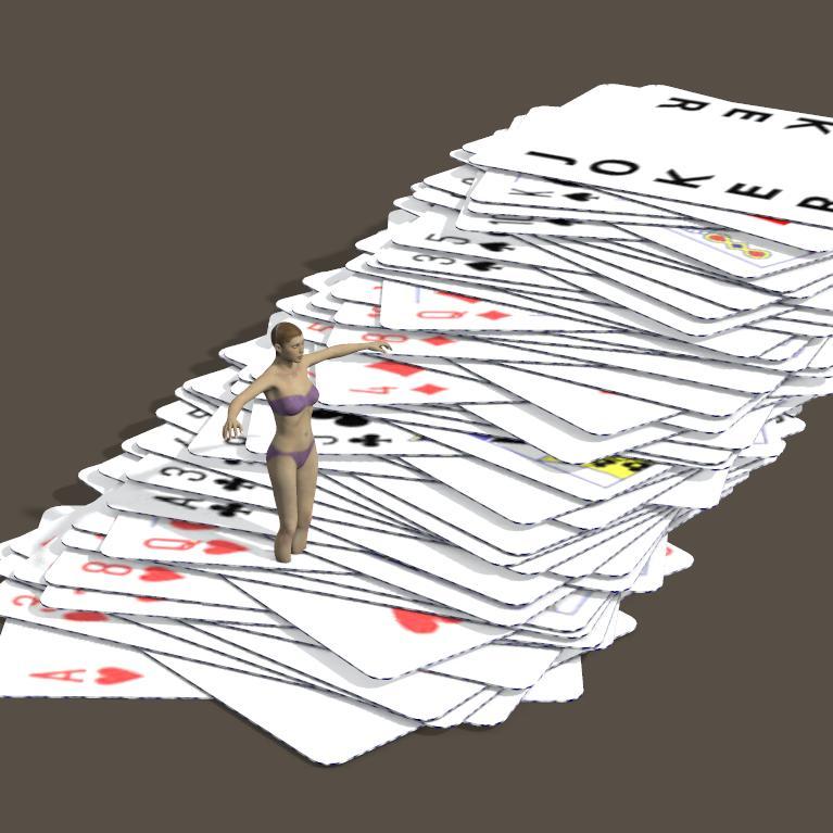
Here's a teaser.
*e.g. Trekkiegrrrl's Playing cards with morphs, DraagonStorm's Royal Silver Playing Cards, Jim's Playing Cards (Jim Farris - Xaa), Adam Thwaites Playing Card Prop (second item on this page)...




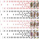

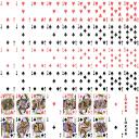


Comments
A few observations (notes to self, or pointers to a couple of areas where other folks thoughts might help?):
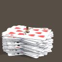
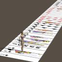
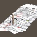
...with one extra morph (a randomish z translationfor each individualcard) dialled up to several hundred percent, the two existing morphs (randomish rotation set to 100%,and the slide left set to several hundred%), and the prop (the full deck of 54 cards is a single prop) scaled down to10% of the current huge default size we're getting somewhere.
But exactly where, I'm not sure...
Now if I add randomish x and z rotations* and randomish x and y translations that should give me a nice 'whole deck thrown in the air in despair' look, which will make me happy.
But what would be useful for those who prefer their virtual cards to remain on the table (or in the hand) ?
*Whoops! I'd forgotten about the problems that the old 'using linear morphs to create rotations' thing would cause - see my next post
I don't know about dispair, the kids years back used to love playing "52 card pickup" which is throwing a deck of cards up in the air. Or down from the upper staircase. The concept was to ask somebody who hasn't heard of the game, if they wanted to play 52 card pick up. They say yes. The kids toss the deck and the newcomer gets to pick up all the cards.
I remember that - one of the best card games ever invented (along with "cheat") !
I've also modified the thread title slightly.
(Edit 6am UTC Sat 7 Dec) Of course, I'd forgotten that adding separate randomish x and z rotation morphs is fine, as long as you don't want to combine them or use any morph values other than exactly 100%.It's the old 'using linear morphs to create rotations' thing.
So useless really for my 54 card pickup deck.
Maybe I'll have to do a (couple of) 'Randomish Rotations' morphs that each include randomish x, y, and z rotations of each card. Morphs to be used at 100% only. Separate x, y, and z translation morphs would then be fine for adding extra randomish-looking-ness.
How about some chips* to go with the 54 card pickup deck** ?
Next job - throw a whole load of chips into the air too...
*These'll be included when I eventually relese this.
**I needed a break from the cards - they're temporarily on hold
Edit (added midday UTC Sat 7 Dec): I now have a test prop in progress containing 40 chips.
Three translate morphs (x, y, and z) move each chip to a randomish position along that axes. So dialing each to a different value gives some nice variation.
A single rotation morph (only intended for use at +100%) orients each chip with a randomish x, y, and/or z rotation. Maybe I'll add a couple of alternative rotation morphs too.
There's only one real problem that I see - intersecting chips...
A probable solution (that I've used before I think?) is to ensure that when creating the x,y,z translate morphs (i.e. the 100% values) each chip is moved to a position where it cannot interfere with any other. Using the morph at 100% or higher will ensure no intersection. Main proviso is that all chips must be in exactly the same position on that axis in the unmorphed state.
I should also probably redo the mesh. The one I'm using has 74 vertices / 78 faces, but was created so that I could use material zones for the white segments around the edges. I wasn't intending to do any UV mapping or texture image, but after googling some images I just got this inexplicable urge. Anyway, the two faces should really be reduced to simple triangle fans, so 38 vertices per chipand 54 faces (or 36 if I do tris to quads on the triangle fans).
Yes chips will come in handy too :-)
Maybe some banknotes too ?
Thinks: With extra morphs to make the casino chips thinner and different sizes they could work as coins
(Textures used on attached image are from Jim Farris (Xaa)'s Free Money! after desaturating and applying an additive dark green layer)
(Edit 3pm UTC Mon 9 Dec) Anyway, I think I've sorted out the morphs that'll work best for me. Each prop (currently two of them - a 54 cards prop, and a 50 casino chip prop) will have 3 separate morphs (cleverly labeled x-tran, y-tran, and z-tran) that move each card/chip a randomish distance along the relevant axis, plus one (or more) rotation morphs (which only work as intended at 100%) giving each card/chip a randomish rotation about a randomish axis through its own centre.
My excuse is that I've never been inside a casino. I simply googled "poker chips" and the majority of images were these plastic toy ones - so I went with them. Although I did do a bit of background reading (okay, Wikipedia) and learnt that genuine casino chips are made from compression molded cat litter*. Unused I hope.
Edit: Using your attached image as a quick test indicates two other things: 1) I'd need to add a mask** to separate the circular label (glossy, papery-plasticy) from the three-colour clay (clay-y); 2) I'd need to remap the edge of the chip, because the current mapping assumes that edge is the same thing repeated 6 times.
*yes, I know that's not quite what it says... but I prefer my version !
**or split into two material zones.
Personally I suggest taking a few hundred to Vegas and doing "research" but I love craps. An alternative would be to Google casino chips and maybe include some casino names. Good luck either way.
Hello
good link for info .They work for many Casino in the world.one factory near my home FRANCECARTES in ST-MAX first name LADUCALE
https://www.cartes-production.com/
Thanks for both the links.
One of my problems is that I get side-tracked rather easily. For instance, the "...maybe include some casino names..." has inspired me to create a few Casino specific chip labels related to the specific project for which I started this...
Also, while looking at Italian, Spanish, etc decks which use different suits, I had another stupid idea. Aces of Klingons and Vulcans attached - I'm sure these must exist for real somewhere. N.B. This particular card mesh, from one of the existing freebies I found, uses a single ngon (36 vertices) for the front of the card. The render is in Poser Pro 2014. You may notice an artefact on the front of each card in the render, due to the way Poser splits the face into triangles, some of which are long and thin, a big no-no since the early days. (Just tried in DAZ Studio 4.11 and the problem doesn't occur)
I also also have an urge to create a full NVIATWAS deck...
(Note to tos moral guardians: she's wearing a full, albeit rather high-cut, swimsuit style costume - Aery Soul's Aermy). Extra image uploaded as verification... oooo... I'm getting a lovely Barbarella/Pygar vibe from that!)
Anyway, back to the cards for a moment. I noted in the previous post about the render artefact on some of the existing freebie cards.As I said this doesn't appear to be a problem in DS 4.11
But since I'm working in Poser I created a very simple mesh with a slight card thickness(38 vertices / 36 faces) - it's basically a 16 vertex cylinder extruded in two directions, with tris to quads on the triangle fans. I prefered to create an extra quad for the main part of each of the front/back faces, rather than leaving all the edges connecting to a singlevertex in the centre.
Of course this mesh doesn't allow any bending of the cards.
And it won't subdivide nicely.
Another option would be to use a simple 4 vertex/2 face mesh with different textures for front and back, and transparency to make the corners rounded
If you are referring to this mesh:
Yes it can be subdivided, etc. Takes a bit of fiddling but I know a way using Hexagon. To start with, one layer thick, then afterwards double it up if so desired.
If this is totally out of line please pardon, am collecting coal for the fireplace ;-)
The chips appear to be about 3x taller/thicker than standard chips, in proportion to their diameters. Or maybe I'm just used to the cheap "Bicycle" ones from WalMart.
It's not just you. I think the same thing, way, way, to thick.
I'd also like to see a set of cards based on the old french picture post cards. I think they still make that sort.
again, real chips(the casinos insist n calling them checks BTW) are about 3 times taller and much heavier. feel really good too. I don't have a gambling addiction, I don't have a gambling addiction. Also the color to denomination is different from any at home set or TV movie casino. If you care to be accurate the ones I saw in the casinos on the Red River were $.5 pink, $1 off white, $5 redish, $25 green, $100 black, $500, $10,000 orange(only saw those used once $21,000 dollars in play on every roll. Poor guy said they told him he had had enough when he was only up $80,000. He was unhappy.) Those are the only values up to $10,000, there is NEVER a $10. When I was in Vegas 30 odd years ago, there was a game called $.10 roulette where you got tiny chips of all colors each player getting their own color. I don't suggest you use these because it was a sucky game for people who couldn't afford to play and probably isn't even played now.
Great idea. Klingon and Vulcan cards should be great for playing physbin. Depending on the day of week of course.
hello all
the chip measure is 39 mm x 3.4 mm
for various playing cards you can try the world of playing cards
https://www.wopc.co.uk/
if you want some unusual cards i collect them.in the past i was a legerdemain. one Magician if you prefer
Sorry, misunderstanding due to me not being precise - I was thinking about the SubD that you apply to the whole mesh from within Poser/DS.
If you apply (in DS: Edit >Object > Geometry >Convert To SubD) just 1 level of that SubD then the edge ring of very thin faces that forms the side/edge/thickness of the card 'creeps' onto the face. So in my view it "doesn't work" (to be more precise, it specifically "doesn't work" with the settings I was using - there are probably a variety of ways round it)
My chip model at present is still basically an 18-sided cylinder (or an extruded octadecagon (or octakaidecagon) or 18-gon if you prefer), and although that's probably okay for the cheapo plastic ones, I don't think it'll pass muster for the expensivo compression-molded cat-litter casino-standard chips !
Using the DS/Poser inbuilt SubD turns the existing model into an overinflated disc. That reminded me of my Preventing Edges On Architectural Etc Models Being Too Sharp In Poser thread over at Renderosity, so I tried the control edges...
Regarding the genuine casino chip dimensions - the dimensions of my model are what is customarily referred to as "arbitrary"
I'm happy to go with REIVAX's 39 × 3.4 if other people agree.
Do you mean postcard images on the faces of all the cards ? I tried googling various terms but nothing seems to match your description. Can you find an image/link ? I think that copyright would be a problem.
I got the impression (from my aforementioned minimal 'researchh') that values and colours varied from casino to casino. And from the pictures many casinos seem to use two or three colours on a single chip.
You know, while we're on the subject of playing cards.... have you ever thought of making kids card games? I mean, they actually make dedicated Go Fish card decks, Old Maid card decks, find-the-pairs card decks, and so on. I've been buying a few different examples of those in real life with the idea of maybe making some Daz Studio prop ones myself.
That's a great link, Thanks. Although I'm sure there'd be copyright problems in using photos/scans of real cards. But fantastic for ideas.
Ah ! Are the "New Zealand Souvenir" deck from REIVAX's link the sort of thing your thinking of ? Except with French postcards.
Most of the freebie cards I found (links listed at the bottom of the OP) seemed to be one card is one prop, and use one texture image per card. Its easy to put any DIY image (e.g my Aces of Klingons and Vulcans) onto any of those. But I reckon you'd have the same thought as I did - I wanted a full deck in a single prop, with one texture image for a full deck (well, for the faces - the back is a separate image at present). That immediately gave me the problem of how many cards in a deck - 52 (4 suits of 13cards) or 54 (4 suits of 13 cards plus 2 jokers) ?
It appears that I've gone for the 54 card deck. It wasn't a deeply considered decision- I just thouight "I want jokers!". Plus 54 standardish dimension cards in a 9x6 grid are almost a square. So I've currently got a single prop containing 54 separate cards, and I have 54 card faces mapped to a single image.
At the back of my mind was a simple idea of how to handle smaller decks - e.g. a "52-card" morph which simply z translates the two jokers several hundred metres vertically downwards!
But larger decks would be a problem -e.g. Jim Farris (Xaa) also did a 78 card Rider-Waite tarot deck freebie (one card one prop, one card one texture image). My prop as it stands couldn't cope with that.
Any idea how many cards there are in the various kids card game decks ?
Assuming that the basic prop contains an adequate number of cards then a simple chequered UV template (PNG, not JPG which is what I've attached) would make it easy for anybody to create their own deck texture by cut-and-pasting separate card faces into each rectangle.
I haven't really started thinking about any morphs other than those for "54-card pickup" (i.e. the whole deck chucked into the air). I have a feeling it may be better to create separate props (using the same basic single card mesh and texture image) for hands, piles of cards,etc.
Edit (18 March 2021): I've changed the template from a 1024x1024 JPG (what was I thinking using a two colour JPG as a template?) to a 1026x1026 PNG. Yes, 1026 not 1024 because 6 x 171 = 1026 and 9 x 114 = 1026 meaning that each card is 114 x 171. Not nice numbers, but integers, which is what I want. Easy to scale down to 1024x1024 after all cards are added, if necessary.
Okay. One tess line in the middle of the two planes could help that. {also makes a nice break for uvmapping}
I don't have the template handy, think it was 6 per page ... if laid out just so, one can print out one side of the cards, flip the paper over and then print out the other side. Thin cardstock. Laminate. Fine sandpaper to smooth the edges.
Hello all
french playing cards svg
https://upload.wikimedia.org/wikipedia/commons/a/a1/Svg-cards-2.0.svg
https://fr.wikipedia.org/wiki/Fichier:Svg-cards-2.0.svg
with link to sourceforge
another playing cards spanish Baraja,Atlasnye,German ,etc some back
https://commons.wikimedia.org/wiki/Category:SVG_playing_cards
the chip measure is not mine but the standard one
in the past i doing my show in many french Casino
perhaps utility
https://www.lybrary.com/card_designer/
free for commercial
https://pixabay.com/vectors/card-deck-deck-cards-playing-cards-161536/
There are generally 3 colors total but the colors I mentioned are the majority color. Other colors will vary by casino as will the picture in the middle. Usually the casino logo. There may be variations but the casinos I have seen followed this format.
The kids-card decks I've bought and examined tend to be the same number of cards as a regular deck of cards, while some of them seem to be a few less, i.e. some of the match-the-pair games. The different Old Maid ones typically came with the same number of cards, but one of those wasn't actually a playable card and had the instructions on it. In fact, a lot of the kids card decks I got typically came with one card that had the instructions on it.
Here's a first try at a proper casino chip, using the 11.47:1 diameter:thickness ratio, and based on a photo of a Casino de Montreal chip that google showed me.
I'm trying to decide how many segments are necessary to avoid it looking too polygonish.The three chips in the top row have 16, 24, and 32 while thosein the bottom row have 18, 20 and 22.The black bits on the edges of some of the chips are because of the texture image - I should extend the colour slightly beyond the UV mapping lines
If I want to use the Poser/DS built-in SubD to make the chips less polygonish then I'll need to add control edges to stop the chips getting that classic inflated look. Just adding 4 control edges (one either side of both the upper and lower edge loops that bound the side of the chip) will more than double the face count. Two control edges would probably do. But I'd prefer not to bother, and instead to use a sufficient number of segments in the basic mesh to make SubD unnecessary. I'm thinking that 16/18 segments isn't enough, but 20/22/24 might be okay.
Regarding colours and values google showed me photos of a couple of sets of chips - the following refer to those specific photos, whose URLs I didn't note:
Monte Carlo ($):: 1=white, 5=red, 10=blue, 25=green, 50=blue, 100=black, 500=black, 1000=yellow, 5000=pink, 10000=orange ...(two additional colours used on each chip which make each unique)
Macau (MOP$ ?): 1=grey, 2=orange, 5=red, 10=blue(dark), 25=green, 50=blue(light), 100=brown, 500=purple, 1000=yellow ...(all are mainly black but with the relevant highlight colour)
That does more or less match up with what dennisgray41 said, i.e. $.5 pink, $1 off white, $5 redish, $25 green, $100 black, $500 ???, $10,000 orange
So maybe I'll take a sort of average: (0.5=pink), 1=grey or white, (2=orange), 5=red, (10=dark blue), 25=green, (50=light blue), 100=black or brown, 500=black or purple, (1000=yellow), (5000=pink), (10000=orange)
I was going to ask how the value was shown on a $0.5 chip, but googling "casino de montreal chip" indicates 50¢ (and it's yellow). It also shows Casino de Montreal chips with asimilar design and value/colour $1=white-with-a-hint-of-beige, $25=green, and $2.50=sky blue. And the $ symbol is actually shown after the amounts.
Looking better.