Can there be TOO MUCH detail?
 Upirium
Posts: 705
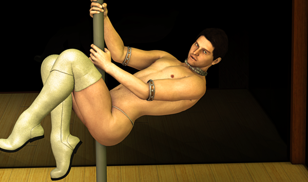
Lately I've been wondering if I'm putting TOO much detail in my art. I love it sometimes; the tiny miniscule details in the image but is it too much? Right now I'm working on an image where you can see almost every crease on every feather on these wings. You can see the individual pores and the veins on this man's skin. Is it TOO much though? Unfortunately I can't post it here but what I can post here (I think) is this. I think...I mean it's..the side of his leg/butt? idk.
But I think I like detial, but then I see some others and I just feel like...my art sucks. Yeah it has detail, but is it good? Idk. Too much detail? Does it just ruin things? What do you think?


strippercas.png
1073 x 635 - 770K


Comments
I guess that depends what you're going for. If you want realism, then the little details make all the difference, but that goes for the background as well as the foreground. If you want a more toonish appearance then less is often more. Naked male pole-dancers aren't really my thing, so I'd be hard-pressed to comment on your image directly, but if you tailor the level of detail for the piece you're working on then you can't go far wrong.
I'm not an artist, so please take my words as those of a hobbyist who doesn't know better. :-)
I think it all burns down to what "story" your image is telling.
The important thing should receive all the attention, so that the "story" will get across to your audience. Sometimes, a lot of detail is part of the story, to showcase one or the other element of your story.
For example, your pole dancer - I look at him and wonder, what exactly is the story you try to tell? He's hanging on his pole with his skimpwear and nice boots, but in all his perfection, he's just alone on that stage. No audience, he's not looking at the camera (so I am not his audience, neither). There's no money on the floor or beer bottles, or whatever would connect him to something, have him interact with something. For example, if you replace the background by a mirror, and have a person stand to the right side in the darkness, so that you can just "feel" there's someone there your pole dancer is looking at, you wouldn't change much about the details of the pole dancer, but add the detail of audience.
Right now, he's kind of dancing in a vaccuum, in his very own bubble of the universe...
So, my very amateurish opinion is that detail is all nice and good, but if you sacrifice story in favor of detail, it will detract from your image. On the other hand, its your artwork. Most of all, you have to like what you are doing. So, just how much detail is enough, is ultimately up to you. There's no right or wrong in art.
lighting conveys a whole lotta info of the story
your pole dancer is prolly in a spotlight or darkly lit club
you want to guide our eyes, give a path for our eyes to follow in the scene
his boots steal the scene. perspective is an important detail.
Here's a very cool article on composition by Ken Gilliland: http://www.empken.com/tutorials/composition.pdf
And there's that old book by Andrew Loomis, Creative Illustration. It was meant for traditional artists, but I'd say it's useful for every artist since it devotes a lot of time to composition and how this or that composition affects the viewer's mood, all that stuff. Very enlightening. His books have been out of print until recently, so maybe try a library.
double post
Yes, you can have too much detail.
It's important to find the right level of detail when creating an image - too much can be distracting or overwhelming, while too little can be uninteresting or vague. The real question you should ask is whether the detail you're adding is necessary for the image you're creating.
It also depends on the look you want to achieve.
If you're going for ultra-realism, details are important and you probably need as many as you can get your software to render. If you're going for minimalism (the way I usually do), you can strip out most details and still have a good image.
The more detail you have, the more accurate everything else has to be. Otherwise you enter the "uncanny valley" really quickly. For example, in the image you've attached, the skin details are good, but any sense of realism is blown by the pose, which has a number of major "this isn't real" tells. (Muscles are flexing wrong to be holding up that much weight, the jewellery is skin tight and hanging in the wrong positions, the toes are bent far too much for a leather shoe that's not pressing against a surface, and, most tellingly, the pole being in a position that would require him to be missing several important pieces of anatomy in order to be tolerable.)