Caressed by light [commercial]
 Khory
Posts: 3,854
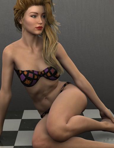
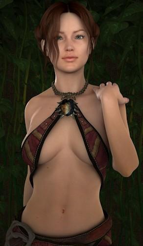
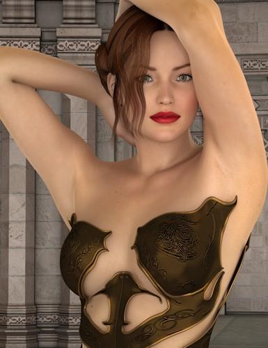
I've released a set with 16 lights that are perfect for indoor portraits. They are especially effective for the new AoA SSS characters. Each light has an uberenviroment light that is based on a different interior space so they span a wide variety of colors and ambient light levels.

board3.jpg
385 x 500 - 37K

board2.jpg
292 x 500 - 32K

Board1.jpg
385 x 500 - 49K


Comments
VERY nice! :D
My first March Madness purchase!
Can't wait to play :)
Thanks. I bought the set and like them! I got good results right out of the box and that's unusual for me!
I'm so pleased your liking them! I am really big on what you see is what you get and easy to use. I tested them on a pretty wide variety of characters and while there are a couple that were better with some characters more than others I was really pleased with how many of them did fine under any of the light sets.
Here is a render I did for the March Madness Render Contest using your lights. I love them.
Lovely render fictionalromance!
So busy today, no time to play properly.
But I did set this one up as I sipped my sleepy tea.
Caressed by Light is straight out of the box.
I forget the number on this one, it has just a whisper of blue in it.
These lights are so clean.
Here is a quick one with zero post-work.
I am looking forward to working with these this weekend.
Great job, Khory!
These lights are amazing, and they render fairly fast too. Here are a couple of renders that I've done.
Thank you Ippotamus! And great job on the render. I know from experience that character can be a bit daunting to light at times.
And thank you Heatherlee! I particularly like that top render. I am overly fond of pale characters I think.
Wonderful Lights, they produce great results out of the box.
I have to wonder if the fellow in that first image is available.. Lovely renders both!
I'm not a FB person but I so wish there was a "like" button on threads sometimes. I like these.
Me too! And thank you again. I really wanted these to be something that were just going to "work". Initially I had a different product started for MM And it had a light component that I was really liking working with so I wanted to expand that concept. There was also a tutorial on character surfaces and the AoA SSS that was getting out of hand and I ended up breaking it out and expanding it as well. Sooner than later I hope to get back to the initial product and finish it.
Light extravaganza this week.
My weakness.
Came back to "Caressed by Light" to get this one done.
Swung the front light around to the other side so I could catch the shadow.
That took about 1 second.
No postwork in this image.
Love the settings on the UE2 here.
Khory did it right.
:)
You have no idea how happy hearing something like this makes me! I really wanted the UE2 lights to enhance things without taking over. I really like that image. But I have already admitted a soft spot for pale skin.
I am still loving these lights. Here's another one I did.
Her skin tone looks really lovely in that image. It has a really nice "depth" if you know what I mean. I'm so pleased your enjoying them. It is such a feel good moment when you get back "happy" from customers!
Thank you. Until I bought these lights I struggled with lighting but I am feel more confident that my renders look 100% better with them.
Thanks Khory and Whispers65.
The guy in the first image is a dial spin but does use Brandon, the texture is the Nevio one.
You did a beautiful job making him sultry. Not that the other fellow isn't fetching mind you.
One last one for these lights.
Obviously some post-work on this image.
But a nice, clean render is a very important part of that too.
Thanks again, Khory. :)
Ippotamus, I really like this one. The green girl rocks and I love the postwork.
effortless lighting, used light set 2, no tweaking.
Lovely render Heatherlee! Which character is that? She looks so normal even though she has makeup on. So many of the ones I end up with that have make up end up looking.. um.. strange? Faces don't really match bodies and stuff. Like they used a bottle of foundation and then painted everything back on.
Thanks Khory, that is Nikki by Virtual World for Dawn.
Well, she looks lovely but I am unlikely to ever even get around to installing Dawn. Le Sigh
I love these lights, they even work nice on textures without the fancy shaders. light set 12