Photorealistic renders in three steps in DAZ Studio
 fredgoff
Posts: 9
I've always been amazed at people who routinely post super photorealistic renders, and most of the time wind up getting depressed about it as I read about using plug ins, complex lighting, different rendering engines, tricky tweaks on materials, etc, etc, etc.
Then, tonight, I stumbled across a method that gives me some really good results in three simple steps: Two renders in DAZ, and one simple post-process in Photoshop or Photoshop elements.
I know a lot of folks here are always looking for ways to improve their renders, so I thought I'd share. So, get your model all staged and follow along.
Step zero, of course, is to set up your lighting. You will need at least two lights: An environment light that does occlusion such as Uberenvironment or the Age of Armour Advanced Ambient light. I prefer advanced ambient because you can use its flag feature to lower sample rates on hair so that your render doesn't slow to a crawl on transmapped hair.
The second light you'll need is a key light to cast shadows. In my examples, I actually used two shadow lights: a key light and a back light.
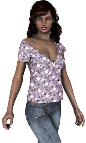
Step one: Set your ambient light to 100%, occlusion with soft shadows, turn off all other lights, and render.
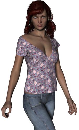
Step two: turn off your ambient light, and turn on your shadow lights. In my example, my key light was a distant light with raytraced shadows set at 25%, white at 90% intensity. The backlight was a white spotlight at 100% intensity, with raytraced shadows at 0% softness. Render.
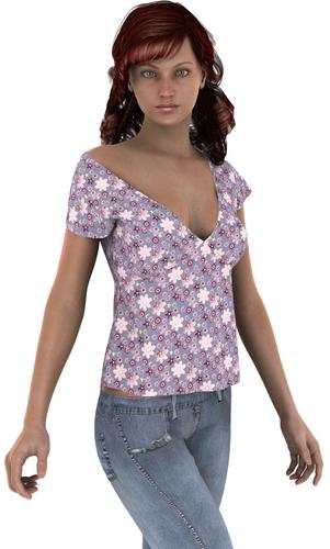
Step three: Open both images in either Photoshop or Photoshop Elements. Copy and paste your shadow image as a new layer on your ambient image. Convert the shadow image to black and white (Enhance > Convert to Black and White). Set the layer to Hard Light and the opacity to between 65 and 70 percent.
That's it! As you can see the results are very impressive. If you want, you can play around with the hard light opacity and the light levels of the shadow image until you get the exact look you like.
Enjoy.




Comments
Thanks, but which one is the final one? It's early here and I'm a bit too slow to notice the most subtle changes. I'd love a way to speed up rendering of hairs Neftis makes. I always use UberEnvironment, because I'm lazy, but those hairs - especially curly ones - are so long to render...
The images are first to last: ambient occlusion, then raytraced lights, then the mix. You can see the effect better if you click the thumbnails.
However, since my first post, I discovered that the important thing is the hard light mix on a black and white version of your render, and 100% strength on your occlusion.
Here's the deal. Real skin is imperfect. It has splotches, blemishes, uneven coloring, etc. Even with the best textures, CG skin is too perfect. What this tip does is add that skin imperfection. To my eye, it makes a render look much more like a photograph.
The first image is the stock V5 with the Bree texture with the Look at Me! eye texture, no postwork. The lighting is AOA's Advanced Ambient set to 100% and 128 samples (all other settings are default). The raytrace lighting is a distant light at 15% ray traced shadow with a 0.3 bias, 90% intensity and a raytraced backlight directly behind at 200% with 0% raytraced shadow a 0.3 bias. All lights are white. I then turned the gain down to 0.5 to prevent overexposure on the render. As you can see, the result looks very nice.
I created the second image by taking the first render into Photoshop Elements. I duplicated the layer and converted the new layer to black and white using the Portrait setting. I then set the blend to Hard Light and the opacity to 50%. I didn't do anything else.
To my eye, the first image looks like a very nice CG render. The second image looks like someone took a picture of a model. Be sure to click the thumbnail to see a larger version.
Here's another image with a 75% soft light instead of hard light. The imperfections are less pronounced, but the image is also truer to the colors of the original. It's a toss up as to which I like more.
I can't wait to try your suggestions when I have more time. You are not using photoshop bridge for any of this?
I understand what you mean about the realistic , blotchy , imperfect skin, however, I also think it's the eyes that make it or break it. It's one of the first things you look at. And if they are not right, then it looks CG. I wish the eyes were a lot better overall figures.
Find a set of eyes you like...and stick with them. You can 'mix and match' character textures...or even make your own presets, from combining several character's 'parts'. I often use eyes from a different character than the ones that came with whatever skin I'm using.
I think half of the people are using either Luxrender or Octane. I can't afford Photoshop. I'll need to use Gimp instead. Thanks for the tips though.
edit: I forgot to mention that uber lighting renders slowly even on a dual-core computer. I like using advance spotlight because I can set transmap hair to use fewer shadow samples than the skin.
Not to want to seem rude, but it looks much better and real the 1st image than all others. For me the problems is the shadows, are too dark, and with this method you are just burning them. Try this, make the same 1st image but set up another color of the shadow, not black, like a dark brown. Then with that same image duplicate it, turn it to black and white and instead of hard light set up overlay or soft light, with 50% opacity.
No offense taken. I prefer the final image myself, otherwise I wouldn't have posted the tip. I'll try your suggestion and see if I like how it looks.
In reply to some of the others, I don't have photoshop, so I don't use the bridge. I have a copy of Photoshop elements, which is good enough for what I want to do and costs a whole lot less. The GIMP may be free, but using it is more of a headache than I want to deal with.
I figure a lot of people who make these awesome renders are using Lux or Octane and spending 7 hours to do the render. I want something "good enough" that I can do in 30 minutes. This gets me toward that goal.
I mean, if we were all super hard-core photorealism, we wouldn't be happy until we could do this:
http://vimeo.com/38047046
Fredgoff -
Thank you for your information. I do a lot of postwork and use other methods to make my renders not look plastic. I quickly tried this and plan to spend the rest of the afternoon experimenting with it. I use blending modes a lot. I use Photoshop CC but I have reviewed graphic software for graphic companies for over 25 years. Elements is the product I would use if I didn't use Photoshop. It is truly an excellent product. For those who don't know it, I have a review on my website:http://www.perpetualvisions.com/new-articles/photoshop-elements12/photoshop-elements12.html.
Postwork on stills can work wonders. It takes less time to fix poke through using a rubber stamp than it often does in DAZ. I can't stress enough how postwork is useful. Now, I obviously am not a purist. I believe in using all the tools in my digital tool box. If I were doing promos, that would be different. Since I have been using Vue since 2000, I use it for all my scenes and renders. Multipass (which I believe DAZ is capable of doing. I read that somewhere) is wonderful for isolating elements, so you don't have to create selections by hand. Now that is time consuming.
Again, thanx Fredgoff for your ideas.
Below is a version using the tip previously. I switched the key light to Advanced spotlight so I could adjust the shadow colors to a deep brown (59,28,0). The first is using overlay at 50%. The second is using soft light at 50%. I upped the gain to 0.55 on the render settings to make the lighting a bit brighter. I think I like this look better. Thanks for the feedback.
You might try to eliminate the double highlights. I know now they are used all the time now and ewyes come with built in double reflections. When I did professional photography eons ago, it was a no no. Remove the larger one and see if you like it better. You might not. The rest is really nice. It definitely doesn't look plastic, but has a much more real feel.
Here's the last one, taking into account all the feedback I got, plus some hair (because I get tired of looking at bald models). I really like the look. I think this is good enough for me. It strikes a good balance between realism and render times (15 minutes with the hair on my machine), and is within my abilities to do.
Thanks for the feedback and help, all.
I agree with you. It looks really nice. It looks very real to me and yet a little soft as a portrait should be.
...
...so how would one go about this process in Paint Shop Pro or GIMP (Don't have Photoshop ore Elements)? In PSP there is nothing similar to a "Hard Light" setting.
I also have to push the opacity of the shadow layer much lower to between 30 - 40 % or it still looks like a B & W image.
Which version of Paint Shop Pro do you have? I think I remember soft and hard lighting settings back in PSP 6.
It's definately in 9 and X5.
You can also start with a black background and add these images on top using screen. by duplicating the layers, fiddling with opacity and other layer settings you can fine tune your results.
When using ambient type lighting, you need something for the light to interact with. TheSea has done some images encased in a cylinder that look impressive. The effect does not seem to be diminished by setting the cylinder to no shadows and not visible in render. I use it alot, and I can tell the difference when I go back in to fix something and forget to turn the cylinder back on...
interesting post thx for sharing that...
Here's an example of layers screen blended on a black background:
1. Post-worked
2. Blended (ambient @ 30%)
3. ambient
4. Key
Edit. Sorry, I'm having a hard time getting the images to post in the right order. they are sorting by size instead of post-order... :P
In PSP X6 Hard Light is one of the blend options for Layers.
For those who love to tinker, ambient occlusion and sub-surface scattering and uber lighting gizmos give you no end of experimentation. But 90% of a good image is simple pure lighting direction, color and intensity and shadows from a small set of basic DAZ lights.
For those of us not entering contests or planning on zooming in on pimples, pores and hairs, we don't really need all those over-the-top lighting sets. Learn the basics of good lighting before adventuring into the expensive lighting set du-jour.
Many of the examples I've seen presented over the years of images done with the expensive sophisticated lighting sets don't look as good to me as the artist brags they do. Yeah, some images are fantastic but they're about as rare as a really good new symphony. Learning the piano doesn't make you a Rachmaninoff.
Perfection is approached asymptotically. Mother Earth's been tweaking "Life" for 4 billion years and still isn't satisfied. Although she has been pleased with the cockroach! 8-o
Which version of Paint Shop Pro do you have? I think I remember soft and hard lighting settings back in PSP 6.
It's definately in 9 and X5.
You can also start with a black background and add these images on top using screen. by duplicating the layers, fiddling with opacity and other layer settings you can fine tune your results.
When using ambient type lighting, you need something for the light to interact with. TheSea has done some images encased in a cylinder that look impressive. The effect does not seem to be diminished by setting the cylinder to no shadows and not visible in render. I use it alot, and I can tell the difference when I go back in to fix something and forget to turn the cylinder back on...
...I only have PSP X4 and at the moment cannot afford to upgrade.
I save all my rendered images as..pngs for better image quality.
What I did kind of looks OK but I had to adjust the filter colour using the Vivid Skin Tones setting in the Film and Filters option to get the ambient layer to show through the B & W shadow layer at the reduced opacity or the character's colour looked a bit "washed out" .
Used the exact same light setup (AoA Advanced Lights) and intensity as mentioned in the OP.
...I only have PSP X4 and at the moment cannot afford to upgrade.
It's definitely there, then. I have X3 and it has it. It's over in the Layers Palette, right below the opacity setting, like jestmart's image shows. There will be a drop-down that says "Normal", and under there are a number of different options, including Hard Light. You can also pull up the Layer Properties dialogue and change it there.
To add to my previous pithy post I'll mention here that although I consider myself very comfortable with Photoshop I rarely need to resort to using it to post process my DAZ images anymore.
However, I will admit that back in my early DAZ days I used Photoshop quite a bit to overcome washed out, low contrast, unsaturated DAZ renders. Or to change the color cast or mood of the image. Photoshop did wonders covering up my naïve attempts to light 3D scenes. It's like calling in the plumber to fix the toilet and mop the floor after you tried installing it yourself.
Now days I design my character action, choose my textures, add my environment setting, create two or possibly three standard DAZ lights, make a couple of renders to adjust the shadows and lighting balance and I'm happy with the render. I have plenty of contrast, the color tone is right, the shadows make sense and the mood is just what I'd planned. I'd show you except for the fact that I tend to only make XXX images that won't pass the DAZ TOS test. 8-o
I don't have any tutorials or hints or magic that I can pass on to the curious, that hasn't already been said in innumerable other places. But I can assure that there is a needle in the haystack! For the 90 percent of us out here who aren't obsessed with imitating a photograph, we can get good renders from DAZ without resorting to complex add-on light systems.
But I also understand and admit that there are situations where the more sophisticated lighting tools are absolutely necessary. I just think that too many people don't recognize that boundary and attempt to employ a sledgehammer to drive a nail.
...did this with only 4 standard Daz Distant Lights and one Point Light
Two low intensity (light blue) from each side (no shadows)
One low intensity (blue/green) from underneath to simulate bounce (no shadows)
One at 100% (light yellow) for the sun.
Low intensity (light tan) Point Light for fill on the character.
Couldn't use UE as it often had a habit of crashing my old 32 bit system especially on large scenes.
Only miss, forgot to set the shadow softness.
THE HILLS ARE ALIVE, ... with the sound of musi....!
Sorry, don't know what came over me, ... just felt I had to, .... :red:
Vinny
(tip-toes off...)
Hmmm..., wasn't that one of those laughable wana-be-scary SYFY movies about living rocks?
Hmmm..., wasn't that one of those laughable wana-be-scary SYFY movies about living rocks?
Ah! errr no, ... well, .. I thunk that was the one about them hills having ears, ... or was it eyes, ... or sumptin like that,
The one I meant was the one about lonely Goat-herds, .. an' leitherhosen, ... I think, ... ;-P
Vinny