IRM2019 Storytelling Feedback [Completed!]
 FenixPhoenix
Posts: 3,099
Feb/22/20 Announcement: Please check this post. Thank you!
Once again, we'd like to thank everyone who entered the It's Raining Men 2019 Competition and especially those who entered our sponsored category: "Storytelling".
As I mentioned in the PM I sent with the thank you gift (if you qualified for the gift but didn't receive the PM, please send us a message so we can provide the link), we had a total of 61 entries from 34 different users. So we ask for your patience while we work to give everyone feedback. We'll do our best to update this thread at least once every week!
Before jumping into the feedback, we'd like to share the criteria we used to rank the entries and select the winners (which was incredibly tough). In order of importance, we rated five aspects as follows:
- Clarity | How clear was the story told with the render? If text accompanied the render, was it cohesive with the render shown?
- Creativity | How unique was the concept and how creatively was the story conveyed?
- Mood | Did the mood of the render coincide with the message/story? Meaning, were the colors, light, poses, expressions and/or composition appropriate or cohesive choices for what was happening in the presented story?
- Composition | How well were the elements integrated into the render?
- Subject | Was a male character the star of the story/render? If he wasn't, we deducted points.
That established we'll now provide feedback highlighting the best quality or qualities of the render. After this, we'll point out areas of opportunity that may be worth exploring as a way to expand or improve upon your story. Think of it as a brainstorming session. Just remember to take our suggestions as food for thought and not as a rule to follow.
To avoid missing people, we'll provide feedback in chronological order going by usernames. If we missed your entry, it might mean the render wasn't tagged as storytelling when we compiled the entries. If so, post here or send us a PM with a link to your entry and we'll provide feedback.
I'm going to reserve 13 spots so all the feedback is compiled neatly at the start of this thread.
Note: BTW, when I say "we" I mean my brother and working partner Alberto and I (Giselle). If I say "I", then those are my individual thoughts. I'll always let you guys know when Alberto and I disagreed (which we did) because it shows how subjective art really is.
Also, everyone is free to keep posting they re-worked renders if they want to. I'd love to see where you take them!
Username: @3dcheapskate
> THE ENTREPRENEUR
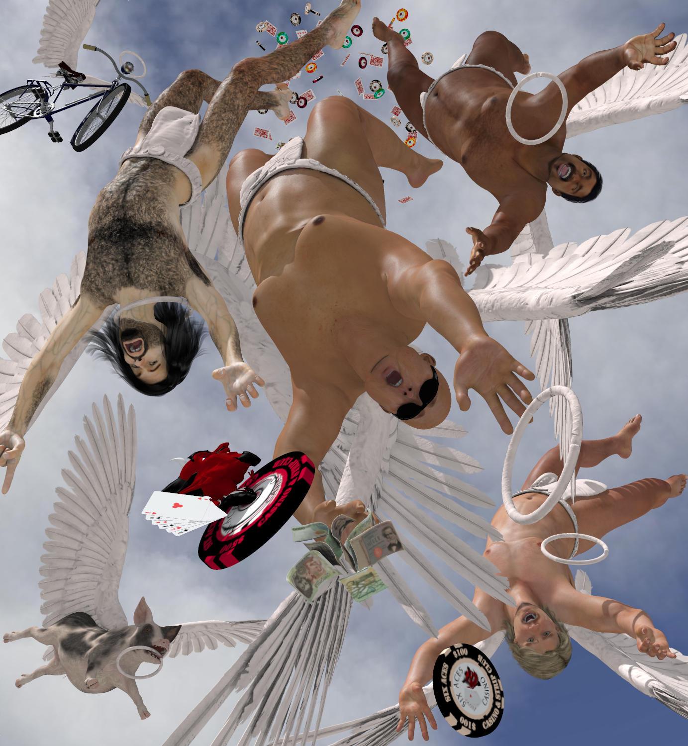
I love it! Easily the best things about this render were how creative and clear the story was. Just the name tells us enough to understand these angels were up to no good and got kicked out of heaven. I love how dynamic the poses and the expressions are, which help sell their downfall.
Areas of opportunity: Beware of where you're cutting your figures. It's never a good idea to cut fingers or toes. Rule of thumb, don't cut near a joint. So zoom out to avoid cutting the members of one of your figures.
That said, I want to commend you for using so many elements in your render. The more elements you include, the more it can say but if you're not careful, it can lose focus. Right now, the composition is way too busy. Below are a few suggestions:
- Establish Visual Hierarchy: you could try getting rid of some elements or blurring them could help create a sense of depth and help establish visual hierarchy. Basically, you need to determine which is your main element and design things so it's clear to us where our focus should be. You can find some great and simple examples of how to create visual hierarchy here.
- The vegas cards and coins that are on the very back/top, for example, are especially busy. Try blurring them to see if they would blend better (or try taking them out altogether). I would also blur the black vegas chip on the very bottom of the render and perhaps lower its opacity so that the contrast of the color doesn't fight for attention. The red chip stands out quite a bit (fighting for attention), so I would also figure out a way to make it blend better. Perhaps making it smaller and/or lighter might help? Or, if it's not necessary, you could simply take it out, as the black chip already establishes they were in "Las Vegas".
- Last but not least, I would layer some clouds to soften the top of the render and help us focus on the figure in the middle (which can be your main focus).
- You could also try adding some motion blur to create a sense of speed as well. Like they are falling and doing so fast!
I recall there was a prior version that was less busy (I don't know if it was your first or second) and I must say I preferred that one precisely because things didn't compete with each other quite so much. If you have at and are willing to re-share it, could you post it here?
Now, all of the things I mention are fixes to what you already have. But if you want to push the render even further, the first thing you need to do is establish the hierarchy of your elements and then build the composition from there. To that end, I looked up some references of a similar concept so they could help you:
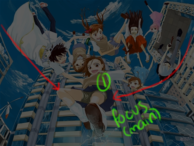
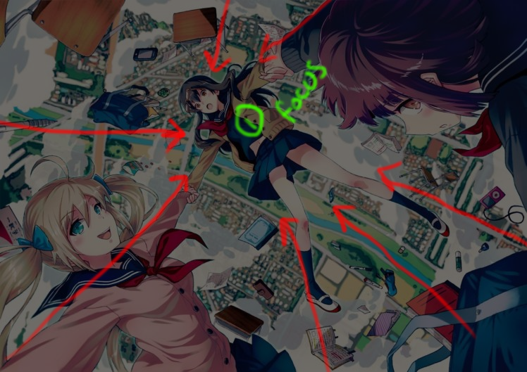
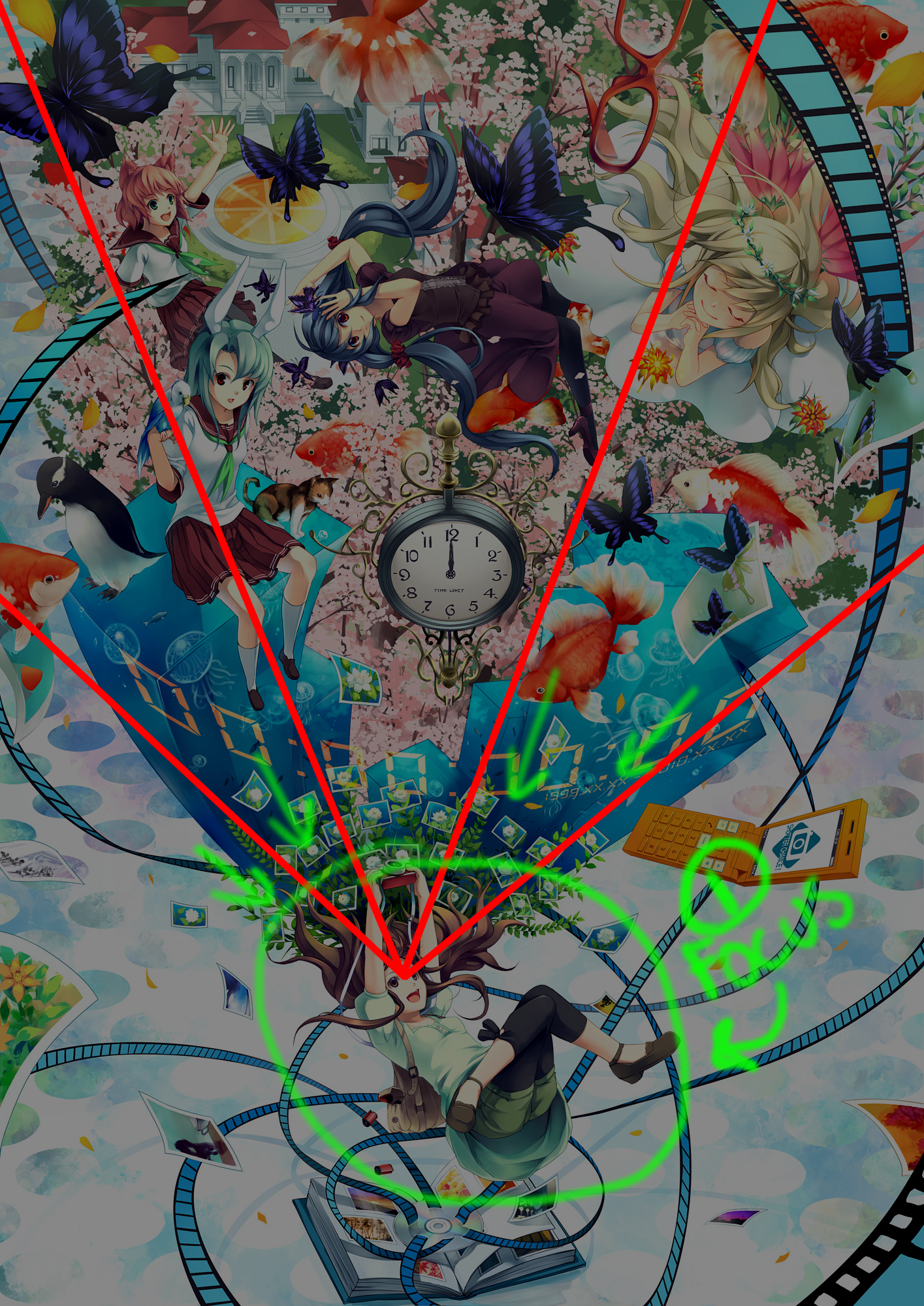
As you can see, these references make use of lines to draw our focus to the main subject. Those lines can be created by the way you position your characters. That in mind, this is a possible way you could approach your design.
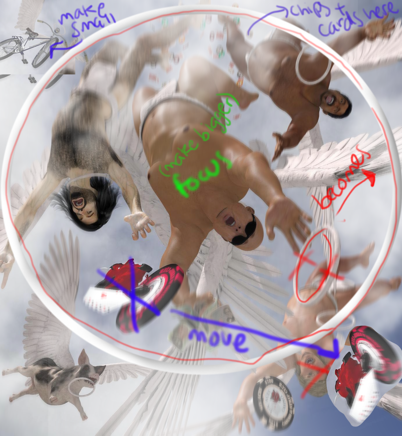
- You could use the halo of your main subject as a way to group the falling angels and separate them from the non-falling and/or non-human objects. Unless you made the other figures smaller, you might need to get rid of one of the falling angels. Or make the render wider so you can have more space. Just remember that even though you're dealing with a group of falling angels, you still need to pick one of them to be your "main star" and then design things around that subject.
Username: @3Ddreamer
Overall, your renders were very clear in regard to the subject of your story. So already you're on the right track since the most important aspect of any and every story is ensuring everyone understands it and, therefore, can enjoy it. Clarity is key when it comes to conveying messages. Now, let's take a look at your entries and go over some areas of opportunities that might be worth pursuing.
> MASTER AND APPRENTICE
| "They had traveled a long way, but the rumors had been right..."
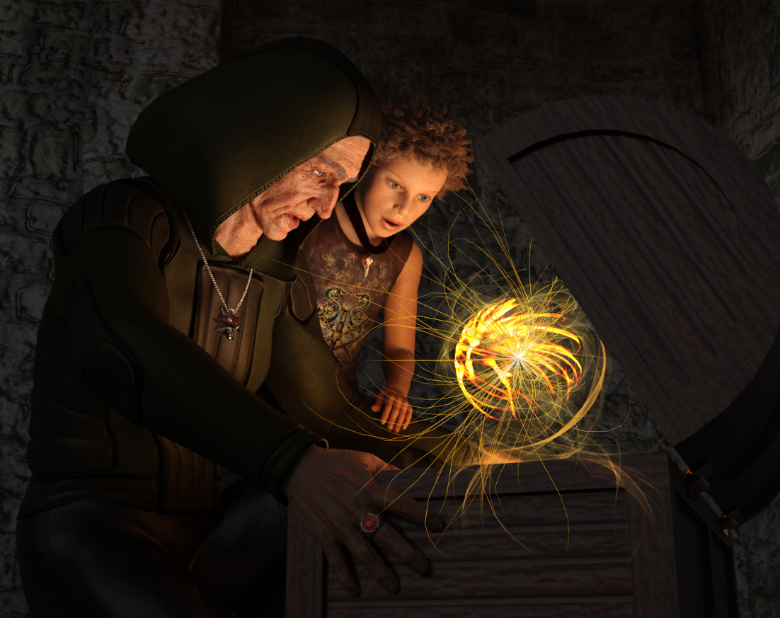
The strongest part of this render is its clarity. It's obvious who is the master and who is the apprentice at a glance. There is also a certain mood of wonderment and enlightenment which is created by the contrast between the soft light emanating from the artifact and the darkness encasing the characters. The warm tint was a great call since it established a sense of comfort, telling us the characters were confronting something wonderous rather than dangerous.
Area of opportunity: The magic artifact as it is right now, is a bit distracting and shows it has been composited in post-work. It needs to be better blended into the scene, which can be achieved by blurring it (especially the tendrils).
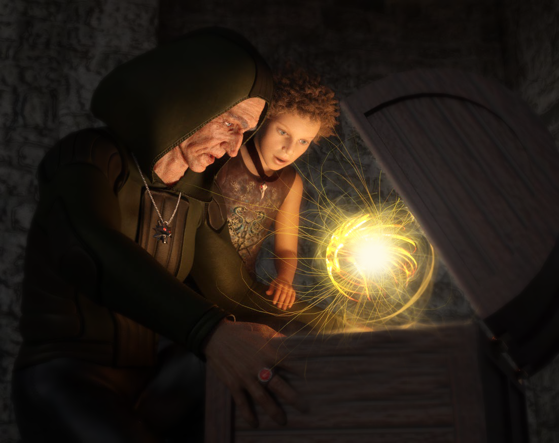
- If you do have the magic artifact in a separate layer, I would also advise that you erased some of the tendrils on the bottom so the ball stays inside the chest. Then you can simply paint a bit of a highlight on the edge of the chest as well.
- If you don't have that ball of energy in a separate layer, you can duplicate your layer > Add around 8-9 points of gaussian blur and then softly erase around the ball of energy. Lastly, you could add some white to the center with a soft brush to create a point of focus.
- Here's a quick example of what these changes would look like:
However, since the magic artifact is quite abstract, I would suggest trying out a more subtle approach. Here are some references you might find useful:
> ANGEL & DEMON

I really like the concept and the composition is off to a good start, with the characters positioned in their appropriate places (heaven and hell). The render has a matte tint which, while it alludes to a catholic-like painting, misses an opportunity to create mood through vibrant colors and contrast. Of course, another way to go is to push the "catholic painting" vibe by tweaking the colors and pushing the shadows.
Areas of Opportunity:
- The lightning strike could use more of a punch. You could turn the lightning white and add a softly blended yellow or blue blur effect. Remember that the hottest point of fire/lightning is white, after all.
- You could also exaggerate the poses a bit more. The angel looks very stiff, while the demon doesn't look like he's in pain. You could try puffing the chest of the former or giving him a more god-like pose and arching the back of the latter (reference howling pose) could give it a more dynamic feel.
- Now, if you wanted to go into a more modern feel, I would personally play with the contrast and vibrancy as well. That will help things pop and add more "life" into the fight.
- If, on the other hand, you wanted to push the catholic painting effect, I'd encourage you to check out some references. Take note of the colors they use, the type of light and the contrast. Then you can build things from there.
> LONELY THIS CHRISTMAS:
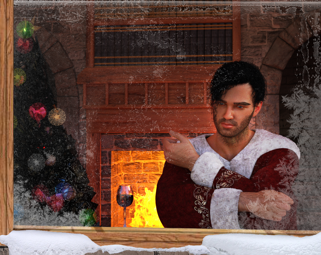
I think adding the frost on the window and using the windowsill to frame him was a good call. Again, your strongest point is in the clarity of the story.
Areas of opportunity: You can create a subtext to your story by adding little details that would bring home the fact that he's not only alone but feeling lonely.
- One way to do that is to add some pictures to the background of his family or friends to create contrast.
- Also changing the temperature of the lights from warm to dark can better establish that gloomy feeling. Because right now, your character is alone but doesn't look lonely. And there's a difference.
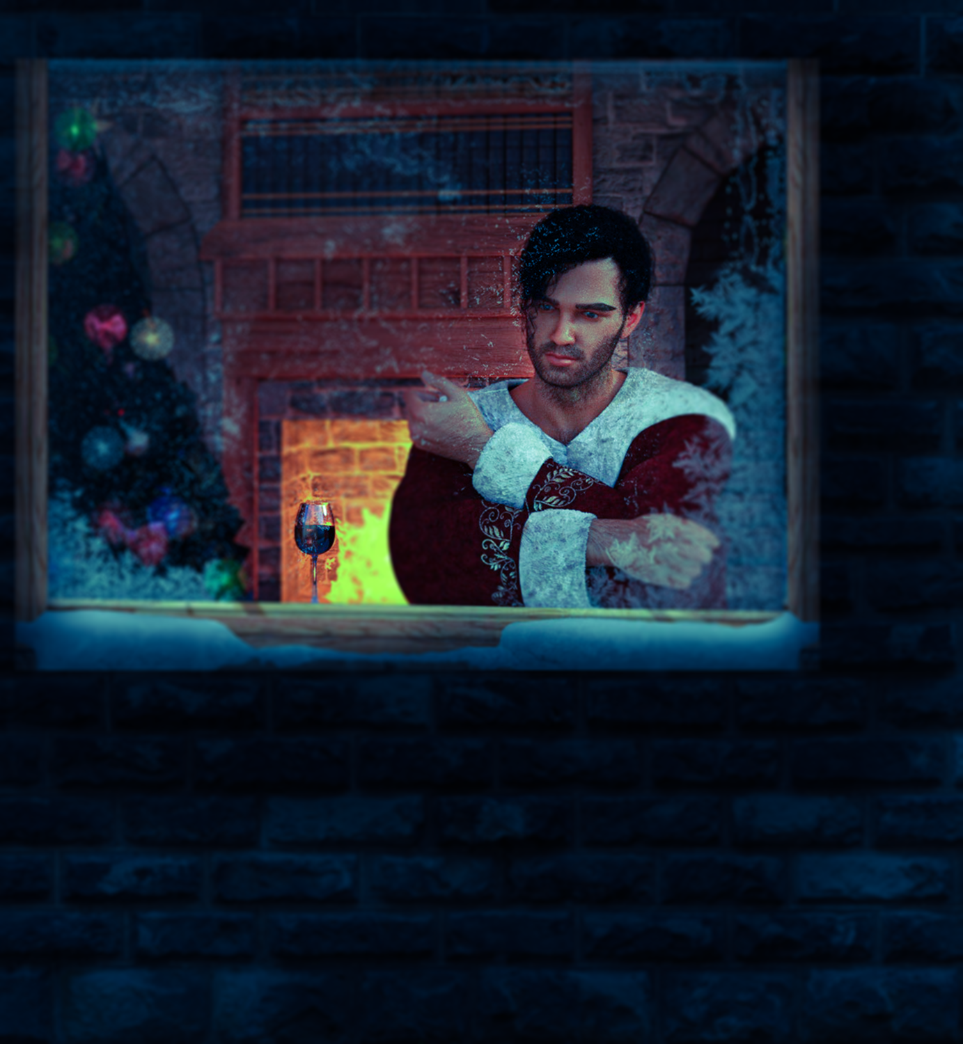
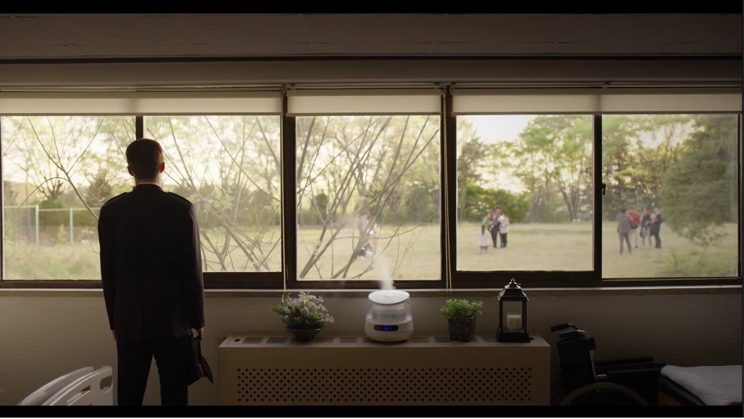
- Another thing that can help you add mood, is to zoom out so your character, framed by the window, becomes a smaller part of the render. In that way, you'll show that he's feeling trapped and isolated. Korean Dramas do this technique (I call it boxing) quite often to showcase a character who's feeling trapped. I wrote an article about the technique showing several examples which you can read here. I'm adding two references (screenshots I took from different dramas) as examples to showcase the boxing technique and how it contributes to a gloomier mood (cold temperature). Notice how the foreground is always quite dark, with whatever is being trapped becomes the focus of the composition.
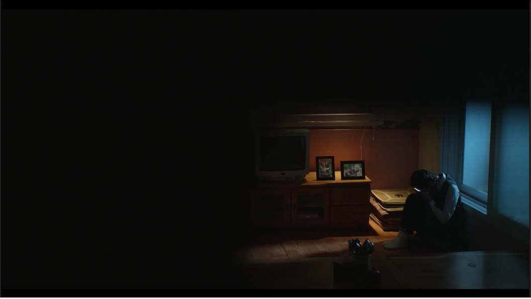
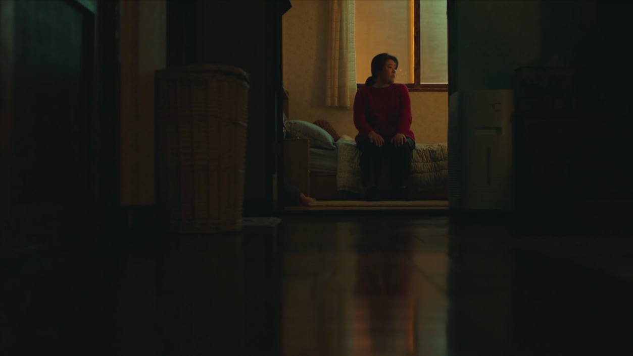
- Taking the boxing into account, here's more or less how it would look like:
- Another approach is to change things up and show his loneliness via comparison. A way to do that would be to have a couple of people inside that Christmas room, enjoying a good time. You can even blur the window a bit so that you hint at a party without showing it. And then you can place your character outside the building. Now you get the contrast from the lively and warm colors of the inside vs him trekking outside in the cold, with his Christmas gear on but nobody to accompany him.
- Here are some examples from the drama "Come and Hug Me" where the director separated his "lonely" characters from families. Injecting the subtext that these two characters crave having a family and, though they never say it, feel quite lonely.

Username: @BronzeDragon
> LOST BUT NEVER FORGOTTEN
| "She was his rival. Then she was his friend. Then she was his lover. Then she was his mate. She was always loyal to all but most to him. She was also a fierce warrior herself. She protected him as long as she could before she fell. She gave her life for him. Now she is gone from him. Now she is lost to him. But never is she forgotten. He, above all, will remember -always."
The best quality of the render lies in its clarity. Even without the story, we know this warrior has lost someone important and he's mourning that person still. I do want to point out that this entry had some conflicting aspects when it came to the rules of the IRM competition. Because while the male warrior is shown as the star of the render, his deceased female partner becomes the star of the story given the written narrative. Alberto and I both had to deduct a point since the purpose of the competition was to have a male as the starring character.
Areas of opportunities: building the right mood. Right now the colors don't add to the "emotion" of the scene. They are too vibrant and surreal; giving the render a dream-like quality. Having said that, there are several ways you can approach building the mood depending on what better fits your vision.
- Mood: A warm & gentle goodbye | This video from the TV show "The Originals" presents two characters (brothers) mourning someone they both loved dearly. Notice that the colors are warm (orange and yellows) and the light is soft which gives a sense of quiet, fragile pain born out of love. The time of the day is sundown, which implies the light is coming to its end. In this case, it symbolizes the death of who they were while Hayley (the one they loved) lived. So the scene shows the parting as a sad, but gentle goodbye.
- Mood: Raw pain (you can skip to the one minute mark) | Notice the colors here are cold (blue) and desaturated. Once again we see the sun coming down, but the feeling is quite different from the previous examples. The rain pours and mingles with the characters' tears. And then he falls boneless to his knees, isolated from the rest of the mourning characters.
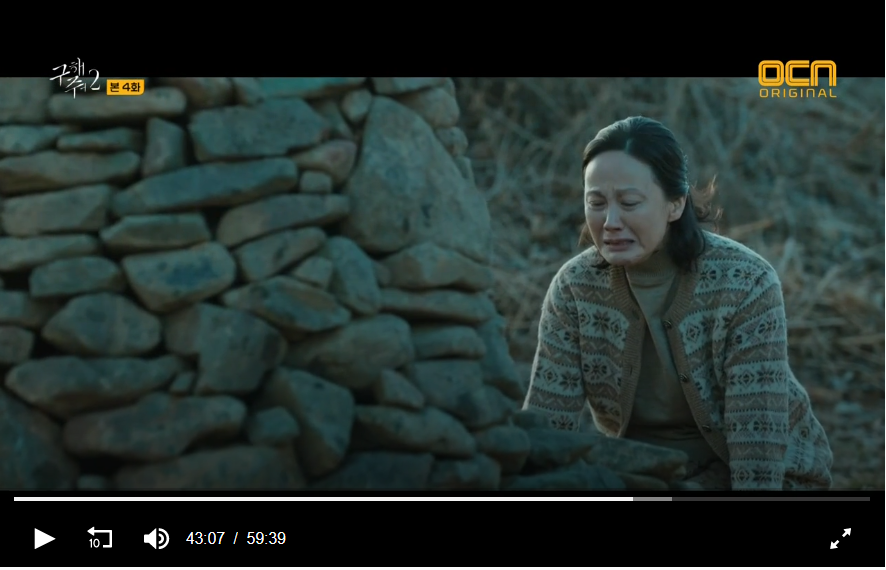
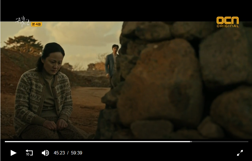
Colors can contribute a ton of context and emotion for your mood. Just check out these two references from a show called "Save Me 2". Both of these shots happen in the same scene, but the director changes the color grading to switch between two moods:
> Sadness and desolation | The blue colors show the desolation of this mother, who has prayed for his children so much, she's built an altar of stones (each stone a prayer). Yet, as she crawls towards the altar she's made for her kids, she's full of pain. No matter how much she wishes for her children to be happy, all she seems to see in them is pain.
> Hope | Suddenly, someone who's passing by noticed her and walks up to her, offering comfort. So the light temperature raises and becomes warm, signifying the character will indeed find comfort in the gentle stranger.
But the colors aren't the only thing that can help create the mood. Posing can also contribute to whatever feeling you want to portray. In your case, the character's lack of facial expression made it difficult to understand his state of mind. Check out these references for inspiration:
- Pain | Notice here there's also a warm tint to the picture, which gives that sense of yearning for those who have passed away. However, the body language of the man indicates the pain he feels is still fresh.
- Memorial day references | Notice the different ways people express their pain. Some seem relaxed and at peace. Others show raw pain.
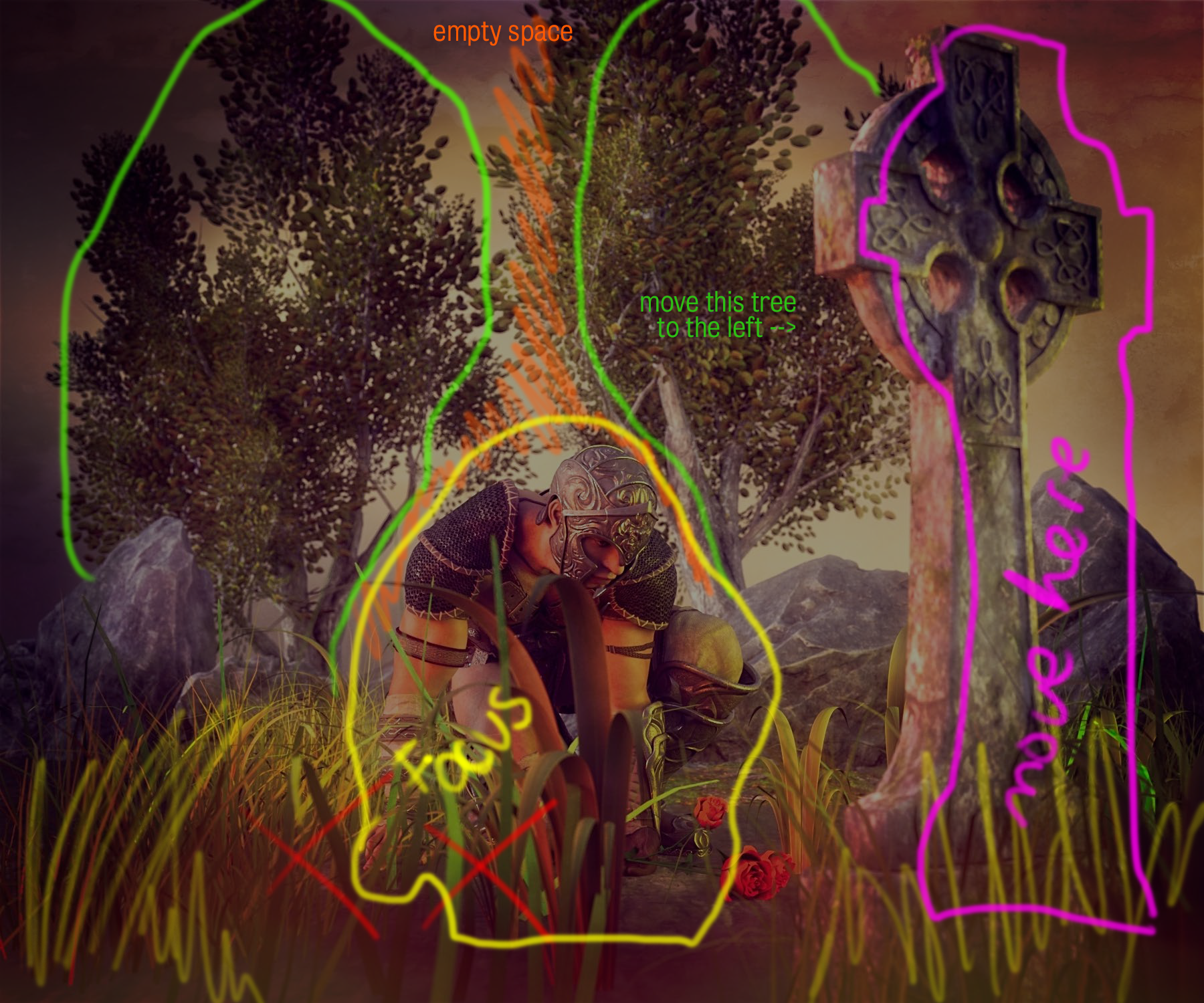
Another area of opportunity is in the composition. I'm adding an idea of how you could switch what you have around to create empty space around the character, helping us focus on him and de-clutter the scene. Of course, you should first decide what emotion you want to convey and go from there.
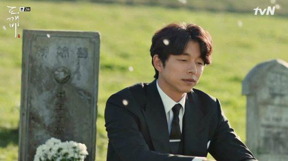
I'm also adding some interesting compositions from a show called "Goblin". The beautiful thing of having the character sit with his back to the grave is that, despite missing the person he's visiting, he's also looking ahead --ready to move forward.
Notice also how de-cluttered these shots are. My advice would be to go simple and get rid of some of the trees and plants if you can. So remember that even the direction in which the character is looking will convey something to the viewer.
Username: @Bunyip02
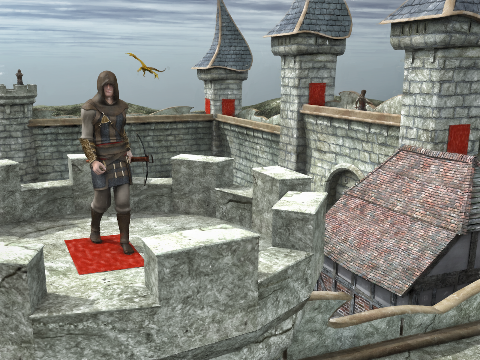
>THERE BE DRAGONS...
The best thing about this render is the concept. Who doesn't like dragons? However, the biggest thing missing is the story. How does the dragon relate to the character with the bow?
Areas of Opportunity: since our category tasked you with telling a story with your render, the first thing you want to tackle is what your story or message is. Like I said before, clarity is key.
To that end, these questions may help you get started: Are dragons friendly in this world? And if they are, why would the character facing us have a bow? There seems to be a contradiction here because I'd expect him to have a bow to take down the dragon. Yet the character on the far back seems really at ease even though the dragon is circling back.
Once you decide on what the relationship between the men guarding the castle and the dragon is, then you can create the appropriate mood. Here are some references that you may find useful:
- Mood: Ominous and Quiet | Notice how the dark colors contribute to this gloomy scene, creating a sense of trepidation and darkness. The mist also creates an eerieness that makes you wonder what lays behind it.
- Mood: Ominous and Dangerous | This one also uses cold colors to build the mood, but the doorway framing our character and dragon creates tension by boxing them in tightly, with darkness encroaching all around. The red highlight at the foot of the broken tower just adds to that sense of danger, which hints that the mage is about to confront this dragon.
- Mood: Peaceful | Now compare the former references to this one and this one. Notice how the colors, the vibrancy, and the soft light indicates there's harmony. For the second reference, you even get some interaction between humans and dragons. Take note of how the weapon the girl on the foreground has doesn't feel like it would hurt the dragon.
Of course, except for the Ominous and Dangerous reference, these examples are mostly for worldbuilding the set of the story. And since the challenge was to tell a story through a render, then including the interaction between your male character and the dragon becomes essential.
Whether that is to have yourcharacters showcase hostility or harmony is up to you!
Just remember that once you've made the decision on what the relationship is between dragon and man, then your colors and lighting choices should match that to create the appropriate mood.





Comments
Username: @Carola O
> AT THE HEARTH
| "Coming home after a long day of work, getting the fire started and simply enjoy a quiet evening. That was what he had done for so long, longer than he cared to admit. Today was supposed to be just like any other, yet the moment he opened the door he knew something was different.
He could smell the scent of fresh coffee lingering in the air, feel a warmth in the house that should have been cold until the fire warmed it up. His breath hitched when he noticed a shirt piled on the floor, slowly he made his way into the living room. Stopping in the doorway he stared at the man straddling the chair, the fire crackling merrily behind the man's back. Brown eyes met his and the man smiled at him, making him chuckle softly "You have been away for a long time, welcome home" he said as he regarded the man he had not seen for nearly ten years."
The best thing about this entry is the story. I loved the way you described the scene. It's important to note that we read the text first and then saw the render. The order became important because your words created an expectation of an image filled with warmth.
Area of Opportunity: This is why your biggest area of opportunity is in building the mood that would best fit your story. So allow me to offer some suggestions:
> Colors and Light:
Notice how in the last one you even see the snow outside the window, creating a sense of warmth without having to turn on the warm (orange/yellow) filter! All of this means that you need that fire you added to bring in more light; softer and warm. Here's what softening the light, adjusting the exposure and adding some warm filters via post-work would look like:
> Framing:
> Posing:
>THE BOSS
| "Enemies and friends alike agreed, he was an honorable man, despite the cutthroat and ruthless underworld he ruled he always kept his honor when dealing with the people he came across. And for this, he was respected and loved, even amongst his enemies."
Even though this didn't have a male figure as the star of the story (since this is an animal), we loved this! However, we would consider this entry more in the lines of a portrait with some hints of storytelling rather than a storytelling render. The most interesting and successful aspect of this, nonetheless, is the mood you created in combination with the creative concept. And it's precisely the mood you inserted that hints at a story reminiscent of "The Godfather".
Area of opportunity: You already created this charming and tough character with TONS of personality. You already nailed the style (matte and desaturated). So now you need to have him interact with something or someone. Whether that be to have him sitting in his office with someone begging for a favor or having a tense and quiet conversation with one of his men is up to you!
Username: @Cismic
> FIGHT
| "The Epsilon 10 Star System is home to many species. They don’t always get along. It’s been reported the cat people’s homeworld of DeltaBetaGamahas been attacked. `It was hot when I left, but it’ll be cooler, wet rainy and dark, when I get back, their friendly leader said. The KameahNational Organization believes the cats’ world of DeltaBetaGamais to blame.
I, Gonorrheregionhave returned when the kameahcats informed me they were not too concerned about those attacks, but they do have some evidence suggesting those attacks may have been orchestrated by the Epsilon attackers from boogerborah. We also have some indications that they are in league with one or more other individuals, not by themselves, but in league with. Those individuals are still unidentified. The only thing we know for sure is that they are the true shadow leadership behind DeltaBetaGama.
On this night it was dark and rainy when I Gonorrheregiondiscovered several urchin carcasses with a large mass of alien fecal matter encased in amber like a trapeze act, swarming the place. The squirming Ivertekfound a method to kill the Thragmastersbut Gonorrheregiontold them he had to do it the old-fashioned way: piercing the heart and crawling away with the head and corpse of the creature as a trophy. At that moment the Thragmastersattacked Gonorrheregion; where he is about to get three trophies."
The render is off to a great start! At a glance, we understand there's a conflict between the man and the creatures attacking him. The written story, however, might've done you more harm than good in this competition. As I've mentioned in this thread before, clarity is key. The convoluted way the story was written made it difficult to read and understand. I get that it was supposed to be absurd, but readability is still important even when telling a joke ;).
So before we even jump into the render, here's a suggested edit to your story:
I, Gonorrheregion, had just returned when the kameahcats informed me they'd secured evidence suggesting troops from Epsilon --in league with unidentified individuals-- were behind their planet's attack.
Not long after that report, while on patrol on a dark and rainy night, I discovered several urchin carcasses near a large mass of alien fecal matter encased in amber.
Although the squirming Ivertek who'd tagged along suggested a method to kill the Thragmasters efficiently, I would have none of it. I insisted I had to do it the old-fashioned way: by piercing the beast's heart and claiming the head and corpse of the creature as my trophy.
A second after I'd made my decision, we were ambushed by a threesome of Thragmasters. And just like that... I was about to get my trophies."
You could probably cut it even more, but that's up to your discretion. That point aside, the render has great action going but now needs to build the appropriate mood.
Areas of Opportunity: You can push the composition and mood to refine your render.
> Mood: I think you had the right idea with the colors but created a discrepancy between your background (cold temperature) and your characters (warm temperature) which made the whole thing feel like it was happening in a theater. Going for desaturated and cold colors might be the way to go since you have a rainy scene like this.
> Decluttering: I would suggest getting rid of the lightning strikes because the scene is already quite crowded and they end up cluttering things even more. Instead, add a hint of mist to the foreground and even more so on the background to create a sense of depth and eerieness, decluttering things in the process. After all, your man is the main focus and everything else should revolve around him.
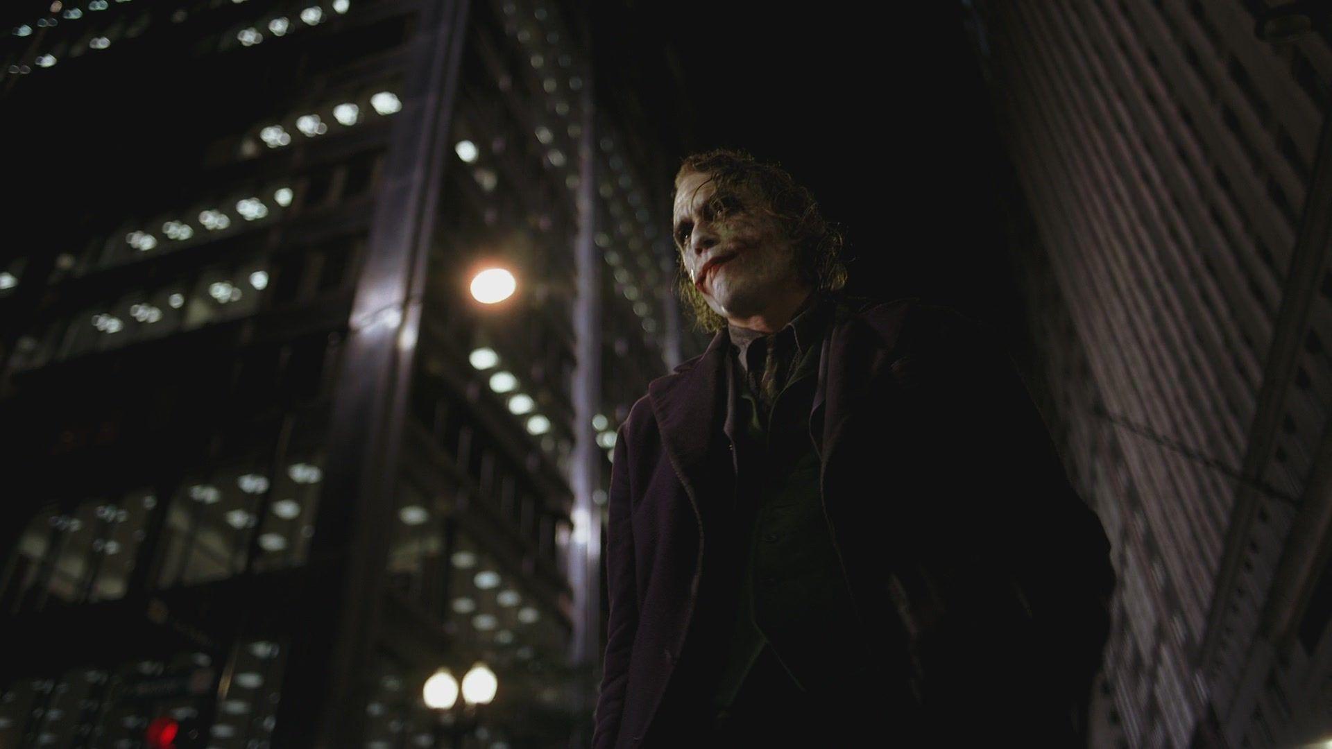
> Composition: Right now the strongest part is the character kicking one of the beasts. However, the other two creatures lack the same dynamic feel. So you could get some inspirations from comics. For example in this one, notice how there's also one character vs three, yet all of them are involved in the fight. Something is happening to all of them and that makes Batman look even more formidable.
Another way to go is to show only two figures (your character and a beast) to create a powerful interaction. Notice the lines in the Batman and Captain America examples are tilted to the side. This is called a Dutch Angle and it serves to create tension in cinematography. So you could try incorporating that as well. I also wrote an article detailing examples of the dutch angle as used in Korean dramas which you can read here. Here are some examples where I've used the dutch angle in my promos:
> EDWARD & TANE
| "Is that you Benjamin? Come on over for this apple."
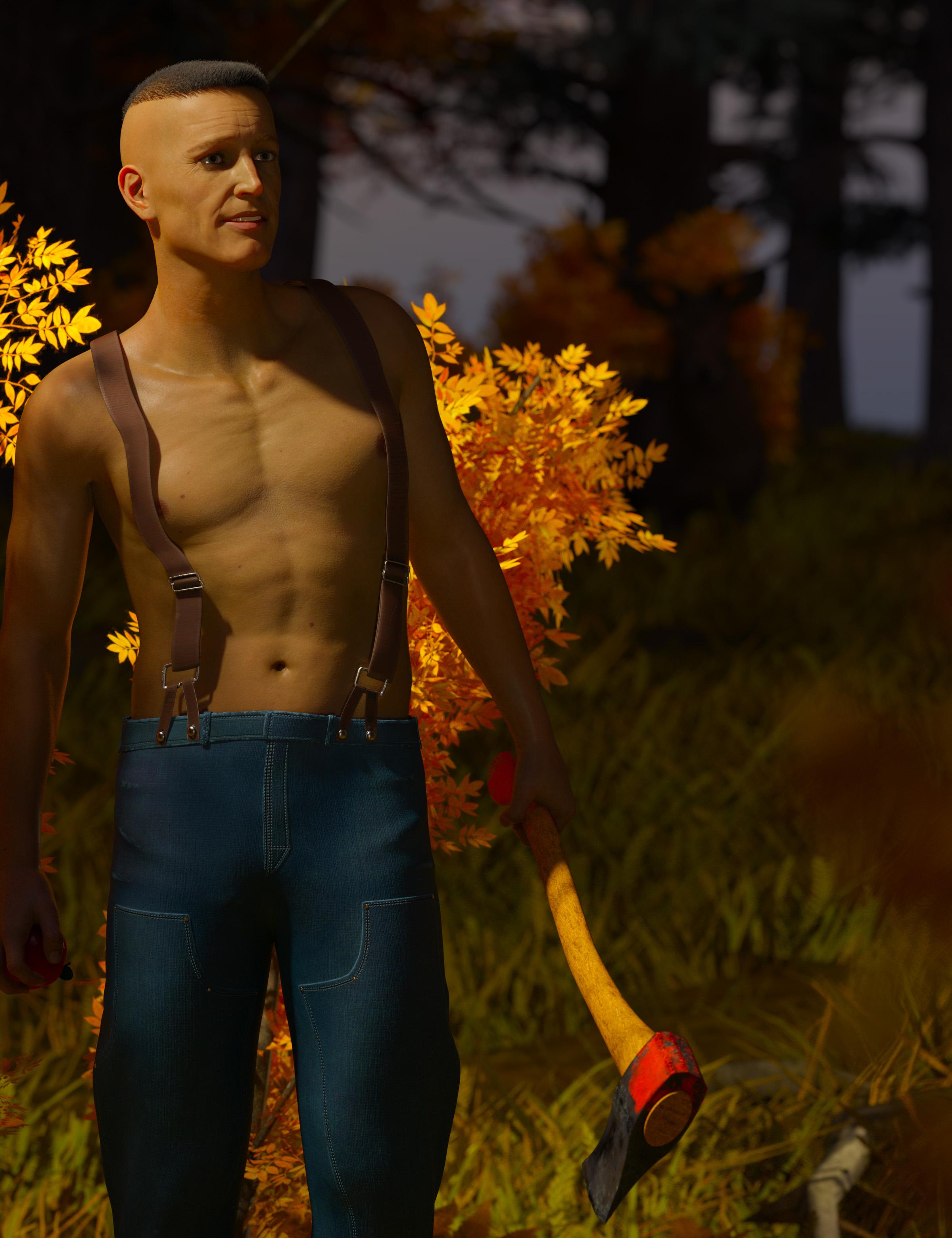
The best thing about this portrait is the lightning and the mood it creates. Perhaps because I've been watching a lot of crime shows, your character gives me a "psycho" vibe. My mind jumped straight to the iconic "American Psycho" movie shot when I saw he was holding an ax.
Areas of Opportunity: Composition and clarity can be refined.
> Composition: I recommend not cutting half of the arm of the character. Instead, show him complete even if close to the border. It was only after carefully studying the composition that I even realize he's holding an apple (I'm sure Alberto didn't catch that at all). So if the apple is an important element, you need to make it pop. In which case you'd need to change the lighting so that it's not shrouded in shadows. You could also color-tweak your render so things that are red pop even more. Stanley Kubrick (thank you, Chris, for the correction) did this for the movie "The Shining", where red seemed to pop out of the frame. Case in point:
> Clarity: Unfortunately, I'm unable to give any feedback in regards to storytelling because I'm not sure what the story is. Is he about to kill someone by luring him with an apple? Does he think he's doing God's work by killing said someone, perhaps? And I ask this last because using warm lightning often signifies that the character is feeling at ease or thinks he's righteous.
In this example from Save Me 2, this priest is creating a cult. Notice that, despite the warm image, the dutch angle tells us something is wrong. The fact that he's standing with his back to the cross in combination with the dutch angle adds to the subtext, telling us he's working against his fate and not for it.
Vibrant colors can also be used to create narrative contrast between what we are looking at (life) and what the character is saying (threat), such as with this example.
Usually, however, a psychopath would more often than not be shrouded with a cold and gloomy light, sometimes even desaturated and.
At times you'll even see a hint of red tainting the often blue landscape near our evil guy. Screenshot below from Save Me 2 and The Game: Towards Zero.
>DIBBS
| This image created based on Aerosmith’s “Dude Looks Like A Lady” song. And, who shouts out dibbs first for the toy?
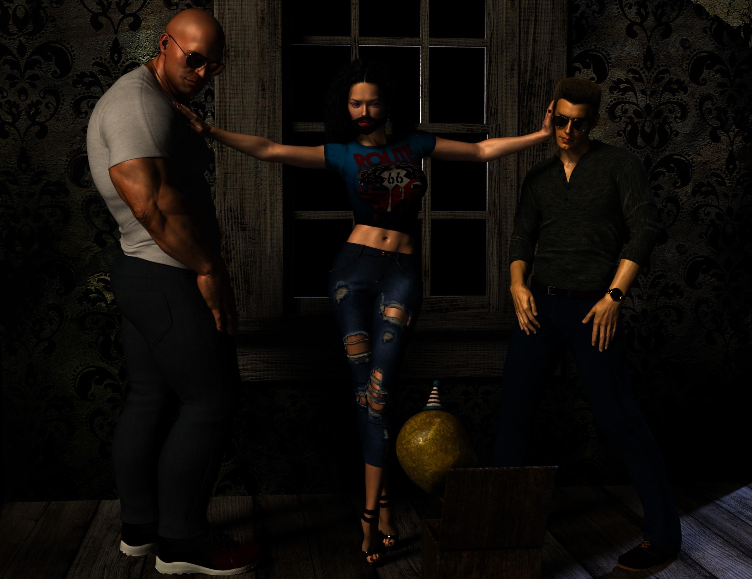
Unfortunately, for this image, I don't have a lot of feedback because I simply don't understand it, so I wouldn't know where to start or what to address. In general, the render could use more light because a lot of things are lost in the shadows.
However, it's important to note that we deducted points from this entry because the competition is meant to present the male figure as a star. In this case, the males are presented as objects and the female character is the main focus and star of the render.
Having said that, your entry reminded me of one of Adam Lavine's poster, which is a perfect example of a similar concept but with the male as the main star. However, this is also a portrait, not a storytelling render.
Username: @DarwinsMishap
> TATHAR IN THE HOG & BARREL
| However, the story is up to the viewer
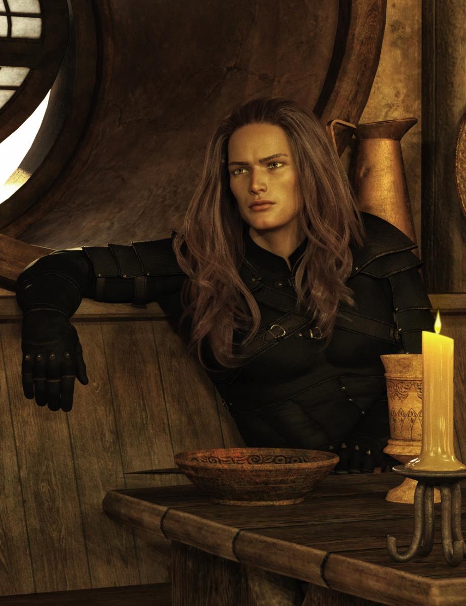
The best thing about this render is the concept and, of course, your gorgeous character. (Suffice to say I used Tathar for my Crow image without any alterations to his shape save for adding the makeup.) Now, having Tathar hold his knife very low-key and looking quite aloof promises an interesting story, albeit the clarity could use some refinement.
Areas of opportunity: Clarity and mood to better establish what's happening. Truth be told, it took me a while to realize that he was indeed holding a knife (Alberto was the one who caught that detail). Even then, I still had trouble making out the shape of the knife. So here are some suggestions:

> Lighting: the render is very reminiscent of the iconic LOTR scene in which Aragon gets introduced. As such, pushing the shadows a bit more and tilting the camera into a slight dutch angle, might help create the missing tension.
> Composition: The tight frame makes a wonderful portrait but at the expense of storytelling. The environment usually provides crucial information, especially when you only have a single image to tell a story. So I would zoom out and declutter the table a bit, so the knife can become more apparent. I would also recommend deciding what the hierarchy is and then building things with that in mind. You could even zoom out and have us see the glint of the knife below the table, for example (if you still want to have it somewhat hidden). Notice in this example, how the objects in the table are pushed to the side, framing rather than obstructing, the character.
> Pushing storytelling: You could also add context by having Tathar with his back to the door and then have whoever he's "waiting for" framed and cast in shadows. That'll make us feel that whomever he's been waiting for has finally arrived and something is about to go down. If you add the dutch angle we'll know right away that the air is hostile. References of what I mean below:
Now, notice in the following screenshots from a show called Tell Me What You Saw, how the dutch angle makes the scene more threatening in comparison to the previous shot.
I provided more references regarding the Dutch angle to the user above you, if you want to also check them out.
Username: @Diomede
>LEON AND THE MAGIC POLYHEDRONS OF SYLVANIA
The best thing about this render lies in it's interesting, albeit a very abstract/surreal, concept. Its dream-like quality makes me wonder about the story/inspiration behind it.
Areas of Opportunity: Clarity. Since this is the storytelling category, what's happening needs to be clear. As it stands, the abstractness makes it hard to understand what's going on.
So I'm going to make a comparison in hopes that what I mean about clarity in regards to your particular case is better understood. We've all had dreams where things tend to be presented in abstract and sometimes chaotic ways. Sometimes our dreams may appear to have no rhyme or reason, yet one thing stands cristal clear... how we felt. So when we wake up and share our dream, we usually describe what we felt alongside the abstractness.
With visual communication, that "description" of our feelings is done through mood-building and composition. Colors, angles, light (or lack thereof), shadows, expressions, body language, leading lines, and movement can be weaved to create our message.
Clarity: Since you've created this interaction between three different species, now you want to decide what the mood between them should be. I would advise writing out the story of this meeting, focusing not only on what the characters are doing but why they're doing them and how that is making them feel. This last is the most important aspect to start building your mood. Right now the absence of emotional expressions in combination with the dream-like colors makes it difficult to gauge things.
So with all this in mind, I'll provide some suggestions which may help you get started:
Dial back the abstractness:
Light & Color:
Body language:
>LI'LMAC CUTS THE DECK
I love the rhyme that accompanies your render and I think this would be a wonderful book if you were to flesh it out, using rhymes to tell the story!
Areas of opportunity: Since this has the potential for a great children's book, I'd suggest adopting that aesthetic. As such, the composition could use some simplifying and the colors some vibrancy.
Color & Vibrancy:
Simplification:
Consistency:
Framing:
Typography:
Now, your main character also reminded me of "Rick and Morty's" (https://www.iamag.co/rick-and-morty-style-guide/) art style, so you could very well push for that as well. If you do, you'll still need to push the colors into vibrancy and you'll also need to add some weirdness to the sky (weird cloud shapes, perhaps?). Though I still think the illustration would do better focusing on children.
Username: @Scorpio
>OUR HERO
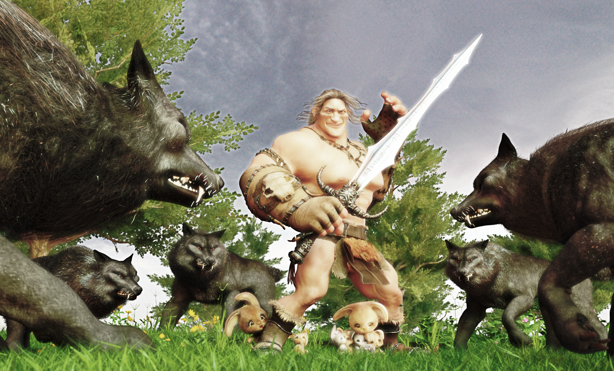
I love this image! I think you're off to a great start with the action presented. I especially appreciate the careful positioning of the rabbits, each with a distinct expression that hints at their personality. My favorite rabbit is the little one near his right foot looking up. It cracks me up every time!
Areas of opportunity: Composition and mood. Right now you have your poses, expressions, and your camera at a low-angle looking up (which adds power to your male character) nailed. So you could push your colors and declutter the scene to refine the render.
Decluttering:
Godrays:
Color:
You render seems to have a style I think children would especially enjoy. So for that reason, I'd suggest pushing the vibrancy of the colors. The blue of the sky and the green of the grass could certainly be enhanced. Here's a quick filtered look what your render would look like with more vibrancy to the colors:
Composition:
Adding subtext:
Alternatively:
Flare (optional/for fun):
>UNTITLED
This is a great render with a strong and clear message that immediately rings through despite the render not even being titled! As an added value, it immediately reminded of the iconic Aliens movie.
Areas of opportunity: Balancing the colors to create coherence and playing with the lighting. Here are some suggestions:
Fire:
Lights:
Angle:
.
Dutch tilt:
Temperature:
>THE CHASE
Love the action portrayed in the render. There's a lot of attention to detail about what's happening in the background, so I applaud you for that! I certainly appreciate the old woman on the ground, since it shows she was a bit of collateral damage!
Areas of opportunity: Composition through leading lines!
Composition:
Speed:
Focus:
To be continued!
Username: @Daventaki
> HEADED FOR VICTORY!
| Enthusiastically they prepared for the battle, knowing without a doubt they will be victorious!
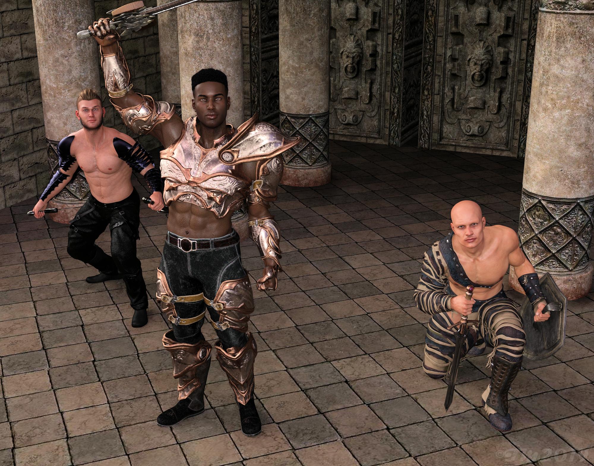
I love the color scheme and how you used neutral colors to pull your characters together, making it evident they belong to the same group/team. It also gives the render a tinge of elegance that I really appreciated.
Areas of Opportunity: Composition and lighting could be improved in order to serve your point rather than oppose it. Here are some suggestions:
Cropping:
Grouping:
Composition:
Here are some references from a Chinese Drama called "Legend of Fuyao" which uses a lot of high angles (which may serve as inspiration). Take note of how powerful they make the subject look. The closer the camera is to the subject, the steeper the angle and the more power you give it at the cost of distorting their figure.
More references with a combination of elements linked below:
>TRUCK
| Whatcha think about my new truck? (Mom is going to be sooo upset!)
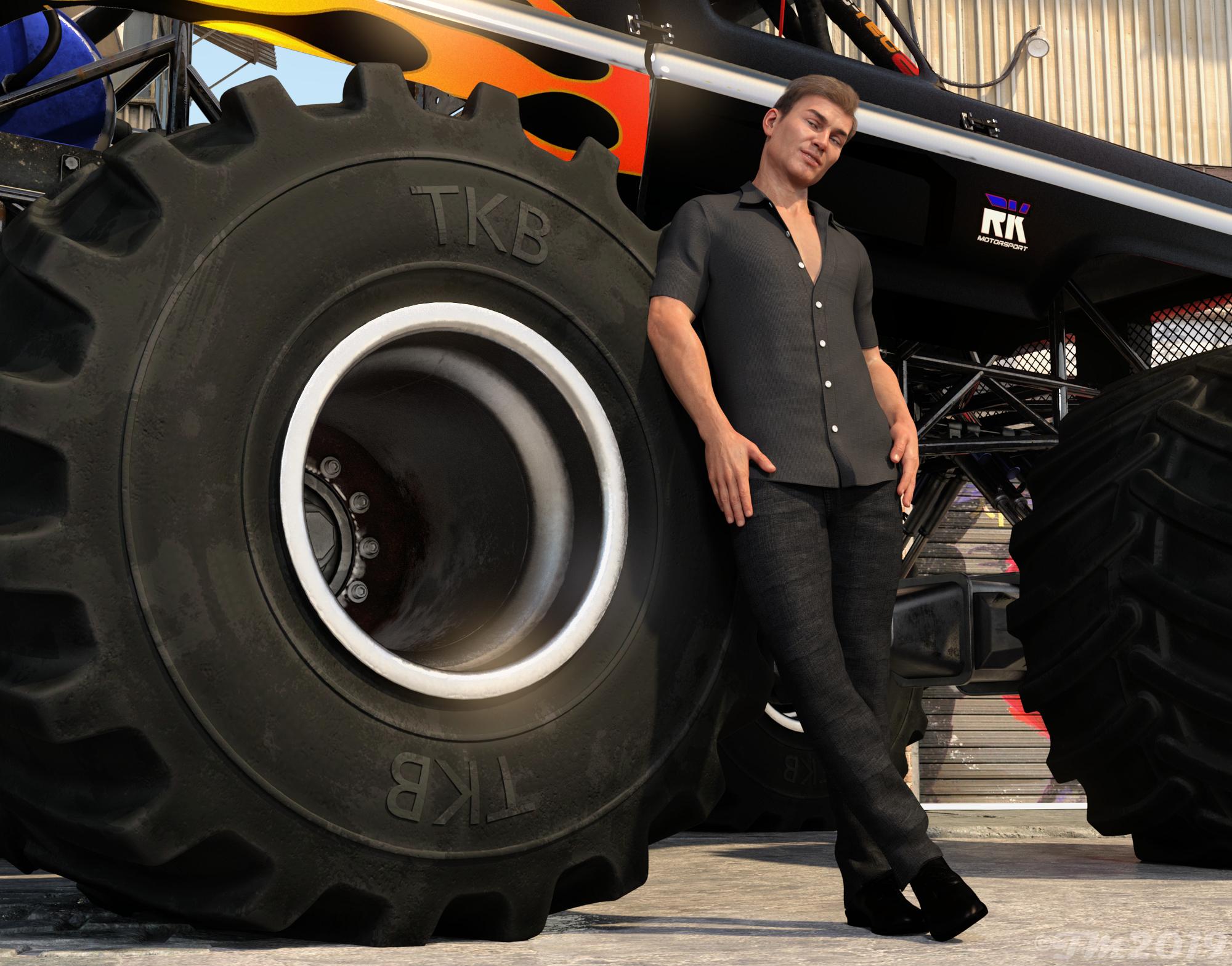
I think this render is a great portrait. Love his laidback pose and especially his expression. In regards to storytelling, however, it could be pushed so the story is clearer (or rather the purpose of the image). There's great potential for a funny story given the description, you just need to show some interaction within the render for the storytelling to take place.
Areas of opportunity: On that note, I can think of several ways in which you could inject some storytelling into your render following the prompt in your description. I'll share a couple here as food for thought:
Username: @SBibb
>THE STORYTELLER
| Every morning, the ancient storyteller sits with the young kitsune to tell the tales of their heritage.
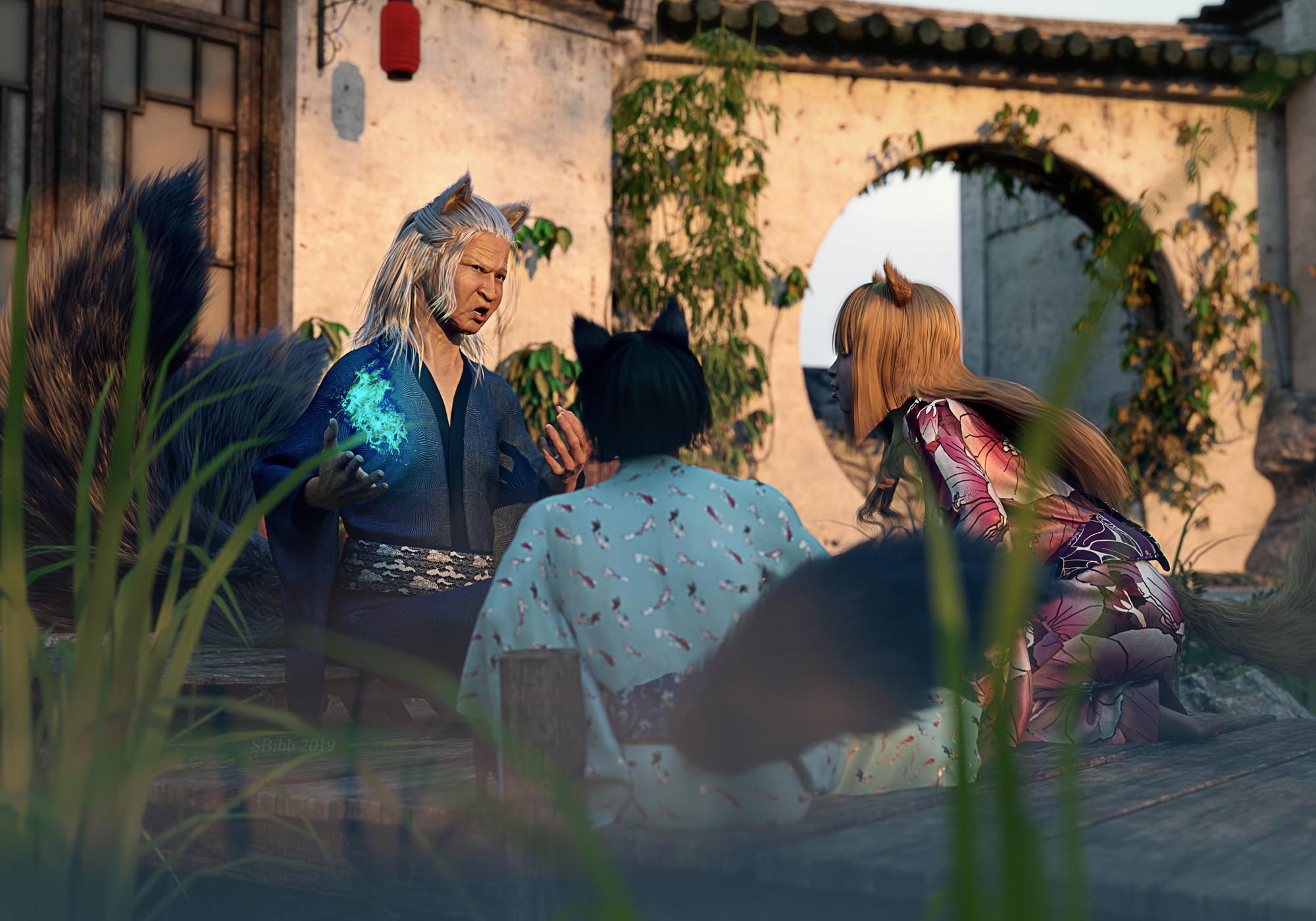
I love it! You captured a sense of normalcy despite the fantastical set-up. I also really appreciate how you made sure we got a sense of depth via depth of field. Adding the grass to the foreground was a nice touch as well!
Areas of opportunity: Since your render is already quite strong in its composition and mood-building, I'm only going to give ideas of how you could add more subtext and complexity to your render (if you wanted to explore that direction).
Show the story: Right now you're telling is this man is storytelling, but what if you showed us instead? There are two ways I can think of that might work:
Enhance the magical atmosphere:
>A MISSTEP IN THE APPLE GROVE
| The apple grove was technically open land, free for everybody's use. But when a gnarly goblin made the grove his home, wandering travelers often found trouble if they took a juicy apple from the trees.
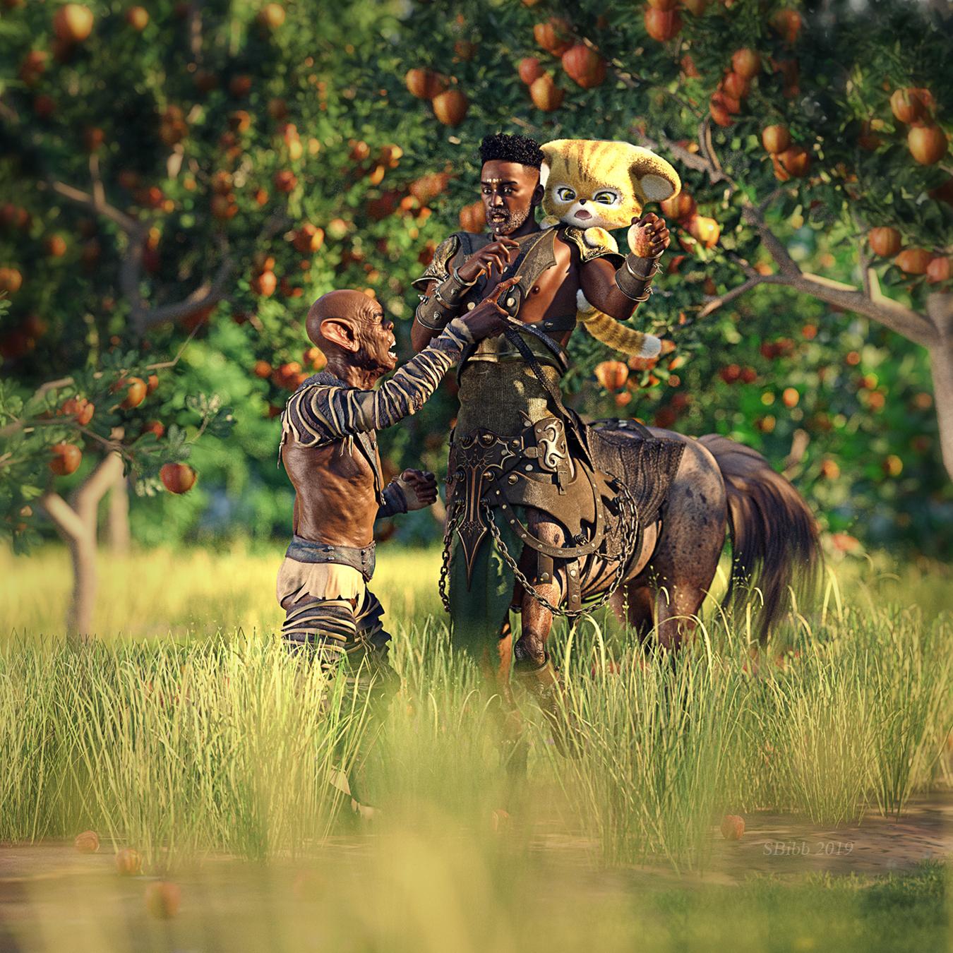
I think there's a reason this won first place in our competition and, as such, I have almost no advice in terms of improvements. Not only did you create a beautiful world, but you also added a story that's both clear and endearing. So for this feedback, I had to get creative (quite literally)!
Areas of opportunity: Expand your concept into a short and sweet story!
I think you have a great set-up and concept which can easily evolve into a short story. The render you have now can be used as a teaser. If so, you want your story to have a story of a twist to make it more interesting. So, for example, here's an idea:
What if you showed your goblin trying to get a specific apple from the tree. Yet no matter what he does, he cannot reach it. So he's down to waiting. Waiting for that scrupulous apple to naturally fall to the ground.
He waits for days and days, unwilling to move far from his spot. Of course, his waiting tires him out and before he knows it, he falls asleep. He wakes up early the next day by the wind picking up! He knows it in his bones that the wind will certainly break that little twig and gift him his apple.
And then it does!
But as the apple falls to the ground a small, quick creature snatches it from the air! Unwilling to stand by the injustice, the goblin follows the cat through the tall grass demanding he returns his apple.
And so now you've changed the roles. The presumed perpetrator turns out to be the victim, and the presumed victims the perpetrators!
Since you already have a great handle on expression and body language, you could even challenge yourself to create a short story using no words and only showing things as they happen! Of course, it's all up to you!
Username: @kimh
Overall, I loved and appreciated the creative concept you used to tie both of your entries' stories.
>THE FOREST GUARDIAN & THE FAE
| Fae: Look, Can't you see?
Guardian: What am I looking for?
Fae: It's that boy, Peter. I told you it was silly to put him in charge of the lost boys and hook him up with Tink
Guardian: Why's that?
Fae: Leadership has gone to his head. Now he thinks he can do as he pleases, even if it puts us in jeopardy. And that hussy Tink!. She's smitten with the boy and she'll do anything for him. I heard she's not above sharing her fairy dust. And it looks like he's bringing company. I haven't seen those strangers before. What are you going to do about this?
Guardian: Hmmm
This render successfully demonstrates how a low angle can be implemented to empower a character; in this case, your guardian male. Even better, by making him larger (even when crouched down) you ensured he became the focus of the composition.
I also quite liked the posing, which hinted at a story even without the additional written narrative. His body language coupled with his subtle expression made him intriguing. Of course, this worked even better with the addition of your expressive female fairy, which added a contrasting dynamic to the pair!
Areas of opportunity: decluttering and cohesiveness with the background. Here are some ideas of how you could tackle that:
Cohesiveness:
Decluttering: You could set the camera to a lower depth of field to blur out the background and diminish the clutter. There are several ways you could go (that I can think of), but here are a few:
Mood: You could accentuate the "magical forest" feel by pushing the colors and perhaps playing with the light. You could go two ways:
> THE GUARDIAN & PETER
| Guardian: What were you thinking Peter? You've put us all in jeopardy
Fae: Tinkerbell, this is all your fault
Peter: I don't know why you are upset. You put me in charge of the Lost Boys. So I am looking after their interests
Guardian: Their interests? I put you in charge of the Lost Boys, hoping it would teach you some responsibility. I was hoping that having someone else in your care would mean you would stop thinking about yourself for once. How is flying off to who knows where and bringing back strangers, looking after their interests? And Tink...I thought you would know better. There's a strict policy about the use of fairy dust around here
Peter: The boys need a mother, so I brought one. Besides Wendy tells the best stories. And truth be told, I wasn't intending to bring them with me. I was just getting new stories until my shadow messed it up. Wendy helped me catch him and reattach him. Well once she saw me, I figured that she may as well come and be our mother. That way she can tell the stories herself and she can't tell anyone about us and no one else will know. Besides, it's not like they could follow us anyway.
Guardian: And the boys? They don't look lost to me
Peter: Well they are Wendy's brothers and they saw me too. Besides, Wendy wouldn't come without them
Tink: Hey it's not like I gave him the fairy dust to share. He just took it. This was not my idea. And I just followed Peter to keep him out of trouble. (To the Fae) And this is not my fault. You are just jealous because Peter likes me better
Guardian: Well Tink, you didn't do a good job now did you. And as for the rest, I'll have to figure out what we are going to do with you. Let's start with the rules
Tink and Fae: Hrmmph
First off, let me commend you for incorporating so many characters! It's not only an ambitious enterprise but a very complex one at that! I also appreciated the extra care you gave each character; ensuring their body language provided an insight into their state of mind. Overall, great work!
Areas of opportunity: same as the previous example. I highly recommend changing the background because the low-resolution ground is hurting your render since the pixels are very distracting. Rather than repeat what I've said above, I'll add some points regarding the composition of this render.
Grouping and dividing:
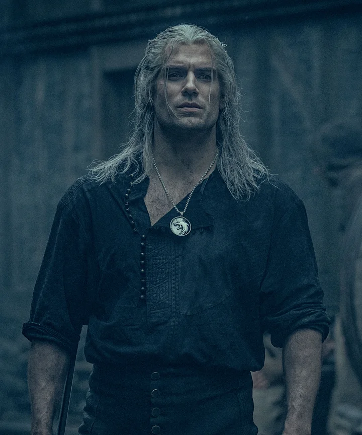
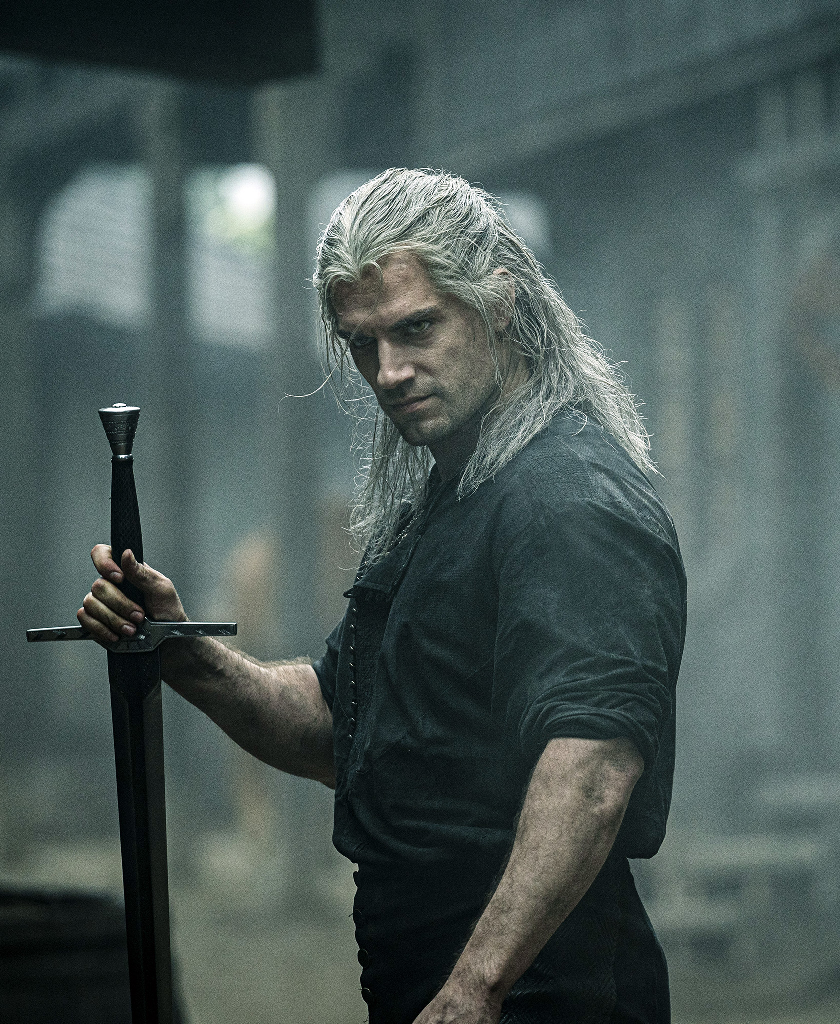
Body-language: the following is simply personal preference and should be taken as food for thought more than a rule or even a guide:
Another example but this one for a taciturn character who says more with looks than with words, would be Geralt from Netflix's The Witcher:
Username: @Mori_mann
>RUNNING TO HER
| Even before he had finished reading the letter, Khithstarted to gather a few necessities. The letter said that she would come to the village to visit him. He could send her a message too -she seemed to expect that -but what if it didn't reach her in time? Or not at all. Would she come anyway? He was not going to wait. Not after all this time. He thanked the courier again and hurried to the stables to find a horse.
Your lighting is spot-on in creating the mood for your story. The light going down may symbolize that if he doesn't hurry, he will indeed miss his chance. I loved it!
Areas of opportunity: I think that a close-up works better for a portrait or when you want to zoom into an emotion. Doing a close up on someone who's crying, for example, can be very powerful. Since your character isn't displaying an intense emotion, zooming out to give us more room to interpret what's happening might benefit you.
Speed & movement:
Zooming out:
Different angle:
Username: @vwrangler
> WOOSH!
I love this image! The storytelling accomplished with a single render and a short description is not only on-point but effective and well thought out. I have nothing to add to this image in terms of improvements and I'll even go as far as to say this was one of my favorite entries.
I especially loved the subtext the man in the balcony gave me. The pose suggested to me he might have superpowers and he might've used them at that moment. I also loved the couple on the stairs and their hilarious interaction.
I think what sells this image to me, is that even the background characters are tied into the action through their reactions, posing, and interactions. I can even get an idea of their personalities which helps them come alive to me. And say nothing about the main character. He's hilarious and I already love him!
Since I cannot add anything but praises, I'll use this image to exemplify the hierarchy @vwrangler managed to create through depth (#), flow (arrows) and, in direct consequence to the first, size (squares).
> TIME PASSAGES
I love this image as well and I wasn't surprised to see it win the main competition. Like with the previous one, it's hard to find an area of opportunity to improve an already strong entry. So rather than any improvements in regards to composition, I'll offer some feedback (highly subjective, like everything when it comes to art) on the concept.
Areas of opportunity: Both Esid and I felt that the second frame/iteration felt disconnected to the other two by the absence of the father figure. Since the story to us was about the evolution of their father-son relationship (not just the son's life), adding the presence of the father to the second frame could tighten everything up more, even if subtly.
Two ideas that come to mind to achieve this:
I couldn't find any references for those ideas, so I hope the description is enough. If I do find any, I'll add them!
Username: @dtrscbrutal
> THE SCI-FI RUNAWAY
This is a very interesting and ambitious take on a classical picture, which I appreciate and encourage!
Areas of opportunity: I think you had the right concept in mind but you may have gone overboard by adding too many elements. As a result, the scene becomes cluttered and we lose the sharp, minimalist focus of the original piece.
Decreasing the clutter:
Tweaking the composition:
Mood (Look & Feel):
Here are some approaches you can take:
>CHRONICLES OF THE WITCHER
This is an excellent portrait! I even voted for this and the win in the main competition was well-deserved.
Areas of opportunities: We need some kind of interaction to hint at something happening to transform a beautiful portrait into a storytelling entry.
Hint of danger:
Changing composition/ Adding Visual Cues:
Even changing the composition to include visual cues to allow his internal conflict (assuming he has one) to be externalized through boxing, reflection or even a shattered reflection can go a long way into adding the missing story. Here are some examples:
Turning it into a conceptual poster:
Since I've wanted the witcher series on Netflix, I think you could also transform this portrait into a conceptual insight into the characters. It would be the comparison between the posters that would hint at a story. Of course, I'd recommend not doing it in black and white, since that takes away the chance to use colors as another means of communication. Here are some examples of what I mean:
To be continued...
Username: @zombietaggerung
DECISIONS
Both Esid and I loved this one. I think if we had awarded someone for the sheer potential in regards to storytelling through subtext, this entry would've won hands down. That's because the mood in combination with some of the objects in your scene makes for a great setup; one which could be enriched with symbolism!
Areas of opportunity: Therein lies the areas of opportunity. You have a ton of objects which aren't being explored and used to push your storytelling.
Clarity:
Symbolism:
Okay, now let's examine the objects you've added to your scene.
Gun, Drink & Bullets:
The Piano:
The Window & the Clock:
Although I didn't provide many visual references, I hope my explanations sufficed. Again, great work in building that mood!
Username: @Mollytabby
THE DISCOVERY
| Leon's life changed forever when he discovered the spaceship hidden in a box in the attic.
I love the mood and framing of this one! It was a great call using a low angle to add power to the scene. It makes the boy's discovery feel monumental. The dog's mesmerized expression adds to that feeling of awe.
Areas of opportunity:
Composition:
Effects:
Overall, though, this was a very strong entry!
---
IT WAS THEIR DESTINY TO PROTECT THE STONE
I like the composition and effects being incorporated here. However, this looks awesome as a book cover or a portrait rather than a storytelling entry. I dig the low lighting with a few highlights since it gives them this sophisticated, sci-fi look!
Areas of opportunity:
Rather than have them posing while staring at the camera, I'd suggest having them interacting --while being unaware of the camera almost. How that interaction would look like, it's something you'd need to decide.
To be continued...
Username: @xmasrose (aka tulipe)
I Miss You
I love the concept and the desaturated colors help build the gloomy mood, conveying Leon's emotions.
Areas of opportunity:
---
Are We There Yet?
As someone who enjoyed the Don Quijote de la Mancha's story, I dug this one right away. The surreal color of the background hint at how Don Quijote was indeed losing his sanity as he plunged into the world of fantasy.
However, the lack of details would make this one more a portrait than a storytelling entry. Having said that, let's look into some of your areas of opportunity.
Areas of opportunity:
Username: @Gerterasmus
THINKING OF YOU
I love the atmosphere in this one. I think you created a wonderful mood already which conveys your concept with the help of your title.
Areas of Opportunity: Like with SBibb, I think that with such a strong base, what you could do is push the storytelling further by adding "a twist" through subtext.
---
DILFO’ CLOCK
This entry shows a very quirky and fun concept that is straightforward and effective.
Areas of Opportunity:
Username: @Sisyphus1977
First of all, let me apologize for the delay in getting your feedback. The world went crazy and this ended up becoming a bigger enterprise than I anticipated. Nonetheless, I hope the following feedback is still useful. Since your three entries relate to one another, I'll treat them as a concept (one story) and give feedback that will apply to all of them. So I'll post the three entries first and then give feedback.
NO ONE LEFT BEHIND
DUSTOFFCAT ALPHA
FALLEN FRIEND
First of all, I want to congratulate you for your strong entries. I was surprised that you were a new user and I'm sure your skills will just keep growing and growing. Out of your three entries the last one is probably our favorite, because it's the most emotional one. But I think your other two entries lend it quite a bit of power, so it was a good strategy trying them all together.
Areas of Opportunity:
Of course these two options may result in a less clear story, but the tradoff would be more interesting and dynamic angles + emotional investment. Once again, great job!
Username: @LaPartita
GOLDFISH VS MERMAN
First of all, let me apologize for how long it took to get to your entry, I hope you have been well and that the feedback is still useful. I LOVE the creativity of your entry, so much so, I actually voted for this one for the repurposed category (congrats on winning that, btw!)!
Areas of Opportunity:
Take note of the empty space around the whales, allowing them to breathe, while the corals surround them like a caccoon. If you were to fill that empty space, the scene would start to feel claustrophobic.
>> Look at how much breathing space (empty space) there is between the figures. We also get hierarchy built upon scale. The whale is the first thing we see, followed by the man.
This actually leads us into another design principle you want to keep in mind, which is...
Hopefully you'll find the feedback useful. Thanks for taking part in our category! :)
Username: @Dartanbeck
I would also like to apologize for the delay in uploading your feedback. Hopefully you'll still find some use for it! Now let's get on with it, since you're the last person on the list :D!
WHAT WE NEED, GOOD KING, IS A HERO
We LOVE the concept. The colors made me think of Greek mythology (Hercules, specifically). I think you showed a great handle on highlights and shadows, which give the render a painterly look that goes quite nicely with the concept and mood!
Areas of opportunity: You could push the framing and composition to bring in more menace from the serpent.
AND WITH THAT, WE ARE DONE! Everyone has gotten their feedback, though it took almost a year. I hope you all enjoyed waddling through this thread. Thanks for particitpating in our Storytelling Category!
Excellent feedback, thanks. I don't think I really ever knew where the main focus was, because the story kept changing and growing in my head - and as you've pointed out, that shows in the final image.
Regarding elements in the picture drawing the viewer's attention to the main focus - I realized that I intentionally (but with no good reason) did the exact opposite at one point: the hairy guy top left is pointing at something out of shot.
I love the idea of using the halo as a frame - that's inspired !
The attached screenshot shows thumbnails of the four earlier versions of the image that I still have, from the original idea (left) to the almost final version (right). Not sure which of them is the one you were thinking of.
Also very interesting reading the feedback on other entries. Looking forward to the rest.
Thanks for your kind words.
Master and Apprentice
The tendrils escaping at the bottom were a deliberate choice; eager to escape the chest. At the heart of the Fx is a 3D rendered power ball, which just wasn't working, so I probably went overboard with Ron's Brushes. :-) Postwork is something I am working on just now. The Fx is actually on several layers and blend modes so I can change them easily. But I do see what you mean about containing the Fx inside the chest, and giving it more 'substance', I think I was focused on the light but it was too whispy to give off the light. They are really good reference links and I'm going to look into that more. Thanks
Angel and Demon
I wasn't really going for a Religious painting with this, though I know it has allot of religious iconography. I just wanted to play with some wings and this evolved. It look quite Baroque to me. I will have to play with the lightening and see what I can do with the punch. The Angel's pose did give me problems, I had to render him a couple of times before I got that far. The contrast and vibrancy link is interesting and not a picture I have seen before, so I'll look into that more when I get home from work.
Lonely This Christmas
Those are good points about him not being lonely. I know nothing about Korean Drama, so I look forward to reading the article. Certainly zooming out and tinting it blue helped the feel. The comparison angle is interesting too, might have a play with that this weekend, though I might be too chicken to have so much of the scene dark and lose detail. I'll see at the weekend
Thanks again for you advise.
@3Dcheapskate, I think it was the third one the one I liked best. However, I forgot to mention an important thing, which is that while I understood the concept without the need of the vegas chips, my brother Alberto did not. So he actually preferred the last version since it was clearer for him. So adding those chips was a good call, but perhaps just keeping one (the black one) will help establish that information without cluttering the scene. In fact, you could have your main subject reach for that coin so it draws our attention to the corner where the black chip can be. (By the way, I am a BIG fan of the random addition of the bike. It makes me chuckle every time I see it!)
If you do decide to re-work this great render and are willing to share it, feel free to post it here. I'd love to see it. Because sometimes ideas on papers might not always work well once executed.
@3Ddreamer, glad the feedback was useful. I actually only started watching K-dramas about two years ago, but they have become my favorite thing to watch. Mostly because they are very artistic in the way they deliver their stories. So they are a great source of inspiration.
This is a screenshot from the drama Come and Hug Me. Notice how the dim light and the cold temperature contribute to a dark mood despite the Christmas decorations. Of course, in this case, this man has just killed the girl's entire family... so MUCH darker concept. But the importance here is how everything contributes to a sad and scary mood.
If you ever rework any of the entries and feel like sharing, I'd love to see them! Feel free to post them here ;)
Thanks again - I've done a quick initial rework incorporating some, but not all, of your suggestions (note: some items failed to load because they were in a temporary runtime when I did the main render - I'll fix that on the next iteration)
Original image alongside for direct comparison
Original suggestions from the first post in this thread:
Additional observations from your second comment here:
I'll try again once I've found all the missing bits and pieces. (several items and/or textures failed to load because I had them in a temporary runtime that's now gone)
*P.S. I just remembered that the title "The Entrepreneur" only came to mind when I added the red chip, with the devilish fellow coming out of it. For a brief while I had the subtitle "Follow Me Boys !", and I was imagining this little red chap as the entrepreneur, pulling teetering angels over the edge (and probably getting a nice little commission from his boss!)
.(hee! hee! I didn't realize that I'd written quite so much in this post - a bit OTT I think ! Don't worry, I'll delete all the comments that come after the picture in a day or two. Or not !)
Edited to add my missing response to the "You could use the halo of your main subject..." comment
@3dcheapskate, it's looking good! Please don't worry about the number of comments. That's actually a part I love about this process, is also getting some insight into what your own process was when creating the scene. Interestingly enough, you nailed the "Hangover" feel! I kept thinking of that movie when I saw your artwork, but couldn't recall the name. So when you added the chips, the feeling intensified! Another interesting thing is your title and your thought process regarding it. For me, the entrepreneurs were the Angels who did things in a bad way (maybe scammed some people) so the red chip to me felt like making it clear they did a bad thing (which I felt was already established). Never would I've thought the red chip was actually the entrepreneur leading them to hell. It's a very interesting interpretation for sure!
Thank you, Giselle and Alberto. This entire Storytelling category has been most generous. I include sponsoring the category, obviously. And now the PM for participation, and these detailed follow-up critiques. I have learned so much from your explanations. And thank you 3dcheapskate and 3ddreamer for your insights. Guessing by the number of entries, this thread could end up being a master class!
It's our pleasure, @Diomede. Hopefully all of these feedback will help people who come across this thread. And while I need to make time to properly write out my thoughts and find references, I love doing it. So it's also an excersize in creativity for me :).
This is fun, so I may as well keep going here (if 3Ddreamer or anybody else wishes to post, don't worry - I'll slam the brakes on !)
I had to reload the scene I used for the entry a few times in order to find allthe missing files, but I got there. It was easier to start again from that than from the modified scene in my previous post. No depth-of-field focus blur or clouds yet, because I'm trying to get the positioning of the figures correct first.
As well as avoiding the halo and the edges of the render cutting hands and feet (and trotters and tyres),I'm wondering if it's possible to avoid cutting the wings, and I'm also trying to make it so that none of the figures are obscured. But every time I adjust one I get a new problem - the obvious ones here are wing poke-through and a left leg appearing to be part of the top right fellow's chest.
Speaking of chest's,the main chap's caved-in chest look is a combination of lighting, morph and pose. The main infinite light is way up high, and while his stomach is lit, the bottom of his ribcage/sternum is casting a shadow onhis chest. A slight movement of the light should fix that- still to be done.
And you'll be pleased to see from this new version that, after some consideration, I've decided that Cheeseburger (that's the pig's name apparently) was actually saved.
Looking at the picture here I think the top right guy'shalo is difficult to see because it's in shadow,somaybe I need to move that. And the hairy guy's halo is around his neck which, using Cheeseburger logic, would imply that he's saved too - which he isn't. So I think his halo shouldgo into free-fall too
And I've just thought - the devilish guy should have the face of the TV presenter who had the catchphrase "Come on down,the price is right!"
LOL Don't mind me - now it is the weekend and I have just finished re-catagorising all my content again, I have a picture in mind to set up this weekend that I'll post.
@3Dcheapskate, glad that you are having fun! That's the most important thing of all, that we all get a conversation going and keep things positive :). And I bet that dealing with all those elements you have included is challenging! And I can't blame you for trying since I like challenges too :D. (What wings are you using, BTW?)
Okay, so I tried to search for more references that would prove inspiring. I got some interesting ones like this one and this one, but the one that seems closest to your concept (POV) is this one. Now take note of the relationship between the angel who's front and center (main focus) and the rest of the falling angels. Not only is the main angel more detailed, but he's quite larger in size when compared to the rest of its kind. I think that in order to keep your composition from feeling too crowded, you'll need to pull some angels way back.
So here are some composition markers that I thought of. You might still need to get rid of one of the extra falling angels. Either that or try to put two angels in one of the orange sides (though that might be too crowded with the wings).
@3Ddreamer, looking forward to it!
Also I've now added new feedback for @BronzeDragon and @Bunyip02. I'll do my best to update the thread with new feedback every Friday (giving feedback to two people each time).
Been working on a new take on the Lonely picture today. This is the first render, basically just scene-setting and layout, allot more to do and think about yet. Sticking with the 'turning back on the fire/warmth' idea, the fire reflection is too distracting at the moment but I don't want to lose the contrast yet. Red picture has to go, maybe be replaced by family pictures. Candlesticks go too. Might need a blue light coming in the window to cool down that side. Looking at it now it divides into 3 - but that could be the red picture effect. In my head I'm thinking 2/3 or 3/4 cold to warmth. Allot could change when I look at it again tomorrow ;-)
I LOVE the direction you're taking it and already I can start to feel his loneliness!
Thanks
There is no bloom set in the render yet - that is purely fire emission and the floor surface. When I get back to it I was thinking about ditching the fire and just having firelight coming off-stage left, but maybe just replace it was a Christmas Tree would work too. The whole fireplace, candles, picture frame is a set I kitbashed in and ran the Iray Uber shader over it quickly, so the shaders could use some work.
I hadn't actually noticed the Wine bottle labels till you mentioned it The two frames on the bookcase were catching my eye more. The 2 bottles needs turned, I agree, and toning down those frames - once I see how they play with a replacement picture above. So I need to render a picture to be the family picture next.
Looking at @3Ddreamer,'s rework, I started hearing Frank Sinatra singing "Only The Lonely" - beautiful melancholy song... great album cover too. Possibly an idea there ?
(P.S. Having hogged this thread for over a week due to the luck of the draw, I'm bowing out now to make room for @3Ddreamer, @BronzeDragon and @Bunyip02 to play. But I'm still working on my picture and watching this with great interest.)
+1! What a great art lesson!!! Thanks!
Those frames actually don't bother me, perhaps because they are thinner.
Ah, yes! That's why the metals over the fireplace look so stark (and unnatural) against the dark background. I look forward to seeing where you take things, since your most certainly on the right track!
@Dartanbeck, my pleasure! I'll be posting new feedback on Friday :).
I've added feedback for @Carola O. I'd hope to also have the feedback written for @Cismic, but I've been crazy busy this week. Hopefully next week I can add feedback for more than one user!
Thank you Fenix, I'll be looking into those advice! Somewhat short of time right now though :)
Okay, got the second render finished for the picture. I think it is a bit distracting because it is so big, I probably should have dulled it down with some grey. Or replaced it with another smaller picture frame. I changed the framing to make him bigger, that does make the warm firelight more subtle but I hope there is enough for the contrast I was after. There is some geometry issue with the lamp, event spinning it around there is light leaking around the top, that needs fixing with postwork. Had to tweak the tone mapping setting to clear up allot of fireflies. But all told it was an interesting and fun exercise.