Less-Than-Stellar 3Delight Renders. Any ideas?
 SubGeniusZero
Posts: 61
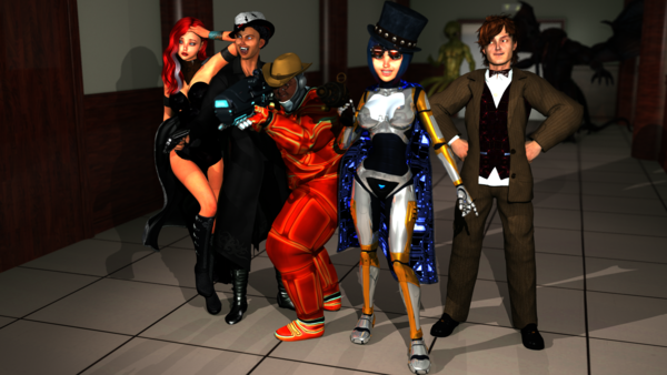
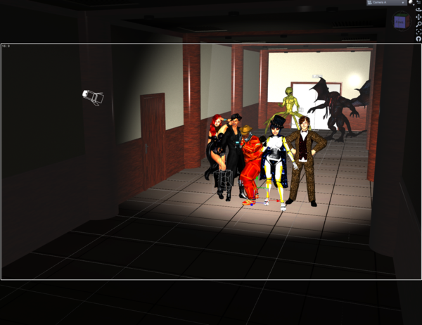
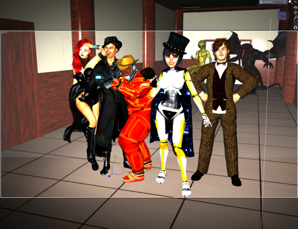
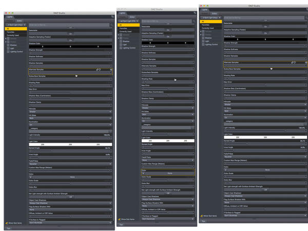
Hello. I’m new to 3D and to Daz Studio still, so go easy on me! I’ve been reading up on lighting and rendering 3D scenes, but am running into a bit of a snag with the current scene I’m working on. I’m using three of the “AoA Advanced Spotlight” in a 3 point lighting setup (Key and Fill slightly elevated and at roughly 45o angles on either side of the main camera — which has DoF enabled — and an Edge light positioned behind the main characters), but am not getting very good results . . . right now the renders are only coming out so-so, and are not like the eye-popping stuff you see on the product pages here on Daz3d.com. As you can see, the girl in the foreground (and the guy on her right, too) is coming out fantastically; I love the way her armor shines and pops. But everyone on the left looks kind of flat, and the Mars Explorer spacesuit (by Midnight_stories) looks terribly cartoonish in this render. So I’m wondering — what am I doing wrong? I’m including screenshots of my lights’ settings and of my viewport and the results, so you can get an idea of how the lights are positioned and what I’m trying to do. I’m shooting for more “photoreal" results than what I’m getting (though I realize you can only do so much when your characters are a bit cartoony to begin with.) I’ve toyed with the Reality plugin and LuxRender and traditional Daz spotlights, but the results there are even less spectacular than these! Any ideas? I've experimented with moving the lights a little, as well as with adding more lights, all to no or little avail. Muchos gracias ahead of time for any input! :D





Comments
At this point, I think the problems you are having are more related to the surfaces/settings than they are lighting. Not that the lighting is 'perfect'...you've got more than one shadow casting light in the scene...and they are causing conflicts (main light direction not matching main shadows).
I'd probably keep the shadows on for the main/brightest light and turn them off on the rest of the lights. I'd probably also add something like an UberEnvironment 2 light/AoA advanced one that adds Ambient Occlusion. That can make details 'pop' and adds a touch of 'realism'. Also the Ambient settings on the surfaces...basically not needed.