Vibrancy lost outside of Carrara
 murph101
Posts: 68
murph101
Posts: 68
I had a similar post a year or so ago, but never found a good solution.
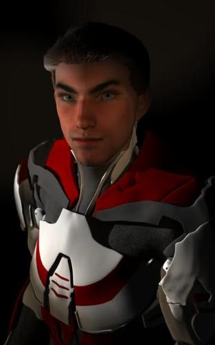
I created a portrait of a character, Genesis, added customization, set portrait style lights. LOOKS FANTASTIC when I render it Carrara.
Then I save it to any format, .JPG, .TIF, .PNG, .PSD, and it comes out looking splotchy OUTSIDE of Carrara. I used the windows previewer or pull it into photoshop, and it looks like a .GIF format with patchy blocks where gradients should be on skin (and elsewhere).
HOWEVER, if I put it on my smart phone or copy to my android tablet, it looks perfect (albeit a little dark).
It looks perfect inside Carrara, but horrible outside Carrara.
Is there another external viewer that will represent the picture correctly? I'd hate to have to transfer pics to my smart phone or tablet every time I want to see how it's going to look on other platforms.
Even if I render at 600 dpi, adjusting for dimensions, it looks bad on my laptop screen. Curiously, when I render, even at 72dpi resulting in a 17K file, if I email it to myself, open up the attachment it looks good!
I've attached a render done at 72 dpi. How does it look to you?
Daz 3D is part of 
Connect
DAZ Productions, Inc.
7533 S Center View Ct #4664
West Jordan, UT 84084
Licensing Agreement | Terms of Service | Privacy Policy | EULA
© 2024 Daz Productions Inc. All Rights Reserved.
Comments
Now that I've posted it, it looks great. Any ideas why it looks so bad in Photoshop and Windows Previewer? I'm using RGB all around.
Actually, I opened it up in Microsoft's Picture Manager. Looks good.
how do other pictures look in windows viewer and photoshop?
photos for example
printing my renders at a photo kiosk they look really good compared to a computer screen, even on 12" x16" poster prints
likewise displayed on my 42" plasma tv
this is how most would see them.
hmm at a bad guess it's moire patterns
http://photo.stackexchange.com/questions/11909/what-is-moire-how-can-we-avoid-it
these should dissappear if you look at the image at 100 percent mag, well they do for me
Photoshop may have selected a color proofing setup that doesn't really work well with your monitor. Check the Proof Colors setting, and try "Monitor RGB".
I calibrate my monitor for producing CMYK docs for printing with an Adobe tool. Never had a problem until sending Car renders in any form into PS. But I have to leave my calibration so I know that the printer service I work for will produce what I see on my monitor. I don't work instore anymore, so faffing around via email isn't worth the aggro. I cringe each time they get a new machine.
Colour management is a graphic designer's nightmare and it gets worse when trying to explain to customers why I can't use the bright RGB colours that show on their screens. They are just outside the gamut of the colour range that offset printers or digital, laser or inject printers can produce. (Unless you want to pay to add a Pantone shade(s) to your offset job).
So I thought I just had to live with this until I saw your post. It's not just me!!! My shadows on characters sometimes take on a rust or greenish tinge, especially if I have used Carrara hair to produce macho chest body hair... that hair makes its own shadows. I just learnt (DOH?) that you can turn shadows off on hair...DOH DOH DOH. What a difference that makes.
Still I get the weird blends of shadows and gradients as OP said. Only way I can get rid of it is to lighten up the scene, use a spotlight vs a scene light for each character AND I use the highest render light settings which one of you gurus gave a recipe for some time ago. It takes forever to render, but THOSE renders look great in PS and even when converting to pdf. Most of what I do are natural colours so I don't worry if I am in RGB or CYMK...they look about the same.
Anyways.... that's my 2p...and it may not help but would suggest trying to use best light settings appropriate for your scene on rendering for images....AND mind the gamma as it can create a lot of contrast. In PS you can use tools there to replace colour at different levels if you find consistent odd-coloured shadows along with other related tools. I have even copied sections and then layered them onto the original scene image and adjust those.
xx :) SileneUK
when you open the image in fotoshop does it open with a rgb profile or some other profile like srgb?
On another note: Cool character! I really like the Carrara hair. Hey... wait! That's you!!! :)