Please Critique Me (Constructively) ;)
Hi All,
I'm hoping to make a visual novel, just as a bit of a hobby in my free time and have been attempting to teach myself Daz over the past few months. I feel like I'm now at the point that in order to get better, I need some feedback on my renders. As such, if anyone could provide any constructive criticism to let me know how I'm going and where they would head next (i.e. tips and tricks to make them look better), I would be very appreciative.
Thanks in advance.


Thompson.jpg
2560 x 1440 - 2M

Jessie.jpg
2560 x 1440 - 2M

Stacey jpg.jpg
2560 x 1440 - 2M
Post edited by Maxo Telleson on


Comments
Overall I like them, but everything can be improved, and since you asked :D
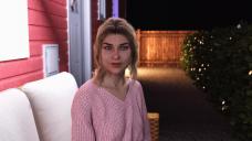
The first thing I notice is that on the guy and the girl in the pink top, they have really harsh light spots on their eyes, but there doesn't seem to be a lightsource for them. If there is, you might want to post it to soften it up some. It doesn't fit in with the rest of the scenes.
The girl in the pink top I like other than that. There's a little blow out on the white thing on the wall, but I'm guessing it's a security light and those are pretty harsh, so it works. She's making the best eye contact with the camera if that's your goal.
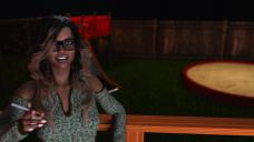
The girl in the blue and green top I think I like the most, but she seems a little stiff in her pose. Maybe slump her right shoulder some and bring her elbow in. Any time you're doing a pose, it really helps to do the pose yourself in the mirror. Her eyes seem a little vacant. She's got a smile but it's not hitting them. Add in some cheek flex and some eye squint maybe. Constricting her pupils a little might help as well. I'd lower her focus just a touch too.
The guy it depends on what he's doing. If he's talking to the viewer passionately, overall I think he works. His left hand looks really stiff, so he looks like he's adamant about something. Again here, take the pose you're trying to do, and try to mimic that. Generally people don't hold their fingers as stiff and even as his left hand unless they're demonstrating something. On the beer bottle hand, it seems too loose. When I grab a glass or bottle, my palm contacts the base of the glass, my fingers angle up on the other side and spread away from each other. Even if I only hold it loosely so my palm doesn't make contact, my fingers spread out and at an angle. It would be very difficult to hold a bottle that way for me. Hands are *the* most difficult thing to get right, which is why I try to hide them :D The furniture piece just behind him has some blowout on the white. There's obviously a light source, but it doesn't seem to fit well with the other lighting in the scene. There is also the *teeniest* amount of pokethru on his right leg under his arm. This is likely do to collision settings on the pants. It's reading the arm as colliding and pulling away but it pushes it into the leg. So you can turn those off or use a deformer or Mesh Grabber to pull that out of his leg (or you can postwork it out).
Hope that's useful. I do like them overall. Those are really mainly just nitpicks.
First comment: Wish I could do as well.
Second comment: Everything is very clean & tidy. I never have that little clutter anywhere in my house or garden. (I assume he's on his patio). Also in the garden I have a few weeds growing in the patio & a few little drifts of windblown dirt. Also, our garden furniture looks vaguely grimy even if only a couple of weeks old because we leave it out 24/7/365.
Image of the bloke: His shirt looks as if it has been inflated round him, rather than draped by gravity. Is it worth trying a simulation to get it to touch him in places & drape elsewhere?
Image of woman in pink: Agree with comments above, plus the camera focal distance should possibly be on her face rather than her right shoulder.
Image of woman in green: The bright light on the table edge takes attention from the figure, otherwise cannot make suggestions.
My points are definitely very minor, and I really wish I could do as well.
Richard.
Glad your getting feedback. You might change the title to Critique rather than Criticise.
Here's a good explanation of critique vs. criticise:
"In general, criticism is judgmental and focused on finding fault, while critique is descriptive and balanced. Here are some more differences: Both criticism and critique are forms of feedback, but it should be obvious that critique provides a better learning environment."
Thank you all so very much. This is exactly what I was after.
ChangelingChick - this advice is most helpful. I really appreciate it, and the manner in which you deliver it. It's always a bit scary putting my work out there, so thank you :) Only thing I wanted to clarify was when you said about ".... If there is, you might want to post it to soften it up some. It doesn't fit in with the rest of the scenes...". Do you mean take it out in post-work or something else? Apologies for my naivity here.
Richard - thank you so very much for your comments. I really appreciate the tip on the focal distance on the girl's shoulder. I see it now :)
Cris - Hah! Yes, bit of an English fail there. Have changed the title - thank you.
Yes, exactly :D
These are very much the kind of renders you see in some visual novels, so you're on the right track. Skin tones are not bad, but that's always tricky in these kinds of indoor/low light settings.
You might want to look into composition. The concepts are pretty universal, and apply to renders, as well. There are lots of Youtube tutorial videos about composition in photography, drawing, painting and that. Have a look at one or two and then see if you would do your renders the same way.
One thing I notice is that the right hand of the woman in the third shot is out of focus. I think you're using depth of field with a small f/stop to blur the background. You might want to try reducing the focal distance, to pull the plane of focus back a bit and sharpen up her hand a little. If your focal range is still too small (i.e. the woman's face goes out of focus as her hand sharpens up), you can try playing around with f/stop, the camera position and focal length until you get a range that includes both the woman and her hand. Top View or one of the side views are good for seeing exactly what's in focus (select the camera to see the focal range indicators).
This is just a personal bugbear of mine: I'm an amateur photographer, and I've lost count of the number of shots I've screwed up by having some body part out of focus due to a too-shallow DoF. Sometimes it's an effect you want, but sometimes it's distracting. In this case, I find it distracting -- but not everyone will necessarily agree.
Sevrin - Thank you very much for your feedback. It's really good to hear that absolute strangers think I'm on the right track because at the end of the day that's who will be playing it. If I'm being honest, the skin tones are what I struggle with the most and why I felt like I needed feedback in the first place. I've watched a few youtube videos on photoshop retouching and a few professional editors do say that your eyes will start to play tricks on you after a while of post/skin work and it often happens to me when creating these renders. I'll render somehting that I think looks really cool, and then come back to it an hour later and wonder how on earth I thought the skin looked good at the time of render. Do you have any tips or feedback for making skin looking better in low-light settings? I've been using the Altern8 system, which I find produces the best results for my characters but lighting is something that I don't think anyone ever perfects, so it's a constant work in progress. Thank you very much for your advice on composition, I have begun to think about after the feedback above so I will definitely hop on youtube and see what I can learn. Cheers.
Bytescapes - Thank you for your feedback - I do see it now, and also appreciate this kind of critique coming from a photographer. I've tried my best to learn a bit about photography (F-stops, Focal etc) as a lot of it applies to renders (i.e. your depth of field remarks). I'll pull the focal back a bit - that's a good idea. In most of my research (i.e. playing other visual novels lol), I found that DOF was used in most shots, and you're right, it can either make something look absolutely amazing or can mess your entire shot up if a body part is blurred as it distracts your eyes and is all you can look at. I'll take this on board - really appreciate it.
Cheers guys.
Marvelous scene renders
hi ;)
sorry if I express myself badly but I use a translator,
the most important thing in a visual novel in my opinion is the story and by far, you can have the most beautiful renderings in the world if your story sucks, no one will be interested in your project.
as far as rendering is concerned they are very good, there are obviously some mistakes like spotlights in the eyes, on picture 1 there is a pocktroughts under the man's elbow and textures problems on the wall, on picture 2 the white of the shutter? dazzled too much, the background window emits a violet light that can't reflect the window frame like that and reflects on the leaves of the shrub, on picture 3 there's a problem with the wood texture, and on all the pictures, the depth of field is too important for my taste, otherwise I think it's a very good work ;) all this remains only my humble opinion and once again the most important thing for a visual novel is the story
I can't see anything wrong, except the beer bottle seems too dark. When in doubt use a reference image and have Iray view port up and tweek the settings. Also grab some smoke PNGs or use some post editing for smoke on the cigarette. http://pngimg.com/imgs/nature/smoke/ Other than that they're awesome.
This is a personal opinion, so that it with a grain of salt...
It unnerves me when a character is very obviously looking at the camera. It creates the "its looking directly" at me impression.
To avoid this I usually create a null and child it to the camera. I zero out the position of the null so that it is directly in the same space as the camera. I then have the model's eyes look at the null. While looking through the camera view port, I nudge the null a bit so that I can see the figure's eyes move.
This lets me subtly change the direction of the figure's gaze; looking at the camera but not LOOKING AT THE CAMERA. If you get what I mean.
It's because she wants these to look like some one is taking pictures at a party.
Understood, but when that happens in real life the subject usually doesn't look directly at the aperture of the camera. They look at the flash or the person. The way they are now the gaze is eerily dead on.
Like I said, personal preference that the images give me the wrong impression because of it.