The character who will never be right
 Upirium
Posts: 705
I don't know why I bother coming here for help on this because I generally do not get it but I am still incredibly desperate to make this damn character look right.
I'm almost ashamed to post it here, because now that I render it to ask a question it just looks bad to me and always will.
I rendered him today to ask for help and I notice a lot of problems but.
Mainly I WAS having trouble in the eyes. I'm not entirely sure what I need to fix, and what parameters to alter. That's my big problem. I need to know what parameters I should alter.
But I see other problems now too...The nose and the mouth don't look entirely right...
Anyway, this is what I have...
He doesn't look right.
The big problem is UNDER his eyes.
I started this character in 9/13 and I'm sick of him looking wrong all the time.
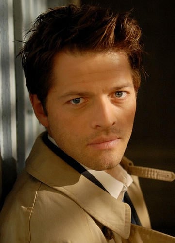
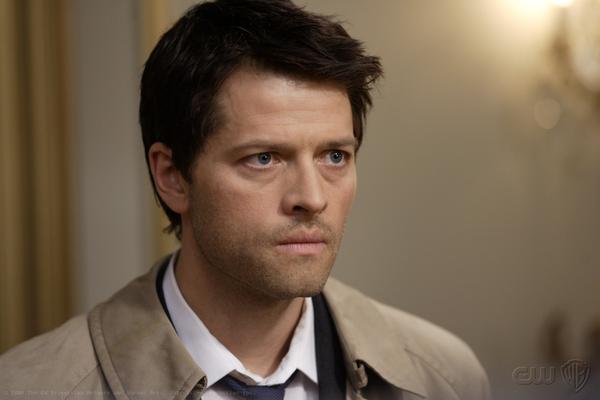
Here's some pics of the dude.
I'm going with just pics of the char this time, but I don't have that many. It's because somehow when he's acting he doesn't look the same as when he's just being a regular dude.
One of them is a gif I'm sorry it's the best side pic.
Please excuse his nudity
I just didn't feel like putting his clothes on they take longer to render.
But I was also testing those wings up close so they are there.
edit:
Closeups added, others removed.
Unfortunately, in the closeup you can see a lot more things you can't see far away.
So some of the detail there is lost.
I uploaded the other pics somewhere else though, so the links to the loss of detail is here:
http://24.media.tumblr.com/7d08909420d624d124738d895e56f9a8/tumblr_n55zp0yB4v1r8y8hko2_1280.png
and it's even worse FURTHER away, as most of the pics I do are not this close up.
It generally looks about like this:
http://fc02.deviantart.net/fs70/i/2014/117/6/d/the_cat_and_the_eagle_by_dirufan-d7gah25.png
edit 2:
I have updated him a bit, but something is still off about him.
I tried to mess with his nostril area with magnets. It looks a little better but somethin' is still of.
So below is the updated images.





Comments
I think you've said this in other threads, but please refresh our memory: what figure is this, M4? And are you using a modeling program, or morph dials, or both?
And can you show a close-up render of his face?
It might be the way Misha's upper eyelids sag. His Castiel character has some of the most saddest, puppydog eyes I've seen (although when he's out of character, not so much).
Can you do a closeup of your chars face?
I'm using M4. I'm using morph dials. It's all I know how to do.
I need to go render it, so it's going to take a second.
I say it is very very close... I agree it is the over the upper lids part that needs work. I'm not sure M4 has the needed morphs or not.
Hmmm, a good side view of the face that isn't moving would be helpful, and I can help with what needs tweaking :)
For one, it appears the nose bump isn't prominent enough. You do bump but also the depth of the bridge of the nose. It's not just the area, but the surrounding areas, that create the right height. I think you're doing very nicely btw! I just can't tell with a moving side profile.
I froze the gif and uploaded it.
And I'm also working on getting closeups on the face
One more favor (because then I'm going into photo paint and point to where it needs tweaking) will you put your character into a side profile exactly as the one you froze, aka, lift his head up and get him exactly as the side photo of the real dude.
Start here. I went to the middle of the real man's nostril, and drew (by hand) a fairly straight line. Look where it hits the top lip, bottom lip, and forehead. Put your character in the same position, do a screenshot, and do the same thing. If these don't line up, it doesn't matter what else you do, he'll never look right in side or 3/4 profiles. :)
I've got to go run errands but will be back.
Check the roundness of the nose (aka, the "bulb" as it might be too big.)
Check the tip of the nose height, do it FROM THE SIDE.
Nostril width might not be enough. Will know more if you provide the head up side view that matches the real man's.
EDIT: Also look at the chin in relationship to the bottom lip. Once you get the nose and lips in proper relationship then you can do the chin if it needs fixing.
Dial the head age morph to somewhere between .3 and .5
Take the EyeBaggy morph to the negatives to get him some lines under his eyes (or use a displacement map)
Also EyeLidBottomOutDefine will help with that.
A combo of EyesPuffyTop and EyeFoldsHeight will help get the top eyelids down closer to his eyes without bringing the inner part down.
The nostrils need a little more up-flare, but if you've got the nostril height up already, you might have to do it with hand morphs.
If it's any consolation, in the thread you were having problems with the wing mats, my husband and I both immediately knew who it was. My first thought was, "Are Castiel's wings actually black?" I only remember seeing them as shadows except in fan art. And the intro has black wings, but I've never been sure if that was literal or metaphoric. Then my husband was walking by behind me and glanced up saying, "Nice Castiel! Who did that?" So it looks like you got the wings fixed. Did that mat file work?
It didn't actually work, I am just using the regular MAT now until I can fool with it some more, because I lost the drive to really care too much at the moment. The more I look at the wings, and the more I work with them, the less irritated I get with the fact that they're not frayed.
But thank you for the tips, I will try working with that.
Just my quick 2 cents - in the side view it looks like your character's lower face is noticeably deeper than the real-life face.
I put it into a graphics program to get definite lines, don't know if that makes it better or worse for others to help you but it may help as the lines of the face are very apparent. I'm posting the plain one and then my markup, so if anyone wants to copy the plain one and do their own markups, they can. The face sizes are almost the same size, your man is a bit smaller, but that does not affect shape.
This is based on the side view and only my opinion :)
1. the forehead of original man has an indentation, yours doesn't. Someone can jump in here and identify that slider, my studio is in the middle of a render and will be for hours. I don't do Poser so can't help there anyway.
2. eyes are possibly too small on yours.
3. lower your nose tip. Make the end of the nose perfectly round from the side view.
EDIT: I don't mean lower it, it needs to be pushed in so you don't have that extra hump. I think that is the "roundness" tip of the nose slider, not the "raise or lower" the tip slider.
4. look at the curve of the nostrils. I think raising them (in DAZ Studio) reshapes that area. Not sure if width of nostrils will help.
5. Raise the nose, it's too close to the mouth. At least it appears that way from the side. The nose appears too long (from the side.)
Take all this with a grain of salt, this is just from the side view. I actually like your character very, very much! :)
Good job on those Novica. Really helps to see the differences with them side by side and labeled that way.
Dear lord can you please tell me what you did to achieve that affect. I've been trying and trying and TRYING to get traditional looking art from Poser but I just can't, and god the sketch doesn't work but THAT is what I'm looking for!
Thank you for the rest of that info too.
I will be sure to use it.
Thank you! :) Do you have Fotosketch Vaskania? I love it- it really helps when you want to get something outlined, watercolored, cartooned, etc.
It's a FREE program :)
http://www.fotosketcher.com/
Here's another look at how to tackle this- draw some vertical lines and see if the corner of the mouth (and nose) lines up at the same place- which you can see the width of the mouth or width of the eyes, something is off.
Happy to help. Just keep us posted on the progress, you're doing a marvelous job.
I had posted some examples of Fotosketch over in my Art Studio thread as we're discussing cartooning. SereneNight did one using SnowSultan's tutorial (which is also linked on my thread in case you're interested in that too.) It's what got me thinking, "Oh, right, FotoSketcher. Haven't used that in awhile." Then I thought "Oh yeah, that might be helpful to outline that man." So you really have SereneNight to thank, lol.
Here's more examples of FotoSketcher: (be sure to go to the post after it as there are two more examples.)
http://www.daz3d.com/forums/discussion/38051/P570/#600530
Here's the link to SereneNight's post as it was a few posts prior to mine.
http://www.daz3d.com/forums/discussion/38051/P570/#600189
Nope, I don't have it, but it looks like an amazing addition to my Photoshop and Krita. Thanks for the link!
/edit
Ok, after opening that sucker, I can't believe it's 100% free and carries no usage restrictions at all. Excellent find! So many options :gulp:
Just repaying ALL the times you've helped me, immensely. :)
To add to Novica's list - Misha's lip-chin area is basically a straight line, yours is indented under the lower lip. Additionally, your jaw angle is more curved, where as the photo it is a flatter line.
I've never used M4 much so I'm not sure which exact morph dials you need to fix those, but those would be areas to look at.
I made my own Cas/Misha morph early last year, but it was based on D5, and I left the Supernatural fandom for good shortly afterwards and haven't touched it since, so there's a lot I'd do better if I revisited it now. I've attached a render anyway just for sharing's sake, and if people are interested I can try to dig up the formula (not sure if I still have it or not, I flattened it out to it's own morph dial at some point).
I also want to add there are no viruses/adware from my experience. I am very careful when downloading programs and researched it carefully before I did. I've had it over a year.
Temporal.Ranger- one word...
YUMMY!
Woooooooooooow :Q