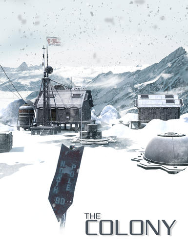
The Colony commercial
 AntMan
Posts: 2,051
Thanks to everyone who purchased the Colony, it's been a great success thanks to all of you. So this is less of a "hey go buy this product" and more market research. I am curious what parts of a set, this one or something else I've done or need to do, do you fine the most helpful.
For instance I have always found preloaded sets handy so I include that as a function. A second texture is handy but is it the attribute that makes a set more desirable or just eye candy.
And again Thanks.
If you didn't see it here is a link.
http://www.daz3d.com/the-colony


MainPop.jpg
1300 x 1689 - 1M


Comments
I haven't bought this one yet, but it is at the top of my mental wishlist. I've got quite a few of your other sets.
Preloaded versions are essential. First thing I do with a new set is just play with it, and it's nice if you can just load it up with one click and then wander around in it (with your camera), rendering here and there, to get a better idea of the details that can't all be shown in promos. I tend to lose track of time doing this -- for me, exploring a new set is just about as much fun as making a render. It's almost like going on a field trip -- sometimes to the strangest and wackiest places. :)
The other thing that's useful is, if there are individual props, that they be available in the library with a thumbnail. Helps the kitbashing. I'm quite capable of saving my own props from a fully loaded scene back into the library, but I appreciate it when some of the work has already been done. Of course, some sets have hundreds of props. It'd be a waste of time, I think, for the vendor to make a library loaded version for every single one. Better to spend that time coming up with new cool things for us to play with.
In the case of this set, the second texture is awesome. It definitely looks like more than eye candy. There isn't nearly as much snow and ice around on terrains as other types of environments so it's great to see and doubles the utility of the set.
Edit: I meant to add: I've bought a few sets *just* for the terrain or ground or even the skydome. So I would definitely value the second texture idea. I don't use Vue, so big open scenes are challenging to set up, and including some natural details, like rocks and trees (and mountains -- so few great, realistic looking mountains out there), is very helpful. My runtime is massive, but I always find I need more...
If a scene has a massive prop with an enclosed interior, it's helpful if the walls have separate material zones and that the set includes presets to make each of the walls invisible. But I honestly don't remember having any trouble navigating through *your* sets, so you either already do that, or you set up your architecture in a way that is very friendly to cameras. :)
I have no complaints whatsoever about anything of yours I've bought. I think you offer a great variety of themes, and variety in the sizes of scenes (from vignettes to big scenes complete with terrain) is very cool too.
Sorry that wasn't all that helpful.
All input is helpful if it's constructive and this was. Thanks for the input. There is no set guideline for products beyond do they function as intended. The more I do, I hope to improve and meet any changing needs of the community. The more advanced the programs get the more can be done, it's just a matter of not wasting time on unnecessary items or functions. The HD function in Daz Studio can be applied to props for instance. This would increase render time but also the amount of detail you get. Like wise, detail can achieved by using a higher poly count which slows down animators but renders fast. Of course normal maps and other things play into the mix.
I think the community is a good sounding board since you are benefiting or suffering the results.
First off, I have no complaints about your products. They are all top notch and so far have been very easy to work with. None of the issues I raise below are targeted at you - then again, I don't have all your products yet. :)
Some of my opinions might be a bit off the beaten path since I do ALL my scene assembly and rendering in either Carrara or Vue. So, with that said, here is what I really like/dislike:
* Pre-assembled scenes: These let me get everything into the scene the way they were meant to go together. Then I can rearrange things to taste. I've been frustrated with other products where I had to spend time aligning walls before moving a building. Pre-assembled scenes avoid that hassle.
* Individual props for just about everything: I rarely use any purchased content in its default state. I tweak the position of just about anything that can be moved to get it exactly where I like. I also habitually mix props from as many sets as possible to get a real "lived in" look to my scenes.
* Many material zones: Some sets I've purchased from other vendors will combine too many parts into a single material zone. For example, a lighting fixture where the fluorescent bulbs are part of the same material zone as their metal housing and translucent plastic cover. This makes it impossible to use application specific materials and glow effects without a lot of hassle creating special maps. Another set I bought combined the neon sign material with the roof. What a pain! Material zones are the difference between selecting a material and double clicking on a shader preset versus opening Photoshop and creating glow maps, masks and so on.
* Terrain Props: I don't have much use for these since I put everything onto a Carrara or Vue terrain. However, I can see how they would be a very nice touch for Poser/DS users.
* Buildings and Sidewalks: Buildings should never be connected to the ground, sidewalks, or street props. Some sets make the building and surrounding sidewalk/street all a single model. This makes it difficult to mix and match with other building sets.
* Second Textures: While not absolutely essential, I won't ever turn them down. However, with sets such as the colony, they are important for choosing the season when the default is winter. It's nice to know I don't have to limit this set to winter renders. However, being from Chicago I wish more scenes had winter options so I could feel more at home.
* Genre: OK, I admit it. I am very, exceptionally, enthusiastically, biased toward Sci-Fi. But that doesn't mean everything has to be greebled to death and have odd looking parts that serve no discernable purpose. I like the products that are somewhat ambiguous about their time period. A 1000 year old building still used in a future time of antigravity and starships? Sure, why not. With some embelishments (high-tech props from other sets) it can work. I have a friend in the UK who lives in a house that is older than the United States, but it has all the modern upgrades (electricity, Cat5e, cable TV, etc.). So, future cities will probably have much in common with those of today, with new construction scattered about while older structures have been retrofitted and upgraded resulting in an absolutely chaotic mix of architectures from different periods. Many of your sets already tend in this direction and are ideally suited for this.
One last thing - I really love the grungy/industrial look to your explicitly sci-fi products. Please keep them comming.
Good Feedback. I always thought the "City of Embers" hit a nice future balance. But I agree integrating the worlds has the best vibe for me. I never bought a clean future, it's just not how humans are wired. When I start a project I try to ask how will people use it, but truth be told you never really know unless you ask. Kit bashing is something I do so individual props has always made sense.
But I thank you for the input.