Dino's post #1
 hergal3d
Posts: 28
Hello guys ...
I am a new user of this forum. Since many years using Bryce to create stereoscopic renderings. Allow me to post four blocks in a series of images that have subjects like dinosaurs, sometimes set in an arbitrary manner. Some scenes I posted the anaglyph version and animated gif to simulate three-dimensionality. The anaglyph images you look with the classic red / cyan glasses. I'm participating in the challenge this month with some renderings that I have not posted here.
I hope that my "intrusion" is not obstructing its.
Pino
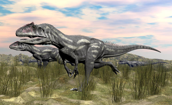

Allosaurus_fragilis.jpg
2000 x 1223 - 1M
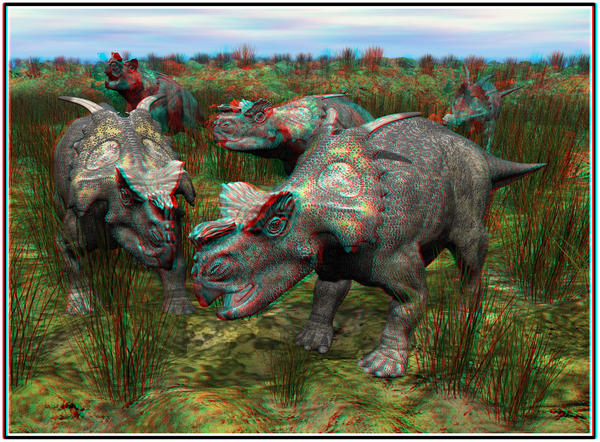

Achelousaurus_horneri_anacolor.jpg
2000 x 1473 - 1M
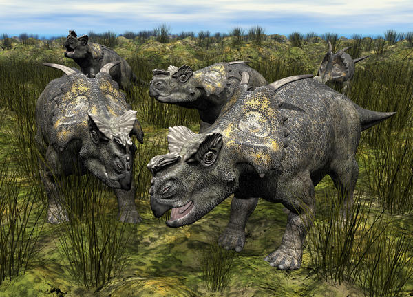

Achelosaurus_horneri.jpg
2000 x 1441 - 2M

Abelisaurus_comahuensis.gif
400 x 235 - 3M
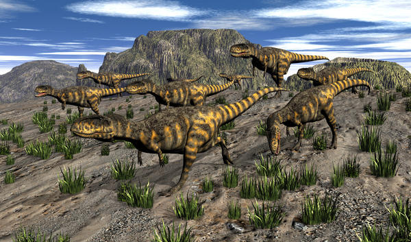

Abelisaurus_comahuensis.jpg
2000 x 1178 - 1M


Comments
Keep watching ...
@Pino - welcome to these forums. Great renders. I'm a fan of anaglyphs and the one shown heare is great. I find it difficult to get coloured anaglyphs right so that the colour doesn't disturb the 3D effect. But in your example, it works a treat.
Again, great renders. Why not keeping them together in the same thread?
+1 I also think they should all be in one thread, and they are wonderful.
I can merge the threads together if you like, to keep the images all in one place
Thanks for your comment, Horo. Your observation is correct: Color anaglyph disturb the vision, especially when there are strong dominant in red and cyan.
I have the limitation of 5 posts, in fact I am posting the renders in groups of 5
I would be grateful, meanwhile sending more images ...
I continue with new images...
All for now ...
Thanks for your attention!
There you go. Now all you need to do is to make a reply to this thread and then attach your images to the reply.
Every post in a thread can have up to 5 images attached.
Miss B, you're really kind!
Thanks chohole, I have other renderings that I could not post.
@Pino: Welcome, and you've done some very nice work.
@Pino - the monochrome anaglyph above (#9) looks great how the dino protrudes out of the image. The one lower down (#10) is a bit problematic because the wall at the bottom protrudes (with the lying dino) but it meets the edge of the image frame. If you cut just that part, it is perfect. In the last one (#13), the head just reaches the image plane and everything goes into the picture, looking good, too; and the one above looks good with the colours. Apart from the anaglyphs, really great renders of these beasts.
Thank you all... and thanks Horo for your advices!
I'm working for new dino's renders. I'll post them soon, but I have ready a lot of renderings with other subjects.
Pino
@Pino: I really like your renders! Wonderful dino-pictures!
Thank you, hansmar!
Wow absolutely beautiful dino renders. Now I really need to get them 3d glasses to view the anaglyph ones.
Hi mermaid010 and thanks a lot for your feedback!