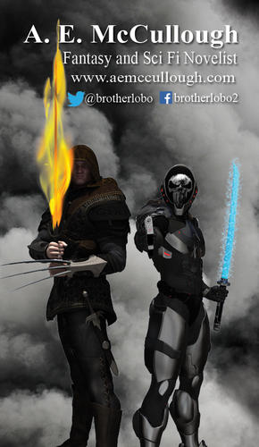
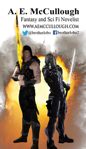
Looking for input on some SWAG
 Brotherlobo
Posts: 495
Some of you may or may not know that I am a self-published author. I have secured a table at a local Comic Con the first weekend in August - FandomFest in Louisville KY. I also realize that on top of having my books for sale, I'm going to need some SWAG (Stuff We Always Get) ie Business Cards and Bookmarks - to help get my name out there.
The first image was the business card I made last year. It served me well (or so I think) but I only got about a 100 of them and I am completely out of them. Time for a new order.
After reading a bunch of websites about 'making an effective business card' - I came up with the second image -- ie my WIP business card. BTW -- the two characters are the protagonists from my two series.
Input, suggestions and comments are GREATLY appreciated.


Comments
Firstly, who are they meant to be? Tell us more about your OCs please.
I could but you may have just answered my question without knowing it.
As an author of both Sci-Fi and Fantasy novels, I wanted to capture potential readers' attention with my main characters. Many websites suggest having the cover of your latest book on the business card. Honestly, I could do that but then I'm only focusing on one audience (ie my last two novels were both fantasy - 1 in my ongoing epic fantasy series and the first book in a fantasy trilogy that I am also writing in my spare time). However, my next novel will be Sci-Fi - book three of 'The Last Spartan' series and I don't have the novel or cover art done yet.
I chose a dark background to 'stand out' from the crowd (another suggestion from the web) but a pure black just didn't look right (hence the smoke). On the backside, I plan on listing my books and maybe adding a QR code to my website/mailing list.
So, the question remains....does the latest layout/design capture your attention? Would it be memorable? Does it say....pick me up? Is the information easily readable? Or should I scrap the whole concept and try something else?
I like the smokey background of the second card. It allows your characters to stand out. The fire in the background of the first card is distracting for me.
The only quibble I have is the fire sword obscures the face of the character on the left but I really like the addition of the claw and his outfit on the 2nd card.
Thanks for the input. You make a valid point on the flaming claymore. I'll do a few tweaks after work today and post my results.
Here is the latest version of the business card.
I did a few tweaks on the positioning of the flaming claymore, changed Graytael's expression, made some reflection tweaks on Iaido's blaster, changed the shade of the blade of his katana and positioning of the lighting (more overhead instead of coming from the left). I wanted Graytael's face to be hidden in shadows (as it is in the novels).
Open to comments and suggestions.
I'd make the feet visible, the colours brighter (so that the face is more exposed) and the flame on the sword more fumes-making. Add some shadows below the OCs too. Apart from that, it's a pretty dashing card!
Thanks for the suggestions.
I have added a bit more light to help brighten up the characters, added shadows to the OC, added some smoke/fumes to the flames, shifted the cloud background a bit and backed off with the camera to add the feet.
How's this?
As always....questions, suggestions and comments are welcomed.
On the one with the mask, I'd like to see a bit more lighting on the bottom part of it so the vertical chrome shows a bit. A dull point light perhaps. But that may ruin the look you're going for :)
Never mind, you did. I posted before getting to your last post.