Can someone help me here...?
 Upirium
Posts: 705
I'm having skin issues. I got a new skin for this character I use because I had problems with the last one.
I like this skin personally. I want to keep using it. But it was just too dark for him at first so I tried to lighten it.
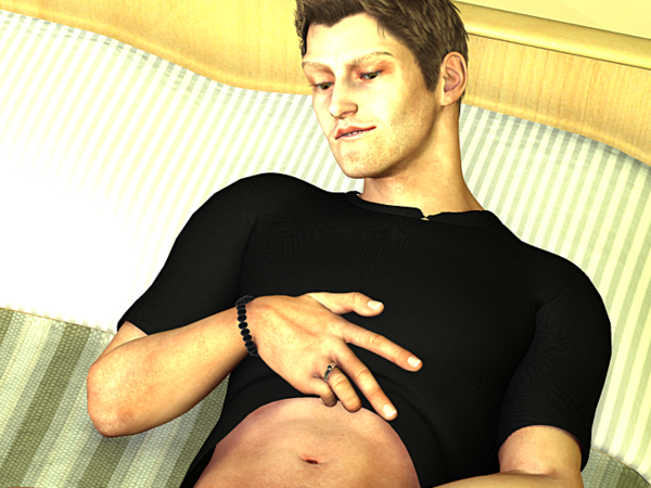
But now I seem to have like splotchiness issues.
I'm not sure what I should do here.
The skin is Lucien for M4 and I've had to do some more editing with it to fit the character but I don't like the way it makes his face look look.
I like the skin on his body but not his face.
This is a crop of the last render I did of him, when I was trying to test his skin.
Idk if this is just a lighting issue or what but it seems to happen no matter where the light is; it just looks weirdly uneven and too light in some places...


Comments
First of all, DS or Poser? What kind of lighting are you using? Splotchy renders are usually a problem with lights. And is that Lucien from Renderosity or Lucien from Runtime DNA? Looks like the rendo one. I have him, I can try to reproduce the problem if you give me lighting and render settings.
Renderosity
Poser
Jeez idk how to answer that one um...
It's called Light Helper or something? Crap I can't remember. I usually just use the standard lights that it loads with. I am actually TERRIBLE with lighting and this is the only thing I can do because I suck so bad I just do not understand it at all it never comes out looking like it does in the preview and it just looks weird all the time.
It doesn't always work with lighthelper but it does sometimes.
My problem is I pair this character with another who's skin usually does look just fine in most lights and I don't want to screw up HIS skin too.
Lol, okay, then you can consider this your first lesson in Poser (or any!) lighting.
Before I start, there are a few things worth noting:
1) No two random complexions (in 3D world or the real one) will respond the same way to the same light. If you want "matching" characters, your best bet is to use two character materials from the same artist, because artists tend to use similar material setups with their characters.
2) SAV (creator of Lucien) makes skin tones that are intended to be realistic. That means they have the normal irregularities, blemishes, etc. that real people have. And, just like with real people, lighting can affect how obvious those imperfections are. This is why lighting is important.
You really can't ignore lighting, lol. I can first of all say that there is a LOT of light in your scene. There are places where the background and skin are too white -- where things that should have color are white because they're too brightly lit.
There are a few solutions to your lighting dilemma. The first (and easiest) is to get some more Poser light sets. There are oodles of free ones. I downloaded the free Nike Art Corner here: http://nikeimage.hu/free.html (last one on the page.) It includes some nice, warm, subtle light sets. I rendered once and decided it needed to be a little less intense , so I found the light that was too bright and adjusted it. A great way of deciding which light is too bright is to select each light, then in the properties tab, turn the light on and off. You'll be able to see the effect of each light easily here.
Notes on lighting:
1) Poser can only show a limited number of lights (I think it's 8) in the preview. It can render as many as you put in, but you'll only ever see 8 (or whatever it is) at once in the preview. This is okay, however because...
2) You really don't want more than a handful of lights in a scene. A good rule of thumb is 3 lights, plus perhaps an extra to highlight the main character/object in a scene. (The only real exception to this is if you're rendering a ton of individual candles or lanterns, in which case you'll have more lights in the scene than Poser can display.) The 3-light setup includes one IBL (image based light), one distant light (hard shadows for sunlight, soft for portraits), and one specular-only light. Again, you can add an extra light or two (points or spotlights) to emphasize the main figure.
3) Poser comes with a decent selection of IBL lights. If you want to add a little more realism to the scene, use an AO (ambient occlusion) IBL light. AO adds some natural shadowing where two objects are close to each other, the way it would look in real life.
4) If all else fails, find an existing light set and tweak! There are lots and lots of great free light sets out there. Otherwise, I LOVE the "Shiny" lights (by vikike176) over at Rendo. There are at least 4 sets available. #2 is my favorite. They use a simple setup and give beautiful results. It's also a great template to follow if you're starting from scratch.
As you can see, lighting makes a HUGE difference. You ought to be able to (with a little practice) find a light setup that works with all the characters in your scene.
I tried a different lighting, but I'm still seeing some splotch?
I'm just wondering if I can like somehow REMOVE it in PS. But I don't even know where I'd start D:
I had to lighten the skin a lot because it's based off of someone who is not really THAT tan.
Here is what I did and here is what the skin is supposed to look like.
That is not a good pic of his face at all but it's the most recent.
I should probably do more work on it...
I don't know about Poser, but normally, you would change the skin tone, rather than adding more light to a scene, if you want to give a person less tan.
Lighting does look better, but I see what you mean about the tan. Not sure which version of PS you have, but your best bet would be to add masked adjustment layers. I know this is easier in CS6 than CS3, but it's definitely possible in both. The nice thing about using a mask is that you can adjust EXACTLY where you want things to be lighter/darker, etc. I'd try a hue/saturation layer to adjust the level of tan and either brightness/contrast or curves to even out the "splotches."
Which version of PS are you using? If you need more help, I can offer it.
By the way... he's so yummy, lol! :D
lol that he is
I am using CS6
I use DAZ and Vue. While lighting is critical, if the mat has issues, lighting cannot really cure it. It might, if you are lucky, mask it. Look at the mat in Photoshop or a similar program. Sometimes I have had to compress the tones, for example. If you have Photoshop, you can do it using the bar in levels. If I am struggling, I always look at the mats. Some artist add highlights to hair mats, especially. If the light is coming from a different angle, they can look weird.
It looks to me as if the lighting itself is very yellow. It is giving a yellow cast to not just his skin but the jeans and glass in the car as well. Look at the lights and see if any of them are really yellow. If so change the light to something more like 230,229,210 which is a more appropriate sun color.