WIP - "The Four Elements : Earth"
 pimpy
Posts: 274
pimpy
Posts: 274
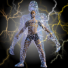
Test render of my new project: "the four elements". The first one is the Earth... :)
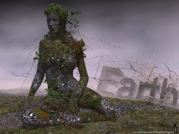
Earth.jpg
2000 x 1500 - 2M
Daz 3D is part of 
Connect
DAZ Productions, Inc.
7533 S Center View Ct #4664
West Jordan, UT 84084
Licensing Agreement | Terms of Service | Privacy Policy | EULA
© 2024 Daz Productions Inc. All Rights Reserved.
Comments
Cool use of natural texture maps and props....I like it!
:) Silene
I like it too! Looking forward to seeing what you do for wind!
Already great - makes curious for more!
This is wonderful.
Really well done. Love the texturing on the model!
Fan-freaking-tastic, my friend!
LOVE IT!!!
very cool
you can post it and (hehee) WIND when done in let it rip thread!! too :lol:
Fire and water of course too
Really nice work. Can't wait for the other 3 elements :)
great idea and execution, well done
Hi guys
thank you very much for your interest and comments on my project!:-)
During the week end I had time to develop my idea for the “Four elements” and I made it. The second one is the “Fire”.
Hope you enjoy it and thanks!
Oooooh...hot stuff! Looking good... is that a lava effect?
;) Silene
Hi Silene.
it is not lava but the effect is similar... I made the body texture with a picture of a dry river that I made some years ago in Greece during my holiday! All around I used a mix of nebula and clouds in differt colors.
Fantastic! I Love it!
I loved the first one. This one I think would be better with a different looking skin shader. It just doesn't seem quite as integrated with the other elements in the scene as the Earth image. The Earth figure had a depth and grit that drew me into the image. This one is still good, but the first image was better and is more memorable for me.
Thanks Evil! Good suggest. I'lltry do do better!
Thanks Evil! Good suggest. I'lltry do do better!
Please don't think it's a bad render. It's a good job. There's just something extra-good about the first one.
Please don't think it's a bad render. It's a good job. There's just something extra-good about the first one.
Dear Evilproducer,
I don’t think it was a bad render but it is not a question of render. When I posted this thread I wrote WIP (Work in progress) because I thought that sharing and commenting my own work with the community could help to improve and make it better! So every different points of view and positive or negative opinions are welcome. In this way I made a new image for the “Fire”, and in my opinion, this is better than the first one. Thanks!
That texture looks much better! Great job!
I agree, he now looks like he's exploding and it's very 3D looking...more vivid.
Cool....erm, I mean HOT...like Greece is this time of year...only cool place is in the mountains!
Can't wait to see Wind.
:) Silene
wow great work and idea, wish it was mine. only comment really is the font, maybe more subtle, competes with image and draws the eye away. still fine work! sorry was looking at previous imge the text is much better in this one but to my eye a little too prominent. my eye goes from FI to head and back again
First render (low resolution) for the 3rd elements: "Air"
Suggest and comments are welcome!
My second render....
Fantastic work on all three images to date, a very impressive series. I think I prefer the second Air image, but it's a close thing.
Thank you Phil,
I agree with you for the second image and I'm working on...
Yeah... I like them ALL! Very excellent work, Pimpy! Although I do like the second Fire image better than the first right now... I still think the first one totally rocks! Like PhilW said: Great series!
Thanks for sharing!