Daz 3D is part of 
Connect
DAZ Productions, Inc.
7533 S Center View Ct #4664
West Jordan, UT 84084
Licensing Agreement | Terms of Service | Privacy Policy | EULA
© 2025 Daz Productions Inc. All Rights Reserved.
Comments
no entry
everyone can use the key card absolutely free of charge anyway you see fit
only thing I ask you not to sell it directly individually but you can include it as part of a whole scene or a collection of items that you sell
say you have made a Sci-Fi warrior model who is holding the key card in or for a video game you can include the key card as part of the SF Warrior and sell it along with the model
good thing is you can modify it reshape it etc and you don't even have to pay me anything
no catch
just a genuine freebie for all of you
Third version. Dropped the opacity on the flame and redid the geoshell for the lavaman.
Beginner challenge, I guess- most of what I did was resurfacing and blending, rather than the LIE and geometry editing. I probably should do another entry to work with those tools in more depth.
@_ AL1vE _
@Linwelly
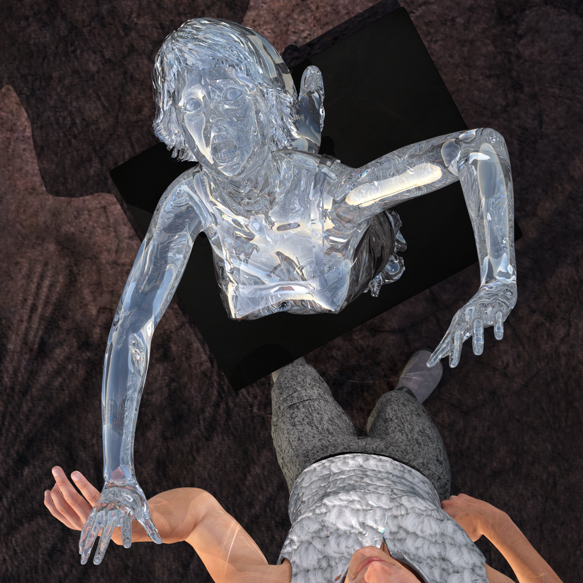
Thank you both for your suggestions. I toyed around with it a bit more. I don't want to change the camera angle if possible because I like the focus on the diamond woman's expression and the secondary subtle focus on the man's expression. I changed the background colours to add more contrast. I also tried making it darker out (8pm instead of 6pm) and adding another lightsource - but it just got darker not sure what happened to my spotlight sources. Not sure what else to try with this.
Ups, hmmmm, let me ask, are you using the sun sky only in your environmental render settingss? If yes, that would explain the changes, because changing the time on that setting will move the sun as you major ilght source, depending on the rest of the setting (day in the year, longitude and latidude) even below the hoizon (8pm is already late in the day). that would remove a lot of light and as well alter the angle of the light hitting the diamond girl.
So maybe return to the original time (or even got to an afternoon or morning time to test the effect). In addition to that try setting the SS multiplier to 0.2 or even highter which will give your sun more power.if this is too much light there are options in the tone mappings to adjust. (I come back to that later if needed)
BTW in this setting Sun sky only no other lights will be counted or rendere by the program. that would explain why your spotlight has no effect (emissive surfaces still do their job though)
When I said more contrast I really only meant to change the surfaces to a darker settings not reducing the amount of light. I should have put that in better words.
I hope this helps you on the way, If you didn't use sun sky only settings let me know what you used, so we find out what happened
Thanks for your comments. Must be honest, I didn't think about hiding the "unseen" extre bodies! The main reason for compositing the scene was that I have a rather old/slow system and it always struggles with more than a couple of figures.
I was aiming for a rather painterly feel, a vague idea was that the figure in the pool was aware of the person looking at the picture and is looking out of the "frame" at them. The main figure (with the "Horror" head) is one that I've tried several versions of. He is loosly inspired by "The King in Yellow" and started off as a slim figure with a "pallid mask", but then I decided to add a touch of H P Lovecraft! I did try a version with depth of field, to make it a bit more realistic and to make the foreground stand out more, but I didn't like the background being out of focus. The lighting is a bit over the top and makes no logical sense but, after many years of lighting stage shows, I tend to like rather "theatrical" lighting. It's one reason I prefer 3Delight to IRay rendering:it seems easier to get the lighting effects that I want.
By the way, sorry for not adding a full size image in the post (and if I haven't done the "quote" thing right in this post) but I'm not very good with posting in forums!
Decided to replace one of the top pieces and I think it greatly enchances the outfit, I still want to get some kind of cape on the figure but that might take a while. Besides that I also changed the background (again) and I like it, besides messing with the lighting some more I'm not to sure where else to take this.
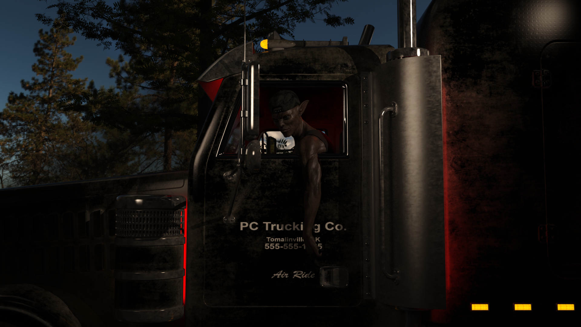
Title: When Loggers Raid the Enchanted Forest
Backstory: The Forgotten Realms aren't forgotten anymore...Drit (name changed to protect copyright infringement) the drow has had to endure the growing influence of human society. He was arrested for his vigilant acts. He had his unlicensed, exotic pet, Gwyn confiscated. He was cited for having unregistered magical swords. His home was condemned for not being built to code as were all of the dwarven mines in the area. Out of desperation, he took a job with the humans. Ironically, he is hauling the fallen trees of his adopted homeland to human-operated sawmills. At least he was able to get a human "magician" to mount some magical "glow tubes" on his truck to remind him of his home city...
Yes, I am rendering in Iray. Upon your advice, and some internet searching, here are the changes I made:
I am not sure I am happy with the sky color in the new image and considered rendering it as a separate layer. Also, does the tree object nearest the truck need some lighting too? I don't have a pine tree so I am considering removing it altogether and seeing if I can spin the HDRI to improve the background...
By the way, you were absolutely correct. Adding lighting cut 10 hours off of the rendering time. Yay. Thank you. You taught me a lot with your response!
Below is the original for comparison:
10 hours render time? are you serious?
what did you do to get 10 hours off your precious time?
It's all about lighting with iray. Though I will say, it seems as though emissives don't help all that much in terms of cutting render times, whereas HDRI and other forms of lighting very much do, on my end at least.
here my general purpose render settings to share with you
I use higher samples when needed with glass or exotic stuff
ps.: system is AMD RYZEN
Wasn't to big on how the helmet's material was looking so I messed with it a tiny bit, also added a (temporary, hopefully I'll find a bigger one) cape to use.
Also does anyone know how to fix the weird shading issue that seems to be occuring around the jacket?
you all have been busy, I'll go backwards through the new posts so I always catch the latest you put here
over all I think this develops nicely and I like that you experiment with different materials here.
I'm not sure what exactly you see with the jacket shader since the image is rather small to notice such details but I guess you mean the lighter and darker areas in the lilac part. I can't say for sure what is happening, maybe there are some bends in the mesh or there are some remainders from the original texture you didn't catch. maybe you can make a screenshot with the viewport setting switched to wire texture shaded showing the detail
compositionwise I woudl suggest twisting the backgeound a bit so that we see the red carped on the way up as a more separate thing. In the moment it's a bit wierd red striped thing standing out from her stomach.
considering the capes, there are several superhero capes around, with a new texture they could serve you or you just drop a plane on her using d-force.
Where you want to go with this, hard to say, maybe think about what caught her attention?
I can confirm that observation
New version has improv3ed by a lot! your question about the trees in the background, no I wouldn't say they need more light, since they are just around and not where our focus is supposed to be. You might even try to use Depth of field (DOF) to further increase the focu on the drow, though this is one of the rare cases where I don't think it's needed.
And yes I think testing different rotation positions might be giving you a better result in the end
That's definitely an interesting choice of texture for the backwall there and the floor as well, looks like you added those from some completely different surface, very art nouveau :D
esp for the floor you might want to try a fiddreent tiling and see if you like that result. Maybe you can experimant as well a bit with the magic effects like reduce the opacity and increase the luminance, mayben even remove the maps from the base colour.
Did you put it through a filter in postwork or is the painterly effect the result from denoiser?
It's interesting to see how our background affects our visual customs. I get that stage effect from you image very well. Now that I understand you intentions I have the following suggestion: try to separate the colours between the figures in the centre of the image more. all three of them are an a range between green and yellow in different nuances, the green from the bathing girl is still the most different. I would esp. try some changes on the coat of your large cthulu sort of character.
with using the layers and composing in post this might be exchanging onyl that one layer
This is giving me already much more of a glowing fiery scene, lots of improvement. I notice that your flames are very yellow, could it be that you tinted the missives colours here in yellow? If yous I would suggest to take that out and turn it back to white. Flame where it is really hot turns white. if there are fire texture maps used in base colour, try to use them in the missive channel instead.
The other thing I would suggest is trying to either change the underground texture or play with the tiling to see if that results in something you like
I think I didn't comment on this one yet. About the textures ther isn't much to add from my side, looking forward to see what else you might want to alter. What I would suggest is to change the light situation. I have the impression that you are using mainly the camera head lamp to lighten up your scene and takes away a lot of dramatic you could have with this.
I would suggest to experiment with twe or three emissive planes one tinted in light blue, the other in a red tone (this time acutally tinted the light temperature can be rather hight like about 5000k). place them in different positions left and right ouside the camera view lighting up the scene, turn off the camera headlamp for this. the third plane could be filling in in white where you need it. try differemt püositions to see what effect it has on the scene. you can try other colours as well of course, there are just some suggestions.
This develops very nicely, just a word about Bloom settings. I would advise to use a much higher value on the bloom filer threshold, standart is 2000. In a scene like this I would use a threashold of 9000. with the low values the effect is the grey out the image. As well try a bit higher bloom filter radius and on the other hand reduce the Bloom filter brightness scale (standart is 1, I would try something about 0.1 to 0.2)
have fun experimenting with that
The cobbled together jetpack probably still needs a fair amount of adjusting
but here is an entry so far for the intermediate challenge
the rocketgirl needs more focus - try lighting her up a bit
Hi all. This started of as a background for another scene and i tosed in a couple of figers. (I hate this one).
second go intermediaet. i have a couple bobo's will fix if i have time.
Marvin paranoid android in Hitchhiker's Guide to the Galaxy; it was a good laugh
Here is my final render for what I am now calling - When Loggers Raid the Enchanted Forest
I rotated the HDRI and then made some tweaks to the lighting, tone mapping, and emissive surfaces to compensate for the change in light resulting from the HDRI rotation.
I have enjoyed reading the posts and seeing other people develop their works as well. This has been really fun!
Thanks for all your advice! Wasn't a yellow tint but it seems I may have dropped the temperature too low; bumping it back up helped, although now it looks a little brighter than I expected - going to play around with that a bit more. Also increased the displacement of the cavern texture and DOF to the camera.
great job looks convincing
now you could play with color grading and add a vignette effect
second and final entry for this month contest
inspired by the TV Series The Expanse
____________________________________________________________________________________________________________________________________________________________
Title: the interface
Software: DAZ Studio 4.12.1
Renderengine: Nvidia Iray
Challenge: November 2020 - Daz 3D New User Challenge
Technique: compositing
Post Work: collor grading