Lighting problem
 TangoAlpha
Posts: 4,584
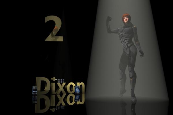
Okay I realise this is a bit like trying to light a black cat down a coal hole, but I'm hoping for suggestions on improving the lighting on this picture.
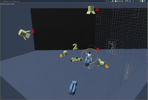
I tried adding rim lighting, but I couldn't get it to do much - just a vague lightening of the armour and some fairly subtle changes to the shadows. The best way to bring out the subject from the background seemed to be a top spot with a light cone, which I think gives a nice effect. But the ring light behind does nada.
Basic lighting on the figure is a spotlight from top left, and the top light. The two other lights in the scene are concerned with lighting the lettering, and have very little effect on the V6.
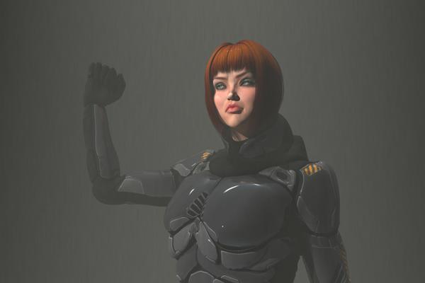
I've added a head & shoulders close up, but the full body profile is the main purpose of the setup.
Thanks in advance :)




Comments
If it were me, I would make a render of the character alone on alpha background (without fog) and I would compose the image in AE… May be a little more reflection on the armor would be welcome ?
Edit: if you do not use fog, you duplicate the spot and you remove the effect.
Interesting idea - I'll try it.
Is the ring light the source of the rim light? If it is, I would try it with two spotlights placed to the rear and slightly to left and right of the figure from your camera's perspective. I would use a Point At modifier on the spots and have them point at the camera. The light value should be pretty high. Maybe start at around 150% and go up or down from there. I would also avoid soft shadows. If you don't want the other objects in the scene lit by the bright spots, then exclude them from the lights.
Yes the ring is for the rim light. As an experiment, I changed its colour to blue and upped the intensity to 800x to see what would happen...
There's light spill in all sorts of odd places - under the collar, under the hair, and a fair bit on the front of the suit. But no rim effect. (the light is set to illuminate only V6)
I'll try the two spots and Dudu's idea before bed if I get the chance (very late night last night, so I'm likely to crash!)
I set one spot to red and one to green, and turned them up to 1000%...
(okay, it does look a bit like she's installed with aircraft running lights!)
I was able to turn the light cone down somewhat too. That's it for tonight. I'll look at Dudu's idea tomorrow.
Normally, I'd say get some beauty rest, but since I don't know what I'm working with..... ;-P j/k
Classic three point lightning should do the trick. The simpler the better, ambient light off. In the simple example I used a shape light, but everything else should work too. The light cone is obscuring the figure instead of pointing it out. But if you do like the cone effect at least try to turn on 3D shadows. Or better yet move the cone slightly behind the figure so she is standig out better. There is no need to get the rim light all around the figure, better to go for a bit of drama instead of forced clarity.