My Blades
 VIArts
Posts: 1,499
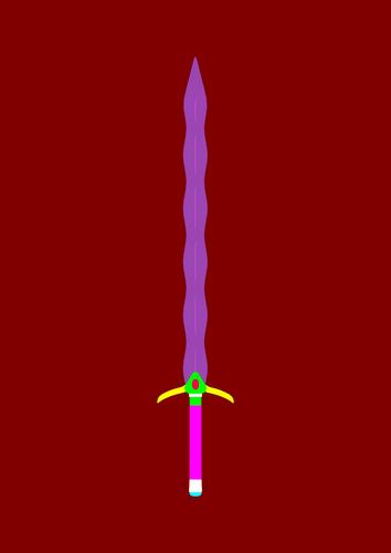
Just wanted to share what I'm working on. No textures yet. I plan to model more but I'm trying to fix triangles on this one at the moment.


snip2.JPG.jpg
1048 x 1482 - 65K


Comments
Hmmm...Pretty wicked looking fellow! :cheese:
Greetings,
Very nice Kris-style blade! You may want to try and match the wavy-inward on one side with the wavy-outward on the other side. The hilt looks very nicely set up for textures.
What modeling tool are you using?
-- Morgan
Well, I did base the blade on a Kris blade, but i don't want an exact match. I'm using Wings mostly, but also Carrara and Blender a tiny bit to try stuff.
That colour scheme honestly makes me want someone to make a She-Ra outfit for G2F (in the same way as Lofn is an excellent replica of Xena's outfit). Think I'd probably buy it, just to match with her!
Looks great, LightofHeaven.
Solid material zones.
Interested in seeing your topology. How bout' showing your wires?
Sure, as soon as I fix what I horribly screwed up today..
The topology right nowv isn't too perfect and has 106 tris according to Wings and 210 according to DS. I've managed to knock it down c to about 12, but found something ugly.
Here..
Not bad...
Looking forward to seeing the completed version.
How are you liking working in W3D? Great little modeler, huh?
It's easiest for me, but can still be complicated and a lotta work.. I uyse Carrara to make up fdor things Wings won't . Like...Welding. Carrara is nicer about welding than Wings.
And do you know anything about a Boolean plugin? i here was one, but can't find it.
Yeah... W3D can pretty much do any modeling task, but there are just a few things the winged edge technology can't handle.
I outsource some modeling tasks such as welding, piping, and facet building to the likes of Metasequoia, Hexagon, Blender, TrueSpace, and Carrara. Depends on which modeler I feel like playing in at the time of outsourcing.
Ninety percent of my work is all done in W3D, though.
As far as the boolean plug-in; It is a Carve CSG Booleans wrapper written by ggaliens (Mark Whittemore). He has an entire plug-in suite (Free: ManifoldLab) you can download from his site here:
https://dl.dropboxusercontent.com/u/56147717/freely-donate.html
(He seems to have deleted his website, and is using a dropbox now)
Thanks. I grabbed the latest one.
Do I need to instal the whoie modeler or just the DLLs?
Sorry, it's been a few years since I installed, so I don't remember the details. It was when he first introduced it, and way before he created his stand-alone W3D build.
I would go for both. It doesn't hurt running side-by-side builds, so go ahead and try out his custom build while leaving your main build installed, and install the plug-in there as well.
Currently I am running 1.4.1, 1.5.2, and 1.5.3. I mainly use 1.4.1 for most of my work. Just haven't wanted to work in the .5 series much, and I am using a very old version of ManifoldLab, and don't really like working with booleans, so don't even have it installed anymore.
You can always get good info over at the Wings3D forums. ggaliens will probably help you out if you need it. He's always been good at helping people out regarding his plug-ins.
Booleans can make a mess of the model and really should be avoided. They create lots of triangles that destroys the topology and 'edge flow' just making it harder to do additional modelling and UV mapping.
Yeah, I'm aware of how ugly booleans can be. It's just a toy I like to play with sometimes.
Right now, I'm trying to UV map my sword. Thought I got it right last night, then I found some tiny "crumbs" and don't know where they go.
One of the great things about Wings3D is the ability to quickly find the "crumbs", and determine if they are leftover degenerate facets, or you just missed something while mapping.
Just in case you don't know (or for others edification), while you have the UV Window open, switch to Face Mode, and select one of the crumbs. Then hover over the workspace window, and press "Shift + A". It will take you to exact location of crumb, and you can identify the issue, then move on to correcting.
Hope this helps...
Well...I've been using UVMappr Classic because W3D insists on giving me grief. BUT...Anytime I import from UVMapper, my UVs stretch and look ugly.
Bleh...
What to do...
make your window of UV mapper square, as close as you can eyeball it, that will help.. if you have it open to the rectangle of your screen everything will look stretched even if it's not.
Okay, it was more like "squished"jjjjjjjjjjj. But I painted a square on a screenie of my desktop to help me square up my window and I'm redoing the map. lol
.......Help!
When texturing metal, Should the texture be shiny? 'Cause I Know lighting will effect it when I render. It's kinda hard to find a tut on painting metal without reflection.
I thought metal was between gloss and reflection, so on a diffuse/bump map you only need to worry about the underlying machining/oxidation texture of the surface. let the render engine deal with the rest... I thought.
(edit)
Some Wikipedia pics to possibly help, or give an idea of how reactive metal is to its lighting and surroundings.
Copper lumps, Carbon-steel knife, and a polished stainless steel dish.
When I texture metal, I keep the diffuse texture Dull and dark, not black but close to. Most of the detail of the metal comes from the bump and specular textures, where you might use a brushed metal texture, add in scratches and wear and tear detail. I also use the specular texture on the reflection strength. Uber Surface and US2 shader are my first choice for metals, they also have the option to add Anisotropic effects (Used when your metal is brushed finish).
I know you have Genesis super suit, I recommend you look at the metal shader presets, some use uber surface others Daz Default, they might give you some ideas :)
Everything depends on what metal you are looking to create, and its condition.