Toon rendering: outline issue in final result
Hi all,
I've been playing around with Daz Studio 4.6 to try and create a comic-style look in my renders.
Now that I've come pretty close to a hand drawn and coloured look (if I may say so myself :) ), it would seem there is a difference in rendering it out inside the viewport using the camera icon, and rendering it out to a picture file to get the resolution up.
I'm using PW toon and Crescent's PW Toon presets to get the outline.
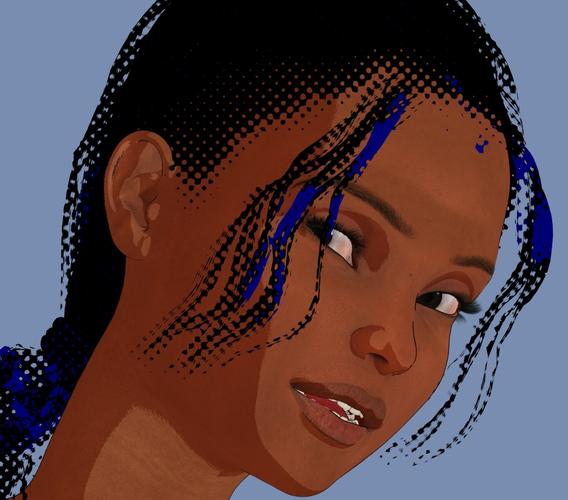
Attached is a picture called Face Test (which was rendered inside the viewport, and which looks the way it should)
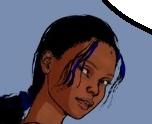
The second picture (Face Zoom ) was cropped from a final render, in which the outline has become way to thin...
How do I get the outline correct? Just like the way it is displayed in the test image, but also in a pic that has a bigger resolution?
(the issue with the hair that you can see in the "Zoom" pic has been solved, only the outline is still an issue)
Thanks a lot,
Me.


Comments
Hey,
I found the solution !
for those with the same question:
There is a setting in the surfaces tab, called "outline". If you turn of the "use limits" option, you can set the value of the outline to anything you want.
Just check the resolution of your viewport (in my case: 1010 x 820). If you're going to render at 3030 x 2460 (I checked the "contain aspect ratio" option) you're multiplying the viewport resolution 3 times.
All you have to do is multiply the "outline" value with the same number. My outline value was set at 64. I reset the value to 192 and issue solved!
So if the resulution goes up by a factor of four, just multiply the "outline" value four times, and so on, and so on...
See pic below for the result :)
Thanks for that!
(What did you do to get the halftone effect on the hair transmapping?)
Hi,
If you are referring to the blue colour:
The hair was done using the Manga style shaders. (here on DAZ)
In those shaders you have an option called "paper colour". I set that to blue. (It's set to whiet by default)
In the outline option in the partial presets, I selected "screentoned" instead of "outlined"
It could still use some finetuning, but the overall look is getting very close to what I'm after.