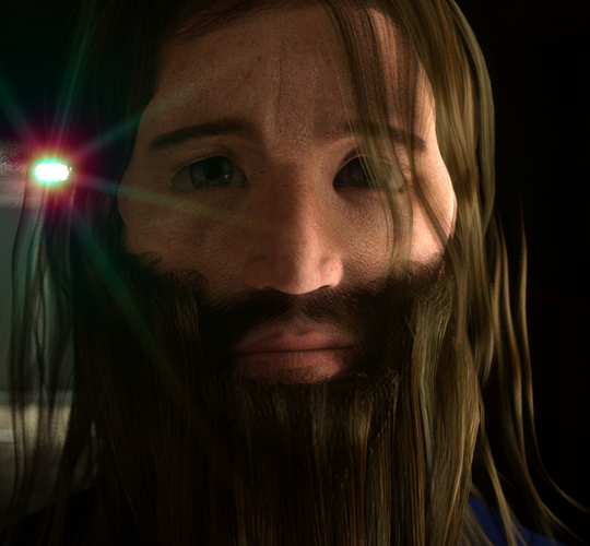
A new Avatar for Christmas? Here's mine.
 Sci Fi Funk
Posts: 1,198
Ho Ho ho.
To celebrate an expected pre-christmas release of Episode 10 of Sci Fi Funk I've changed my avatar all over the place.
It's Steve Malore, the central character of the series in some dark place. (A cut out of a frame from Ep 10).
How about you Sir/Madam? A new Avatar for Christmas? Share here for all to enjoy / marvel at.
Here it is in full res.


Steve_Malore_Unshaven_Headshot.png
1167 x 1080 - 2M


Comments
Hope I'm not being rude here.
It reminds me of Rasputin :)
actually more like the homeless men pushing carts of belongings who swear at themselves as if talking on a phone but have no phone
yes I know he"s been asleep in suspended animation a loooooong time, those nails sure needed trimming too!
actually more like the homeless men pushing carts of belongings who swear at themselves as if talking on a phone but have no phone!Just proves that looks can be deceiving! LOL
Mr. Malore, I have a feeling, is quite the opposite ;)
Cool Avatar! Merry pre-Christmas, Steve!
Ha ha - thanks Guys.
Yes he sure is in need of a trim. Happy way before Christmas to all!
Happy Way Before Christmas to You, Too!!!
BTW, love the render! Can't wait to see his exploits!
It's about to get dark man, very Dystopian.
:D
Here is a full res render of my avatar, which also happens to be the central character of my next movie.
I really like the look you've generated there. It's striking and doesn't look like it came from Carrara. I think disguising the software that was used to make the scene is an art. Congrats!
No, it was made entirely in Carrara. No post. Honest! For the face, I just used some displacement maps made for Daz Studio (skin overlay), only I used them in Carrara. The background too, all in Carrara. No sub-surface scattering, no global illumination.
P.S.: I admire the lighting in your avatar. I wish I could light like you.
Yes. I realise it was made in Carrara - I am complimenting you that you've made it LOOK like it was not. That makes it art inho. :)
For example, look at Steve's Avatar. See how he uses the light from the right to paint shadows onto the skin? Very nice! Especially for showing of the texture of the skin. The same can be achieved in a less dark situation, to a degree, by using the same angle and placement (even the same light) and then bringing up the levels that fill the other angles (fill), making the dark shadows disappear, while still holding onto the details that they bring out.
My new job has been keeping me away from my computer lately :( so it's been a while since I've watched that video (Paint with Shadows), but I've used similar methods for years to find my sweet spot for my animated scenes - and the elements within. It's amazing how a god day full of experimentation like this can save hours of time in the future, with stunning results!
I missed the compliment about lighting Argus - thanks.
As Dartan says the light from the right makes the face look more 3d. In actual fact I have 4 lights around him bright enough to shine light on the character. It's a 3 point lighting set up we talked about before plus an extra light which shines up into the face. That one is fainter but allows me to avoid using GI. So I'm faking the light around him.
It all started with playing with 3 point lighting for me. What ever rig ideas you use getting something to act as the main light (the key light) and another one to act as the indirect lighting (the fill light) will help every scene become more 3d.
Having said that going the flat light route can look pretty wonderful as well, so I guess it all depends at the look you are aiming for.
Agreed.
I like to use a modified three-point rig on each of my characters - specifically linked to the individual. These rigs are carefully made to compliment my heroes and 'paint their shadows' over and above the usual environment lighting that I use, which makes it much less time-consuming on me to tweak everything out in the end. The individual linked lighting rigs for each character are parented to a target helper, making it super-simple to work with angle and location changed throughout the animation. Then the main fake GI that I use for my stages adds to those rigs to cast shadows from those characters onto the environment. It took me a long time to make the actual Character vs Environment defaults, but now that the hero light rig is saved as a drag n' drop Carrara element, it's easy and fast, and works with all of the stage scenes that I've been lighting and saving to my browser over the years.
BTW, I should also add that I, too, am a SciFi Funk lighting fan! ;)
Cheers Dartan.
As we've both learned independently you have to ignore the default logic that "one lighting rig SHOULD work for all shots in a room", and Instead modifiy PER SHOT, using techniques you build up by trying similar environments over and over.
I'm expecting to have nearly mastered it just before my time on this earth is up. lol. In the meantime we keep exploring ....
One thing to remember is not even cinematographers, professional photographers, and good, moderate to advanced amateur photographers and cinematographers/videographers, working with practical lighting and film think that there is a one solution light set up or rig. Lighting in movies, TV shows, and good quality photography is very scene/shot dependent and has as much a basis in reality as CG lighting.
Keep in mind the motivation of the lighting in your scene, just as an actor thinks of the motivation of his character, but like an actor making up a back story for his character that isn't scripted to help "get" the motivation, lighting can also be manipulated in ways that it wouldn't behave in a naturally lit scene. Rim lights and back lights to separate the actor from the background or even make them stand out from other characters is common practice. If it's done poorly, it sticks out like a sore thumb and feels manipulative. If it's done well, it fits the scene, and even if it is designed to manipulate the emotion of the viewer, it doesn't feel manipulative.
well not new but rendered in carrara too
More for Halloween than Christmas, but here's an enlarged frame from my new avatar. Eyes were purposely large to show up better in the animated .gif.
Maybe I should make a mock movie poster for. Evil Dead VII, Deadites in Space. ;-)
The tag line could be, "in space, no one can hear your chainsaw!"
That's great advice evilproducer and in the last year or so I've been adopting that approach.
For example I am watching Mad Men again right now and marveling at how the characters stand out in each scene (most of the time) clearly via artificial lighting, but with a skill that lets them blend into the scene as well. An art form worth studying. :)
Evilproducer and Wendy,
Worthy entries indeed!
Hail to the King, baby.
Groovy
Hail to the King, baby.
Groovy
Out of time, running low on rocket fuel!