Critique, please?
 murph101
Posts: 68
murph101
Posts: 68
Hi, all. I created this image a month ago, and I've been sitting on it, not wanting to upload it quite yet to my website.
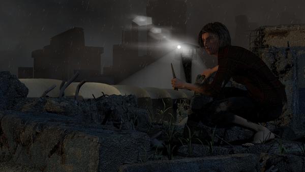
The image depicts the protagonist of my novel, at this stage of the story, a rebel against new world government in the decimated city of Bangkok. He's probing the military's compound. I realize that the image should tell the story, but I suspect the image by itself wouldn't mean much to the average viewer unless they have the backstory of the novel.
As I ruminate on this pick, there's a certain dullness about it and I was wondering if y'all might offer some critique and what you would do to liven things up.
Thanks for any help and advice!
Daz 3D is part of 
Connect
DAZ Productions, Inc.
7533 S Center View Ct #4664
West Jordan, UT 84084
Licensing Agreement | Terms of Service | Privacy Policy | EULA
© 2024 Daz Productions Inc. All Rights Reserved.
Comments
Overall I think the image is great, but like you mentioned it's a bit dull or dark. I'd just open it in Gimp or Photoshop (or your favorite image manipulation software) and adjust the levels a bit to lighten it up (see attached example). Of course, the image doesn't transmit the details of the story you conveyed above, but the characters expression, image mood and composition stands very well on it's own, or as support for your story.
Hope this helps!
And that's the key :)
The challenge with any image is to tell the story, or evoke an emotion or to put the viewer in the scene.
IMO, you get high marks for evoking a certain feeling with your image. Dark, a single light piercing the darkness...it all evokes an emotion.
The challenge is to achieve your goals for the image, to manipulate the viewer in the way you want.
So first I'd say, what is your goal for the image? If you just say, "here's and image, what do you think?" then it's hard to judge. What is your goal?
Secondly, just as an image, I find it's rather distracting trying to figure out what I'm seeing. It took a while to decipher that there is a guard tower, since the lens flare from the light was so overpowering and, as lens flares go, kind of confusing and not really looking like a lens flare. And the white mound behind the tower. And the stuff under the guy's feet. Basically I'm saying that I was spending time trying to figure out what I was looking at, instead of allowing the image to do what you wanted it to do.
My recommendation is to first decide on a goal for the image. Secondly, I'd review your scene elements and, using reference photos as a guide, decide which objects and textures are truly recognizable to viewers and modify accordingly.
And lastly, but most importantly, GET RID OF THE AMBIENT LIGHTING !!! :) Sorry, that's one of my personal dislikes with so many renders I see. It greatly reduces the impact of well done lighting, and washes out the scene.
By the way, another thing that I see a lot in renders is an attempt to show a lot. People love to light things up, especially with ambient lighting, so that viewers will see everything. But in fact an image can be far more powerful if you show less.
For example, your scene shows a guy looking around a city with a guard tower in the distance. Perhaps just one strand of barbed wire would speak volumes about the environment and the mood. Maybe a single floodlight partially lighting him up and a shocked expression as he gets up to run. But it all depends on your goal.
Often, less is more.
Ah, okay....it took me a while to figure out what I was seeing... :)
The "white mound behind the tower" is actually the floodlight beam in the fog, correct? And the stuff under his feet and around him is concrete and rebar...
I'd work on the floodlight beam. If it was that foggy to make the floodlight beam so dense then you probably couldn't see the buildings in the background. And the overall ambient lighting level isn't high enough so that I can see that it's concrete and rebar, so maybe lower it and just a well place bounce light to show a small amount of concrete and rebar to establish the mood.
Hi John, Hope you are well! As others have suggested, I think it is the staging of the image that you need to adjust:
- the guard tower is not clear and is obscured by the lens flare rather than it enhancing it;
- placing the guard tower almost behind the figure is confusing and it would be better placed to the left to balance the image more;
- for me, the background looks too light and it would be better darker;
- make your key light stronger to provide more contrast and highlight the figure more.
I hope this is helpful!
I agree with Joe and Phil about the lens flare. You could scale it down and to hide the fact that emitter is a tiny point, just use a 3D light sphere (under the light's effect tab). Set to realistic and adjust the diameter, brightness and quality to suit. You may even find that the lens flare is no longer needed.
My other suggestion is for the light cone. Try adjusting the intensity and falloff much lower.
Another suggestion is a rim light or halo light to on the figure or object you wish to draw attention to. So, going with Joe's suggestion about barbed wire, with the spotlight from the guard tower, you would have a justified excuse to put a bright rim light to accent a barbed wire fence.
One last suggestion would be to use a slight depth of field. I would be judicious with it, as if you go to far with it, it will look more like a miniature.
In the example image below, I used a rim light to accent the woman. I used a depth of field that I applied in Photoshop by using a depth pass. I don't have a light cone, but I was able to get a look of light shining through mist by using volumetric clouds.
Speaking of which, I like volumetric clouds better than the light cone in many instances because of the way it looks. It also renders faster than the light cone in certain situations, such as if you have the light through transparency option enabled in cone editor. It can take longer to set up, so this is something to experiment with if you don't have a deadline.
There is a lot of good stuff going on in this render. It is quite nearly complete in my view. If the goal is to reveal a bit of the story then you should allow yourself to do just that without any apology.
The emphasis makes the song, so they say. I always struggle with what to highlight and what to downplay
To brighten up the lighting, you should allow him to carry a localized light source with him. If nothing more than a flame from a hand held cigarette lighter, it could provide an albeit contrived but still plausible explanation for additional light on the figure. The exact placement of source light near his face could add further emphasis to what is going on there.You could also place a lamp on a nearby building to his shoulder to add some light.
I would like to get a slightly more direct view of his face, as his emotional state is made clearer. This doesn't mean he has to be facing directly, I think some degree of mystery about his face is wise, but for an unconscious mind focus standpoint of the viewer it is hard for people not to look into the the eyes of someone. I would ensure that his face tells a story of it's own, which to some extent it already does, just go further with it. His face currently looks as if he is somewhat blown away by what he is seeing, which is awesome. However, with no idea what he is seeing, it is hard to qualify the value of his expression with any certainty. What I might want here is the look from his face that he is somehow deeply resolute about doing the terrible things he needs to do to survive. But maybe he's still discovering his inner warrior and doesn't become a full warrior until later on? (I'm quite compelled by the story so far as you can see, so you're obviously doing something right.)
It is okay to see the names of one or two of the corporate bad guy companies glowing on some of the distant structures in the background.
Best of luck and great work so far!!!