Thanatos - advice welcomed!
 OriginalSamhain
Posts: 38
OriginalSamhain
Posts: 38
Hi everyone. I'm working on this portrait, inspired by the work of Cliff Neilsen. I'm somewhat happy with the pose, though I think he looks a bit flat, and overall the lighting just comes across a bit cartoony and unrealistic. Ay advice you have on making it more dynamic and interesting would be greatly appreciated, or just any comments in general!
Thanks!

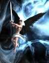
Thanatos 1.png
1222 x 1582 - 2M
Post edited by OriginalSamhain on
Daz 3D is part of 
Connect
DAZ Productions, Inc.
7533 S Center View Ct #4664
West Jordan, UT 84084
Licensing Agreement | Terms of Service | Privacy Policy | EULA
© 2025 Daz Productions Inc. All Rights Reserved.
Comments
Hey there! Here's some random opinions:
- Try rotating the HDRI to get a more dramatic lighting situation.
- See if adding a differently coloured point light (red? orange? green?) will make it look more dynamic.
- Looks like Neilsen works with a less saturated palette; I'd desaturate the render in post but there's also a way to do it in the DS render settings somewhere.
- Add bloom. Again, can be done in DS render settings but I'd do it in post.
- Experiment with layering on haze, smoke, dust, bokeh, flares, godrays, etc. I'd definitely do that in post, way too much hassle to do it on DS.
- The pose could be more dramatic. The torso should be more twisted, his right leg more angled. Try to put more tension into his body.
- The sword should either be exactly vertical or have a more interesting angle. The almost-but-not-quite vertical angle right now looks half-assed.
- His facial expression needs work. Right now he's making the kind of tense-but-goofy face that you often see in sports photography. And I think the figure should look to the right side or upper right corner (as seen from the viewer's perspective.)
- The composition is a little plain. Try cropping the image in a more interesting way.
I hope some of that was useful!
1) The muscles flexed in the way they are flexed in that pose are wrong.
2) The drape of that loin cloth needs dForced to drape correctly
3) Need to use 3D Toon clouds and adjust the transmitted color instead of that pasted on background (your render times will take much longer). I would use the "Stormy Preset" and white wings or the Sunset Presets and black wings.
4) Looks too glossy, like plastic for the skin. Sharpness for non-toon compositions in DAZ Studio will do that to you.
5) Try a different hair. Try a different color hair or color wings so that they are complementary colors from each other.
Thank you for your comments! I'm still working on his pose, it's still a little flat and I can see now what needs to change, but your feedback was really helpful. This is where I'm at so far. It's looking a lot better I think.
I'm going to adjust his arms, they look a bit funny still, I'm on the hunt for a better sword because this one looks garbage, and I think I'll swap his hair out again - this one didn't really get the movement I was looking for.
Yes, the colors, contrasts, and complements are much better. The drape of the loin cloth is much better.
You are right, the pose is awkward and unnatural. It's mostly in the positioning of the elbows. The unnatural muscle flexes you are stuck with as they were sculpted that way. A bit awkward to say but the loin cloth needs a section to fall and drape lower down his loin as now it looks like he has, like a Ken doll, no such need for a loin cloth at all to conceal his modesty.
The sword looks like an unfinished cheap 3D model. Not sure what it's supposed to be made of but it doesn't look good. Try using free Uber IRay presets for gold, silver, and so on to apply to the sword's surfaces.
Believe it or not, that sword was with IRay shaders added! It's just a crap model, I've found a better one now thankfully.
I think this is my final version, I still think his arms are a little bit awkward, I can't escape the thought that it looks like he's swinging from the sword rather than holding it up! The loincloth is something I'm going to come back to, I've been using dforce and wind nodes to try and blow it into the right shape (it's just a plane with a bunch of divisions). I think I need to figure out push modifiers to do it manually rather than trying to get it to fall naturally with just dforce, if that makes any sense, but for now I'm sick of looking at it!
Thank you for your advice, it's been really helpful!
Now that sword is cool. The colors, contrasts, and complements are right, but you are right it does nook now like he's swinging Tarzan style but it's a big improvement on the other poses so go with it.