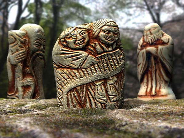
Can you tell the difference?
 StuartB
Posts: 596
StuartB
Posts: 596
I understand what you are both saying but....
These 3 images are all diffferent formats saved straight from Bryce.
1 is a Jpeg,
1 is a Bitmap converted to Jpeg with Photoshop
1 is a Tiff converted to Jpeg with photoshop
I'm really struggling to tell the difference.
So there does'nt seem to be anything wrong with Bryce's Jpeg option.
Quite surprising really, when you think that the Bryce Jpeg is only 134KB
and the Bitmap and Tiff conversions to Jpeg are 687KB.


Daz 3D is part of 
Connect
DAZ Productions, Inc.
7533 S Center View Ct #4664
West Jordan, UT 84084
Licensing Agreement | Terms of Service | Privacy Policy | EULA
© 2025 Daz Productions Inc. All Rights Reserved.
Comments
JPG is a "lossy" format -- if you do postwork, for example, every time you resave the file you lose some detail.
Fortunately Stuart, you've picked an image that lends itself to JPEG compression. This is exactly the kind of image JPEG is designed for: lots of contrast and variation, patternless, no large solid areas, intricate, rough detail.
I'd be willing to bet that you could take this image and turn it into an adaptive color 7-bit GIF (128 colors) and it would still look pretty amazing.
@StuartB4 - here, all three are jpgs and I can't see any difference. The problem with the lossy jpg is not so much the first time you compress but rather if you want to manipulate it later. Each time it gets worse. This is not a problem of Bryce jpg. Of course, it depends on the quality you set. Good graphics programs let you chose the quality in 1% steps. I don't know what quality settings are programmed into Bryce so I save and archive in BMP or TIFF and only for publication I jpeg them with at least 80% quality.
I see a difference in the material used for the crevices between all three images. The material in the first image is a bit darker than the other two. The material in the second image is darker than the material in the third image. And in the third image, the shadow on the left hand figure seems a bit lighter as well.
@gussnemo.
That's probably the way the monitor screen is illuminated from behind.
Especially if it has only one light tube, like most laptop screens.
They are usually fitted to the bottom of the screen and have to illuminate the whole
screen so the top is very slightly darker.
Look at each image in the same place on the screen.
Scroll down and place the bottom of the first image on the
bottom edge of your screen, have a good look at it, then do it with the second and third image.
On my monitor they look darker at the top and lighter at the bottom.
No. GussNemo is right. I didn't notice until he mentioned it. Now that I see it, doesn't matter where on the screen.
Do you know how to view those 3D images where they sit side by side, and you cross your eyes slightly for the 3D effect? Put these three side by side and do that. The differences sort of glow 3D-ish. They are more places than where GussNemo named.
I can see the loss, in the form of what looks like jpeg artifacts floating around the head. See screenshot. I'm not an expert in this area, but I often note that what should be a smooth background (such as a blue sky) has these weird floating artifacts right around the edges of objects that are silhouetted against that smooth background. I notice it a lot when I try to post an image to Renderosity, because they have a small file size limit and I always have to lower the quality and size of my image to be able to upload it, and see this start to happen.
Here's another comparison (of a piece of a photo, resaved at lower quality).
(click on pictures to zoom in and see the issue clearly.)
Hey, but do you know what I forgot to mention? Nice piece. Really shows off Bryce's abilities at realism. Good work, StuartB4!
If you try to compress an image too far then the artefacts will appear. It will also depend on the content how far it will compress before they doappear. Any image with a lot of small colour pieces; lots of different colours or highly detailed wont compress as far as an image with only a few different colours or great swathes of colour like sky and sea.
In Bryce I Save as .jpg at the highest level. The sizes of a 1000x556px image, my default size, range from 250 KB to 800 KB depending on the content. There are ways to compress the files without too many artefacts appearing. I use IrfanView.
The first one here is 764.88 KB and the next is compressed to 74 KB
The next is 530.84 KB compressed to 74.58 KB
The last is 266.51 KB compressed to 72.66 KB
Compressed file of the last image.
JPEG is also optimised for human light perception so not all colors or intensities compress evenly.
The hardest color humans perceived differences in is blue. It also tends to be the hardest color monitors have to reproduce, and you can see this in any moderately compressed JPEG if you have software capable of splitting an in image into separate Red, Green and Blue channels as greyscale layers.
The red channel looks ok. The green channels looks superb (we have an evolutionary advantage in seeing a large range of green values, given we were once forest dwellers), but the blue channel almost always looks like a patchy, contrasty explosion in a dice factory.
So when comparing JPEG compression methods, try using an image with a lot of blue and gradients of blue in it.
Ok........I give in.:) It seems my old eyes are not what they used to be. I may even start saving my renders in a different format to Jpeg.
@CTippetts.
Thanks for the kind comment on the image.
@Stuart: Okay, I scrolled that image up and down and did see there was a difference between viewing the image at the top of the screen and the bottom. Yet I still see a slight intensity difference of the brown material on the figures. Still, it's not a big deal as it is a great looking image overall.
@Sandy: Those are nice images you posted. I noticed the blue in the second tree image isn't as intense as in the first image.
Seems that it only exports at 72 dpi ? Is this the case ? The images are too small to layer with something that is 300 dpi.
Do not worry about the dpi reports in Bryce, they should have been removed, they are misleading, rather concern yourself only with the pixel by pixel size of the images you wish to manipulate. An image of any pixel resolution 850 x 850 can be set to any dpi you desire (within the limitations of Bryce's range for setting dpi) but doing so will not change the density of information in the image, it will remain 850 x 850 pixels. Dpi was only really relevant for the printing industry and is not really compatible with digital images because there is not a 1:1 relationship between a pixel and a dot. For example, in a four colour printer, you need more than one dot to represent one R G B pixel where a pixel can have a stored value which represents one of 16 million colours, you would need a few dots at least to give a reasonable approximation of the information stored in that cell.
thanks for the reply. wasn't a quality thing. Been watching a few more videos ...