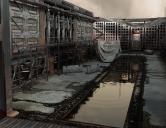
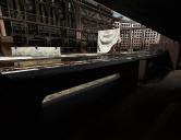
M.O.A.B. Missile Silo Commercial
 AntMan
Posts: 2,072
Post apocalyptic industrial dead tech seems a bit on the nose these days, but that doesn't mean we can't have fun messing around with a Nuclear warhead does it? But seriously I did have fun creating this set and I hope you enjoy using it.
AntMan


popup 04.jpg
1300 x 1000 - 1M


popup 09.jpg
1000 x 1300 - 837K


popup 03.jpg
1300 x 1000 - 1M


Main.jpg
1000 x 1300 - 2M


popup 06.jpg
1300 x 1000 - 984K


Comments
Are the taxtures IRay or 3Delight?
This set up is for Iray but there is nothing fancy in the set up. A PBR setup, so most items use 4 maps. A Color map, Metallic (that would be 3DS reflective amount not source) Normal map (makes a great Bump or Height map in 3DS) And a Roughness map. That's more than a simple yes or no but "Iray" can be an issue for some machines so I want to be clear it's Iray but could be converted. Iray often means it's going to take more time to render or bog down my machine. That's one reason I made the set so you can hide everything you're not using. Less stuff, less time.
Cool beans. Just some of your older stuff isn't, and I'm crap at converting 3Delight to Iray.
Oh yeah we all struggle to get the right look with the least render time/ brain drain. I was always going back and forth messing with metal, which I do a lot of, and finally saw the metal shader pack by V3Digitimes, and I love it. it's 3DS renders so it's quick and looks great. apply one of the preset metals, take the Diffuse/color map and swap it out and add in the Normal maps and you'er pretty much there. There is a place for the roughness map as well. The point is you will have all the meatlosity of Iray, just 3DS render times. I know that's just the metals but on a set like this one it would go a long way.
https://www.daz3d.com/advanced-metal-shaders
Sorry. For the 'exploded view' I was expecting a huge mushroom cloud, not everything placed a little further apart than normal.
Looks grungy, old & deteriorated. Most impressive.
Regards
Richard.
I love stuff like this - lots of detail, old and grungy, dirty and deteriorated :)
Looks like it is supposed to be an above ground set. But we get no outside view.
This is really well done, as usual for you. Thanks for making it, although dystopian themes are not as interesting to me as they once were, for some reason.
Since you're doing a lot of Daz+ nowadays, can you check with Jack to see if Daz will commission a series of fake (made-up corporate) emissive logo props? You know, like the ones you've put in so many of your older sets, such as Forgotten Factory, Anti-Gravity Diner, Unrealty Downtown, Window Shopping, etc. Stonemason's most recent Urban Future could use a lot more set dressing with lit corporate logos, which is a mainstay of every urban or cyberpunk scene. You could milk this idea for quite awhile methinks.
Ascania, true the focus is what is going on inside the walls and I wanted users to be able to use the set with nothing more than a sky dome, with the walls there to keep people out and you being inside. I take your point though I will in the future consider things from all POVs. Where to end a set is always an internal struggle, a viewable outer wall may need some land prop and vegetation and so on.
Xyer0, Yes I like that Idea!
Thanks for the input!
Very cool
Pretty sure M.O.A.B. is dropped from a plane, not a missle. Especially not a silo missle, that would make it over 50 years old.
But M.A.O.B. is a bomb but not a missle and it is non nuclear. Also very current, It could be used in Ukraine.