Have you seen the new Store Views?
 DAZ_bfurner
Posts: 62
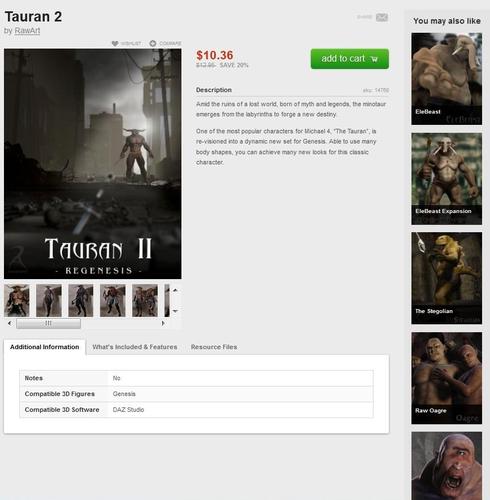
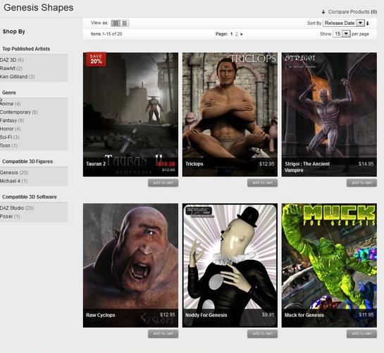
Have you seen the new look and feel of the store "Grid" view? What about the product pages with the new "You May Also Like" list?
What do you think?
Bigger product images
More products related to the product you are viewing on the product page


YouMay_also_Like.jpg
867 x 885 - 151K


GridViewStore.jpg
967 x 887 - 236K
Post edited by DAZ_bfurner on


Comments
Some Comments are here http://www.daz3d.com/forums/discussion/5521/ :)
I kinda like it, especially the list variant is nice in mobile devices.
I wondered why the new store was so much less efficient in displaying lists of products than the old store. The old store was four thumbnails across. Moving to three meant that you had 25% more pages to dig through to get to the end of the list. Seemed counter-intuitive to me.
Now I see why they did it. The new thumbs are rather nice. Not quite so necessary to get into the page view unless you are actually interested in something, rather than just what to see what it is.
yep, seen it... YEP, LOVE IT! :) Nice!
I see quite a lot of pixelation on the new larger product images and with all the extra huge advertising images the site is weighty on mobile devices.
perhaps it's time for a mobile specific site seeing how tablets and smartphones are being hyped as the post pc future :blank:
It's alright. Though, the product vendors list feel a bit crowded and PA names aren't hyper-linked to their product pages anymore again if more than one are credited.
That, and as JOdle said, the bigger thumbnails, while definitely let's us have better views of the product promos, adds more pages to dig through...
Its looking good... I still miss the old website. (;p
Daz guys I actually like this new look and feel of the Daz web site.I definitely like the navigation better.
. I know people hate change ,I am one of the biggest ones that do hate change.,.
But as a web site developer I also understand it takes time to get the bugs worked out and add all the feature to a site and i have seen a lot of improvement s with the daz site in the last couple of weeks.
So I am sure with little more time things will improve even more. I look forward to new changes and products to be released.
Though I have to admit as Daz moves forward with genesis and away from gen4 and poser compatibilities,. I maybe spending a lot less money here than I use to. it was nice to be able to buy a model or product that worked in both programs ..
Now days , I'm just filling my runtimes with products that poser and older daz3a can share., more bang for my buck so to speak.
This crappy economy has made it so I can't afford to feed both poser and daz4 programs, with different models for that I am truly sorry because there is some very nice gen5 products I won't be able to use.
But the new web site is awesome
I do like the grid layout with bigger thumbs. :-) Same number of items per page, less wasted space.
The "You may also like" part adds little value, IMO. Whatever search it's using seems to come up with the Superhero Bundle and Reby Sky for Genesis no matter what page I view. :smirk: Perhaps part of the problem is that when the PA is Daz, it is not using the original artist as the source of related items, and there are too many items owned by Daz for the related items to be meaningful. Examples: Glymmer by Thorne and Sarsa is owned by Daz, and it comes up with NO related items. Briana comes up without a link to the Briana Bundle, Briana's Culaith, or Briana's Temple. That's not helpful. Kay did come up with a link to Kay's Leathers, tho. The search engine definitely needs work.
I like that thst the shop is easier with bigger previews and that the bugs are dropping off.
could we have a safe for work filter of some sort
I feel a lot of promos are done very tasefully now and not like a mens magazine
but some products are out there
i would like to check the store more often but i do not like to be questioned for what the uninformed consider inappropriate browsing in public places
thanks for all your hard work
I love the bigger thumbs! It's great on my laptop and desktop but seeing them so clearly on my tablet is just the best! Thanks DAZ! :)
Yes. A definite improvement, looks far more dynamic than the previous format.
:-)
You don't want to know what I think, you wont like it.
I really like the new larger thumbnails/imagaes, they make it much easier to assess the item and whether it is something you would be interested in (and also to appreciate the art of the render). I'll happily trade off fewer items per page for the ease of viewing them this gives (and most of the time I have 60/page selected anyway).
Only downside is I've noticed a couple of thumbnails that weren't really flattered by the larger view, including one which looked to have slightly skewed proportions, but that's a handful in the nearly 1000 I skimmed past over the weekend. I also spotted one image where the list of compatible figures (it was one of the characters that comes with V3, Girl, SP3 and L3 versions) in the image was nearly obscured by the title and price overlay at the bottom, so maybe that stripe could be a touch more translucent.
Running the 'You May Also Like' images as a sidebar down the right-hand edge of the page is the best idea I've seen for it yet. It isn't intrusive, yet it's there if you want to look.
I also really like the overlaying of the discount percentage on the top of the image, with this set of changes in place I think the new store has now surpassed the old one.
Hmmmmmmm, not quite IMHO. People are getting burned because we don't have the sale-end dates back in the store.
On-topic, it'd be great to have them up with the discount percentage in the store's grid view! ("Save 30% through 8/31/2012", for example -- DAZ can reduce the fontsize on "through" so it doesn't take up much room.) Off-topic, we at least need sale-end dates back on the product pages before I can agree that the new store surpasses the old one (and that's aside from issues like coupon handling/restrictions and file-size info).
I don't care much either way.
To be honest it does not seem to matter much on my computer, but it does seem better on a tablet... now I wanna check it out on an iPhone... will have to wait till I see my wife later, for that. The transparent black border at the bottom is nice, but it blocks out some of the promo info... which may or may not be an issue for some folks... ?
Is it just me or have the promos been looking different lately?
More contrast, and slightly darker backgrounds... looks good.
I do like the new thumbnails but I too would like more info on when a sale is ending included.
Hmmmmmmm, not quite IMHO. People are getting burned because we don't have the sale-end dates back in the store.
On-topic, it'd be great to have them up with the discount percentage in the store's grid view! ("Save 30% through 8/31/2012", for example -- DAZ can reduce the fontsize on "through" so it doesn't take up much room.) Off-topic, we at least need sale-end dates back on the product pages before I can agree that the new store surpasses the old one (and that's aside from issues like coupon handling/restrictions and file-size info).
I have to agree with you Beth, the sale end dates are really important. If I don't take note of it in the newsletter, I have no way of planning when to buy what. I like to spread out my purchases so they aren't all clumped together. That way some might actually wind up in the next month's bill. ;-)
As far as the larger thumbnails go, I like them, but as has been mentioned, that lengthens the amount of pages in a category to go through. That said, however, the one thing the old store allowed us to do was "save" the amount of items per page so that it was optimized to the largest number per page (in the new store that would be 60), but this new store only saves it as long as you're online. If you have to close your browser and reopen it (for whatever reason) and come back to the DAZ store, it defaults back to only 15 per page, which also happens when I log back in the next day. If that could be fixed as it was in the old store, that would be really nice. I've already bookmarked New Releases and DAZ Originals that way, but I'm not about to bookmark every single category so that I can be sure I'm getting 60 items per page all the time.
OK, I think that's the end of my mini-rant, though I prefer to think of it as constructive critique. :-)
Please put the "Add To Wishlist" button back.
Or, at the very least, tell us how to add products to our wishlists now that you've taken the easy way away from us.
Please put the "Add To Wishlist" button back.
Or, at the very least, tell us how to add products to our wishlists now that you've taken the easy way away from us.
It's on top of the main product picture: Wishlist to the left of it is Compare :)
It's on top of the main product picture: Wishlist to the left of it is Compare :)
I don't see a Compare button, either.
Here's what I see in SeaMonkey. (That big "M" is the "Email to a friend" button.)
Ivy, I just wanted to say we appreciate your comments on the site. Also I can't let much out of the bag yet, but you should know DAZ has moved dramatically forward with our Genesis technology as well as recently modifying our business model. I have a feeling the next few months will begin to resolve your concerns with Gen5 products. Thanks again.
Rob,
It appears your browser has cached the old DAZ stylesheet so you aren't seeing the new styles that display the wishlist, compare and share icons.
Please force refresh your browser and you should see the new icons. Let us know if you can't seem to get things displaying correctly.
:cheese:
Miss B,
Just a couple updates. We know the sale end dates are an issue. This new commerce engine handles discounts in a much more complex way than our old store, so displaying end dates accurately isn't a small task. We may end up displaying them in a little different way than we did in the old store. At any rate we will be addressing end dates in the near future.
As far as categories result pages, they are still displaying the same amount of products per page. The thumbnails are slightly taller so there will be more scrolling involved but you shouldn't have to click through more pages. We did extensive optimization and testing to make sure the new thumbnails did not increase page load times as well. We apologize that we've increased scrolling per page, but we do feel the new thumbnails do a much better job showing off the product imagery and we feel confident the overall shopping experience will be improved.
Finally, in the old store we allowed customers to save their preferred number of products per page in the database. The new commerce engine saves this setting exclusively in sessions. Closing your browser or leaving the site ends your session and this preference is lost. I will make sure this feature is added to our request list. You aren't the only one missing this feature.
Thanks for the feedback. Hopefully you'll continue to let us know what we're doing good and bad as we continue to improve the site.
Yes, several of my products have 'squashed' thumbnails, but I've already uploaded new ones to replace them. Since we PAs are just getting to grips with the new sizes too, you'll see skewed thumbs gradually replaced over time. They're mostly caused by the thumbnails being generated from horizontal format originals, which squashes them into verticals.
mac
I really like the new format - bigger thumbnails look better and show off the product to great effect! I also like the red sale tags. :) Glad to hear that the sale end dates are being addressed; it can be annoying when something suddenly goes off sale just as you were about to buy it....
One thing I haven't seen mentioned here (though I've seen it mentioned in several previous threads) is the file size info - both on the product page and in the download process. I think it is very important to know file sizes in advance, especially for people who are still on slow download speeds, and it helps to identify whether you have a completed download or a failed one. Hope this can be added back to the pages and downloads soon.
Otherwise - keep up the good work Daz!! ;)
Miss B,
Just a couple updates. We know the sale end dates are an issue. This new commerce engine handles discounts in a much more complex way than our old store, so displaying end dates accurately isn't a small task. We may end up displaying them in a little different way than we did in the old store. At any rate we will be addressing end dates in the near future.
As far as categories result pages, they are still displaying the same amount of products per page. The thumbnails are slightly taller so there will be more scrolling involved but you shouldn't have to click through more pages. We did extensive optimization and testing to make sure the new thumbnails did not increase page load times as well. We apologize that we've increased scrolling per page, but we do feel the new thumbnails do a much better job showing off the product imagery and we feel confident the overall shopping experience will be improved.
Finally, in the old store we allowed customers to save their preferred number of products per page in the database. The new commerce engine saves this setting exclusively in sessions. Closing your browser or leaving the site ends your session and this preference is lost. I will make sure this feature is added to our request list. You aren't the only one missing this feature.
Thanks for the feedback. Hopefully you'll continue to let us know what we're doing good and bad as we continue to improve the site.
Thanks for the updates Jeff. So far those were my main concerns, but if I come across something else, I'll be sure to post. ;-)
I'm not entirely happy about the reduced number of items visible at a time, but that's just a minor nuisance. What keeps tripping me up, especially during the current sale, is that PC items no longer display the "P" logo; instead, they just have a Very Large Percent Off sign in the corner, looking just like any other Percent Off sign.
I tried the Forced Refresh but I still can't see the "Add to Wishlist". I'm using Firefox.