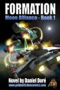
E-book cover created in Carrara 8.5 Pro and Photoshop
 pfontaine2_6fda6a5e0e
Posts: 10
pfontaine2_6fda6a5e0e
Posts: 10
Hi All,
I'm new at the forum though I'm a long-time Carrara user, going back to version 3.
I want to share an e-book cover I made recently using mostly Carrara 8.5 Pro and Photoshop. While the composition is a bit busier than I would have liked, I'm very happy with the final outcome. All the elments were built, arranged and lit in Carrara then rendered out as separate elements with alpha channels. The elements were then brought into Photoshop where they were reassembled. All the laser and missle fire as well as the explosions were created in Photoshop. I could certainly have done them in Carrara but time was an issue and thought it would be easier to paint them in rather than fiddle with particles.
I've got quite a few of these types of images I've done over the years, often starting in a modeling program other than Carrara then rendered in Carrara and composited in Photoshop. It's a great workflow which makes it easy to compose and modify as you go along. Perhaps I'll post a few other images later.
Pierre

Daz 3D is part of 
Connect
DAZ Productions, Inc.
7533 S Center View Ct #4664
West Jordan, UT 84084
Licensing Agreement | Terms of Service | Privacy Policy | EULA
© 2024 Daz Productions Inc. All Rights Reserved.
Comments
Congratulations. It looks great. Yes, please, if you get a chance post more images.
would love to see your images... with your workfllow
looks great
I'll post a few additional images. They are all essentially done the same way. I often use a very quirky program called Curvy 3D to make some simple lathed objects with complex extrusions based on images that distort the basic shapes. The texture mapping is also worked out in Curvy and cleaned up in Photoshop.
The finished model is then exported as an .obj file. I open the .obj file in Carrara, apply the texture then setup the lighting for the final render.
The render is then opened in Photoshop where all the elements are composited and extra work is done to add effects. Amazingly, I can often get an image done in an afternoon though if it's for a client then more time is spent getting the image just as the client wants.
The spidery machines in this image were all created in Curvy 3D, rendered out along with the landscape from Carrara and then finished in Photoshop.
Here's another Curvy3D/Carrara/Photoshop image. The only difference this time is that I dropped in some people I photographed during a trip to England a couple of years ago. Same basic workflow.
I think this is my favorite of all my rendered images. Same workflow except for the camel that I believe I lifted off the internet and dropped into Photoshop. Also, much of this image was constructed in Carrara with Photoshop only used to add the lens flare, the camel, and some color correction. My basic idea was of a futuristic tourist ship visiting various parts of the world, in this case a desert.
And yet another Curvy/Carrara/Photoshop image. This one came together very quickly. Again, Curvy3D allowed me to create a very simple extruded shape that was heavily modified by the displacement map.
I've got a few more image but these are really the best ones of the bunch. What's fun about the workflow is that I'm never really certain what I'm creating when I start but something presents itself as I continue to work. It's a bit like playing jazz and improvising. One thing leads to another and before you know it something cool comes out at the end!
wonderful well done :)
Very nice!
The tourist ship and cityscape images are particularly striking.
great
thanks for sharing
Very cool! Love this!
Wow, Curvy3D, eh? I've messed with it a little... so totally different! This makes me feel like firing it up for some more practice. Very cool work... very cool! Love the style, love the rendering! Bravo! Very cool Models! Love it!
Very good work, and the book cover looks like many of the types of books I'm always purchasing from self-published authors on Amazon.
Pfontaine, These are beautifully constructed and illustrated. The renders are amazing and I love the way you integrated the people and other elements. These are the way covers should be created. Fantastic!
Jonstark, I agree. A cover should invite you into the book. I also do covers/illustrations for indie authors. Most times I have a specific brief as to what they want on the cover, even if I am not in agreement (too much going on, or emphasis on weird details, clothing styles or poses). Anyways, recently I stumbled on a cover that I am sure was quickly made using Dusk/Dawn in a way that is just plain wrong! Or maybe he is supposed to be a mannequin carrying a mannequin and a spear? Ouch! The book cover (regardless of the title) screams... do NOT buy me!! And I have seen a few of these, they are more common that you'd think. (click on Look Inside for closeup of cover).
http://www.amazon.com/dp/B00XOJVD78/ref=rdr_kindle_ext_tmb
Great Thread. I am being tasks to help my wife with a Book cover (well it will be two).
I to have Curvy3D But never really used it, its just the basic version. Which version do you use? Have you thought about doing a walk through, I would love to see how it fits into the pipeline in the modeling and then using whats created in Carrara after.
The Spaceport (I think) with the people and grass, do you do paint overs to blend them in to match style in that one?
Thanks again for the thread
That reminds me, I've got a cover to design too!
I have a specific idea: Deserted beach. Black sand, very craggy rocks (think volcanic - Canary Islands), dramatic sea & sky. Two women walking L-R (or R-L), one is older (say Stephanie 6), the other a young teen (13 in the book, so either YT Julie or Teen Josie). Both wear shredded prison orange, no sleeves legs above the knee. Bare feet. Footprints in the sand where they've been. The woman is holding a simple wooden bow & arrow. The young girl has an assault rifle over her shoulder. Both are blonde, similar features. The girl has a tattoo on her face, "SLAVE". maybe some other clutter (e.g. wrecked rowboat, masts in the sea) to give the idea of shipwreck
The poses are going to be the hardest to get right, & have the most potential to look silly. Distressing the prison costumes is going to be fun too (they're stock items from the store)
Joy, eh? :)
I'd like to see what you come up with! Fuerteventura sounds good for deserted beaches... when can we leave? Silene
The book's actually set on the Anaga coast of Tenerife (the "beak of the duck" as it were). But Fuerteventura sounds good -- just as soon as I win the lotto!
Finally I've had a chance to make a prototype cover. This is in DS, because FirstBastion is using instances for the smaller rocks (which won't show in Carrara), and I wanted to see how he had them laid out. The scene as it is, is FirstBastion's secluded shore, with the textures recoloured. Stephanie 6 and Teen Josie 6, in Oskarson's G2F prison outfits (modified).
Next stage is to bring it into Carrara. I'm going to swap out the displacement mapped sea for an ocean primitive. I need to figure out how to add breakers and white caps - the sea is far too calm!! Also the rocks and cliffs need jaggying up. Lighting, atmospherics, crew for the airship etc etc
Please feel free to make comments and suggestions - this is only a prototype; nothing is set in stone (ha!)
Well, there is that ocean shader U made with easily animated foam. ;-)
http://carraracafe.com/news/tutorial-ocean-with-easily-animated-foam/
The amount of foam is controlled through elevation and such. You could increase the amount of foam perhaps by adjusting the height of the waves in the ocean's controls.
For breakers, you may wish to use particle emitters in key areas, coupled maybe with volumetric clouds for atomized spray. There's also postwork.
As to the current image... Well, let's just say I can tell it is a Studio render. ;-) The people and the airship really need to blend into the environment better, they look composited as the lighting does not match. They also don't seem to be looking at the airship which seems a bit out of place where it is, but that could be because it looks pasted in. I think you are headed in the right direction and with some tweaks to the lighting, effects and layout, it could look very good.
If you have the time, check out the pulp magazine cover Carrara Challenge. There are some very talented people posting WIPs in that one- Some that clearly have had professional experience (not me)! It could provide some inspiration on layout, lighting etc. I may go mucking about in that thread tonight to refresh my memory on some of the stuff I learned.
http://www.daz3d.com/forums/discussion/47148/october-carrara-challenge-wip-thread-create-a-pulp-magazine-cover-with-chills-thrills-carrara-s/p1
Yeah, it's really just a concept render at this stage, to see if the idea is viable before bringing it into Carrara to work on. There's no real effort gone into lighting & such, at this point - that'll come after it's imported.
Nice one Time!
Have you considered Phi's Carrara Realistic Seas? http://www.daz3d.com/carrara-realistic-seas-2 I think it gives a very good effect.
I like First Baston's rocks, etc. I often go into the modelling room and pull the bottom edges out to make them more jagged as I work with a lot of stone making caves, cliffs, etc. That's the cool thing about Car, you can mess with things!
Here's the first Carrara version. I've used Phil's Realistic Seas and Cloud Domes (from the same bundle) I've got the sun beams effect turned on, which adds a lot of bloom to the sky even though you can't really see much in the way of berams.
Phil uses a Marble pattern in a mixer for the foam, and while I rather like the reults, I'd like a lot more of it close to the shore. Unfortunately, the tweaking I tried just turned it into a very obviously repeated patterm. Phil, any ideas?
Another problem I had was applying the DP shaders to the figures. Both characters (Stephanie 6 & Teen Josie 6) just threw up around 40 blank File Open dialogs (nothing to indicate what file they were looking for), which was odd. It's the first time I've tried to apply those shaders since upgrading my OS to El Capitan. CA does seem to be doing some funny things with its file dialogs now. I'll try reinstalling the shaders, see if that helps.
The lighting still needs work. I had to add a fill light, otherwise everything was more or less just silhouette, but I think either it needs no shadows, or softer ones. Ideas welcome...
Finally, it took a bugger of a time to render -11.5 hours on my system! For the paperback, it'll need to be 4 times the size, to get 300dpi - perhaps I should set it going then take a week's vacation!
Both sky and water make it crawl - it zips through the rocky/sandy bits of the render. It's easier to show you my render settings.
GI is skylight only - required for the sun beams.
I have tried having the sea edge that is choppy from Phil's Realistic Seas (which looks good to me!) stop short of the shoreline.
Then create another water layer as a terrain to creep up under it to the shore with a foam edge. I have used a surf tool that comes in Ground Control Terrain Tools by Digital Carver. http://www.digitalcarversguild.com/plugin.php?ProductId=19 but have not used it together with Phil's seas. It was a fiddle the way I did it... so perhaps another who has used this can explain a better way.
In the end I did not use the scene and did not save it, but Ground Control 's a relatively easy tool to use...even for me!
Nice render... it's coming along. I am following what you do as I need to learn more about doing these kinds of outdoor scenes myself.
:) Silene
Interesting tool, Silene - thanks. I might well give it a go. And even if it doesn't work out, there's other things it's bound to come in useful for.
The thing killing the render times was definitely the sky. I may try again later using one of Tim Payne's presets, but for now I've abandoned that image (48 hours to do the 300dpi render!!!)
The second cover idea uses a scratch-built set and an ocean primitive. Same Stephie 6 & outfit. The moon was added in post (I rendered to png with alpha, so the sky was a cutout)