November 2022 - Daz 3D New User Challenge - Materials and next level kitbashing
 Linwelly
Posts: 5,963
Linwelly
Posts: 5,963
New User's Challenge – November, 2022
Are you new to the 3D World? Are you at the beginning stages of learning 3D rendering? Have you been around for a little bit but feel you could benefit from some feedback or instruction? Have you been around a while and would like to help other members start their creative journey? Well then come and join the fun as we host our newest challenge.
We continue breaking down each month into 2 different challenges. A Beginner Challenge and then also an Intermediate Challenge.
So which "Challenge" should you choose?
Follow the Beginner Challenge if you are:
- New to the New User Challenges
- New to Daz Studio
- Newer to 3D Rendering in General
Follow the Intermediate Challenge if you have:
- Participated in the New User Challenge for awhile
- Know the basics of Daz Studio and would like to learn more in depth topics
- Been using 3D Rendering Applications for awhile and feel comfortable with learning Intermediate Topics
*Please be sure to list in your post which Challenge level you are participating in*
Closing date for both is November 30, 2022
For a list of the current challenge rules, please see this thread: Challenge Rules
They apply for both versions of the challenge.
Daz 3D is part of 
Connect
DAZ Productions, Inc.
7533 S Center View Ct #4664
West Jordan, UT 84084
Licensing Agreement | Terms of Service | Privacy Policy | EULA
© 2025 Daz Productions Inc. All Rights Reserved.
Comments
From shiny polished gems to rough bark, from silk to leather
Beginner - "Materials"
This month's focus will be on Materials and Surfaces. One of the most important aspects of a great render is the effective use of materials. Effective surface settings can add realism, style, and visual interest to an image. This month we will be concentrating on how to create and manipulate the surfaces on the objects in your scene.
Also, keep in mind all the various items covered over the past several months. They will affect the way your materials look in your final rendered scene.
previous challenges on this topic:
November 2017
November 2018
November 2019
November 2020
November 2021
Helpful Links:
When following tutorials, be cognizant of the different applications (Bryce, Daz Studio, Poser, Carrara and Blender, etc.) and different render engines (3Delight, Iray, Reality, etc). Techniques for one may not apply directly to another. If you have some favorite Materials, Surfaces, and Shader tips, please share them in this thread.
Daz Studio Tutorials:
Daz 101: Surfaces by Daz 3D (video)
Iray Surfaces and What They Mean by Sickleyield
The Iray Uber Base Shader by Daz 3D (video)
Daz 3D Tutorial: Make anything a light source by Daz 3D (video)
Daz 3D Tutorial: Using bump and displacement maps by Daz 3D (video)
a more recent recording of a stream by Jay Versluis:
In the Studio with DAZ3d - Shaders and Materials
in case you want to work with filament:
Daz3d Animation Series: animation_filament
Bryce Tutorials:
A compilation of tutorials for Bryce, there is a lot about materials to find there as well by Daz 3D
Other helpful places:
3Delight - Uberenvironment made easy!
this is more in depth and experimental for the 3delight renderer: 3Delight Laboratory Thread: tips, questions, experiments
Create something new from clothing and props you already own, retexture, and make it look as one again
Intermediate Challenge - next level kitbashing
So you already know how to change shader presets, and give your character a sweat sheen but you want to combine different outfits and make them look as one? You want this tag on the shirt or a hole in that door or create a whole new building from your library? Then this challenge is for you.
Some parts of this challenge are easier when using an image manipulation program like Gimp or Photoshop to prepare the new texture
The tools you might want to use are geometry editor and Layered image editor (LIE). Understanding UV maps will help you with the more advanced use of materials and surfaces
geometry editor tutorial
Beginners guide to Daz Studio Layered Image Editor
DAZ : LIE Quick How To
DAZ Studio Tutorial - Layered Image Editor - Make your own Tattoos (nudity)
Tutorial: Adding Surfaces and Striped Texture to a T-Shirt
Daz Studio UV Maps
Fixing UV maps in DAZ Studio (got to say it's not happening in DAZ Studio, it's just used in DAZ Studio)
Painting on Uv Maps for Daz, Different ways to add texture/color to figures
Daz 3D Tutorial: Use "cut and paste" functions for Textures in Iray
Beginner Submission
Title: "If you're not cops. . ."
The title is from "Bryant" (Capt. Bryant, Blade Runner) and the full quote is known to many of us who love Blade runner, "If you're not cops you're little people."
So I made this for the Nov new user submission. I've been afraid of messing with surfaces but decided to jump in after watching a ton of YouTube tutorials; although what I did is obvious and kind of tame. I made the eyes on the robot emmissives, as well as the man's jacket shoulders and collar. I was going for a Cyberpunk look and imagined future cops might flash these pieces like squad car lights todat.
I also made the tip of the cigar emmissive too. The big step for me was loading the (not sure right word) texture file? the image file for the cop's helmet. I repainted the stripe skin blue - but it didn't work. I only go the blue stripes when I had it radiate blue too. Not sure why. When I did that the white lettering of the label "Police" also turned blue and I had no clue why. So I opened it up in Clip Studio Paint and wrote the letters manually on his helmet and the droid's shoulder. Drew some smoke and that was it.
that's a great start to get into altering surfaces, I like those details esp. the lights on the cigar.
I'm not sure what happened with the helmet texture and I don't think I own that helmet so I can't really look it up, I'm assuming that there might be an additional layer in the top coat which had other settings and that's why your changes didn't transport into the render.
Here is an idea for the smoke so that you could render it in place as well: paint some smoke in grey tones on a black background, for example in CSP then you add a small plane to the tip of the cigar in your scene, go to the surface settings of the plane and add the smoke you painted into the map for cutout opacity. you can then play around with the strength of that dial from 1 where the smoke should be fully visible to like 0.20 where there should only a whisp being seen of it
(edited the typos for readability)
Thanks Linwelly. I'll give that a try.
I can definitely see where you're going and I like the idea - it's a great start, so don't let any of the suggestions below discourage you at all. :)
The first things are the robot's eyes and the cigar tip. They're both going to be tricky but kind of related, so here's my input:
For the cigar, you'll want to add much more grey with bits of red on it. Cigars don't light up quite as much as cigarettes, and even when you're inhaling, there's more often than not some ash at the tip covering the red. Here's a good example of what the end might look like: https://img.vimbly.com/images/full_photos/cigar-4.jpg , so I'd take that emissive way down. Usually a cigar will only stand out like that in a very dark picture when it's the brightest light source.
For the robot eyes it's just a bit too intense. A really good example of a glow effect is, of course, a lightsaber. Here's a comic one: https://static0.srcdn.com/wordpress/wp-content/uploads/2019/01/Darth-Vader-Lightsaber-Promo.jpg . The core of the item is almost all the way white, but it tapers off pretty quickly to the edges. That can be a hard effect to get right, but you could try making the eyes very light red in the center, with a small edge of full red (then red if the light bounces off of anything).
I like the flashing outfit idea - you'll be able to dazzle the criminals before you arrest them.
I hope this helps!
Title: It's the end of the world as we know it
Intermediate challenge - Next level kitbashing
First attempt at photo realism. Pure iray render, no postprocessing
Title: Sworn enemies
Intermediate challenge - Next level kitbashing - 2ND entry
Pure iray render. No postprocessing
Let Me In
Intermediate Challenge
I used a push modifier, LIE and geoshells to create the effect around the woman. Feedback welcome!
did you put two houses on top of each other to get that two levels building? Lot's of nice details and a good lighting as well, now I would suggest to you to add some Depth of field to the images to give it even more realism.
good work here as well, interesting camera angle and lighting. also I like the detail of the fight of a second set of fighters in the back. The lich's green magic is getting a bit lost in all that action, maybe you can add more emissive power to that? And I think her feathers look a bit more translucent than they should? depends on your intentions of course
great work on the effects, I really like that, but I'm not sure which way I'm actually looking at the scene, she seems somehow above him but then again not? I understand that you would like to give both the same importance in the scene but I think from the compositional aspect the image woud benefit if you give one of them the main focus so either the menace it what you concentrate on and the sleeper gets moved innocently in the background (like through Depth of field, different cmarea angle or some other means) or we get the focus on the the sleeper and the menace is lurging on the edge. Looking forward to where you go with this
The translucency was intentional
there is depth of field but it's not very noticable since teh store is very closeby, mostly noticeable on foreground asphalt at the bottom and back right windows. increasing is would make it look weird.
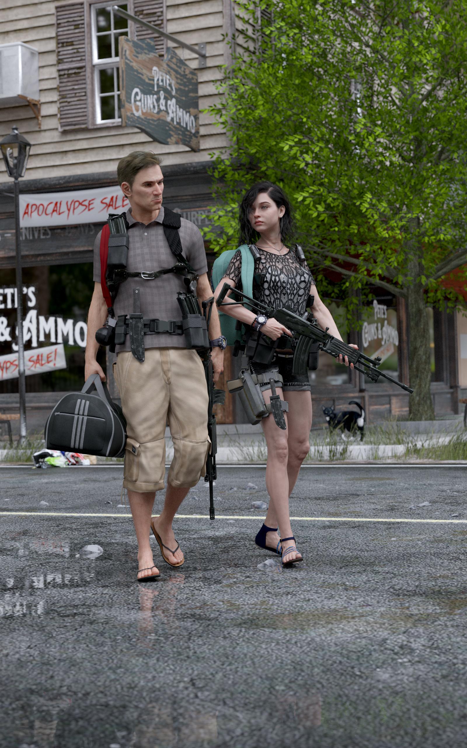
Title: It's the end of the world as we know it
Intermediate challenge - Next level kitbashing
Updated version. Improved lighting and materials to realy make it photorealistic. also improvved foliage on tree and it is not growing out of the concete anymore. also added a curious stray cat.
No, tit's a model of a corner store with an apartment above it that's already part of my library which I retexured
nice update on that, the puddles really add to the setting and the light does work better as well
Beginner Submission
Title: Uknown Beauty
The scene takes place inside a museum. Created in DAZ Studio.No postwork.
Used Products:
https://www.daz3d.com/hailey-81
https://www.daz3d.com/everyday-frames-mirrors
https://www.daz3d.com/seaside-apartment (flower pot)
https://www.daz3d.com/tiles-aplenty (and other shaders)
https://polyhaven.com/a/qwantani_puresky
Question:
Is it possible to tell a shader to be applied in a 90 degree angle?
Disclaimer:
This is the first time I submit to the contest. If I misunderstood/ missed anything it was oversight and not in bad intention.
welcome the the NUC @apprentice (what a fitting username ) that looke really good and the light setting is brilliant
about the rotation of shaders, a few offer that option in their utilities settings but most don't. But with the latest DAZ version the Layered Images Editor (LIE) now has the option to rotate the texture map by 90, 180 and -90°. Esp with wooden surface shaders this is a really nice option. Remember you need to rotate the texture maps for bump /normal maps and whatever other maps are there in the surface as well
you access that tool by going to the surfaces tab, click on the texture map (for example in the base colour slider) and in the popuo yhou choose the Layered image editor (image editor doesn't offer this)
Usually the surface in quiestion is then already highlighted in the popup window (this is where you could add another layer with an inscription, or whatever else you come up with as well) and in the lower field on the right side of the popup you find rotate where you can choos the direction you want in 90° increments. The tool is a bit slow in reaction so give it time to think about that, then press accept
Thanks for the advice @Linwelly. I tried two different DOF, one with a focus on the menace, the other on the sleeper. Also tweaked the lighting slightly
Ok, mine is still a WIP, but hopefully it is going in the right direction. I wanted to create an image using inspiration from a search on Indian Renaissance Art.
Intermediate Challenge - next level kitbashing
I made the saree red (brought image in photoshop to change colors) and added a bindi as LIE. I also combined several flowers and plants from different sets for the environment. I created the G9 character using the skin that came with it and head and body using the Genesis 9 Essential Shapes Bundle.
Next up: I think I'll use more custom shaders and I need to fix the earrings and saree since they did not like being put on G9 with the pose. I might read up on how to make non dforce clothing dforce. Comments and suggestions are appreciated, thanks!
my personal favourite is with the focus on the menace
great work and lovely choice on the colours! you can make an item d-force by selecting it in the scene tab, go to the simulation tab click on the hamburger menue right next to the blue "simulate" button. on the popup choose the dForce asnd then Add dforce modifyer: Dynamic surface. Though not all cloting react well to is and might go for an explode, that's why I would suggest to make a subscene with only the character and the piece of clothing that you want to simulate on and once it worked you can reimport that subscnee to your main.
If the dforce experiments are not working out other options are the d-former and the push modifyier
Intermediate Submission
Title: New Rules
The coven has a new leader and all the rules are about to change.
(Zero post work, all done in Daz Studio)
@Sprucebeard
Title: "If you're not cops. . ." - Great first image with changing surfaces! I think Linwelly made some good suggestions on the cigar and robot eyes. One more thing I think might improve the image is to look at the composition of the image or how the scene is arranged for the viewer. The rule of 3rds can help out here (it's used in art & photography a lot). I think your image looks a little unbalanced and might be better to move the camera to helps your eyes focus on what is important.
@DarkSoul
Title: It's the end of the world as we know it - Great job, I love your second take. The puddles of water make it so much better and the cat! I mean, who wants to start the end of the world without a cat?
@aprilshowers2065
Title: Let Me In - Very creepy image! I like the focus on the creature more than the sleeper. Maybe you can add mist around the edges to make the creature bring in the evilness?
@apprentice
Title: Unknown Beauty - Very cool idea! I like the stand and the way the light is hitting the award. I'm wondering if you can do something to the square inside the green award to make it also stone so that the statue looks like it belonged to a block of stone instead of just standing on wood?
@marconft6
Title: New Rules - Great job, I really like the details on this image. I noticed the veins even appear to be filled with black blood. The only thing I can think of to improve the image is the reflection in the eyes. It seems too round. It might be interesting to see what can be reflected back in that brightness?
Title: Among the Hibiscus and Elderberries
Intermediate challenge - Next level kitbashing
This is my second attempt at this image. I did play with dforce, but after finally removing everything that caused explosions, I just didn't like what it did to the cloth. I also made adjustments to the jewelry and removed the ball that was having issues on the earring when fit to G9.
I added some additional fauna with the flora since hibiscus attracts butterflies and hummingbirds love Turk's cap and visit it frequently so hopefully you'll see one in there.
I really want my images to look like art so I did some postwork in photoshop to try and give it more of an artistic look. Hopefully I didn't overdo it.
very good work, lots of nice details, the only thing I think that could use some changes is the light, which I think could be used to add a little more mood/drama to the scene. For one I woudl suggest to make the lights a bit stronger and add one emissive plane to the scene that lights up the all black parts a little bit, maybe even add a colour to the emissive ot colour the light sources you have, when you tine one side read and the other in blue or green this often fives an interesting drama effect. Also maybe make the eyes of the creatures glowing red?
An alternative would be to add some dust/ smoke / mist to the scene. (I know this is usually topic in another month) If you don't have any smoke or mist props you can create them yurself using the same technique as I descibed for the cigar smoke fo an image above, make the plane for that large and make the brush a cloudy thingy fading out to one side.
But if you are using Iray you can as well try to use a setting that is hitten in the render settings /environment scroll all to the and and use ground fog on it's a bit of experiementing to get the setting right in hight and density but ist a neat tool
yes sometimes it's hard to make the d-force do what you would like it to do, some things can be arranged with the cloth parameters in the surface tab but it takes time and experimentation.
about the postwork there is something that's rather irritating me about it (not postwork in general) that is the "canvas structure" you added seems to be mostly noticable on some places of her skin (arms) and with that looks more like a render artefact than an intended. maybe you find something better there
Thanks for the comments! I've been modeling for around 16 years, but it was only technical modeling (machine parts, architecture, etc.). I've never ever had to worry about lighting because that's not how work was presented. With starting to learn Daz Studio a few months ago, I realize I know nothing about lighting. Almost to the point where I feel like I need to spend a few weeks learning about it. It's definitely something I need to work on. I'll try a few of the changes you've mentioned and reupload. Thanks!
Thanks for the feedback! I love layers! It was easy to just click off the layer with the canvas texture even though I had tons of other layers on top of it. I wasn't actually sure if I liked that particular texture before posting, but it reminded me of acrylic and oil paintings I've done in the past, so I left it there.
Here is the image without that texture added:
Link to the image in my gallery
Now I'm off to see what I can create with the new G9 and Michael 9 HD! Not sure I'll have time to create a second entry before the month is over, but I'll try!